代码如下:
index.html
<!DOCTYPE html>
<html>
<head>
<meta charset="UTF-8">
<style type="text/css">
.img-circle {
	-moz-border-radius: 50%;
	-webkit-border-radius: 50%;
	border-radius: 50%;
}

.img-circle:hover {
	-moz-box-shadow: 0px 0px 25px rgba(0, 255, 178, 1);
	-webkit-box-shadow: 0px 0px 25px rgba(0, 255, 178, 1);
	box-shadow: 0px 0px 25px rgba(0, 255, 178, 1);
	cursor: pointer;
}
</style>
<title>Insert title here</title>
</head>
<body>
	<img class="img-circle" alt="我是头像" src="images/default_head.jpg">
</body>
</html>
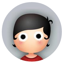
鼠标未移动在头像上时
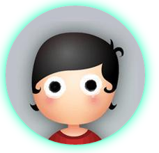
鼠标移动到头像上时
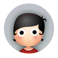
如果头像太大, 可以通过样式来限制, 可以在<img>里添加属性style="width: 100px; height: 100px;"
即
<img class="img-circle" alt="我是头像" src="images/default_head.jpg" style="width: 100px; height: 100px;">
效果如下:
另外, z-index值一定要比周围元素的要高, 否则有可能出现头像被其他元素遮挡住, 可以用.img-circle里加上z-index: 99;
如果还想在头像外加上一层border像光晕也是可以的,为突出效果, 我设置body的背景颜色
完整代码如下:
<!DOCTYPE html>
<html>
<head>
<meta charset="UTF-8">
<style type="text/css">
body {
	background-color: #0D5193;
}
.img-circle {
	z-index: 99;

	-moz-border-radius: 50%;
	-webkit-border-radius: 50%;
	border-radius: 50%;

	border: 8px solid;
	border-color: rgba(255, 255, 255, 0.2);
}

.img-circle:hover {
	-moz-box-shadow: 0px 0px 25px rgba(0, 255, 178, 1);
	-webkit-box-shadow: 0px 0px 25px rgba(0, 255, 178, 1);
	box-shadow: 0px 0px 25px rgba(0, 255, 178, 1);
	cursor: pointer;
}
</style>
<title>Insert title here</title>
</head>
<body>
	<img class="img-circle" alt="我是头像" src="images/default_head.jpg" style="width: 100px; height: 100px;">
</body>
</html>
效果如下:


OK, Enjoy it!!! 例子代码下载


 扫一扫
扫一扫

 被折叠的 条评论
为什么被折叠?
被折叠的 条评论
为什么被折叠?
 到【灌水乐园】发言


