


本文只是根据视频进行记录,回顾知识的..............
界面:

1.界面分析
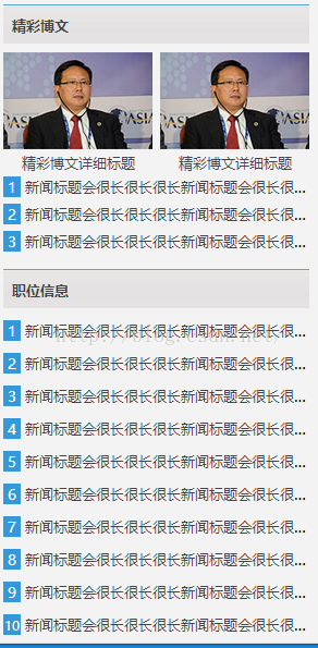
第一幅图:最上面是标题 然后是图片列表+描述信息然后新闻标题列表 css演示是前篇是一样的 下面也是标题+列表 后面一幅图也是 标题+列表
2.代码解析
标题在第二篇就说了制订了样式
html 代码也就是
  <div class="title_bg">
                <h2><a href="list.html">精彩博文</a></h2>
            </div>
然后是两个标题
  <section id="bowen_a">
                <ul>
                    <li><a href="content.html"><img src="images/bowen_06.jpg"></a><a href="content.html">精彩博文详细标题</a></li><li>
                    <a href="content.html"><img src="images/bowen_06.jpg"> </a><a href="content.html">精彩博文详细标题</a> </li>
                </ul>
            </section>
            <section id="bowen_b">
                <ul>
                    <li><a href="content.html">新闻标题会很长很长很长新闻标题会很长很长很长新闻标题会很长很长很长新闻标题会很长很长很长</a></li>
                    <li><a href="content.html">新闻标题会很长很长很长新闻标题会很长很长很长新闻标题会很长很长很长新闻标题会很长很长很长</a></li>
                    <li><a href="content.html">新闻标题会很长很长很长新闻标题会很长很长很长新闻标题会很长很长很长新闻标题会很长很长很长</a></li>
                </ul>
/*博文信息*/
section#bowen_a li{
    display: inline-block;
    vertical-align: top;
    margin-top: 10px;
    width: 172px;
    height: 136px;
    text-align: center;

}
section#bowen_a a{
    color: #444;
    text-decoration: none;
    display: inline-block;
    width: 100%;
}
section#bowen_a li:first-child{
    margin-right: 8px;
}
section#bowen_a li a:first-child{
    width: 172px;
    height: 111px;
}
section#bowen_a li a:last-child{
    height: 21px;
    overflow: hidden;
}
然而后面的列表还是那样的 没啥不同的 加了动画
section#bowen_b li:before{
    content: counter(listxh);
    background: #3598db;
    padding: 2px 5px;
    color: #fff;
    margin-right: 5px;
}
section#bowen_b li{
    counter-increment: listxh;
    display: inline-block;
    width: 100%;
    vertical-align: bottom;
    overflow: hidden;
    white-space: nowrap;
    text-overflow: ellipsis;
    margin-top: 8px;
    -webkit-transition:text-shadow 1s linear;
    -moz-transition:text-shadow 1s linear;
    -ms-transition:text-shadow 1s linear;
    -o-transition:text-shadow 1s linear;
    transition:text-shadow 1s linear;
}
section#bowen_b li:hover{
    text-shadow: 1px 4px 4px #000;
}
section#bowen_b a{
    color: #444444;
    text-decoration: none;
}
然后再是<联系我们>那里 两张图片
   <section id="lianxi">
            <div class="title_bg">
                <h2><a href="list.html">联系我们</a></h2>
            </div>
            <a href="content.html"><img src="images/about_13.jpg"></a>
        </section>
/*联系我们*/
section#lianxi{
    margin-top: 20px;
}
section#lianxi a ,section#lianxi img{
    display: inline-block;
    width: 352px;
    height: 199px;
}
点击下载源码
End


 4316
4316


 被折叠的 条评论
为什么被折叠?
被折叠的 条评论
为什么被折叠?
 到【灌水乐园】发言


