


Button
存在两个类,一个是mobile使用的sap.m.Button,另外一个是sap.ui.commons.Button
sap.ui.commons.Button
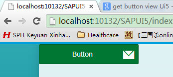
var oButton1 = new sap.m.Button("But1",{
            text : "Button",
            width : "200px",
            icon : "sap-icon://email",
            activeIcon : "sap-icon://accept",
            type : "Accept",
            enabled : true,
            iconFirst : true,
            tooltip : "This is a test tooltip",
            textDirection : "RTL",
            styled: false,
            press : function() {
                 this.setIcon("sap-icon://accept");
            }
        });
其中:
type表示按钮的类型,对应sap.m.ButtonType,有Accept 、Back、Default 、Emphasized 、Reject 、Transparent、Unstyled、Up
enabled表示是否可以选择,布尔类型
iconFirst表示图标在前还是文字在前,布尔类型
sap.ui.commons.Button
createContent : function(oController) {
var oButton1 = new sap.ui.commons.Button("But1",{
text : "Button",
width : "200px",
height : "30px",
helpId : "help",
icon : "sap-icon://email",
iconHovered : "sap-icon://accept",
iconSelected : "sap-icon://accept",
iconFirst : true,
tooltip : "This is a test tooltip",
styled: false,
press : function() {
// this.setIcon("sap-icon://accept");
}
});
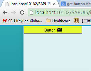
oButton1.addStyleClass("myButton");其中,需要注意的是,可以自己修改样式,styled要设置为false
新建css文件
.myButton {
    background-color: #e3fa2e;
}
HTML中添加
<link rel="stylesheet" href="css/style.css">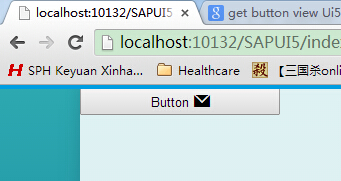


 扫一扫
扫一扫
 1146
1146

 被折叠的 条评论
为什么被折叠?
被折叠的 条评论
为什么被折叠?
 到【灌水乐园】发言


