


0)一个最基本的调用bootstrap的头部的写法
<!doctype html>
<html lang="en">
<head>
    <meta charset="UTF-8">
    <title>表单控件状态——焦点状态</title>
    <link rel="stylesheet" href="//netdna.bootstrapcdn.com/bootstrap/3.1.1/css/bootstrap.min.css">
    <link rel="stylesheet" href="style.css">
</head>
<body>
1)
垂直显示
Bootstrap框架默认的表单是垂直显示风格,但很多时候我们需要的水平表单风格(标签居左,表单控件居右)
水平表单
在Bootstrap框架中要实现水平表单效果,必须满足以下两个条件:
1、在元素是使用类名“form-horizontal”。
2、配合Bootstrap框架的网格系统。(网格布局会在以后的章节中详细讲解)
在元素上使用类名“form-horizontal”主要有以下几个作用:
1、设置表单控件padding和margin值。
2、改变“form-group”的表现形式,类似于网格系统的“row”。
内联表单
有时候我们需要将表单的控件都在一行内显示。
<!doctype html>
<html lang="en">
<head>
    <meta charset="UTF-8">
    <title>内联表单</title>
    <link rel="stylesheet" href="//netdna.bootstrapcdn.com/bootstrap/3.1.1/css/bootstrap.min.css">
</head>
<body>
<form class="form-inline" role="form">//加了form-inline之后,将所有的东西都显示到一行
  <div class="form-group">
    <label class="sr-only" for="exampleInputEmail2">邮箱</label>
    <input type="email" class="form-control" id="exampleInputEmail2" placeholder="请输入你的邮箱地址">//表示加入默认的占位符
  </div>
  <div class="form-group">
    <label class="sr-only" for="exampleInputPassword2">密码</label>
    <input type="password" class="form-control" id="exampleInputPassword2" placeholder="请输入你的邮箱密码">
  </div>
  <div class="checkbox">
    <label>
      <input type="checkbox"> 记住密码
    </label>
  </div>
  <button type="submit" class="btn btn-default">进入邮箱</button>
</form>
</body>
</html>
<!doctype html>
<html lang="en">
<head>
<meta charset="UTF-8">
<title>表单控件——下拉选择框select元素</title>
<link rel="stylesheet" href="//netdna.bootstrapcdn.com/bootstrap/3.1.1/css/bootstrap.min.css">
</head>
<body>
<form role="form">
<div class="form-group">
<select class="form-control">
<option>1</option>
<option>2</option>
<option>3</option>
<option>4</option>
<option>5</option>
</select>
</div>
<div class="form-group">
<select multiple class="form-control">
<option>1</option>
<option>2</option>
<option>3</option>
<option>4</option>
<option>5</option>
</select>
</div>
</form>
</body>
</html>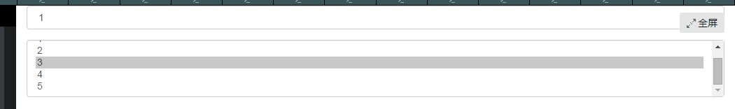
2)
表单控件(文本域textarea)
<form role="form">
  <div class="form-group">
    <textarea class="form-control" rows="3"></textarea>
  </div>
</form>
表单控件(复选框checkbox和单选择按钮radio)
<!doctype html>
<html lang="en">
<head>
    <meta charset="UTF-8">
    <title>表单控件——表单控件大小</title>
    <link rel="stylesheet" href="//netdna.bootstrapcdn.com/bootstrap/3.1.1/css/bootstrap.min.css">
</head>
<body>
<form role="form">
  <h3>案例1</h3>
  <div class="checkbox">
    <label>
      <input type="checkbox" value="">
      记住密码
    </label>
  </div>
  <div class="radio">
    <label>
      <input type="radio" name="optionsRadios" id="optionsRadios1" value="love" checked>
      喜欢
    </label>
  </div>
    <div class="radio">
    <label>
      <input type="radio" name="optionsRadios" id="optionsRadios2" value="hate">
      不喜欢
    </label>
  </div>


</form>
</body>
</html>加上class="radio-inline"或者"checkbox-inline"就能出现在同一行了
表单控件(按钮)
按钮也是表单重要控件之一,制作按钮通常使用下面代码来实现:
☑ input[type=“submit”]
☑ input[type=“button”]
☑ input[type=“reset”]
☑
在Bootstrap框架中的按钮都是采用来实现。
有关于Bootstrap中按钮如何制作,在这里不做过多阐述,因为按钮也是Bootstrap框架中核心部分之一,后面我们专门有一节内容来介绍Bootstrap的按钮。
控件大小控制
可以通过设置控件的height,line-height,padding和font-size等属性来实现控件的高度设置。不过Bootstrap框架还提供了两个不同的类名,用来控制表单控件的高度。这两个类名是:
1、input-sm:让控件比正常大小更小
2、input-lg:让控件比正常大小更大
表单控件状态(焦点状态)
要让控件在焦点状态下有上面样式效果,需要给控件添加类名“form-control”:
(鼠标单击输入框,使其获得焦点就可以看到加入蓝色边框效果)
表单控件状态(禁用状态)
在fieldset里面加上一个disable就好了
<!doctype html>
<html lang="en">
<head>
    <meta charset="UTF-8">
    <title>表单控件状态——禁用状态</title>
    <link rel="stylesheet" href="//netdna.bootstrapcdn.com/bootstrap/3.1.1/css/bootstrap.min.css">
</head>
<body>

<h3>示例3</h3>
<form role="form">
  <fieldset disabled>
    <legend><input type="text" class="form-control" placeholder="显然我颜色变灰了,但是我没被禁用,不信?单击试一下" /></legend>
    <div class="form-group">
      <label for="disabledTextInput">禁用的输入框</label>
      <input type="text" id="disabledTextInput" class="form-control" placeholder="禁止输入">
    </div>
    <div class="form-group">
      <label for="disabledSelect">禁用的下拉框</label>
      <select id="disabledSelect" class="form-control">
        <option>不可选择</option>
      </select>
    </div>
    <div class="checkbox">
      <label>
        <input type="checkbox"> 无法选择
      </label>
    </div>
    <button type="submit" class="btn btn-primary">提交</button>
  </fieldset>
</form>
</body>
</html>
表单控件状态(验证状态)
<form role="form">
<div class="form-group has-success has-feedback">
  <label class="control-label" for="inputSuccess1">成功状态</label>
  <input type="text" class="form-control" id="inputSuccess1" placeholder="成功状态" >
  <span class="glyphiconglyphicon-ok form-control-feedback"></span>
</div>
<div class="form-group has-warning has-feedback">
  ......
</div>
<div class="form-group has-error has-feedback">
  ......
</div>
</form>
效果图:
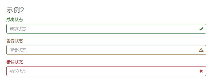
描述:has-success warning error等表示状态,然后后面的小图标的话就是紧随这两个图标之后加上打钩或者打叉的话,就在那几个状态后面跟上一个 has-feedback.
表单提示信息
平常在制作表单验证时,要提供不同的提示信息。在Bootstrap框架中也提供了这样的效果。使用了一个”help-block”样式,将提示信息以块状显示,并且显示在控件底部。
代码:
<form role="form">
<div class="form-group has-success has-feedback">
  <label class="control-label" for="inputSuccess1">成功状态</label>
  <input type="text" class="form-control" id="inputSuccess1" placeholder="成功状态" >
  <span class="help-block">你输入的信息是正确的</span>
  <span class="glyphiconglyphicon-ok form-control-feedback"></span>
</div>
  …
</form>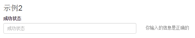


 2万+
2万+


 被折叠的 条评论
为什么被折叠?
被折叠的 条评论
为什么被折叠?
 到【灌水乐园】发言


