


此博客基于react-native-0.49.3
上一篇介绍了一下react-navigation依赖库中的StackNavigator 这篇文章就接着上一篇继续往下说也就是依赖库中的第二个导航栏TabNavigator相当于Android中的TabLayout
TabNavigator:
官网地址:https://reactnavigation.org/docs/navigators/tab
废话就不多说了直接来看效果、看代码
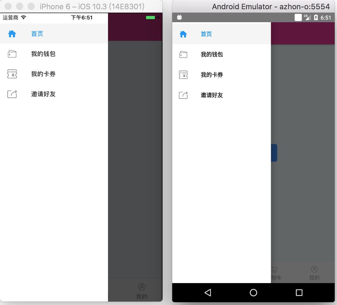
效果图:
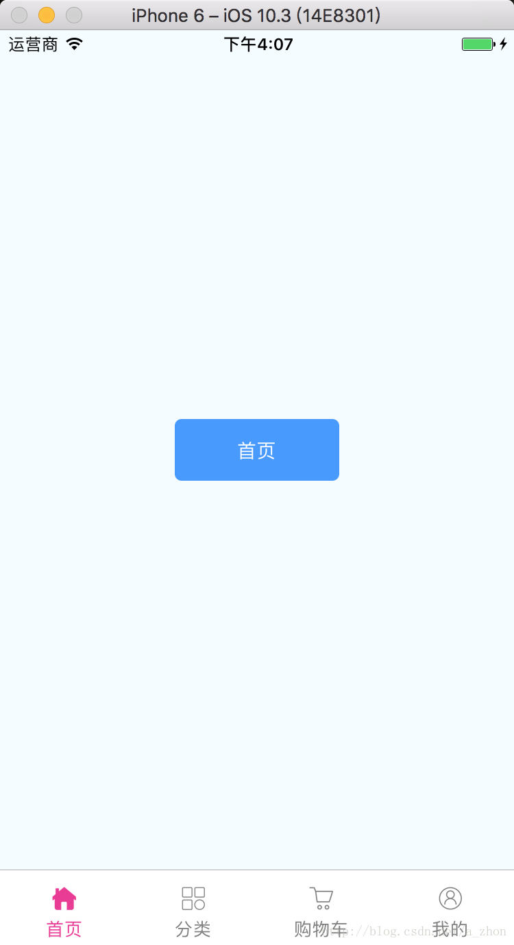
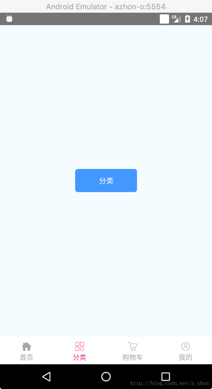
使用的第一步当然是下载react-navigation这个依赖库了
- 既然使用的是第三方库,如果在你项目的
node_modules文件夹中没有react-navigation那么你需要执行如下命令
//进入你项目的根目录下执行
npm install --save react-navigation由于react-native-0.49.3这个版本直接将index.android.js和index.ios.js这两个入口文件直接合并为了一个index.js文件并创建一了一个App.js文件,那我们现在就只需要来修改我们这个文件就可以达到我们的效果了。
直接配置导航栏
import React, {Component} from 'react';

import {
    Image,
} from 'react-native';

//引入react-navigation依赖库
import {
    TabNavigator,
} from 'react-navigation';

//展示的页面
import Home from './src/Home';
import Type from './src/Type';
import ShopCar from './src/ShopCar';
import Mine from './src/Mine';

//Tab
export default Tab = TabNavigator({
    //每一个页面的配置
    Home: {
        screen: Home,
        navigationOptions: {
            tabBarLabel: '首页',
            tabBarIcon: ({tintColor}) => (
                <Image
                    source={require('./images/ic_home.png')}
                    style={[{height: 24, width: 24}, {tintColor: tintColor}]}
                />
            ),
        },
    },
    Type: {
        screen: Type,
        navigationOptions: {
            tabBarLabel: '分类',
            tabBarIcon: ({tintColor}) => (
                <Image
                    source={require('./images/ic_type.png')}
                    style={[{height: 24, width: 24}, {tintColor: tintColor}]}/>
            ),
        }
    },
    ShopCar: {
        screen: ShopCar,
        navigationOptions: {
            tabBarLabel: '购物车',
            tabBarIcon: ({tintColor}) => (
                <Image
                    source={require('./images/ic_shop_car.png')}
                    style={[{height: 24, width: 24}, {tintColor: tintColor}]}/>
            ),
        }
    },
    Mine: {
        screen: Mine,
        navigationOptions: {
            tabBarLabel: '我的',
            tabBarIcon: ({tintColor}) => (
                <Image
                    source={require('./images/ic_me.png')}
                    style={[{height: 24, width: 24}, {tintColor: tintColor}]}/>
            ),
        }
    },

}, {
    //设置TabNavigator的位置
    tabBarPosition: 'bottom',
    //是否在更改标签时显示动画
    animationEnabled: true,
    //是否允许在标签之间进行滑动
    swipeEnabled: true,
    //按 back 键是否跳转到第一个Tab(首页), none 为不跳转
    backBehavior: "none",
    //设置Tab标签的属性

    tabBarOptions: {
        //Android属性
        upperCaseLabel: false,//是否使标签大写,默认为true
        //共有属性
        showIcon: true,//是否显示图标,默认关闭
        showLabel: true,//是否显示label,默认开启
        activeTintColor: '#EB3695',//label和icon的前景色 活跃状态下(选中)
        inactiveTintColor: 'gray',//label和icon的前景色 活跃状态下(未选中)
        style: { //TabNavigator 的背景颜色
            backgroundColor: 'white',
            height: 55,
        },
        indicatorStyle: {//标签指示器的样式对象(选项卡底部的行)。安卓底部会多出一条线,可以将height设置为0来暂时解决这个问题
            height: 0,
        },
        labelStyle: {//文字的样式
            fontSize: 13,
            marginTop: -5,
            marginBottom: 5,
        },
        iconStyle: {//图标的样式
            marginBottom: 5,
        }
    },
});
- 解释一下上面的代码
//每一个页面的配置
Home: {
screen: Home,//当前选项卡加载的页面
//配置每一个选项卡的样式
navigationOptions: {
tabBarLabel: '首页',//显示的标签文字
//显示的图片
tabBarIcon: ({tintColor}) => (
<Image
source={require('./images/ic_home.png')}
style={[{height: 24, width: 24}, {tintColor: tintColor}]}
/>
),
},
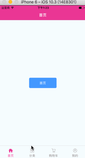
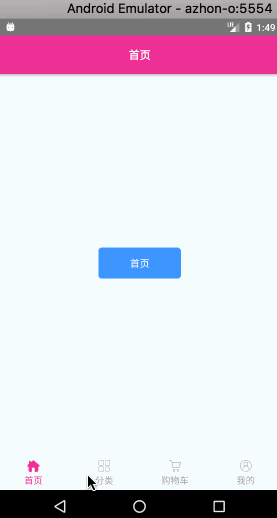
},- 后半部分则是配置整个TabNavigator的样式了;重要的东西都在上面标好了注释认真阅读哦!
- 更多的属性介绍详见文章顶部给出的官网地址
接下来就是编写那四个页面的布局了,都是一样的改几个字就好了。
Home.js
import React, {Component} from 'react';
import {
    View,
    Text,
    StyleSheet,
    TouchableOpacity,
} from 'react-native';

export default class Home extends Component {

    render() {
        return (
            <View style={styles.container}>
                <TouchableOpacity style={styles.button} activeOpacity={0.5}>
                    <Text style={{color: 'white'}}>首页</Text>
                </TouchableOpacity>
            </View>
        );
    }
}

const styles = StyleSheet.create({
    container: {
        flex: 1,
        justifyContent: 'center',
        alignItems: 'center',
        backgroundColor: '#F5FCFF',
    },
    button: {
        width: 120,
        height: 45,
        borderRadius: 5,
        alignItems: 'center',
        justifyContent: 'center',
        backgroundColor: '#4398ff',
    }
});
TabNavigator源码下载地址
这篇文章到这就over了,TabNavigator使用起来还是很简单的。接下来就可以写一个将
StackNavigator、TabNavigator结合起来使用的Demo了。
将StackNavigator和TabNavigator结合使用案例下载地址


 2万+
2万+


 被折叠的 条评论
为什么被折叠?
被折叠的 条评论
为什么被折叠?
 到【灌水乐园】发言


