library(ggplot2)
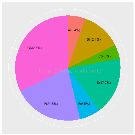
type <- c('A','B','C','D','E','F','G')
nums <- c(10,23,8,33,12,40,60)
df <- data.frame(type = type, nums = nums)
#绘制条形图
p <- ggplot(data = df, mapping = aes(x = 'Content', y = nums, fill = type)) + geom_bar(stat = 'identity', position = 'stack', width = 1)
p
label_value <- paste('(', round(df$nums/sum(df$nums) * 100, 1), '%)', sep = '')
label_value
label <- paste(df$type, label_value, sep = '')
label
p + coord_polar(theta = 'y') + labs(x = '', y = '', title = '') + theme(axis.text = element_blank()) + theme(axis.ticks = element_blank()) + theme(legend.position = "none") + geom_text(aes(y = df$nums/2 + c(0, cumsum(df$nums)[-length(df$nums)]), x = sum(df$nums)/150, label = label))
library(ggplot2)
#type <- c('A','B','C','D','E','F','G')
#nums <- c(10,23,8,33,12,40,60)
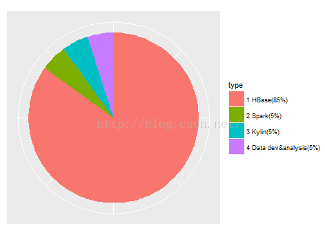
type <- c('1 HBase','2 Spark','3 Kylin','4 Data dev&analysis')
nums <- c(85,5,5,5)
df <- data.frame(type = type, nums = nums)
#绘制条形图
p <- ggplot(data = df, mapping = aes(x = 'Content', y = nums, fill = type)) + geom_bar(stat = 'identity', position = 'stack', width = 1)
p
label_value <- paste('(', round(df$nums/sum(df$nums) * 100, 1), '%)', sep = '')
label_value
label <- paste(df$type, label_value, sep = '')
label
p + coord_polar(theta = 'y') + labs(x = '', y = '', title = '') + theme(axis.text = element_blank()) + theme(axis.ticks = element_blank()) + scale_fill_discrete(labels = label)


 本文介绍如何利用R语言中的ggplot2包绘制堆叠条形图,并展示如何添加百分比标签,最终形成饼图样式。通过具体的数据实例,详细展示了绘制过程及代码实现。


 被折叠的 条评论
为什么被折叠?
被折叠的 条评论
为什么被折叠?
 到【灌水乐园】发言


