


<title>导航菜单</title> <style> * { padding: 0px; margin: 0px; font-size: 14px; } .menu { width: 216px; margin-left: 100px; border: 2px solid #E4393C; } .title { height: 40px; line-height: 40px; background-color: #E4393C; padding-left: 20px; } .title a { color: white; text-decoration: none; font-weight:bold; } .title01 { height: 30px; line-height: 30px; padding-left: 10px; background: url("images/2.png") no-repeat right center; z-index:3; } /*为后面的悬浮层做准备*/ .title01 a { color: #313131; text-decoration: none; font-size: 13px; } .title01 a:hover { text-decoration: underline; font-weight:bold; color: #E4393C; } .title01:hover { border: 1px solid #ddd; border-right: none; -webkit-box-shadow: 0 0 8px #ddd; /*阴影外发光效果*/ -moz-box-shadow: 0 0 8px #ddd; box-shadow: 0 0 8px #ddd; } .title01:hover .show_menu { display: block; } .title01:hover span { /*添加空标签span来形成遮罩层挡住边框线*/ width: 25px; height: 30px; background-color: #fff; position: relative; z-index:10; float: right; right: -2px; } .show_menu { display: none; position: absolute; z-index:4; top: 42px; left: 318px; border: 1px solid #ccc; width: 715px; background: #fff; } .left_div { width: 400px; float: left; margin: 0 5px; } .right_div { width: 300px; float: left; background-color: greenyellow; margin: 0 2px; } </style> </head> <body> <div class="menu"> <div class="title"><a href="#">全部商品分类</a></div> <div class="title01"><a href="#">图书、音像、数字产品</a><span></span> <div class="show_menu"> <div class="left_div"> 左侧分类区域<br/> 左侧分类区域<br/> </div> <div class="right_div"> 右侧分类区域<br/> 右侧分类区域<br/> </div> </div> </div>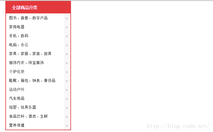
总结: 1,用div来写导航 2,box-show来添加发光阴影效果 3,span空标签来写遮罩层,形成直通的效果 4,通过绝对定位的方式position和z-index的属性来形成遮罩效果


 1838
1838
“相关推荐”对你有帮助么?
-

 非常没帮助
非常没帮助 -

 没帮助
没帮助 -

 一般
一般 -

 有帮助
有帮助 -

 非常有帮助
非常有帮助
提交

 被折叠的 条评论
为什么被折叠?
被折叠的 条评论
为什么被折叠?
 到【灌水乐园】发言


