


网易V4.4.4 的导航抽屉长啥样,我想在此无需多说,没见过的自己去体验吧。
当时吸引我的是左边滑动,箭头图标变菜单图标动画,这个非常不错。殊不知,Android5.0以上官方提供的API便可轻松实现。5.0以下,需要添加android-support-v7-appcompat包支持。这个在SDk V7目录下。
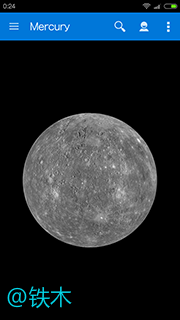
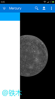
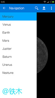
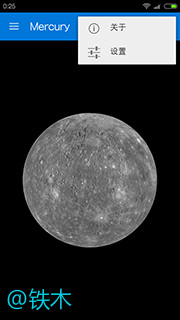
直接先看看实现运行效果图吧:(有网易效果了吧)

下面谈谈实现要点:
先利用DrawerLayout创建导航抽屉,这个可以参考我上一篇博文:DrawerLayout 官方创建导航抽屉示例。
在我上一篇博文利用DrawerLayout创建导航抽屉的基础上,稍加修改便可实现。(不清楚的,可先上篇创建看看)
下面谈谈在利用DrawerLayout创建导航抽屉的基础上,具体修改如下:
1. ActionBar改用ToolBar
1.1、在原来基础上,修改activity_main.xml,增加Toolbar这个控件
<LinearLayout xmlns:android="http://schemas.android.com/apk/res/android"
    xmlns:app="http://schemas.android.com/apk/res-auto"
    android:layout_width="match_parent"
    android:layout_height="match_parent"
    android:orientation="vertical" >

    <!-- 增加Toolbar -->
    <android.support.v7.widget.Toolbar
        android:id="@+id/toolbar"
        android:layout_width="match_parent"
        android:layout_height="wrap_content"
        android:background="?attr/colorPrimary"
        android:minHeight="?attr/actionBarSize"
        app:popupTheme="@style/PopupMenuStyle" />

    <android.support.v4.widget.DrawerLayout
        android:id="@+id/drawer_layout"
        android:layout_width="match_parent"
        android:layout_height="match_parent" >

        <!-- The main content view -->

        <FrameLayout
            android:id="@+id/content_frame"
            android:layout_width="match_parent"
            android:layout_height="match_parent" />
        <!-- The navigation drawer -->

        <ListView
            android:id="@+id/left_drawer"
            android:layout_width="240dp"
            android:layout_height="match_parent"
            android:layout_gravity="start"
            android:background="#ffffff"
            android:choiceMode="singleChoice"
            android:divider="@android:color/transparent"
            android:dividerHeight="0dp"
            android:scrollbars="none" />

        <TextView
            android:id="@+id/right_drawer"
            android:layout_width="280dp"
            android:layout_height="match_parent"
            android:layout_gravity="end"
            android:background="#ffffff"
            android:gravity="center"
            android:textColor="#444444"
            android:text="@string/right_drawer_info"
            android:textSize="30sp" >
        </TextView>
    </android.support.v4.widget.DrawerLayout>

</LinearLayout>
1.2、添加主题风格
先在values/styles.xml添加:
<resources>

    <!-- Base application theme. -->
    <style name="AppTheme" parent="AppTheme.Base">
        <!-- Customize your theme here. -->
    </style>
    <!-- 主要是这个基础风格 -->
    <style name="AppTheme.Base" parent="Theme.AppCompat">
        <item name="windowActionBar">false</item>
        <item name="android:windowNoTitle">true</item>
        <!-- Actionbar color -->
        <item name="colorPrimary">#0077d9</item>
        <!-- Status bar color -->
        <item name="colorPrimaryDark">#5577d9</item>
        <!-- Window color -->
        <item name="android:windowBackground">@color/dim_foreground_material_light</item>
    </style>

    <style name="PopupMenuStyle" parent="Theme.AppCompat.Light"></style>

</resources>
上面创建一个基础风格,为了方便,以后要添加专属于values-v21的属性的话,可以在继承这个基础风格上,添加。
再在values-v21/styles.xml添加:
<?xml version="1.0" encoding="utf-8"?>
<resources>

    <style name="AppTheme" parent="AppTheme.Base">

        <!-- Navigation bar color -->
        <item name="android:navigationBarColor">@color/accent_material_light</item>
    </style>

</resources>
上面这个,主要是可以添加一些5.0可以显示的效果。
1.3、在MainActivity.java,初始化Toolbar:
public class MainActivity extends ActionBarActivity {
    ……

    @Override
    protected void onCreate(Bundle savedInstanceState) {
        super.onCreate(savedInstanceState);
        setContentView(R.layout.activity_main);

        Toolbar toolbar = (Toolbar) findViewById(R.id.toolbar);
        setSupportActionBar(toolbar);
2. v4.app.ActionBarDrawerToggle改用v7.app.ActionBarDrawerToggle
2.1、换用v7.app.ActionBarDrawerToggle,实例化ActionBarDrawerToggle,传入Toolbar
public class MainActivity extends ActionBarActivity {
    ……

    @Override
    protected void onCreate(Bundle savedInstanceState) {
        super.onCreate(savedInstanceState);
        setContentView(R.layout.activity_main);
        ……
        mDrawerToggle = new ActionBarDrawerToggle(this, mDrawerLayout, toolbar,
                R.string.drawer_open, R.string.drawer_close) {
            public void onDrawerClosed(View drawerView) {
                if (drawerView == mDrawerList) {
                    isDirection_left = false;
                } else if (drawerView == mPersonLayout) {
                    isDirection_right = false;
                }
                getSupportActionBar().setTitle(mTitle);
                invalidateOptionsMenu(); // creates call to
                                            // onPrepareOptionsMenu()
            }

            public void onDrawerOpened(View drawerView) {

                if (drawerView == mDrawerList) {
                    isDirection_left = true;
                } else if (drawerView == mPersonLayout) {
                    isDirection_right = true;
                }
                getSupportActionBar().setTitle(mDrawerTitle);
                invalidateOptionsMenu(); // creates call to
                                            // onPrepareOptionsMenu()
            }

        };
2.2、将原来的getActionBar()的地方全部换成getSupportActionBar(),比如:
public class MainActivity extends ActionBarActivity {
        ……
        getSupportActionBar().setDisplayHomeAsUpEnabled(true);
        getSupportActionBar().setHomeButtonEnabled(true);

        // ActionBarDrawerToggle ties together the the proper interactions
        // between the sliding drawer and the action bar app icon
完成到这里,左边的抽屉便可以实现类似网易V4.4.4的滑动效果了
下面主要是实现overflow menu,也就是右边菜单的效果,及增加右边抽屉。
3、ToolBar上面的overflow menu 实现图标+文字
3.1、修改menu/main.xml:
<menu xmlns:android="http://schemas.android.com/apk/res/android"
    xmlns:app="http://schemas.android.com/apk/res-auto" >

    <!-- 这是Toolbar上的搜索Button -->
    <item
        android:id="@+id/action_search"
        android:icon="@drawable/ic_action_search"
        android:title="@string/action_search"
        app:showAsAction="ifRoom"/>

    <!-- 这是Toolbar上的个人信息Button -->
    <item
        android:id="@+id/action_person"
        android:icon="@drawable/ic_action_person"
        android:title="@string/action_persion"
        app:showAsAction="ifRoom"/>

      <!-- 这是Toolbar上的overflow  menu -->
    <item
        android:id="@+id/action_overflow"
        android:icon="@drawable/ic_action_overflow"
        android:title="@string/action_search"
        app:showAsAction="ifRoom">
        <menu>
            <item
                android:id="@+id/action_about"
                android:icon="@drawable/ic_action_about"
                android:showAsAction="always|withText"
                android:title="@string/action_about"/>
            <item
                android:id="@+id/action_settings"
                android:icon="@drawable/ic_action_settings"
                android:showAsAction="always|withText"
                android:title="@string/action_settings"/>
        </menu>
    </item>

</menu>
上面overflow menu部分,是为了实现icon+文字的效果,如果只需要显示文字,那直接去掉外面嵌套的自定义的action_overflow即可。
4、实现左右滑动抽屉
4.1、修改layout/activity_main.xml,增加作为右边抽屉显示的View,下面是直接简单用textview作为显示:
<LinearLayout xmlns:android="http://schemas.android.com/apk/res/android"
    xmlns:app="http://schemas.android.com/apk/res-auto"
    android:layout_width="match_parent"
    android:layout_height="match_parent"
    android:orientation="vertical" >
    ……
    <!-- 增加右边抽屉显示 -->
        <TextView
            android:id="@+id/right_drawer"
            android:layout_width="280dp"
            android:layout_height="match_parent"
            android:layout_gravity="end"
            android:background="#ffffff"
            android:gravity="center"
            android:textColor="#444444"
            android:text="@string/right_drawer_info"
            android:textSize="30sp" >
        </TextView>
    </android.support.v4.widget.DrawerLayout>

</LinearLayout>
4.2、处理好Toolbar上点击左边按键,个人信息按键,用以控制显示左右抽屉:
在监听抽屉打开或者关闭回调部分,记录好左边还是右边打开的标志位:
// ActionBarDrawerToggle ties together the the proper interactions
        // between the sliding drawer and the action bar app icon
        mDrawerToggle = new ActionBarDrawerToggle(this, mDrawerLayout, toolbar,
                R.string.drawer_open, R.string.drawer_close) {
            public void onDrawerClosed(View drawerView) {
                if (drawerView == mDrawerList) {
                    isDirection_left = false;
                } else if (drawerView == mPersonLayout) {
                    isDirection_right = false;
                }
                getSupportActionBar().setTitle(mTitle);
                invalidateOptionsMenu(); // creates call to
                                            // onPrepareOptionsMenu()
            }

            public void onDrawerOpened(View drawerView) {

                if (drawerView == mDrawerList) {
                    isDirection_left = true;
                } else if (drawerView == mPersonLayout) {
                    isDirection_right = true;
                }
                getSupportActionBar().setTitle(mDrawerTitle);
                invalidateOptionsMenu(); // creates call to
                                            // onPrepareOptionsMenu()
            }

        };
设置好Toolbar监听,监听左边Button点击事件,以便处理相关抽屉打开或关闭:
    toolbar.setNavigationOnClickListener(new View.OnClickListener() {

            @Override
            public void onClick(View v) {
                // catch here title and home icon click
                if (isDirection_right) {
                    mDrawerLayout.closeDrawer(mPersonLayout);
                } else {
                    if (!isDirection_left) {
                        mDrawerLayout.openDrawer(mDrawerList);
                    } else {
                        mDrawerLayout.closeDrawer(mDrawerList);
                    }
                }

            }
        });
在onOptionsItemSelected回调函数中,处理属于个人信息Button点击事件,也就是控制右边抽屉的Button点击事件,以便处理相关抽屉打开或关闭:
    @Override
    public boolean onOptionsItemSelected(MenuItem item) {
        // The action bar home/up action should open or close the drawer.
        // ActionBarDrawerToggle will take care of this.

        if (mDrawerToggle.onOptionsItemSelected(item)) {
            return true;
        }
        // Handle action buttons
        switch (item.getItemId()) {

        ……
        case R.id.action_person:
            if (isDirection_left) {
                mDrawerLayout.closeDrawer(mDrawerList);
            } else {
                if (!isDirection_right) {
                    mDrawerLayout.openDrawer(mPersonLayout);
                } else {
                    mDrawerLayout.closeDrawer(mPersonLayout);
                }
            }
            break;
        default:
            break;
        }
        return super.onOptionsItemSelected(item);
    }
这样便可以实现左右抽屉自然滑动切换了。
上面只要是一些具体修改细节,详细Demo工程共享如下:http://download.csdn.net/detail/bighulk/8629899


 3060
3060


 被折叠的 条评论
为什么被折叠?
被折叠的 条评论
为什么被折叠?
 到【灌水乐园】发言


