


弹出框是一个经常使用的组件,一般用于弹出提示信息,确认信息,表单等内容。
弹出框是浮动在页面之上的,弹出时其他页面元素不可被选中。
弹出框的基本结构:头部、内容、底部(常常是按钮)
基本用法:
1.通过 data 属性:在控制器元素(比如按钮或者链接)上设置属性 data-toggle="modal",同时设置 data-target="#identifier" 或 href="#identifier" 来指定要切换的特定的模态框(带有 id="identifier")。
如图:
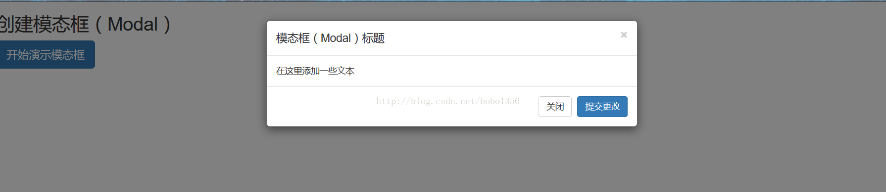
基本结构的代码:
<!DOCTYPE html>
<html lang="en">
<head>
    <meta charset="UTF-8">
    <title>弹出框(模态框)</title>
    <link rel="stylesheet" href="https://cdn.static.runoob.com/libs/bootstrap/3.3.7/css/bootstrap.min.css">
    <script src="https://cdn.static.runoob.com/libs/jquery/2.1.1/jquery.min.js"></script>
    <script src="https://cdn.static.runoob.com/libs/bootstrap/3.3.7/js/bootstrap.min.js"></script>
</head>
<body>

<h2>创建模态框(Modal)</h2>
<!-- 按钮触发模态框 -->
<button class="btn btn-primary btn-lg" data-toggle="modal" data-target="#myModal">开始演示模态框</button>
<!-- 模态框(Modal) -->
<div class="modal fade" id="myModal" tabindex="-1" role="dialog" aria-labelledby="myModalLabel" aria-hidden="true">
    <div class="modal-dialog">
        <div class="modal-content">
            <div class="modal-header">
                <button type="button" class="close" data-dismiss="modal" aria-hidden="true">×</button>
                <h4 class="modal-title" id="myModalLabel">模态框(Modal)标题</h4>
            </div>
            <div class="modal-body">在这里添加一些文本</div>
            <div class="modal-footer">
                <button type="button" class="btn btn-default" data-dismiss="modal">关闭</button>
                <button type="button" class="btn btn-primary">提交更改</button>
            </div>
        </div><!-- /.modal-content -->
    </div><!-- /.modal -->
</div>

</body>
</html>
弹出框一般从属于body元素,以防止弹出框被其他元素影响。


 869
869


 被折叠的 条评论
为什么被折叠?
被折叠的 条评论
为什么被折叠?
 到【灌水乐园】发言


