


border-image 简介
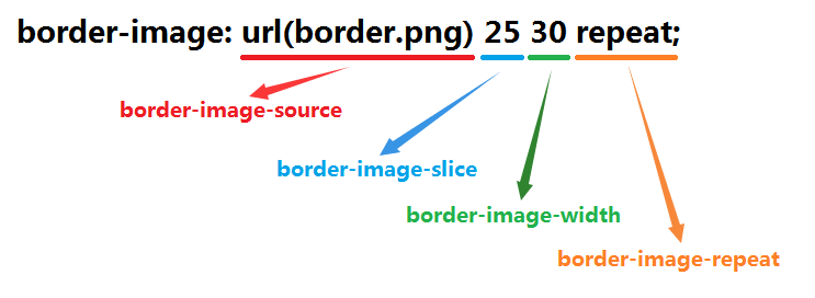
border-image 属性是一个简写属性,用于设置以下属性:
- border-image-source
边框图片的路径 - border-image-slice
边框图片向内偏移 - border-image-width
边框图片的宽度 - border-image-outset
边框图片区域超出边框的距离 - border-image-repeat
边框图片是否应平铺(repeated)、铺满(rounded)或拉伸(stretched)
默认值: none 100% 1 0 stretch
注意
除了border-image-source外,每一个属性均可以填写4个值,分别表示上、右、下、左的相应量;也可以简写为2个值,分别表示上下、左右;或者只写1个值,表示上下左右均为该大小。
简写
border-image: url(border.png) 25 30 repeat;
详细介绍
border-image-source
MDN https://developer.mozilla.org/en-US/docs/Web/CSS/border-image-source
Summary
The border-image-source CSS property defines the <image> to use instead of the style of the border. If this property is set to none, the style defined by border-style is used instead.
CSS 定义了图片属性 border-image-source 来代替边框的风格。如果该属性被设置为 none,该样式就会被border-style取而代之。
Syntax
/* no border-image, use the specified border-style */
border-image-source: none;

/* the image.jpg is used as image */
border-image-source: url(image.jpg);

/* a gradient is used as image */
border-image-source: linear-gradient(to top, red, yellow);

/* Global values */
border-image-source: inherit;
border-image-source: initial;
border-image-source: unset;
Example
与CSS2中background-image属性一样,border-image的背景图使用url()调用,图片可以是相对路径或是绝对路径,也可以不使用图片,即border-image:none。
<!DOCTYPE html>
<html>
<head>
    <style>
        div {
            width: 100px;
            height: 100px;
            margin: 20px;
            display: inline-block;

            border-style: solid;
            border-color: black;
            border-image-source: url(border.png);
        }
        .thin {
            border-width: 10px;
        }
        .fat {
            border-width: 30px;
        }
    </style>
</head>
<body>
    <div class="thin"></div>
    <div class="fat"></div>
</body>
</html>
border-image-slice
MDN https://developer.mozilla.org/en-US/docs/Web/CSS/border-image-slice
Summary
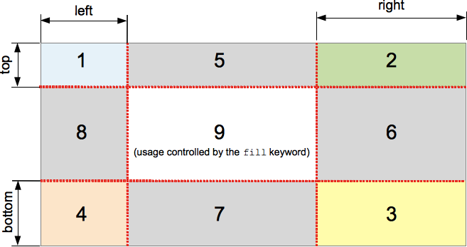
The border-image-slice CSS property divides the image specified by border-image-source in nine regions: the four corners, the four edges and the middle. It does this by specifying 4 inwards offsets.
Four values control the position of the slice lines. If some are not specified, they are inferred from the other with the usual 4-value syntax of CSS.
The middle is not used by the border itself but is used as a background-image if the keyword fill is set. The keyword can be set at any position in the property (before, after or between the other values).
The border-image-repeat, border-image-width, border-image-outset properties define how these images will be used.
The shorthand CSS property border-image may reset this property to its default value.
CSS 属性 border-image-slice 将 border-image-source 定义的图片划分为九个区域:四个角,四个边和中间部分。它是通过指定四个向内的偏移来实现的。
四个值控制了分割线的位置。如果有某些未指定,它将会通过CSS常用的四值语法,通过其它值推断出。
中间部分将不会被边框使用,但是如果fill关键字被设置的话,会当作是背景图片。该关键字可以被设置在该属性的任何位置(之前,之后或者值得中间)。
border-image-repeat, border-image-width, border-image-outset 属性定义了如何使用那些图片。
CSS 属性 border-image 的简写发可能会重置该属性为它的默认值。
Syntax
/* border-image-slice: slice */
border-image-slice: 30%;

/* border-image-slice: horizontal vertical */
border-image-slice: 10% 30%;

/* border-image-slice: top horizontal bottom */
border-image-slice: 30 30% 45;

/* border-image-slice: top right bottom left */
border-image-slice: 7 12 14 5;

/* border-image-slice: … fill */
/* The fill value can be placed between any value */
border-image-slice: 10% fill 7 12;

/* Global values */
border-image-slice: inherit;
border-image-slice: initial;
border-image-slice: unset;
注意:border-image-slice 不能带单位,否则无效(自动会被按像素(px)设置)
Formal syntax
<number-percentage>{1,4} && fill?
where
<number-percentage> = <number> | <percentage>
Example
<!DOCTYPE html>
<html>
<head>
    <style>
        div {
            width: 100px;
            height: 100px;
            margin: 20px;
            display: inline-block;

            border-style: solid;
            border-color: black;
            border-image-source: url(border2.png);
        }
        .thin {
            border-width: 10px;
        }
        .fat {
            border-width: 30px;
        }
        .sliceSmall {
            border-image-slice: 26;
        }
        .sliceMiddle {
            border-image-slice: 39;
        }
        .sliceBig {
            border-image-slice: 52;
        }
        .sliceSmallFill {
            border-image-slice: 26 fill;
        }
        .sliceMiddleFill {
            border-image-slice: 39 fill;
        }
        .sliceBigFill {
            border-image-slice: 52 fill;
        }
    </style>
</head>
<body>
    <img src="border2.png">
    <br>
    <div class="thin sliceSmall"></div>
    <div class="thin sliceMiddle"></div>
    <div class="thin sliceBig"></div>
    <br>
    <div class="fat sliceSmall"></div>
    <div class="fat sliceMiddle"></div>
    <div class="fat sliceBig"></div>
    <br>
    <div class="fat sliceSmallFill"></div>
    <div class="fat sliceMiddleFill"></div>
    <div class="fat sliceBigFill"></div>
</body>
</html>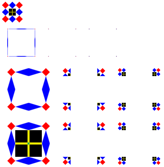
可以看到:
- 当没有设置 border-image-width 的时候,切片宽度会被 border-width 所限制。
- border-image-repeat 的值默认是 stretch。
- border-image-slice 不用加px单位(加了px单位算错误,设置无效)
- 四个角只按 border-width 或 border-image-width 进行缩放,与 border-image-repeat 无关。
- border-image-repeat 控制的是四条边,如果 border-image-slice 的值大于图像的一半,那么四条边将为空。
border-image-width
MDN https://developer.mozilla.org/en-US/docs/Web/CSS/border-image-width
Summary
The border-image-width CSS property defines the width of the border image by defining inward offsets from the border edges. If the border-image-width is greater than the border-width, then the border image extends beyond the padding (and/or content) edge.
CSS 属性 border-image-width 通过定义从边框边缘向内的位移量,定义了边框图像的长度。如果 border-image-width 比 border-width 大,那么边框图像将会越过填充(或者内容)边缘。
Syntax
/* border-image-width: all */
border-image-width: 3;

/* border-image-width: vertical horizontal */
border-image-width: 2em 3em;

/* border-image-width: top horizontal bottom */
border-image-width: 5% 15% 10%;

/* border-image-width: top right bottom left */
border-image-width: 5% 2em 10% auto;

/* Global values */
border-image-width: inherit;
border-image-width: initial;
border-image-width: unset;
Formal syntax
[ <length-percentage> | <number> | auto ]{1,4}
where
<length-percentage> = <length> | <percentage>
Example
<!DOCTYPE html>
<html>
<head>
    <style>
        div {
            width: 100px;
            height: 100px;
            margin: 20px;
            display: inline-block;

            border-style: solid;
            border-color: black;
            border-image-source: url(border.png);
        }
        .thin {
            border-width: 10px;
        }
        .fat {
            border-width: 30px;
        }
        .sliceSmall {
            border-image-slice: 26;
        }
        .sliceMiddle {
            border-image-slice: 39;
        }
        .sliceBig {
            border-image-slice: 52;
        }
        .borderImgWidth {
            border-image-width: 30px;
        }
    </style>
</head>
<body>
    <br>
    <div class="thin borderImgWidth sliceSmall"></div>
    <div class="thin borderImgWidth sliceMiddle"></div>
    <div class="thin borderImgWidth sliceBig"></div>
    <br>
    <div class="fat sliceSmall"></div>
    <div class="fat sliceMiddle"></div>
    <div class="fat sliceBig"></div>
</body>
</html>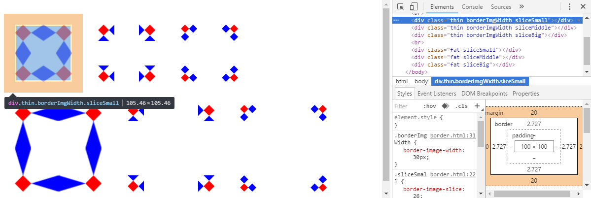
border-image-outset
MDN https://developer.mozilla.org/en-US/docs/Web/CSS/border-image-outset
Summary
The border-image-outset property describes by what amount the border image area extends beyond the border box.
Portions of the border image that are rendered outside the border box as a result of this property do not cause scrolling to be triggered. These areas also don’t capture or cause mouse events to occur on behalf of the bordered element.
border-image-outset 属性介绍了边框图像区域可以超出边框盒多大长度。
作为该属性的结果,边框图像的一部分会在边框盒之外被渲染,但不会触发滚动事件。这些区域也不会捕获或者造成发生在代表边框元素上的鼠标事件。
Syntax
/* border-image-outset: sides */
border-image-outset: 1.5;

/* border-image-outset: vertical horizontal */
border-image-outset: 1 1.2;

/* border-image-outset: top horizontal bottom */
border-image-outset: 30px 2 45px;

/* border-image-outset: top right bottom left */
border-image-outset: 7px 12px 14px 5px;

border-image-outset: inherit;
Formal syntax
[ <length> | <number> ]{1,4}Example
<!DOCTYPE html>
<html>
<head>
    <style>
        div {
            width: 100px;
            height: 100px;
            margin: 20px;
            display: inline-block;

            border-style: solid;
            border-color: black;
            border-width: 26px;
            border-image-source: url(border.png);
            border-image-slice: 26;
            border-image-width: 26px;
            border-image-outset: 26px;
        }
    </style>
</head>
<body>
    <div></div>
</body>
</html>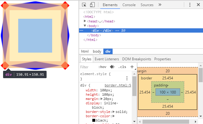
border-image-repeat
MDN https://developer.mozilla.org/en-US/docs/Web/CSS/border-image-repeat
Summary
The border-image-repeat CSS property defines how the middle part of a border image is handled so that it can match the size of the border. It has a one-value syntax that describes the behavior of all the sides, and a two-value syntax that sets a different value for the horizontal and vertical behavior.
CSS 属性 border-image-repeat 定义了如何处理边框图像的中间部分,以至于它可以满足边框的大小。它有一个单值的语法,描述了所有边的行为,和双值得的语法,它为水平和垂直的行为设置了一个不同的值。
- stretch
Keyword indicating that the image must be stretched to fill the gap between the two borders.- repeat
Keyword indicating that the image must be repeated until it fills the gap between the two borders.- round
Keyword indicating that the image must be repeated until it fills the gap between the two borders. If the image doesn’t fit after being repeated for an integral number of times, the image is rescaled to fit.- space
The image is tiled (repeated) to fill the area. If it does not fill the area with a whole number of tiles, the extra space is distributed around the tiles.
- stretch
关键字指示了图片必须被拉伸来充满两个边界之间的缝隙。 - repeat
关键字指示了图片必须被重复直到它填满了两个边界之间的缝隙。如果被重复后的图片不是整数个数,图像就会被拉伸来填满它。 - round
关键字只是了图片必须被重复直到它填满了两个边界之间的缝隙 - space
图片以平铺(重复)的方式来填充该区域。如果不能使用一个整的平铺数来填满该区域,额外的空间也会被平铺。
Syntax
/* border-image-repeat: type */
border-image-repeat: stretch;

/* border-image-repeat: horizontal vertical */
border-image-repeat: round stretch;

/* Global values */
border-image-repeat: inherit;
border-image-repeat: initial;
border-image-repeat: unset;
Formal Syntax
[ stretch | repeat | round | space ]{1,2}Example
<!DOCTYPE html>
<html>
<head>
    <style>
        div {
            width: 100px;
            height: 100px;
            margin: 20px;
            display: inline-block;

            border-style: solid;
            border-color: black;
            border-width: 26px;
            border-image-source: url(border.png);
            border-image-slice: 26;
            border-image-width: 26px;
        }
        .borderStretch {
            border-image-repeat: stretch;
        }
        .borderRepeat {
            border-image-repeat: repeat;
        }
        .borderRound {
            border-image-repeat: round;
        }
        .borderSpace {
            border-image-repeat: space;
        }
    </style>
</head>
<body>
    <div></div>
    <div class="borderStretch"></div>
    <div class="borderRepeat"></div>
    <div class="borderRound"></div>
    <div class="borderSpace"></div>
</body>
</html>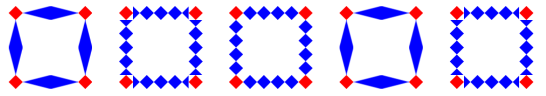
图片素材
素材一
下面这个小方格的大小是 72 x 72。单元格 3 等分,正好切成 9 宫格,每份 26px。

素材二
图片的基本规格与“素材一”相同,只不过在中间的空白区域补了一个大小为 26 x 26 的黑色块。然后黄线和绿点的宽度均为 2px。


 扫一扫
扫一扫

 被折叠的 条评论
为什么被折叠?
被折叠的 条评论
为什么被折叠?
 到【灌水乐园】发言


