


 本文介绍了一种使用StateListDrawable和RoundRectShape等类自定义圆角按钮的方法,通过简单的代码实现了不同状态下的按钮背景及文字颜色变化。
前沿:
现在网上随便输入一句圆角button就会出现很多博客和文章提示做这样的一个效果,但是那多半都是xml文件来做的,这样做有个很大的弊端,因为每一次都需要重写xml文件(就连简简单单的修改个按钮的颜色也需要修改)。~~为什么呢?因为不修改臣妾做不到啊!!!今天就带大家做一个真正的圆角button,我们还是来看效果吧。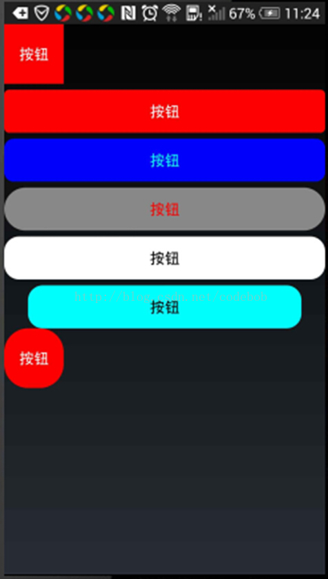
正文干货开始:
很明显我们的按钮的背景就是我们要实现的圆角部分,那么我们情不自禁的想到了setBackground这个方法,看看里面的参数,需要的是一个Drawable,而我们的按钮还需要点击不可用的圆角效果,所以我们很自然的想到了StateListDrawable这个类 ,而且还要是圆角效果,那么就还需要RoundRectShape这个类和ShapeDrawable这个类,如果这些类不熟悉的,那么我就简单的介绍一下这些类的作用。
StateListDrawable
主要用来添加和管理背景每个状态应该使用那个Drawable的类,需要注意的是的它里面的每个状态的管理。其实可以可以理解为一个hashmap每个状态对应一个值而已。
RoundRectShape
还记得我们需要一个圆角矩形吗?对这个类就是我们主要的画圆角矩形的类。但是要注意它的构造方法,到时候代码里面再讲。
ShapeDrawable
状态管理和形状都有了,那么我们的猪脚就要登场了,对就是ShapeDrawble它就是我们setBackground里面需要的Drawble啊。
好了,每个类的作用都介绍了那么我们就直接上代码吧。
import android.content.Context;
import android.content.res.ColorStateList;
import android.graphics.Color;
import android.graphics.drawable.ShapeDrawable;
import android.graphics.drawable.StateListDrawable;
import android.graphics.drawable.shapes.RoundRectShape;
import android.view.Gravity;
import android.widget.Button;

/*
 * @FileName:StyleButton.java
 * @Version:V1.0
 * @Date: 2014-5-7 Create
 * @author: edsheng
 */
public class StyleButton extends Button
{
	public static int[]	mNormalState		= new int[] {};
	public static int[]	mPressState			= new int[] { android.R.attr.state_pressed, android.R.attr.state_enabled };
	public static int[]	mDisableState		= new int[] { -android.R.attr.state_enabled };
	public static int[]	mSelectedState		= new int[] { android.R.attr.state_selected, android.R.attr.state_enabled };
	private int			mRadius				= 0;																			//默认的圆角半径

	//默认文字和背景颜色
	private int			mBgNormalColor		= Color.RED;
	private int			mBgPressedColor		= Color.GREEN;
	private int			mTextNormalColor	= Color.WHITE;
	private int			mTextPressedColor	= Color.GRAY;

	public StyleButton(Context context)
	{
		super(context);
		initUI();
	}

	private void initUI()
	{
		setGravity(Gravity.CENTER);
		buildDraweableState();
		buildColorDrawableState();
	}

	/**
	 * 构建图片drawble
	 */
	private void buildColorDrawableState()
	{
		ColorStateList colorStateList = new ColorStateList(new int[][] { mPressState, mNormalState },
				new int[] { mTextPressedColor, mTextNormalColor });
		setTextColor(colorStateList);
	}

	/**
	 * 构建背景Drawble
	 */
	private void buildDraweableState()
	{

		float outRectr[] = new float[] { mRadius, mRadius, mRadius, mRadius, mRadius, mRadius, mRadius, mRadius };
		//创建状态管理器
		StateListDrawable drawable = new StateListDrawable();
		/**
		 * 注意StateListDrawable的构造方法我们这里使用的
		 * 是第一参数它是一个float的数组保存的是圆角的半径,它是按照top-left顺时针保存的八个值
		 */
		//创建圆弧形状
		RoundRectShape rectShape = new RoundRectShape(outRectr, null, null);
		//创建drawable
		ShapeDrawable pressedDrawable = new ShapeDrawable(rectShape);
		//设置我们按钮背景的颜色
		pressedDrawable.getPaint().setColor(mBgPressedColor);
		//添加到状态管理里面
		drawable.addState(mPressState, pressedDrawable);

		//		ShapeDrawable disableDrawable = new ShapeDrawable(rectShape);
		//		disableDrawable.getPaint().setColor(prssedClor);
		//		disableDrawable.getPaint().setAlpha(125);
		//		drawable.addState(mDisableState, disableDrawable);

		ShapeDrawable normalDrawable = new ShapeDrawable(rectShape);
		normalDrawable.getPaint().setColor(mBgNormalColor);
		drawable.addState(mNormalState, normalDrawable);
		//设置我们的背景,就是xml里面的selector
		setBackgroundDrawable(drawable);
	}

	/**
	 * 设置圆角矩形
	 *
	 * @param radius
	 */
	public void setRadius(int radius)
	{
		this.mRadius = radius;
		buildDraweableState();
	}

	/**
	 * 设置按钮背景颜色
	 *
	 * @param normalColor
	 * @param prssedClor
	 */
	public void setBgNormalPressedcolor(int normalColor, int prssedClor)
	{

		mBgNormalColor = normalColor;
		mBgPressedColor = prssedClor;
		buildDraweableState();

	}

	/**
	 * 设置按钮文字颜色
	 *
	 * @param normalColor
	 * @param pressedColor
	 */
	public void setTextNormalPressedcolor(int normalColor, int pressedColor)
	{
		mTextPressedColor = pressedColor;
		mTextNormalColor = normalColor;
		buildColorDrawableState();

	}
}
这样我们的圆角按钮就创建起来了。
看看我们怎么使用它吧。直接贴出oncrate函数。
requestWindowFeature(Window.FEATURE_NO_TITLE);
		LinearLayout linearLayout = new LinearLayout(this);
		linearLayout.setOrientation(LinearLayout.VERTICAL);

		LinearLayout.LayoutParams layoutParams = new LayoutParams(200, 200);
		layoutParams.bottomMargin = 20;

		LayoutParams commomlayoutParams = new LayoutParams(LayoutParams.MATCH_PARENT, LayoutParams.WRAP_CONTENT);
		commomlayoutParams.bottomMargin = 20;

		StyleButton button = new StyleButton(this);
		button.setText("按钮");
		linearLayout.addView(button, layoutParams);


		StyleButton button2 = new StyleButton(this);
		button2.setText("按钮");
		button2.setRadius(16);
		linearLayout.addView(button2, commomlayoutParams);

		StyleButton button3 = new StyleButton(this);
		button3.setText("按钮");
		button3.setRadius(32);
		button3.setTextNormalPressedcolor(Color.CYAN, Color.WHITE);
		button3.setBgNormalPressedcolor(Color.BLUE, Color.CYAN);
		linearLayout.addView(button3, commomlayoutParams);

		StyleButton button4 = new StyleButton(this);
		button4.setText("按钮");
		button4.setRadius(80);
		button4.setBgNormalPressedcolor(Color.GRAY, Color.CYAN);
		button4.setTextNormalPressedcolor(Color.RED, Color.WHITE);
		linearLayout.addView(button4, commomlayoutParams);

		StyleButton button5 = new StyleButton(this);
		button5 = new StyleButton(this);
		button5.setText("按钮");
		button5.setRadius(50);
		button5.setTextNormalPressedcolor(Color.BLACK, Color.BLUE);
		button5.setBgNormalPressedcolor(Color.WHITE, Color.CYAN);
		linearLayout.addView(button5, commomlayoutParams);

		StyleButton button6 = new StyleButton(this);
		button6.setText("按钮");
		button6.setRadius(50);
		button6.setTextNormalPressedcolor(Color.BLACK, Color.CYAN);
		button6.setBgNormalPressedcolor(Color.CYAN, Color.BLUE);
		LayoutParams params = new LayoutParams(LayoutParams.MATCH_PARENT, LayoutParams.WRAP_CONTENT);
		params.leftMargin = 80;
		params.rightMargin = 80;
		linearLayout.addView(button6, params);

		StyleButton button7 = new StyleButton(this);
		button7.setText("按钮");
		button7.setRadius(80);
		linearLayout.addView(button7, layoutParams);

		setContentView(linearLayout);


 扫一扫
扫一扫


 2万+
2万+

 被折叠的 条评论
为什么被折叠?
被折叠的 条评论
为什么被折叠?
 到【灌水乐园】发言


