


基本实例
单独的表单控件会被自动赋予一些全局样式。所有设置了 .form-control 类的 <input>、<textarea> 和 <select> 元素都将被默认设置宽度属性为 width: 100%;。 将 label 元素和前面提到的控件包裹在 .form-group 中可以获得最好的排列。
内联表单
为 <form> 元素添加 .form-inline 类可使其内容左对齐并且表现为 inline-block 级别的控件。只适用于视口(viewport)至少在 768px 宽度时(视口宽度再小的话就会使表单折叠)。
注意:
需要手动设置宽度
在 Bootstrap 中,输入框和单选/多选框控件默认被设置为 width: 100%; 宽度。在内联表单,我们将这些元素的宽度设置为 width: auto;,因此,多个控件可以排列在同一行。根据你的布局需求,可能需要一些额外的定制化组件。
一定要添加 label 标签
如果你没有为每个输入控件设置 label 标签,屏幕阅读器将无法正确识别。对于这些内联表单,你可以通过为 label 设置 .sr-only 类将其隐藏。
<span style="font-size:18px;"><!DOCTYPE html>
<html>
<head>
    <title>BootstrapTest</title>
   <!-- 新 Bootstrap 核心 CSS 文件 -->
    <link rel="stylesheet" href="http://cdn.bootcss.com/bootstrap/3.3.0/css/bootstrap.min.css">
    <!-- jQuery文件。务必在bootstrap.min.js 之前引入 -->
    <script src="http://cdn.bootcss.com/jquery/1.11.1/jquery.min.js"></script>
    <!-- 最新的 Bootstrap 核心 JavaScript 文件 -->
    <script src="http://cdn.bootcss.com/bootstrap/3.3.0/js/bootstrap.min.js"></script>
</head>
<body>
    <form class="form-inline" role="form">
      <div class="form-group">
        <label class="sr-only" for="exampleInputEmail2">Email address</label>
        <input type="email" class="form-control" id="exampleInputEmail2" placeholder="Enter email">
      </div>
      <div class="form-group">
        <div class="input-group">
          <div class="input-group-addon">@</div>
          <input class="form-control" type="email" placeholder="Enter email">
        </div>
      </div>
      <div class="form-group">
        <label class="sr-only" for="exampleInputPassword2">Password</label>
        <input type="password" class="form-control" id="exampleInputPassword2" placeholder="Password">
      </div>
      <div class="checkbox">
        <label>
          <input type="checkbox"> Remember me
        </label>
      </div>
      <button type="submit" class="btn btn-default">Sign in</button>
    </form>
</body>
</html></span>

水平排列的表单
通过为表单添加 .form-horizontal 类,并联合使用 Bootstrap 预置的栅格类,可以将 label 标签和控件组水平并排布局。这样做将改变 .form-group 的行为,使其表现为栅格系统中的行(row),因此就无需再额外添加 .row 了。
输入框
包括大部分表单控件、文本输入域控件,还支持所有 HTML5 类型的输入控件: text、password、datetime、datetime-local、date、month、time、week、number、email、url、search、tel 和 color。
<span style="font-size:18px;"><form class="form-horizontal" role="form">
  <div class="form-group">
    <label for="inputEmail3" class="col-sm-2 control-label">Email</label>
    <div class="col-sm-10">
      <input type="email" class="form-control" id="inputEmail3" placeholder="Email">
    </div>
  </div>
  <div class="form-group">
    <label for="inputPassword3" class="col-sm-2 control-label">Password</label>
    <div class="col-sm-10">
      <input type="password" class="form-control" id="inputPassword3" placeholder="Password">
    </div>
  </div>
  <div class="form-group">
    <div class="col-sm-offset-2 col-sm-10">
      <div class="checkbox">
        <label>
          <input type="checkbox"> Remember me
        </label>
      </div>
    </div>
  </div>
  <div class="form-group">
    <div class="col-sm-offset-2 col-sm-10">
      <button type="submit" class="btn btn-default">Sign in</button>
    </div>
  </div>
</form></span>
文本域
支持多行文本的表单控件。可根据需要改变 rows 属性。
<textarea class="form-control" rows="3"></textarea>
多选和单选框
多选框(checkbox)用于选择列表中的一个或多个选项,而单选框(radio)用于从多个选项中只选择一个。
设置了
disabled属性的单选或多选框都能被赋予合适的样式。对于和多选或单选框联合使用的<label>标签,如果也希望将悬停于上方的鼠标设置为“禁止点击”的样式,请将.disabled类赋予.radio、.radio-inline、.checkbox、.checkbox-inline或<fieldset>。
内联单选和多选框
通过将
.checkbox-inline或.radio-inline类应用到一系列的多选框(checkbox)或单选框(radio)控件上,可以使这些控件排列在一行。<label class="checkbox-inline"> <input type="checkbox" id="inlineCheckbox1" value="option1"> 1 </label> <label class="checkbox-inline"> <input type="checkbox" id="inlineCheckbox2" value="option2"> 2 </label> <label class="checkbox-inline"> <input type="checkbox" id="inlineCheckbox3" value="option3"> 3 </label> <label class="radio-inline"> <input type="radio" name="inlineRadioOptions" id="inlineRadio1" value="option1"> 1 </label> <label class="radio-inline"> <input type="radio" name="inlineRadioOptions" id="inlineRadio2" value="option2"> 2 </label> <label class="radio-inline"> <input type="radio" name="inlineRadioOptions" id="inlineRadio3" value="option3"> 3 </label>下拉列表(select)
使用默认选项或添加
multiple属性可以同时显示多个选项。<select class="form-control"> <option>1</option> <option>2</option> <option>3</option> <option>4</option> <option>5</option> </select> <select multiple class="form-control"> <option>1</option> <option>2</option> <option>3</option> <option>4</option> <option>5</option> </select>静态控件
如果需要在表单中将一行纯文本和
label元素放置于同一行,为<p>元素添加.form-control-static类即可。输入框焦点
我们将某些表单控件的默认
outline样式移除,然后对:focus状态赋予box-shadow属性。
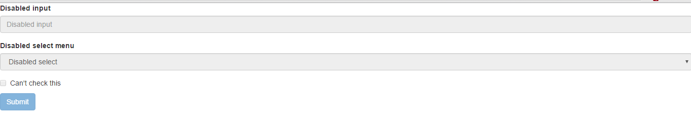
被禁用的 fieldset
为<fieldset> 设置 disabled 属性,可以禁用 <fieldset> 中包含的所有控件。
<a> 标签的链接功能不受影响
我们试图通过设置 pointer-events: none 来禁用 <a class="btn btn-*"> 按钮的链接功能,但是这个 CSS 属性尚未标准化,目前也没有被所有浏览器支持,包括 Opera 18 或 Internet Explorer 11 及更低版本。建议用户自己通过 JavaScript 代码禁用链接功能。
跨浏览器兼容性
虽然 Bootstrap 会将这些样式应用到所有浏览器上,Internet Explorer 11 及以下浏览器中的 <fieldset> 元素并不完全支持 disabled 属性。因此建议在这些浏览器上通过 JavaScript 代码来禁用 <fieldset>。
<span style="font-size:18px;"><form role="form">
  <fieldset disabled>
    <div class="form-group">
      <label for="disabledTextInput">Disabled input</label>
      <input type="text" id="disabledTextInput" class="form-control" placeholder="Disabled input">
    </div>
    <div class="form-group">
      <label for="disabledSelect">Disabled select menu</label>
      <select id="disabledSelect" class="form-control">
        <option>Disabled select</option>
      </select>
    </div>
    <div class="checkbox">
      <label>
        <input type="checkbox"> Can't check this
      </label>
    </div>
    <button type="submit" class="btn btn-primary">Submit</button>
  </fieldset>
</form></span>
只读输入框
为输入框设置 readonly 属性可以禁止用户输入,并且输入框的样式也是禁用状态。
校验状态
Bootstrap 对表单控件的校验状态,如 error、warning 和 success 状态,都定义了样式。使用时,添加 .has-warning、.has-error 或 .has-success 类到这些控件的父元素即可。任何包含在此元素之内的 .control-label、.form-control 和 .help-block 元素都将接受这些校验状态的样式。
<div class="form-group has-success">
  <label class="control-label" for="inputSuccess1">Input with success</label>
  <input type="text" class="form-control" id="inputSuccess1">
</div>
<div class="form-group has-warning">
  <label class="control-label" for="inputWarning1">Input with warning</label>
  <input type="text" class="form-control" id="inputWarning1">
</div>
<div class="form-group has-error">
  <label class="control-label" for="inputError1">Input with error</label>
  <input type="text" class="form-control" id="inputError1">
</div>
<div class="has-success">
  <div class="checkbox">
    <label>
      <input type="checkbox" id="checkboxSuccess" value="option1">
      Checkbox with success
    </label>
  </div>
</div>
<div class="has-warning">
  <div class="checkbox">
    <label>
      <input type="checkbox" id="checkboxWarning" value="option1">
      Checkbox with warning
    </label>
  </div>
</div>
<div class="has-error">
  <div class="checkbox">
    <label>
      <input type="checkbox" id="checkboxError" value="option1">
      Checkbox with error
    </label>
  </div>
</div>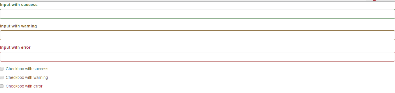
添加额外的图标
你还可以针对校验状态为输入框添加额外的图标。只需设置相应的 .has-feedback 类并添加正确的图标即可。
Feedback icons only work with textual <input class="form-control"> elements.
图标、label 和输入控件组
对于不带有 label 标签的输入框以及右侧带有附加组件的输入框组,需要手动为其图标定位。为了让所有用户都能访问你的网站,我们强烈建议为所有输入框添加 label 标签。如果你不希望将 label 标签展示出来,可以通过添加 sr-only 类来实现。如果的确不能添加 label 标签,请调整图标的 top 值。对于输入框组,请根据你的实际情况调整 right 值。
<div class="form-group has-success has-feedback">
  <label class="control-label" for="inputSuccess2">Input with success</label>
  <input type="text" class="form-control" id="inputSuccess2">
  <span class="glyphicon glyphicon-ok form-control-feedback"></span>
</div>
<div class="form-group has-warning has-feedback">
  <label class="control-label" for="inputWarning2">Input with warning</label>
  <input type="text" class="form-control" id="inputWarning2">
  <span class="glyphicon glyphicon-warning-sign form-control-feedback"></span>
</div>
<div class="form-group has-error has-feedback">
  <label class="control-label" for="inputError2">Input with error</label>
  <input type="text" class="form-control" id="inputError2">
  <span class="glyphicon glyphicon-remove form-control-feedback"></span>
</div>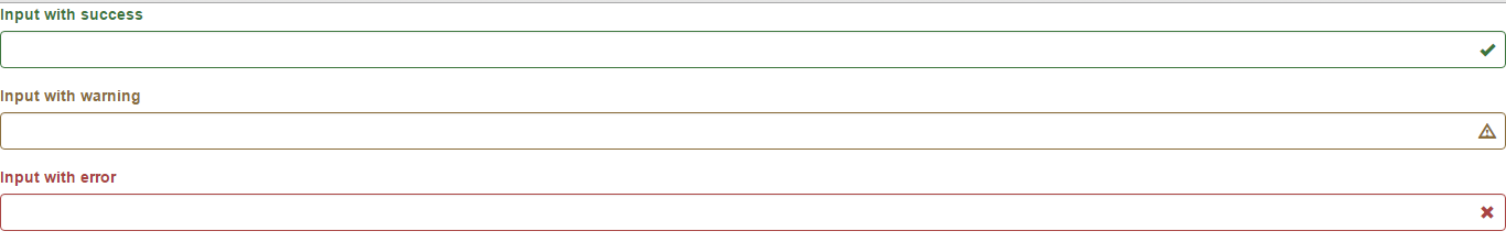
控件尺寸
通过 .input-lg 类似的类可以为控件设置高度,通过 .col-lg-* 类似的类可以为控件设置宽度。
<form class="form-horizontal" role="form">
  <div class="form-group form-group-lg">
    <label class="col-sm-2 control-label" for="formGroupInputLarge">Large label</label>
    <div class="col-sm-10">
      <input class="form-control" type="text" id="formGroupInputLarge" placeholder="Large input">
    </div>
  </div>
  <div class="form-group form-group-sm">
    <label class="col-sm-2 control-label" for="formGroupInputSmall">Small label</label>
    <div class="col-sm-10">
      <input class="form-control" type="text" id="formGroupInputSmall" placeholder="Small input">
    </div>
  </div>
</form>
调整列(column)尺寸
用栅格系统中的列(column)包裹输入框或其任何父元素,都可很容易的为其设置宽度。
<span style="font-size:18px;"><div class="row"> <div class="col-xs-2"> <input type="text" class="form-control" placeholder=".col-xs-2"> </div> <div class="col-xs-3"> <input type="text" class="form-control" placeholder=".col-xs-3"> </div> <div class="col-xs-4"> <input type="text" class="form-control" placeholder=".col-xs-4"> </div> </div></span>辅助文本
针对表单控件的“块(block)”级辅助文本。
<span class="help-block">A block of help text that breaks onto a new line and may extend beyond one line.</span>


 256
256


 被折叠的 条评论
为什么被折叠?
被折叠的 条评论
为什么被折叠?
 到【灌水乐园】发言


