


案例
.box1{
    width:200px;
    padding:20px;
    border:1px solid red;
    margin:10px;
}
.float{ float:left; }
.clear{ clear:both; }

<div> <!-- 效果1 -->
	<div class="box1 float">文本内容1</div>
	<div class="box1 float">文本内容2</div>
</div>
<div class="box1">文本内容4</div>

<div> <!-- 效果2 -->
	<div class="box1 float">文本内容1</div>
	<div class="box1 float">文本内容2</div>
	<div class="box1">文本内容3</div>
</div>

<div> <!-- 效果3 -->
	<div class="box1 float">文本内容1</div>
	<div class="box1 float">文本内容2</div>
	<div class="clear"></div>
	<div class="box1">文本内容3</div>
</div>

<div> <!-- 效果4 -->
	<div class="box1 float">文本内容1</div>
	<div class="box1 float">文本内容2</div>
	<div class="clear"></div>
</div>
<div class="box1">文本内容3</div>

<div> <!-- 效果5 -->
	<div class="box1 float">文本内容1</div>
	<div class="box1 float">文本内容2</div>
</div>
<div class="clear"></div>
<div class="box1">文本内容3</div>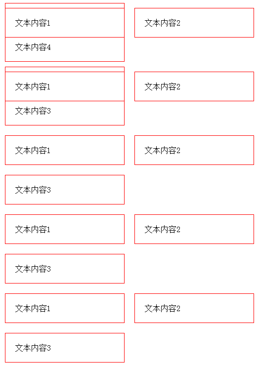
理论
浮动目的
i、当前元素进行浮动;
ii、对其他元素有浮动影响。
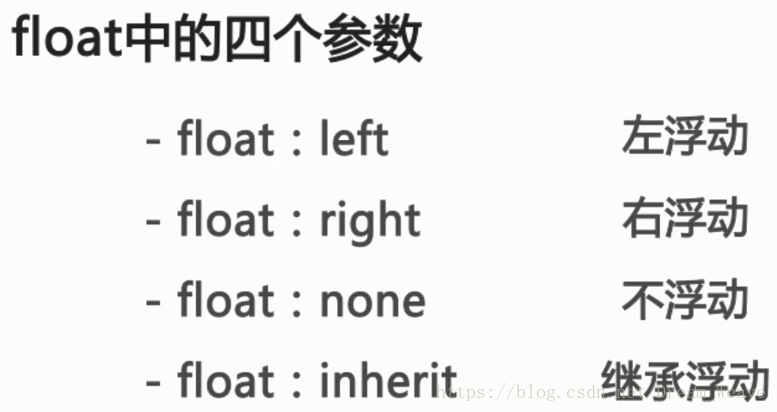
Ps1:float属性定义了元素在哪个方向进行动,在HTML中任何元素都是可以浮动的。
Ps2:float:right; 元素排列倒序,因为先渲染的先进行右浮动。
a、浮动可以使得行内元素=>块级元素。

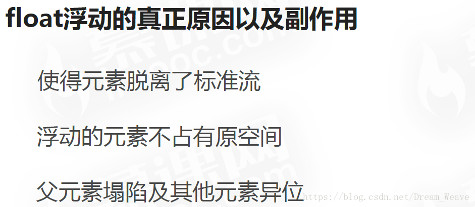
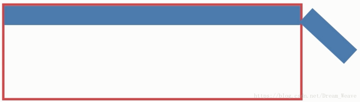
b、浮动块虽然脱离的文档流,但是依然占据文档的空间。
Ps:应用:文字环绕图片。
c、浮动导致的副作用:
<!DOCTYPE html>
<html lang="en">
<head>
    <meta charset="UTF-8">
    <title>float</title>
    <style>
        *{
            margin: 0;
            padding: 0;
        }

        .per{
            width:500px;
            height: auto;
            border: 1px solid #000;
        }

        .test{
            width: 80px;
            height: 30px;
            background: red;
            border: 1px solid #FFF;
            float: left;
        }

        .bro{
            width: 100px;
            height: 100px;
            background: blue;
        }
    </style>
</head>
<body>
    <div class="per">
    <div class="test"></div>
    <div class="test"></div>
    <div class="test"></div>
    <div class="test"></div>
    </div>
    <div class="bro"></div>
</body>
</html>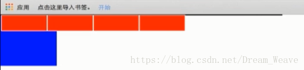
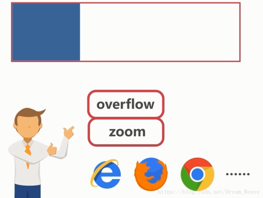
d、zoom:IE专用属性,为了兼容IE的内核浏览器;超出的部分,自动撑开。类似于 heigh:auto; 不过heigh只适用于标准流,而浮动破坏了这规则,但是zoom照样可以控制浮动的元素。
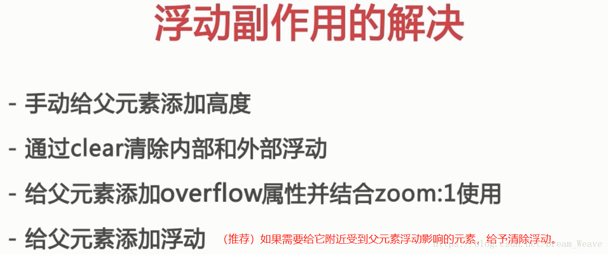
Ps1:第一种解决办法其实是通过高度给人一种错觉,但是元素一旦多了就会撑下去了,又塌陷了。
Ps2:更推荐使用“::before”伪元素来清除浮动更规范。
<!DOCTYPE html>
<html lang="en">
<head>
    <meta charset="UTF-8">
    <title>float</title>
    <style>
        .per{
            width: 500px;
            height: auto;
            border: 1px solid #000;
            float: left;
        }
        .test{
            width: 100px;
            height: 30px;
            background: red;
            border: 1px solid #FFF;
            float: left;
        }

        .bro{
            width: 100px;
            height: 100px;
            background: blue;
            clear: both;
        }
    </style>
</head>
<body>
    <div class="per">
        <div class="test"></div>
        <div class="test"></div>
        <div class="test"></div>
    </div>
    <div class="bro"></div>
</body>
</html>
e、Clear 属性
- clear:none
- clear:left
- clear:right
- clear:both
最佳清除浮动方式
.clearfix:before,
.clearfix:after
{
    content:" ";
    display: table;
}

.clearfix:after
{
    clear: both;
}


 2532
2532


 被折叠的 条评论
为什么被折叠?
被折叠的 条评论
为什么被折叠?
 到【灌水乐园】发言


