


参考文章:http://hi.baidu.com/alimyself/item/3aa6763d787cc7697c034b9d
参考文章:http://www.cnblogs.com/webmoon/archive/2013/05/05/3060918.html
参考文章:http://blog.sina.com.cn/s/blog_92d6237201016jhs.html(div居底)
参考文章:http://biancheng.dnbcw.info/css/429958.html(占满全屏)
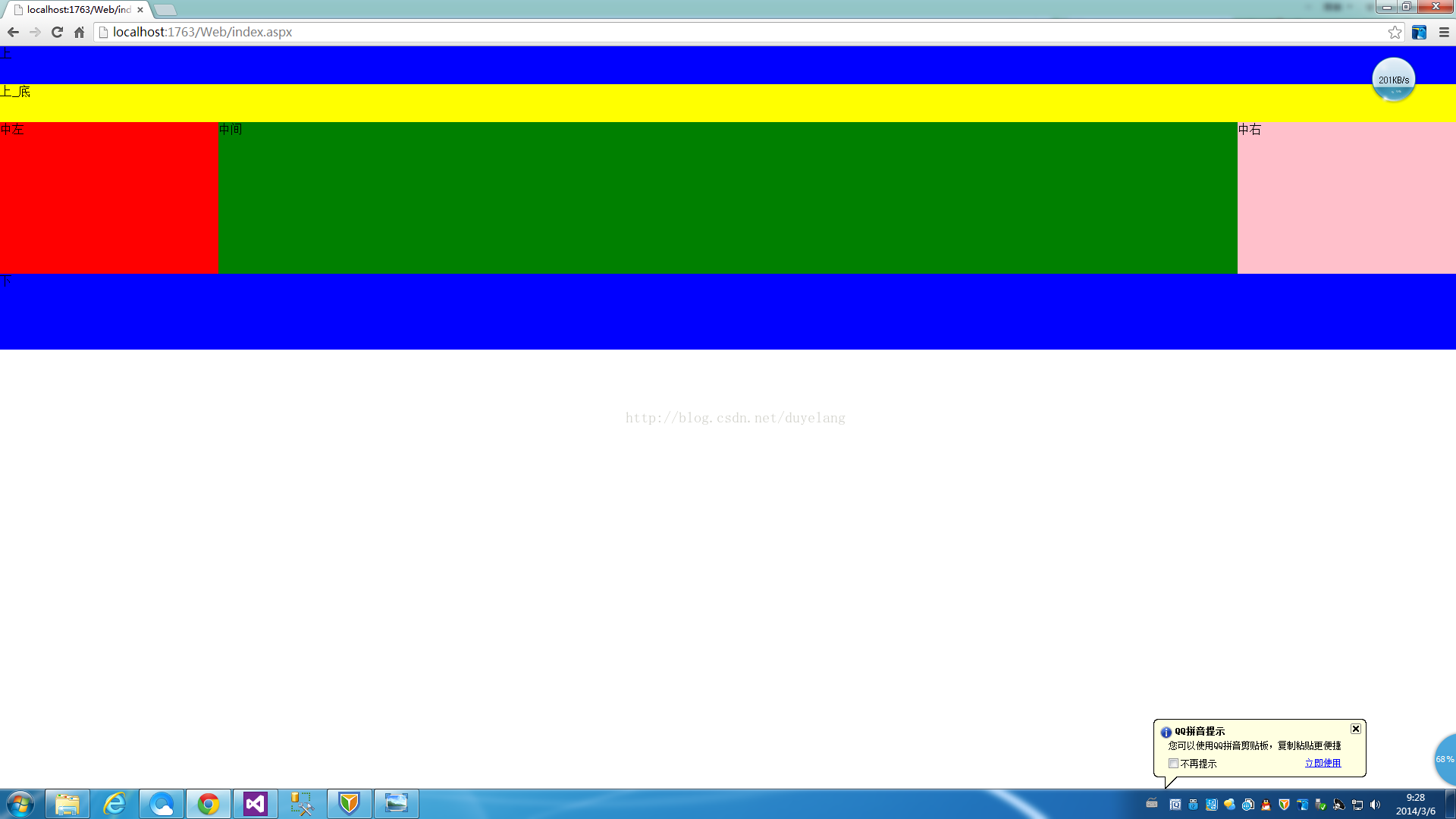
div布局:
<div>
            <div id="header">
                上
                <div id="h_menu">
                    上_底
                </div>
            </div>
            <div id="middle">
                <div class="left">
                    中左
                </div>
                <div class="right">
                    中右
                </div>
                <div class="center">
                    中间
                </div>
            </div>
            <div id="footer">
                下
            </div>
        </div>
样式:
<style type="text/css">
        body, html {
            margin: 0px;
        }
        #header {
            background: blue;
            height: 100px;
            width: 100%;
            position:relative; /*父div的位置设置成相对的*/
        }
            #h_menu {
                width:100%;
                height:50px;
                background:yellow;
                /*而子div的位置设置成绝对的,并且下边缘设为0*/
                position:absolute;
                bottom:0;
            }
        .left {
            width: 15%;    /*这里是百分比或者像素值,对应下面的center就是百分比或者像素值*/
            height: 200px;
            background: red;
            float: left;
        }
        .right {
            width: 15%;  /*这里是百分比或者像素值,对应下面的center就是百分比或者像素值*/
            height: 200px;
            background: pink;
            float: right;
        }
        .center {
            height: 200px;
            background: green;
            /*两种方式均可(一)margin(二)margin-left、margin-right*/
            /*(一)、用这种方式上面的left和right中的width是百分比或者像素值都可以*/
            margin: auto;
            /*(二)、这里是百分比或者像素值,对应上面的left、right中的width就是百分比或者像素值*/
            /*margin-left:15%;
            margin-right:15%;*/
        }
        #footer {
            background: blue;
            height: 100px;
            width: 100%;
        }
    </style>
效果图如下:
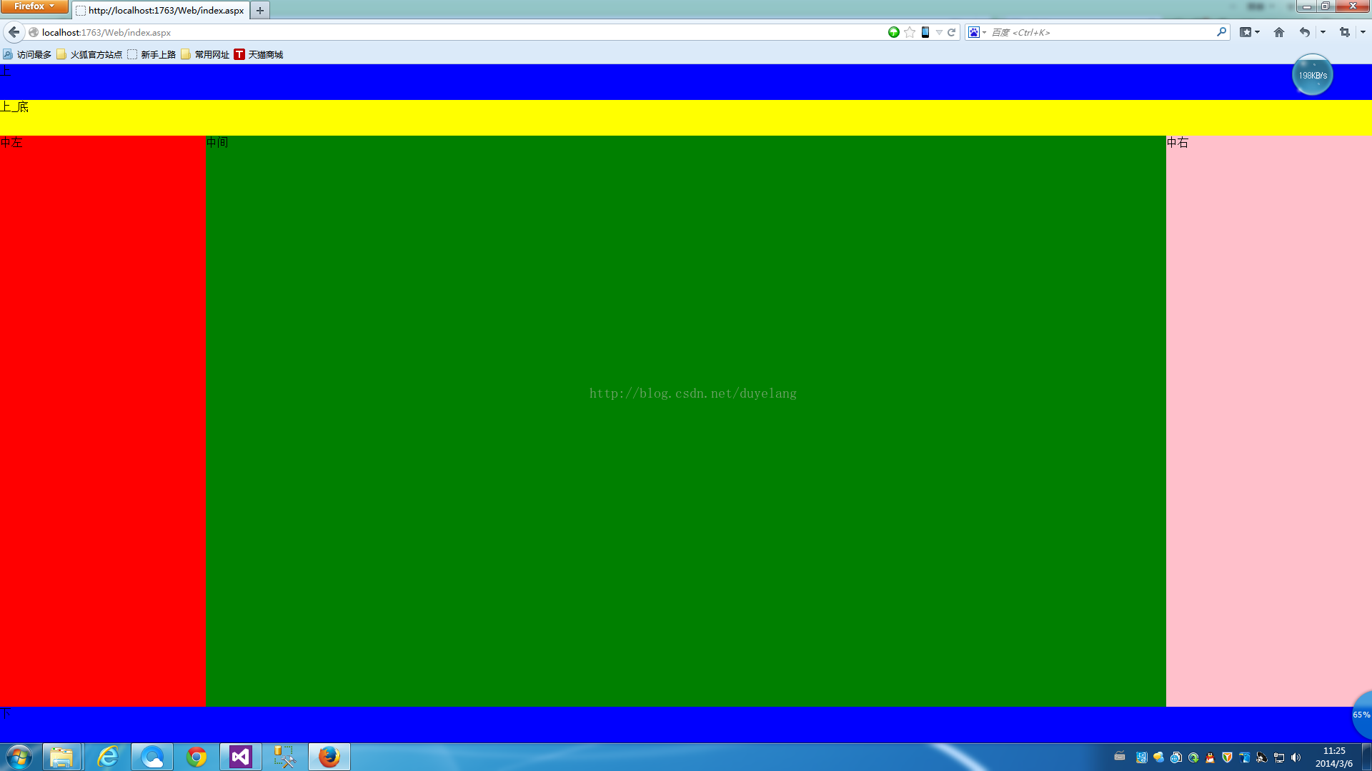
另一种实现方式(高度也占满全屏)
<!DOCTYPE html>
<html xmlns="http://www.w3.org/1999/xhtml">
<head runat="server">
    <meta http-equiv="Content-Type" content="text/html; charset=utf-8" />
    <title></title>
    <style type="text/css">
        body, html {
            margin: 0px;
        }
        #header {
            background: blue;
            height: 100px;
            width: 100%;
            position: relative; /*父div的位置设置成相对的*/
            top: 0;
        }
            #header #h_menu {
                position:absolute;
                bottom:0;
                background:yellow;
                width:100%;
                height:50px;
            }
        #middle {
            position:absolute;
            width:100%;
            height:auto;
            top: 100px;
            bottom:50px;
        }
        .left {
            width: 15%;    /*这里是百分比或者像素值,对应下面的center就是百分比或者像素值*/
            background: red;
            float: left;
            height:100%;
        }
        .right {
            width: 15%;  /*这里是百分比或者像素值,对应下面的center就是百分比或者像素值*/
            height: 100%;
            background: pink;
            float: right;
        }
        .center {
            height: 100%;
            background: green;
            /*两种方式均可(一)margin(二)margin-left、margin-right*/
            /*(一)、用这种方式上面的left和right中的width是百分比或者像素值都可以*/
            margin: auto;
            /*(二)、这里是百分比或者像素值,对应上面的left、right中的width就是百分比或者像素值*/
            /*margin-left:15%;
            margin-right:15%;*/
        }
        #footer {
            background: blue;
            height: 50px;
            width: 100%;
            position: absolute;
            bottom: 0;
        }
    </style>
</head>
<body>
    <form id="form1" runat="server">
        <div>
            <div id="header">
                上
                <div id="h_menu">
                    上_底
                </div>
            </div>
            <div id="middle">
                <div class="left">
                    中左
                </div>
                <div class="right">
                    中右
                </div>
                <div class="center">
                    中间
                </div>
            </div>
            <div id="footer">
                下
            </div>
        </div>
    </form>
</body>
</html>
截图如下:


 3992
3992


 被折叠的 条评论
为什么被折叠?
被折叠的 条评论
为什么被折叠?
 到【灌水乐园】发言


