


Ratingbar UseGuide
Ratingbar是一个评分控件,系统给我们提供了这样一个控件,样式如下:

相信大家都见过这样一个控件。本文将详细的讲解Ratingbar的使用和改造。
系统默认Ratingbar
RatingBar是基于SeekBar(拖动条)和ProgressBar(状态条)的扩展,用星形来显示等级评定。
我们来看下系统默认的Ratingbar:
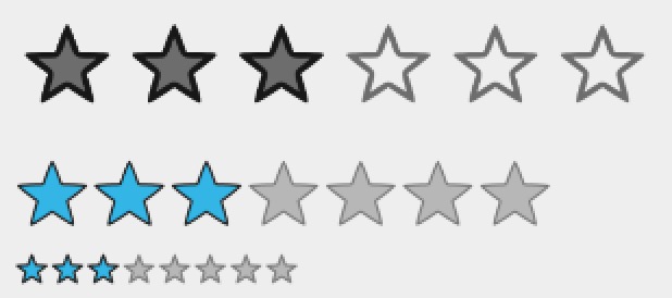
这三种Ratingbar是系统给我们提供的样式,代码分别如下:
    <RatingBar
        android:id="@+id/origin_ratingbar"
        android:layout_width="wrap_content"
        android:layout_height="wrap_content"
        android:layout_marginTop="8dp"
        android:numStars="6"
        android:rating="3"/>

    <RatingBar
        style="?android:attr/ratingBarStyleIndicator"
        android:layout_width="wrap_content"
        android:layout_height="wrap_content"
        android:layout_marginTop="8dp"
        android:numStars="7"
        android:rating="3"/>

    <RatingBar
        style="?android:attr/ratingBarStyleSmall"
        android:layout_width="wrap_content"
        android:layout_height="wrap_content"
        android:layout_marginTop="8dp"
        android:numStars="8"
        android:rating="3"/>
第一种为系统默认样式Ratingbar,不做任何改变,完全原生态。
第二种为大样式Ratingbar,使用系统Style
“?android:attr/ratingBarStyleIndicator”
第三种为小样式Ratingbar,使用系统Style
“?android:attr/ratingBarStyleSmall”
系统给我们提供的Ratingbar基本可以满足我们不高的需求,它提供了一些属性:
| 属性 | 作用 |
|---|---|
| android:rating=”3” | 当前显示的Star数 |
| android:numStars=”7” | 总共的Star数 |
| android:stepSize=”1.5” | Star增加时的步长 |
| android:isIndicator=”true” | Ratingbar是否可用 |
都很简单明了,看了就知道怎么用。
PS:很蛋疼的一点,系统的Ratingbar必须使用wrap_content布局,如果match_parent,定义的numStars就失效了。而且,系统的Ratingbar是无法调节Star与Star之间的间距的。
自定义样式Ratingbar
系统的Ratingbar虽然功能满足了,但是实在太丑,Star的样式还是无法控制,所以,我们可以通过Style来控制其样式。
创建Star图片
首先,我们创建一个drawable:
<?xml version="1.0" encoding="utf-8"?>
<layer-list xmlns:android="http://schemas.android.com/apk/res/android">
    <item
        android:id="@+android:id/background"
        android:drawable="@drawable/staroff"/>
    <item
        android:id="@+android:id/secondaryProgress"
        android:drawable="@drawable/staroff"/>
    <item
        android:id="@+android:id/progress"
        android:drawable="@drawable/staron"/>
</layer-list>
很简单,指定三个属性:
- progress:用来在背景图片基础上进行填充的指示属性(和进度条类似,第一进度位置)
- secondaryProgress:类似progressbar的二级进度条
- background:用来填充背景图片,和进度条类似,当我们设置最高Star时(android:numStars),系统就会根据我们的设置,来画出以Star为单位的背景(例如android:numStars=”5”,就会画出5颗灰色的Star)
引用的id在IDE中可能会报错,但是不影响编译。
定义Style
我们创建一个Style,用来定义Ratingbar的样式:
    <style name="MyRatingBar" parent="@android:style/Widget.RatingBar">
        <item name="android:progressDrawable">@drawable/ratingbar_bg</item>
        <item name="android:minHeight">48dp</item>
        <item name="android:maxHeight">48dp</item>
    </style>
通过拓展Widget.RatingBar来自定义样式,并指定其android:progressDrawable参数为我们前面设置的图片样式。
引用Style
最后,我们在代码中引用自定义的Style:
    <RatingBar
        style="@style/MyRatingBar"
        android:layout_width="wrap_content"
        android:layout_height="wrap_content"
        android:layout_marginTop="8dp"
        android:numStars="8"
        android:rating="3"/>
最后的显示样式如下:

这里也有个蛋疼的地方,那就是,一旦设置了自定义的Star样式、背景,Star在Ratingbar中就无法竖直居中了,所以,只能靠切图时留好边距来调整位置,这样同时也能解决无法定义Star直接间隔的问题。
重写Ratingbar
这必须的,最后我们会发现,系统提供的这个Ratingbar太鸡肋了,实在是不好意思直接拿来用,所以,我们来重写一个Ratingbar。
重写Ratingbar,我们就不使用系统的方式——拓展progressbar的方式。我们创建一个ViewGroup,通过设置不同数量的图片,来控制显示的Star。
创建属性
首先我们自定义attrs属性:
<?xml version="1.0" encoding="utf-8"?>
<resources>
    <declare-styleable name="RatingBarView">

        <attr name="starImageSize" format="dimension"/>
        <attr name="starCount" format="integer"/>
        <attr name="starEmpty" format="reference"/>
        <attr name="starFill" format="reference"/>

    </declare-styleable>
</resources>
定义四个属性,分别用来控制显示Star的大小,数量,未填充的图像,填充的图像。
重写Ratingbar
我们通过继承LinearLayout的方式来实现,往LinearLayout里面塞ImageView。
package com.xys.ratingbarguide;

import android.content.Context;
import android.content.res.TypedArray;
import android.graphics.drawable.Drawable;
import android.util.AttributeSet;
import android.view.View;
import android.view.ViewGroup;
import android.view.animation.ScaleAnimation;
import android.widget.ImageView;
import android.widget.LinearLayout;

public class RatingBarView extends LinearLayout {

    public interface OnRatingListener {
        void onRating(Object bindObject, int RatingScore);
    }

    private boolean mClickable = true;
    private OnRatingListener onRatingListener;
    private Object bindObject;
    private float starImageSize;
    private int starCount;
    private Drawable starEmptyDrawable;
    private Drawable starFillDrawable;
    private int mStarCount;

    public void setClickable(boolean clickable) {
        this.mClickable = clickable;
    }

    public RatingBarView(Context context, AttributeSet attrs) {
        super(context, attrs);
        setOrientation(LinearLayout.HORIZONTAL);
        TypedArray ta = context.obtainStyledAttributes(attrs, R.styleable.RatingBarView);
        starImageSize = ta.getDimension(R.styleable.RatingBarView_starImageSize, 20);
        starCount = ta.getInteger(R.styleable.RatingBarView_starCount, 5);
        starEmptyDrawable = ta.getDrawable(R.styleable.RatingBarView_starEmpty);
        starFillDrawable = ta.getDrawable(R.styleable.RatingBarView_starFill);
        ta.recycle();

        for (int i = 0; i < starCount; ++i) {
            ImageView imageView = getStarImageView(context, attrs);
            imageView.setOnClickListener(new OnClickListener() {
                @Override
                public void onClick(View v) {
                    if (mClickable) {
                        mStarCount = indexOfChild(v) + 1;
                        setStar(mStarCount, true);
                        if (onRatingListener != null) {
                            onRatingListener.onRating(bindObject, mStarCount);
                        }
                    }
                }
            });
            addView(imageView);
        }
    }

    private ImageView getStarImageView(Context context, AttributeSet attrs) {
        ImageView imageView = new ImageView(context);
        ViewGroup.LayoutParams para = new ViewGroup.LayoutParams(Math.round(starImageSize), Math.round(starImageSize));
        imageView.setLayoutParams(para);
        // TODO:you can change gap between two stars use the padding
        imageView.setPadding(0, 0, 40, 0);
        imageView.setImageDrawable(starEmptyDrawable);
        imageView.setMaxWidth(10);
        imageView.setMaxHeight(10);
        return imageView;
    }

    public void setStar(int starCount, boolean animation) {
        starCount = starCount > this.starCount ? this.starCount : starCount;
        starCount = starCount < 0 ? 0 : starCount;
        for (int i = 0; i < starCount; ++i) {
            ((ImageView) getChildAt(i)).setImageDrawable(starFillDrawable);
            if (animation) {
                ScaleAnimation sa = new ScaleAnimation(0, 0, 1, 1);
                getChildAt(i).startAnimation(sa);
            }
        }
        for (int i = this.starCount - 1; i >= starCount; --i) {
            ((ImageView) getChildAt(i)).setImageDrawable(starEmptyDrawable);
        }
    }

    public int getStarCount() {
        return mStarCount;
    }

    public void setStarFillDrawable(Drawable starFillDrawable) {
        this.starFillDrawable = starFillDrawable;
    }

    public void setStarEmptyDrawable(Drawable starEmptyDrawable) {
        this.starEmptyDrawable = starEmptyDrawable;
    }

    public void setStarCount(int startCount) {
        this.starCount = starCount;
    }

    public void setStarImageSize(float starImageSize) {
        this.starImageSize = starImageSize;
    }

    public void setBindObject(Object bindObject) {
        this.bindObject = bindObject;
    }

    public void setOnRatingListener(OnRatingListener onRatingListener) {
        this.onRatingListener = onRatingListener;
    }
}
代码基本没有什么好说的,非常简单的自定义View。在显示Star的时候,我们还可以添加显示的动画,我这里就只做了一个简单的缩放动画。同时,通过设置imageView的padding,我们可以解决Star之间设置间距的问题。
最后,显示效果如下:

响应事件
Ratingbar的响应事件与progressbar的响应事件类似。通过设置监听来监听Star选择的改变,当然,我们自定义的RatingbarView设置了一个接口,来实现监听:
RatingBar customRatingbar = (RatingBar) findViewById(R.id.origin_ratingbar);
        customRatingbar.setOnRatingBarChangeListener(new RatingBar.OnRatingBarChangeListener() {
            @Override
            public void onRatingChanged(RatingBar ratingBar, float rating, boolean fromUser) {
                Toast.makeText(MainActivity.this, String.valueOf(rating), Toast.LENGTH_SHORT).show();
            }
        });

        RatingBarView originRatingbar = (RatingBarView) findViewById(R.id.custom_ratingbar);
        originRatingbar.setOnRatingListener(new RatingBarView.OnRatingListener() {
            @Override
            public void onRating(Object bindObject, int RatingScore) {
                Toast.makeText(MainActivity.this, String.valueOf(RatingScore), Toast.LENGTH_SHORT).show();
            }
        });
回调中的参数,就是Star的数量。除了回调,Ratingbar也提供了一些方法来返回Star的数量。
原生:
- mRatingBar.getMax()
- mRatingBar.getRating()
自定义:
- mRatingBarView.getStarCount()
库
这个自定义Ratingbar可以放到单独的库项目中,作为UIKit来进行使用,那么为什么我这里没有呢?原因就是,我比较懒。需要的请自己抽一下,一共就两个文件。
以上,Ratingbar全解析结束,只留下一个Github:
https://github.com/xuyisheng/RatingbarGuide
欢迎fork、Star。


 5249
5249


 被折叠的 条评论
为什么被折叠?
被折叠的 条评论
为什么被折叠?
 到【灌水乐园】发言


