


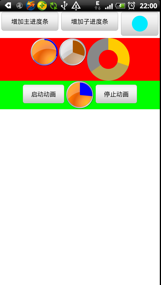
废话不多说,先上效果图:
Android提供了很多基本的控件实现,但不是一个完整、强大的实现。
幸运的是,Android提供了自定义控件的实现,有了自定义控件,我们就可以再Android的基础控件上实现我们想要的功能或者自定义的外观。
以ProgressBar为例,对于可调节的进度条似乎只有长条形的ProgressBar(圆形的都是不停转动的那种)
假如我们想要一个可调节进度的圆形进度条呢。。。
Ok,下面我们直接切入主题(关于自定义控件的相关实现细节就不多说了,还不太清楚的童鞋先找相关资料补习一下)
该自定义控件的实现思路是继承自View,然后重写onDraw
先看看该类有哪些成员变量:
public class CircleProgress extends View{


	 private  static final int DEFAULT_MAX_VALUE = 100;			// 默认进度条最大值
	 private  static final int DEFAULT_PAINT_WIDTH = 10;			// 默认画笔宽度
	 private  static final int DEFAULT_PAINT_COLOR = 0xffffcc00;		// 默认画笔颜色
	 private  static final boolean DEFAULT_FILL_MODE = true;		// 默认填充模式
	 private  static final int DEFAULT_INSIDE_VALUE = 0;			// 默认缩进距离


	 private CircleAttribute mCircleAttribute;				// 圆形进度条基本属性

	 private int mMaxProgress;						// 进度条最大值
	 private int mMainCurProgress;						// 主进度条当前值
	 private int mSubCurProgress;						// 子进度条当前值

	 private CartoomEngine mCartoomEngine;					// 动画引擎

	 private Drawable mBackgroundPicture;					// 背景图
class CircleAttribute
	{
		 public RectF  	mRoundOval;				// 圆形所在矩形区域
		 public boolean mBRoundPaintsFill;			// 是否填充以填充模式绘制圆形
		 public int  	mSidePaintInterval;			// 圆形向里缩进的距离
		 public int    	mPaintWidth;				// 圆形画笔宽度(填充模式下无视)
		 public int     mPaintColor;				// 画笔颜色  (即主进度条画笔颜色,子进度条画笔颜色为其半透明值)
		 public int     mDrawPos;				// 绘制圆形的起点(默认为-90度即12点钟方向)

		 public Paint   mMainPaints;				// 主进度条画笔
		 public Paint   mSubPaint;    				// 子进度条画笔

		 public Paint   mBottomPaint;				// 无背景图时绘制所用画笔
	class CartoomEngine
	{
		public Handler mHandler;
		public boolean mBCartoom;				// 是否正在作动画
		public Timer   mTimer;					// 用于作动画的TIMER
		public		 MyTimerTask	mTimerTask;		// 动画任务
		public int 	 mSaveMax;				// 在作动画时会临时改变MAX值,该变量用于保存值以便恢复
		public int     mTimerInterval;				// 定时器触发间隔时间(ms)
		public float   mCurFloatProcess;			// 作动画时当前进度值
下面看看onDraw的代码片段:
public void onDraw(Canvas canvas) {
		// TODO Auto-generated method stub
		super.onDraw(canvas);

		if (mBackgroundPicture == null)									// 没背景图的话就绘制底色
		{
			canvas.drawArc(mCircleAttribute.mRoundOval, 0, 360, mCircleAttribute.mBRoundPaintsFill, mCircleAttribute.mBottomPaint);
		}


		float subRate = (float)mSubCurProgress / mMaxProgress;
		float subSweep = 360 * subRate;
		canvas.drawArc(mCircleAttribute.mRoundOval, mCircleAttribute.mDrawPos, subSweep, mCircleAttribute.mBRoundPaintsFill, mCircleAttribute.mSubPaint);

		float rate = (float)mMainCurProgress / mMaxProgress;
		float sweep = 360 * rate;
		canvas.drawArc(mCircleAttribute.mRoundOval, mCircleAttribute.mDrawPos, sweep, mCircleAttribute.mBRoundPaintsFill, mCircleAttribute.mMainPaints);


	}
canvas的drawArc(RectF oval, float startAngle, float sweepAngle, boolean useCenter, Paint paint) 方法是关键
相关参数说明大家详看SDK文档
控件大小决定oval
画笔属性设置paint
useCenter表示是否填充
startAngle是绘制圆弧的起点,我们使用-90度,即12点钟方向
sweepAngle是从起点顺时针绘制覆盖的角度,意味着进度值为30%的话,就是 360 * 30%
设置进度的代码片段:
 public synchronized void setMainProgress (int progress)
	 {
	    	mMainCurProgress = progress;
	    	if (mMainCurProgress < 0)
	    	{
	    		mMainCurProgress = 0;
	    	}

	    	if (mMainCurProgress > mMaxProgress)
	    	{
	    		mMainCurProgress = mMaxProgress;
	    	}

	    	invalidate();
	}
设置进度值之后触发重绘,计算sweepAngle的值,最后完成绘制效果,怎么样,是不是就对上了
该控件的自定义属性如下:
	<?xml version="1.0" encoding="utf-8"?>
<resources>

    <declare-styleable name="CircleProgressBar">
        <attr name="max" format="integer"/>				<!-- 进度条最大值 -->
        <attr name="fill" format="boolean"/>			<!-- 是否填充圆形区域 -->
        <attr name="Paint_Width" format="integer"/>		<!-- 画笔宽度,填充模式下无效,会被重置为0 -->
        <attr name="Paint_Color" format="integer"/>		<!-- 画笔颜色 -->
        <attr name="Inside_Interval" format="integer"/> <!-- 圆形区域向里缩进的距离 -->
    </declare-styleable>

</resources>
再贴上本例的布局文件:
<?xml version="1.0" encoding="utf-8"?>
<LinearLayout xmlns:android="http://schemas.android.com/apk/res/android"
    xmlns:roundProgress="http://schemas.android.com/apk/res/com.genius.progress"
    android:layout_width="fill_parent"
    android:layout_height="fill_parent"
    android:orientation="vertical"
    android:background="#ffffff">


    <LinearLayout
    android:layout_height="wrap_content"
    android:layout_width="match_parent"
    android:id="@+id/linearLayout1"
    android:orientation="horizontal"
    android:gravity = "center_horizontal">

      	<Button
		android:text="增加主进度条"
		android:id="@+id/buttonAddMainPro"
		android:layout_width="wrap_content"
		android:layout_height="wrap_content"
		android:layout_weight="1">
		</Button>


		<Button
		android:text="增加子进度条"
		android:id="@+id/buttonAddSubPro"
		android:layout_width="wrap_content"
		android:layout_height="wrap_content"
		android:layout_weight="1">
		</Button>

   		<ImageButton
   		android:id="@+id/buttonImage"
    	android:layout_width="wrap_content"
    	android:layout_height="wrap_content"
    	android:src="@drawable/background2"
    	android:layout_weight="1" />

    </LinearLayout>


    <LinearLayout
	    android:layout_height="wrap_content"
	    android:layout_width="match_parent"
	    android:id="@+id/linearLayout2"
	    android:orientation="horizontal"
	    android:background="#ff0000"
	    android:gravity = "center_horizontal">


        <com.genius.circle.CircleProgress
	    android:id="@+id/roundBar1"
	    android:layout_width="wrap_content"
	    android:layout_height="wrap_content"
	    android:background="@drawable/background1"
		roundProgress:max="100"
		roundProgress:fill = "false"
		roundProgress:Inside_Interval="5"
	    roundProgress:Paint_Width = "4"
	    roundProgress:Paint_Color = "0xff0000ff"
		/>


	 	<com.genius.circle.CircleProgress
	     android:id="@+id/roundBar2"
	     android:layout_width="wrap_content"
	     android:layout_height="wrap_content"
	     android:background="@drawable/background3"
	 	 roundProgress:max="100"
	 	 roundProgress:Inside_Interval="8"
	     roundProgress:fill = "true"
	     roundProgress:Paint_Width = "4"
	     roundProgress:Paint_Color = "0xffaa5500"
	    />


	 	<com.genius.circle.CircleProgress
	     android:id="@+id/roundBar3"
	     android:layout_width="96dp"
	     android:layout_height="96dp"
	 	 roundProgress:max="100"
	     roundProgress:fill="false"
	      roundProgress:Paint_Width="40"
	     roundProgress:Inside_Interval="20"
	    />

    </LinearLayout>


  	<LinearLayout
    android:layout_height="wrap_content"
    android:layout_width="match_parent"
    android:id="@+id/linearLayout3"
    android:orientation="horizontal"
    android:gravity = "center_horizontal|center_vertical"
    android:background="#00ff00">


		    <Button
			android:text="启动动画"
			android:id="@+id/buttonStart"
			android:layout_width="100dip"
			android:layout_height="wrap_content">
			</Button>


		    <com.genius.circle.CircleProgress
		     android:id="@+id/roundBar4"
		     android:layout_width="wrap_content"
		     android:layout_height="wrap_content"
		     android:background="@drawable/background1"
		 	 roundProgress:Inside_Interval="6"
		     roundProgress:Paint_Color = "0xff0000ff"
		    />

		    <Button
			android:text="停止动画"
			android:id="@+id/buttonStop"
			android:layout_width="100dip"
			android:layout_height="wrap_content">
			</Button>


    </LinearLayout>


</LinearLayout>
大家比对下效果图就明白了
此外该控件中有两个接口是作动画相关的
public synchronized void startCartoom(int time)
public synchronized void stopCartoom()
比如你想播放一个10秒的声音片段,同时用进度条来表示播放进度,那么直接调用 startCartoom(10)来开启动画即可
其他的似乎没啥好说的了,源码工程里的注释也写很清楚了,有兴趣的童鞋下下来看看就明白了
附属工程链接:
http://download.csdn.net/detail/geniuseoe2012/4387677
喜欢就顶一下,你们的支持是窝的动力。


 被折叠的 条评论
为什么被折叠?
被折叠的 条评论
为什么被折叠?
 到【灌水乐园】发言


