


实现渐变效果如下:
在线生成渐变样式,工具地址(很强大):http://www.colorzilla.com/gradient-editor/
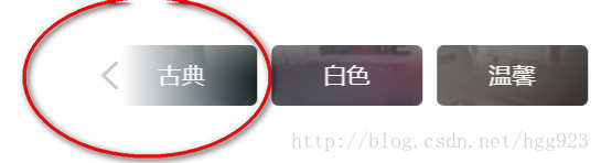
生成样式如下:
.swiper-button-prev:after {content: '';position: absolute;top: 0;right: -95px;width: 100px;height: 44px;

    background: -moz-linear-gradient(left, rgba(255,255,255,1) 0%, rgba(255,255,255,0) 100%); /* FF3.6-15 */
    background: -webkit-linear-gradient(left, rgba(255,255,255,1) 0%,rgba(255,255,255,0) 100%); /* Chrome10-25,Safari5.1-6 */
    background: linear-gradient(to right, rgba(255,255,255,1) 0%,rgba(255,255,255,0) 100%); /* W3C, IE10+, FF16+, Chrome26+, Opera12+, Safari7+ */
    filter: progid:DXImageTransform.Microsoft.gradient( startColorstr='#ffffff', endColorstr='#00ffffff',GradientType=1 ); /* IE6-9 */
    }
附录一(充电): background:-webkit-gradient详解
附录二:思路来源,感谢


 2837
2837


 被折叠的 条评论
为什么被折叠?
被折叠的 条评论
为什么被折叠?
 到【灌水乐园】发言


