


大多android应用都有一个底部菜单功能,点击其中一个按钮,切换到不同的界面。有很多实现方法,比较简单的是使用 tabhost+
其他2个代码一样,就加载了一个布局文件而已
RadioGroup来实现。还有一般购物app,都有一个购物车按钮,当你买商品时候,购物车右上角显示一个购买数量提醒信息,实现方法也比较多。
下面就用其中一种方式实现上面的功能:切换按钮+提醒信息
如图:
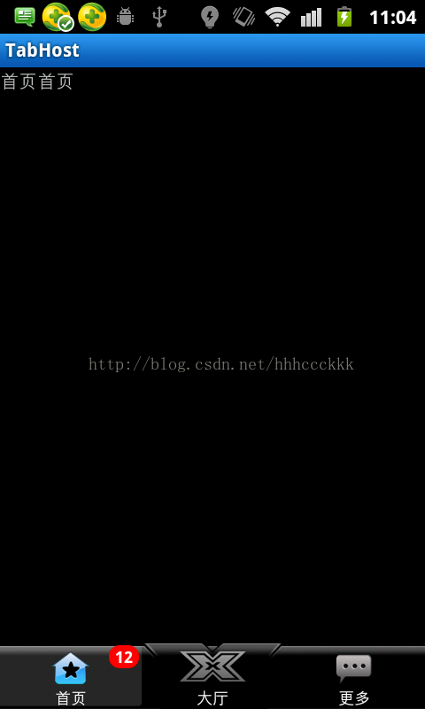
下面是3个切换按钮,点击不同的按钮切换到不同页面,已加载的页面,不会呗重新加载。在首页按钮右上角有一个提醒信息,比如有新的信息,新的通知,可以显示在这里,提醒用户。这个功能使用的是别人写好的一个类,使用很简单方便,有多个方法可以实现不同的提醒效果,背景,字体颜色大小,间距,显示位置,都是可以自己设置的。
代码:
主界面代码 MainActivity.java:
package com.hck.ui;

import android.app.TabActivity;
import android.content.Intent;
import android.graphics.Color;
import android.os.Bundle;
import android.util.Log;
import android.view.View;
import android.widget.Button;
import android.widget.RadioButton;
import android.widget.RadioGroup;
import android.widget.RadioGroup.OnCheckedChangeListener;
import android.widget.TabHost;
import android.widget.TabHost.TabSpec;
import android.widget.TabWidget;

import com.hck.tabhost.R;

public class MainActivity extends TabActivity implements
		OnCheckedChangeListener {
	private static final String HOME = "home";
	private static final String LIFT = "lift";
	private static final String MORE = "more";
	private TabHost tabHost; // tabhost对象
	private TabSpec tabSpec1, tabSpec2, tabSpec3; // 现象卡对象
	public Button button1;// 用来显示提醒信息
	private RadioGroup radioGroup;

	@Override
	protected void onCreate(Bundle savedInstanceState) {
		super.onCreate(savedInstanceState);
		setContentView(R.layout.main);
		initView();
		addSpec();
		setListener();
	}

	private void initView() {
		radioGroup = (RadioGroup) findViewById(R.id.RadioG);
		tabHost = this.getTabHost();
		button1 = (Button) findViewById(R.id.bt);
		remind(button1);

	}

	private void remind(View view) { //BadgeView的具体使用
		BadgeView badge1 = new BadgeView(this, button1);// 创建一个BadgeView对象,view为你需要显示提醒的控件
		badge1.setText("12"); // 需要显示的提醒类容
		badge1.setBadgePosition(BadgeView.POSITION_TOP_RIGHT);// 显示的位置.右上角,BadgeView.POSITION_BOTTOM_LEFT,下左,还有其他几个属性
		badge1.setTextColor(Color.WHITE); // 文本颜色
		badge1.setBadgeBackgroundColor(Color.RED); // 提醒信息的背景颜色,自己设置
		badge1.setTextSize(12); // 文本大小
		//badge1.setBadgeMargin(3, 3); // 水平和竖直方向的间距
		badge1.setBadgeMargin(5); //各边间隔
		// badge1.toggle(); //显示效果,如果已经显示,则影藏,如果影藏,则显示
		badge1.show();// 只有显示
		// badge1.hide();//影藏显示
	}

	private void setListener() { // 设置点击监听事件
		radioGroup.setOnCheckedChangeListener(this);
	}

	private void addSpec() {
		tabSpec1 = tabHost.newTabSpec(HOME).setIndicator(HOME)
				.setContent(new Intent(this, MainLeft.class)); // 点击第一个button,跳转到哪个activity(点击跳到MainLeft界面)
		tabHost.addTab(tabSpec1);
		tabSpec2 = tabHost.newTabSpec(LIFT).setIndicator(LIFT)
				.setContent(new Intent(this, MainCenter.class));// 点击第2个button,跳转到哪个activity
		tabHost.addTab(tabSpec2);

		tabSpec3 = tabHost.newTabSpec(MORE).setIndicator(MORE)
				.setContent(new Intent(this, MainRight.class));// 点击第3个button,跳转到哪个activity
		tabHost.addTab(tabSpec3);

	}

	@Override
	public void onCheckedChanged(RadioGroup group, int checkedId) { // 点击按钮事件
		switch (checkedId) {
		case R.id.home_id: // 点击第一个按钮
			tabHost.setCurrentTab(0); // 显示第一个选项卡,即跳到MainLeft
			break;
		case R.id.lift_id:
			tabHost.setCurrentTab(1);// 跳到MainCenter
			break;
		case R.id.more_id:
			tabHost.setCurrentTab(2);// 跳到MainRight
			break;
		}

	}

}
代码有详细注解,就不多解释了。里面的button1,是用来显示提醒信息的。开始的时候,没有用该button,而是直接用了首页这个RadioButton,可以显示提醒信息,但是,界面的切换会失效。后面只能用了一个透明的button覆盖在上面,用来显示信息,而不是用RadioButton来显示。(大家可能没明白我在说什么,请看我的另外一篇文章,android实现提醒信息:链接)
提醒信息的实现主要是方法:remind()方法实现,配置好相应的属性,就ok了。
切换界面代码:
MainCenter.java
package com.hck.ui;

import com.hck.tabhost.R;

import android.app.Activity;
import android.os.Bundle;

public class MainCenter extends Activity{
	@Override
	protected void onCreate(Bundle savedInstanceState) {
		super.onCreate(savedInstanceState);
		setContentView(R.layout.main_center);
	}

}
BadgeView.java :
别人写的一个类,用来实现提醒信息的,相当好用,具体怎么实现什么的,没去看了。知道怎么用,也差不多了。
(用法在MainActivity里面的remind()方法)。
package com.hck.ui;

import android.content.Context;
import android.content.res.Resources;
import android.graphics.Color;
import android.graphics.Typeface;
import android.graphics.drawable.ShapeDrawable;
import android.graphics.drawable.shapes.RoundRectShape;
import android.util.AttributeSet;
import android.util.Log;
import android.util.TypedValue;
import android.view.Gravity;
import android.view.View;
import android.view.ViewGroup;
import android.view.ViewGroup.LayoutParams;
import android.view.ViewParent;
import android.view.animation.AccelerateInterpolator;
import android.view.animation.AlphaAnimation;
import android.view.animation.Animation;
import android.view.animation.DecelerateInterpolator;
import android.widget.FrameLayout;
import android.widget.TabWidget;
import android.widget.TextView;

/**
 * A simple text label view that can be applied as a "badge" to any given {@link android.view.View}.
 * This class is intended to be instantiated at runtime rather than included in XML layouts.
 *
 * @author Jeff Gilfelt
 */
public class BadgeView extends TextView {

	public static final int POSITION_TOP_LEFT = 1;
	public static final int POSITION_TOP_RIGHT = 2;
	public static final int POSITION_BOTTOM_LEFT = 3;
	public static final int POSITION_BOTTOM_RIGHT = 4;
	public static final int POSITION_CENTER = 5;

	private static final int DEFAULT_MARGIN_DIP = 5;
	private static final int DEFAULT_LR_PADDING_DIP = 5;
	private static final int DEFAULT_CORNER_RADIUS_DIP = 8;
	private static final int DEFAULT_POSITION = POSITION_TOP_RIGHT;
	private static final int DEFAULT_BADGE_COLOR = Color.parseColor("#CCFF0000"); //Color.RED;
	private static final int DEFAULT_TEXT_COLOR = Color.WHITE;

	private static Animation fadeIn;
	private static Animation fadeOut;

	private Context context;
	private View target;

	private int badgePosition;
	private int badgeMarginH;
	private int badgeMarginV;
	private int badgeColor;

	private boolean isShown;

	private ShapeDrawable badgeBg;

	private int targetTabIndex;

	public BadgeView(Context context) {
		this(context, (AttributeSet) null, android.R.attr.textViewStyle);
	}

	public BadgeView(Context context, AttributeSet attrs) {
		 this(context, attrs, android.R.attr.textViewStyle);
	}

	/**
     * Constructor -
     *
     * create a new BadgeView instance attached to a target {@link android.view.View}.
     *
     * @param context context for this view.
     * @param target the View to attach the badge to.
     */
	public BadgeView(Context context, View target) {
		 this(context, null, android.R.attr.textViewStyle, target, 0);
	}

	/**
     * Constructor -
     *
     * create a new BadgeView instance attached to a target {@link android.widget.TabWidget}
     * tab at a given index.
     *
     * @param context context for this view.
     * @param target the TabWidget to attach the badge to.
     * @param index the position of the tab within the target.
     */
	public BadgeView(Context context, TabWidget target, int index) {
		this(context, null, android.R.attr.textViewStyle, target, index);
	}

	public BadgeView(Context context, AttributeSet attrs, int defStyle) {
		this(context, attrs, defStyle, null, 0);
	}

	public BadgeView(Context context, AttributeSet attrs, int defStyle, View target, int tabIndex) {
		super(context, attrs, defStyle);
		init(context, target, tabIndex);
	}

	private void init(Context context, View target, int tabIndex) {

		this.context = context;
		this.target = target;
		this.targetTabIndex = tabIndex;

		// apply defaults
		badgePosition = DEFAULT_POSITION;
		badgeMarginH = dipToPixels(DEFAULT_MARGIN_DIP);
		badgeMarginV = badgeMarginH;
		badgeColor = DEFAULT_BADGE_COLOR;

		setTypeface(Typeface.DEFAULT_BOLD);
		int paddingPixels = dipToPixels(DEFAULT_LR_PADDING_DIP);
		setPadding(paddingPixels, 0, paddingPixels, 0);
		setTextColor(DEFAULT_TEXT_COLOR);

		fadeIn = new AlphaAnimation(0, 1);
		fadeIn.setInterpolator(new DecelerateInterpolator());
		fadeIn.setDuration(200);

		fadeOut = new AlphaAnimation(1, 0);
		fadeOut.setInterpolator(new AccelerateInterpolator());
		fadeOut.setDuration(200);

		isShown = false;

		if (this.target != null) {
			applyTo(this.target);
		} else {
			show();
		}

	}

	private void applyTo(View target) {

		LayoutParams lp = target.getLayoutParams();
		ViewParent parent = target.getParent();
		FrameLayout container = new FrameLayout(context);

		if (target instanceof TabWidget) {

			// set target to the relevant tab child container
			//target = ((TabWidget) target).getChildTabViewAt(1);
			//this.target = target;
			Log.i("hck", "target>>>>>> "+target);
			((ViewGroup) target).addView(container,
					new LayoutParams(LayoutParams.FILL_PARENT, LayoutParams.FILL_PARENT));

			this.setVisibility(View.GONE);
			container.addView(this);

		} else {
			// TODO verify that parent is indeed a ViewGroup
			ViewGroup group = (ViewGroup) parent;
			int index = group.indexOfChild(target);

			group.removeView(target);
			group.addView(container, index, lp);

			container.addView(target);

			this.setVisibility(View.GONE);
			container.addView(this);

			group.invalidate();

		}

	}

	/**
     * Make the badge visible in the UI.
     *
     */
	public void show() {
		show(false, null);
	}

	/**
     * Make the badge visible in the UI.
     *
     * @param animate flag to apply the default fade-in animation.
     */
	public void show(boolean animate) {
		show(animate, fadeIn);
	}

	/**
     * Make the badge visible in the UI.
     *
     * @param anim Animation to apply to the view when made visible.
     */
	public void show(Animation anim) {
		show(true, anim);
	}

	/**
     * Make the badge non-visible in the UI.
     *
     */
	public void hide() {
		hide(false, null);
	}

	/**
     * Make the badge non-visible in the UI.
     *
     * @param animate flag to apply the default fade-out animation.
     */
	public void hide(boolean animate) {
		hide(animate, fadeOut);
	}

	/**
     * Make the badge non-visible in the UI.
     *
     * @param anim Animation to apply to the view when made non-visible.
     */
	public void hide(Animation anim) {
		hide(true, anim);
	}

	/**
     * Toggle the badge visibility in the UI.
     *
     */
	public void toggle() {
		toggle(false, null, null);
	}

	/**
     * Toggle the badge visibility in the UI.
     *
     * @param animate flag to apply the default fade-in/out animation.
     */
	public void toggle(boolean animate) {
		toggle(animate, fadeIn, fadeOut);
	}

	/**
     * Toggle the badge visibility in the UI.
     *
     * @param animIn Animation to apply to the view when made visible.
     * @param animOut Animation to apply to the view when made non-visible.
     */
	public void toggle(Animation animIn, Animation animOut) {
		toggle(true, animIn, animOut);
	}

	private void show(boolean animate, Animation anim) {
		if (getBackground() == null) {
			if (badgeBg == null) {
				badgeBg = getDefaultBackground();
			}
			setBackgroundDrawable(badgeBg);
		}
		applyLayoutParams();

		if (animate) {
			this.startAnimation(anim);
		}
		this.setVisibility(View.VISIBLE);
		isShown = true;
	}

	private void hide(boolean animate, Animation anim) {
		this.setVisibility(View.GONE);
		if (animate) {
			this.startAnimation(anim);
		}
		isShown = false;
	}

	private void toggle(boolean animate, Animation animIn, Animation animOut) {
		if (isShown) {
			hide(animate && (animOut != null), animOut);
		} else {
			show(animate && (animIn != null), animIn);
		}
	}

	/**
     * Increment the numeric badge label. If the current badge label cannot be converted to
     * an integer value, its label will be set to "0".
     *
     * @param offset the increment offset.
     */
	public int increment(int offset) {
		CharSequence txt = getText();
		int i;
		if (txt != null) {
			try {
				i = Integer.parseInt(txt.toString());
			} catch (NumberFormatException e) {
				i = 0;
			}
		} else {
			i = 0;
		}
		i = i + offset;
		setText(String.valueOf(i));
		return i;
	}

	/**
     * Decrement the numeric badge label. If the current badge label cannot be converted to
     * an integer value, its label will be set to "0".
     *
     * @param offset the decrement offset.
     */
	public int decrement(int offset) {
		return increment(-offset);
	}

	private ShapeDrawable getDefaultBackground() {

		int r = dipToPixels(DEFAULT_CORNER_RADIUS_DIP);
		float[] outerR = new float[] {r, r, r, r, r, r, r, r};

		RoundRectShape rr = new RoundRectShape(outerR, null, null);
		ShapeDrawable drawable = new ShapeDrawable(rr);
		drawable.getPaint().setColor(badgeColor);

		return drawable;

	}

	private void applyLayoutParams() {

		FrameLayout.LayoutParams lp = new FrameLayout.LayoutParams(LayoutParams.WRAP_CONTENT, LayoutParams.WRAP_CONTENT);

		switch (badgePosition) {
		case POSITION_TOP_LEFT:
			lp.gravity = Gravity.LEFT | Gravity.TOP;
			lp.setMargins(badgeMarginH, badgeMarginV, 0, 0);
			break;
		case POSITION_TOP_RIGHT:
			lp.gravity = Gravity.RIGHT | Gravity.TOP;
			lp.setMargins(0, badgeMarginV, badgeMarginH, 0);
			break;
		case POSITION_BOTTOM_LEFT:
			lp.gravity = Gravity.LEFT | Gravity.BOTTOM;
			lp.setMargins(badgeMarginH, 0, 0, badgeMarginV);
			break;
		case POSITION_BOTTOM_RIGHT:
			lp.gravity = Gravity.RIGHT | Gravity.BOTTOM;
			lp.setMargins(0, 0, badgeMarginH, badgeMarginV);
			break;
		case POSITION_CENTER:
			lp.gravity = Gravity.CENTER;
			lp.setMargins(0, 0, 0, 0);
			break;
		default:
			break;
		}

		setLayoutParams(lp);

	}

	/**
     * Returns the target View this badge has been attached to.
     *
     */
	public View getTarget() {
		return target;
	}

	/**
     * Is this badge currently visible in the UI?
     *
     */
	@Override
	public boolean isShown() {
		return isShown;
	}

	/**
     * Returns the positioning of this badge.
     *
     * one of POSITION_TOP_LEFT, POSITION_TOP_RIGHT, POSITION_BOTTOM_LEFT, POSITION_BOTTOM_RIGHT, POSTION_CENTER.
     *
     */
	public int getBadgePosition() {
		return badgePosition;
	}

	/**
     * Set the positioning of this badge.
     *
     * @param layoutPosition one of POSITION_TOP_LEFT, POSITION_TOP_RIGHT, POSITION_BOTTOM_LEFT, POSITION_BOTTOM_RIGHT, POSTION_CENTER.
     *
     */
	public void setBadgePosition(int layoutPosition) {
		this.badgePosition = layoutPosition;
	}

	/**
     * Returns the horizontal margin from the target View that is applied to this badge.
     *
     */
	public int getHorizontalBadgeMargin() {
		return badgeMarginH;
	}

	/**
     * Returns the vertical margin from the target View that is applied to this badge.
     *
     */
	public int getVerticalBadgeMargin() {
		return badgeMarginV;
	}

	/**
     * Set the horizontal/vertical margin from the target View that is applied to this badge.
     *
     * @param badgeMargin the margin in pixels.
     */
	public void setBadgeMargin(int badgeMargin) {
		this.badgeMarginH = badgeMargin;
		this.badgeMarginV = badgeMargin;
	}

	/**
     * Set the horizontal/vertical margin from the target View that is applied to this badge.
     *
     * @param horizontal margin in pixels.
     * @param vertical margin in pixels.
     */
	public void setBadgeMargin(int horizontal, int vertical) {
		this.badgeMarginH = horizontal;
		this.badgeMarginV = vertical;
	}

	/**
     * Returns the color value of the badge background.
     *
     */
	public int getBadgeBackgroundColor() {
		return badgeColor;
	}

	/**
     * Set the color value of the badge background.
     *
     * @param badgeColor the badge background color.
     */
	public void setBadgeBackgroundColor(int badgeColor) {
		this.badgeColor = badgeColor;
		badgeBg = getDefaultBackground();
	}

	private int dipToPixels(int dip) {
		Resources r = getResources();
		float px = TypedValue.applyDimension(TypedValue.COMPLEX_UNIT_DIP, dip, r.getDisplayMetrics());
		return (int) px;
	}

}
main.xml:
里面有简单注解的
styles.xml
注意 :在提醒button xml 布局加上 android:focusable="false" 不然可能,点击切换按钮,不切换


 317
317


 被折叠的 条评论
为什么被折叠?
被折叠的 条评论
为什么被折叠?
 到【灌水乐园】发言


