


本次实验,我们将就CSS3新特性transition做一些深入研究。
实验对象:transition
transition实际上是一种提供了一组用来实现效果过渡方法的复合属性。
语法
transition:[ transition-property ] || [ transition-duration ] || [ transition-timing-function ] || [ transition-delay ]
说明
transition-property:参与过渡的属性,可以是任意的CSS属性,也可以是none代表不设置,或者all代表所有可以进行过渡的属性,可以提供多个属性值,用逗号隔开;
有过渡效果的属性:
| 属性 | 可能值 |
|---|---|
| background-color | color |
| background-image | only gradients |
| background-position | percentage, length |
| border-bottom-color | color |
| border-bottom-width | length |
| border-color | color |
| border-left-color | color |
| border-left-width | length |
| border-right-color | color |
| border-right-width | length |
| border-spacing | length |
| border-top-color | color |
| border-top-width | length |
| border-width | length |
| bottom | length, percentage |
| color | color |
| crop | rectangle |
| font-size | length, percentage |
| font-weight | number |
| grid-* | various |
| height | length, percentage |
| left | length, percentage |
| letter-spacing | length |
| line-height | number, length, percentage |
| margin-bottom | length |
| margin-left | length |
| margin-right | length |
| margin-top | length |
| max-height | length, percentage |
| max-width | length, percentage |
| min-height | length, percentage |
| min-width | length, percentage |
| opacity | number |
| outline-color | color |
| outline-offset | integer |
| outline-width | length |
| padding-bottom | length |
| padding-left | length |
| padding-right | length |
| padding-top | length |
| right | length, percentage |
| text-indent | length, percentage |
| text-shadow | shadow |
| top | length, percentage |
| vertical-align | keywords, length, percentage |
| visibility | visibility |
| width | length, percentage |
| word-spacing | length, percentage |
| z-index | integer |
| zoom | number |
transition-duration:过渡效果的持续时间,单位为s或ms

transition-trming-function:过渡的动画类型,可取值为:
| 取值 | 说明 |
|---|---|
| linear | 线性过渡 |
| ease | 平滑过渡 |
| ease-in | 由慢到快 |
| ease-out | 由快到慢 |
| ease-in-out | 由慢到快再到慢 |
| step-start | 等同于steps(1,start) |
| step-end | 等同于 steps(1,end) |
steps(,[start | end]):这是一个步进函数,接受两个参数,第一个必须为正整数,表示单位步进数,第二个值可以为start或end,指定每一步的值发生变化的时间点。
还有一个函数可作为值:
cubic-bezier(,,,) :特定的贝塞尔曲线类型,4个值需在[0,1]区间内。
贝塞尔曲线也用在作图领域(想想钢笔工具),
不了解贝塞尔曲线的,请移步这里:贝塞尔曲线-百度百科
transition-delay:过渡延迟时间,单位s或ms;
实例
HTML
……
  <title>CSS3新特性实验——transition</title>
    <link rel="stylesheet" href="style.css" type="text/css"/>

</head>
<body>

    <div class="content">
        <div class="box1"></div>
    </div>
</body>
</html>
LESS
.transition(@pro:background-color,@dur:3s,@fn:ease-in,@delay:.5s){
  -webkit-transition-property: @pro;
  -moz-transition-property: @pro;
  -o-transition-property: @pro;
  transition-property: @pro;

  -webkit-transition-duration: @dur;
  -moz-transition-duration: @dur;
  -o-transition-duration: @dur;
  transition-duration: @dur;

  -webkit-transition-timing-function: @fn;
  -moz-transition-timing-function: @fn;
  -o-transition-timing-function:@fn;
  transition-timing-function: @fn;

  -webkit-transition-delay: @delay;
  -moz-transition-delay: @delay;
  -o-transition-delay: @delay;
  transition-delay: @delay;
}

.content {
  width: 1400px;
  height: 600px;
  margin-left: 100px;
  margin-top: 100px;
  border: 1px solid #ccc;
}

.box {
  width:100px;
  height:100px;
  float: left;
  margin-right: 30px;
  background-color: #000;
}

.box1 {
  .box;
  .transition();
}

.box1:hover{
  background-color: #666;
}
css
.content {
  width: 1400px;
  height: 600px;
  margin-left: 100px;
  margin-top: 100px;
  border: 1px solid #ccc;
}
.box {
  width: 100px;
  height: 100px;
  float: left;
  margin-right: 30px;
  background-color: #000;
}
.box1 {
  width: 100px;
  height: 100px;
  float: left;
  margin-right: 30px;
  background-color: #000;
  -webkit-transition-property: background-color;
  -moz-transition-property: background-color;
  -o-transition-property: background-color;
  transition-property: background-color;
  -webkit-transition-duration: 3s;
  -moz-transition-duration: 3s;
  -o-transition-duration: 3s;
  transition-duration: 3s;
  -webkit-transition-timing-function: ease-in;
  -moz-transition-timing-function: ease-in;
  -o-transition-timing-function: ease-in;
  transition-timing-function: ease-in;
  -webkit-transition-delay: 0.5s;
  -moz-transition-delay: 0.5s;
  -o-transition-delay: 0.5s;
  transition-delay: 0.5s;
}
.box1:hover {
  background-color: #666;
}
效果:
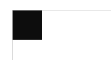
这是默认状态
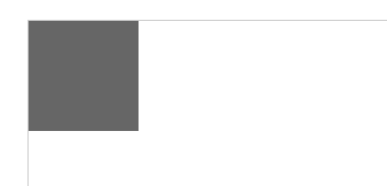
这是鼠标悬停在box1之上之后的效果
总结
总的来说,transition规定了过渡效果的各项参数,但它需要一定的触发条件,比如上面css中的
.box1:hover,就是使用鼠标悬停来触发过渡,实际应用中,多采用与JS结合的方式,动态添加类名来实现各种过渡效果。


 扫一扫
扫一扫
 1129
1129

 被折叠的 条评论
为什么被折叠?
被折叠的 条评论
为什么被折叠?
 到【灌水乐园】发言


