


在谷歌2015的I/O大会上,谷歌公布了一个新的设计支持库,它里面包含许多材料设计组件,并且这个库支持Android 2.1及其以上版本。
这个支持库,包含了以下关键特性:
1、NavigationView
2、Floating Action Button (FAB)
3、Snackbar
4、TabLayout
5、CoordinatorLayout
AppBarLayout
CollapsingToolbarLayout
6、Floating Labels for EditText
7、PercentRelativeLayout和PercentFrameLayout
下面我们来具体看看它们的效果和用法:
可以下载最终的代码实例:Github
1、在Android Studio中创建一个项目,确保支持的最小SDK版本为API 15
2、添加下面的依赖在build.gradle (Module:app) 文件中
compile 'com.android.support:design:22.2.0'
compile 'com.android.support:cardview-v7:21.0.2'
上面的第一个声明是添加设计支持库,第二个是添加CardView库。它们将会在后面使用到。更改后,文件的顶部会出现下图的提示,点击Sync Now,同步项目来更新Gradle文件,这个可以触发去下载一些支持库。
在res/values文件夹中创建一个资源文件colors.xml,添加一些内容:
<?xml version="1.0" encoding="utf-8"?>
<resources>
    <color name="primary">#3F51B5</color>
    <color name="primary_dark">#303F9F</color>
    <color name="accent">#FF4081</color>
</resources>
修改res/values/strings.xml,下面的字符串都会使用到:
<resources>
    <string name="app_name">Design Demo</string>
    <string name="hello_world">Hello world!</string>
    <string name="action_settings">Settings</string>
    <string name="nav_item_attachment">Attachment</string>
    <string name="nav_item_images">Images</string>
    <string name="nav_item_location">My Location</string>
    <string name="nav_sub_menu">Sub Menu</string>
    <string name="nav_sub_menu_item01">Sub Menu Item 1</string>
    <string name="nav_sub_menu_item02">Sub Menu Item 2</string>
    <string name="drawer_header_text">Drawer Header</string>
    <string name="second_activity_text">Lorem ipsum dolor sit amet, consectetur adipiscing elit. Proin consectetur diam id aliquam scelerisque. Donec ultrices lacus vel dignissim pharetra. Vivamus pharetra augue quis rhoncus placerat. Sed ultricies at risus non cursus. Nam rutrum leo nec placerat consectetur. Vestibulum feugiat eleifend diam, nec interdum augue tincidunt sit amet. Praesent feugiat est auctor lacus consectetur, vitae pellentesque dolor laoreet.</string>
    <string name="title_activity_second">SecondActivity</string>
</resources>
修改res/values/styles.xml:
<resources>
<!-- Base application theme. -->
<style name="AppTheme" parent="Theme.AppCompat.Light.NoActionBar">
<!-- Customize your theme here. -->
<item name="colorPrimary">@color/primary</item>
<item name="colorPrimaryDark">@color/primary_dark</item>
<item name="colorAccent">@color/accent</item>
</style>
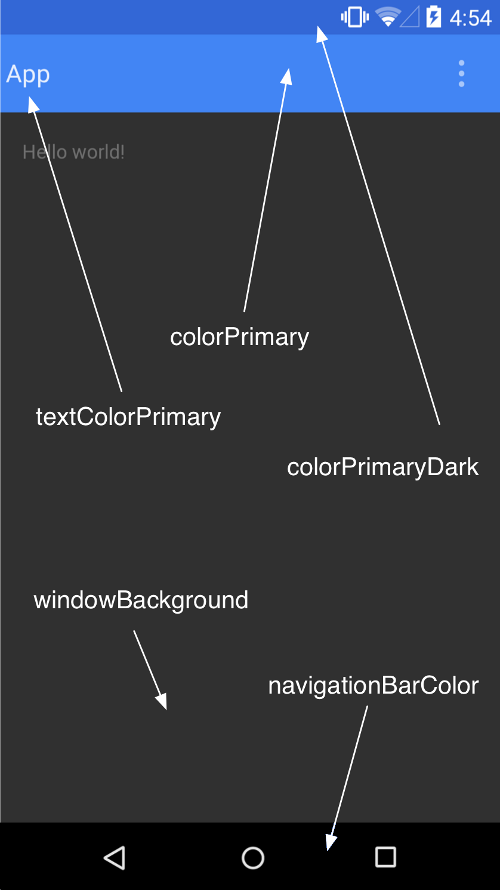
</resources>在上面的代码中,通过设置primary, primary-dark 和 accent三个属性的颜色,自定义了应用的Color Palette.
其他的主题设置可以参考下面图片进行自定义设置。需要注意的是不能在项目名称的前面带有android:前缀(例如:android:colorPrimaryDark),这是因为它需要向后兼容,android:注解需要的最小API级别是21,上面使用的主题带有NoActionBar是因为我们需要使用Toolbar去作为Action Bar。
(SOURCE: https://developer.android.com/training/material/theme.html)
在/layout/activity_main中加入ToolBar。
<RelativeLayout xmlns:android="http://schemas.android.com/apk/res/android"
    xmlns:tools="http://schemas.android.com/tools"
    android:layout_width="match_parent"
    android:layout_height="match_parent"
    tools:context=".MainActivity">

    <android.support.v7.widget.Toolbar
        android:id="@+id/toolbar"
        android:layout_width="match_parent"
        android:layout_height="?attr/actionBarSize"
        android:background="?attr/colorPrimary"
        android:theme="@style/ThemeOverlay.AppCompat.Dark" />

</RelativeLayout>
在上面我们加入了支持库中的ToolBar,如果你只需要支持的API级别是21及其以上,你就只需要使用默认的ToolBar组件而不需要使用支持库中的。
在MainActivity.java文件中,我们做下面这些修改:
@Override
protected void onCreate(Bundle savedInstanceState) {
    super.onCreate(savedInstanceState);
    setContentView(R.layout.activity_main);
    //获取ToolBar的引用
    Toolbar toolbar = (Toolbar) findViewById(R.id.toolbar);
    //把toolbar设置为actionbar
    setSupportActionBar(toolbar);
    //获取到actionbar
    ActionBar actionBar = getSupportActionBar();
    //设置Home icon
    actionBar.setHomeAsUpIndicator(R.drawable.ic_menu);
    actionBar.setDisplayHomeAsUpEnabled(true);
}下载资源文件夹,在这个里面包含了图片资源,你可以直接复制到你工程的res目录下,这样你上面的代码就不会报错。
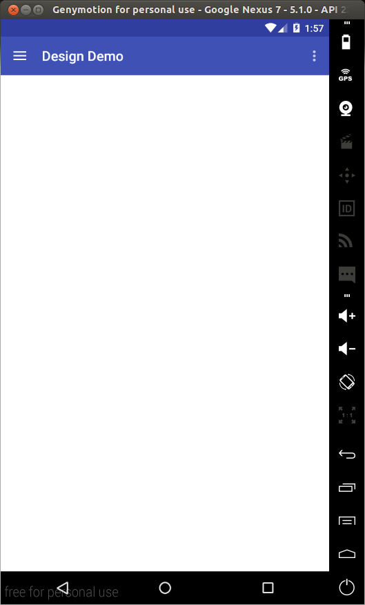
上面的代码具体做了什么事情,可以看上面的注释,运行项目,效果图如下:
NavigationView
导航抽屉是一个普通的组件在Android应用中,通过设计支持库我们可以很轻松的实现这种效果。
继续修改activity_main.xml文件的内容如下:
<android.support.v4.widget.DrawerLayout
    xmlns:android="http://schemas.android.com/apk/res/android"
    xmlns:app="http://schemas.android.com/apk/res-auto"
    android:id="@+id/drawer_layout"
    android:layout_width="match_parent"
    android:layout_height="match_parent"
    android:fitsSystemWindows="true">

    <RelativeLayout
        android:layout_width="match_parent"
        android:layout_height="match_parent">

        <android.support.v7.widget.Toolbar
            android:id="@+id/toolbar"
            android:layout_width="match_parent"
            android:layout_height="?attr/actionBarSize"
            android:background="?attr/colorPrimary"
            android:theme="@style/ThemeOverlay.AppCompat.Dark" />

    </RelativeLayout>

    <android.support.design.widget.NavigationView
        android:id="@+id/navigation_view"
        android:layout_width="wrap_content"
        android:layout_height="match_parent"
        android:layout_gravity="start"
        app:headerLayout="@layout/drawer_header"
        app:menu="@menu/drawer"/>
</android.support.v4.widget.DrawerLayout>
在上面的代码中,我们添加了一个NavigationView到布局中,NavigationView是放在DrawerLayout里面,它里面有两个比较重要的属性,一个是app:headerLayout,它是NavigationView顶部的布局,一个是app:menu它是这个导航视图的菜单条目,也就是说整个导航视图包含两部分内容,一个是顶部视图,一个是菜单项。
下面我们在res/layout文件夹中创建这个顶部视图的布局drawer_header.xml。
<?xml version="1.0" encoding="utf-8"?>
<LinearLayout xmlns:android="http://schemas.android.com/apk/res/android"
    android:orientation="vertical"
    android:layout_width="match_parent"
    android:layout_height="150dp"
    android:background="?attr/colorPrimaryDark"
    android:padding="16dp"
    android:theme="@style/ThemeOverlay.AppCompat.Dark"
    android:gravity="bottom">

    <TextView
        android:layout_width="match_parent"
        android:layout_height="wrap_content"
        android:text="@string/drawer_header_text"
        android:textAppearance="@style/TextAppearance.AppCompat.Body1"/>

</LinearLayout>
接下来,我们在 MainActivity.java中加入下面的成员变量。
private DrawerLayout mDrawerLayout;在onCreate(Bundle)中加入下面的代码:
mDrawerLayout = (DrawerLayout) findViewById(R.id.drawer_layout);修改onOptionsItemSelected(MenuItem)这个函数里面的内容:
@Override
public boolean onOptionsItemSelected(MenuItem item) {
// Handle action bar item clicks here. The action bar will
// automatically handle clicks on the Home/Up button, so long
// as you specify a parent activity in AndroidManifest.xml.
int id = item.getItemId();
switch (id) {
case android.R.id.home:
mDrawerLayout.openDrawer(GravityCompat.START);
return true;
case R.id.action_settings:
return true;
}
return super.onOptionsItemSelected(item);
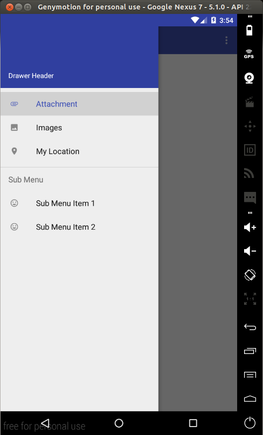
}下面运行程序,让点击Home键就可以看到这个抽屉效果,如下图:
为了捕获菜单项的点击事件,我们需要对NavigationView设置一个OnNavigationItemSelectedListener,在onCreate(Bundle)中放入下面代码:
NavigationView navigationView = (NavigationView) findViewById(R.id.navigation_view);
navigationView.setNavigationItemSelectedListener(new NavigationView.OnNavigationItemSelectedListener() {
        @Override
        public boolean onNavigationItemSelected(MenuItem menuItem) {
            menuItem.setChecked(true);
            mDrawerLayout.closeDrawers();
            Toast.makeText(MainActivity.this, menuItem.getTitle(), Toast.LENGTH_LONG).show();
            return true;
        }
    });
Floating Action Button (FAB)
设计库中的FloatingActionButton默认的颜色就是主题中的colorAccent。
添加一个FAB到布局中去,修改res/layout/activity_main.xml.
<android.support.v4.widget.DrawerLayout
xmlns:android="http://schemas.android.com/apk/res/android"
xmlns:app="http://schemas.android.com/apk/res-auto"
android:id="@+id/drawer_layout"
android:layout_width="match_parent"
android:layout_height="match_parent"
android:fitsSystemWindows="true">
<RelativeLayout
android:layout_width="match_parent"
android:layout_height="match_parent">
<android.support.v7.widget.Toolbar
android:id="@+id/toolbar"
android:layout_width="match_parent"
android:layout_height="?attr/actionBarSize"
android:background="?attr/colorPrimary"
android:theme="@style/ThemeOverlay.AppCompat.Dark" />
<android.support.design.widget.FloatingActionButton
android:id="@+id/fab"
android:layout_width="wrap_content"
android:layout_height="wrap_content"
android:layout_alignParentBottom="true"
android:layout_alignParentRight="true"
android:layout_marginRight="@dimen/activity_horizontal_margin"
android:layout_marginBottom="@dimen/activity_vertical_margin"
android:src="@drawable/ic_done" />
</RelativeLayout>
<android.support.design.widget.NavigationView
android:id="@+id/navigation_view"
android:layout_width="wrap_content"
android:layout_height="match_parent"
android:layout_gravity="start"
app:headerLayout="@layout/drawer_header"
app:menu="@menu/drawer"/>
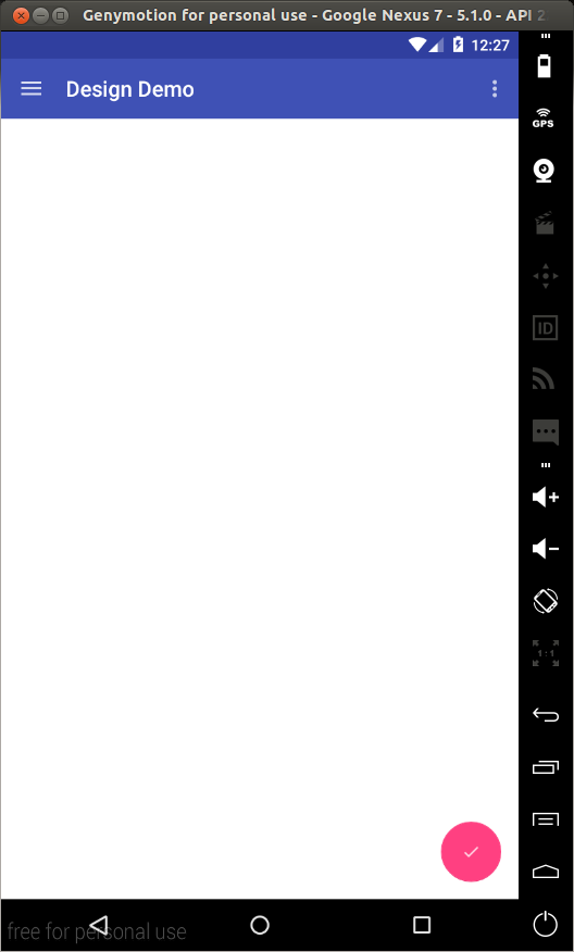
</android.support.v4.widget.DrawerLayout>在上面我们就在布局的右下方添加了一个FloatingActionButton,android:src属性用来设置这个按钮的图标,也可以在代码中使用setImageDrawable()来设置,运行程序,最终的效果如下。
Snackbar
一般情况下,如果我们需要呈现一个快速简洁的反馈给用户,我们可以使用Toast,现在有另一种选择—— Snackbar.
Snackbars显示在屏幕的底部,并且它的里面可以包含文本。它可以在给定的时间之后自动的以动画的形式消失在屏幕中,用户也可以在这个时间之前把它去掉。
下面我们在MainActivity.java的onCreate(Bundle)中添加如下代码:
FloatingActionButton fab = (FloatingActionButton)findViewById(R.id.fab);
fab.setOnClickListener(new View.OnClickListener() {
@Override
public void onClick(View v) {
//第一个参数是Snackbar尝试找到Snackbar视图的一个合适的父试图
//接着它就会显示在这个父试图的底部
Snackbar.make(findViewById(R.id.drawer_layout), "I'm a Snackbar", Snackbar.LENGTH_LONG).setAction("Action", new View.OnClickListener() {
@Override
public void onClick(View v) {
Toast.makeText(MainActivity.this, "Snackbar Action", Toast.LENGTH_LONG).show();
}
}).show();
}
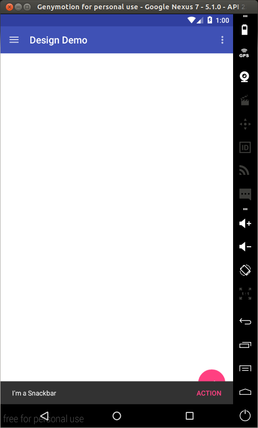
});在上面,我们为FAB设置了一个onClickListener,当FAB被点击的时候,Snackbar就会显示,我们为Snackbar也设置了一个onClickListener监听,当点击的时候会显示一个Toast,运行程序,效果如下:
TabLayout
在Android中,使用Tabs去转换在不同的视图之间已经不是一个新的概念了。设计库中的TabLayout简化了向应用程序中添加Tab的处理。
修改res/layout/activity_main.xml文件:
<android.support.v4.widget.DrawerLayout
    android:id="@+id/drawer_layout"
    xmlns:android="http://schemas.android.com/apk/res/android"
    xmlns:app="http://schemas.android.com/apk/res-auto"
    android:layout_width="match_parent"
    android:layout_height="match_parent"
    android:fitsSystemWindows="true">

    <RelativeLayout
        android:layout_width="match_parent"
        android:layout_height="match_parent">

        <LinearLayout
            android:layout_width="match_parent"
            android:layout_height="match_parent"
            android:orientation="vertical">

            <android.support.v7.widget.Toolbar
                android:id="@+id/toolbar"
                android:layout_width="match_parent"
                android:layout_height="?attr/actionBarSize"
                android:background="?attr/colorPrimary"
                android:theme="@style/ThemeOverlay.AppCompat.Dark" />

            <android.support.design.widget.TabLayout
                android:id="@+id/tablayout"
                android:layout_width="match_parent"
                android:layout_height="wrap_content"
                android:background="?attr/colorPrimary"
                app:tabGravity="fill"
                android:theme="@style/ThemeOverlay.AppCompat.Dark" />

            <android.support.v4.view.ViewPager
                android:id="@+id/viewpager"
                android:layout_width="match_parent"
                android:layout_height="0dp"
                android:layout_weight="1"/>

        </LinearLayout>

        <android.support.design.widget.FloatingActionButton
            android:id="@+id/fab"
            android:layout_width="wrap_content"
            android:layout_height="wrap_content"
            android:layout_alignParentBottom="true"
            android:layout_alignParentRight="true"
            android:layout_marginBottom="@dimen/activity_vertical_margin"
            android:layout_marginRight="@dimen/activity_horizontal_margin"
            android:src="@drawable/ic_done"/>

    </RelativeLayout>

    <android.support.design.widget.NavigationView
        android:id="@+id/navigation_view"
        android:layout_width="wrap_content"
        android:layout_height="match_parent"
        android:layout_gravity="start"
        app:headerLayout="@layout/drawer_header"
        app:menu="@menu/drawer"/>
</android.support.v4.widget.DrawerLayout>
上面的代码中添加了TabLayout和ViewPager,ViewPager可以在不同的tab中水平换页。
在MainActivity.java中添加下面的子类代码:
public static class DesignDemoFragment extends Fragment {
    private static final String TAB_POSITION = "tab_position";

    public DesignDemoFragment() {

    }

    public static DesignDemoFragment newInstance(int tabPosition) {
        DesignDemoFragment fragment = new DesignDemoFragment();
        Bundle args = new Bundle();
        args.putInt(TAB_POSITION, tabPosition);
        fragment.setArguments(args);
        return fragment;
    }

    @Nullable
    @Override
    public View onCreateView(LayoutInflater inflater, ViewGroup container, Bundle savedInstanceState) {
        Bundle args = getArguments();
        int tabPosition = args.getInt(TAB_POSITION);
        TextView tv = new TextView(getActivity());
        tv.setGravity(Gravity.CENTER);
        tv.setText("Text in Tab #" + tabPosition);
        return tv;
    }
}
static class DesignDemoPagerAdapter extends FragmentStatePagerAdapter {
public DesignDemoPagerAdapter(FragmentManager fm) {
super(fm);
}
@Override
public Fragment getItem(int position) {
return DesignDemoFragment.newInstance(position);
}
@Override
public int getCount() {
return 3;
}
@Override
public CharSequence getPageTitle(int position) {
return "Tab " + position;
}
}在onCreate(Bundle)中添加下面的代码:
DesignDemoPagerAdapter adapter = new DesignDemoPagerAdapter(getSupportFragmentManager());
ViewPager viewPager = (ViewPager)findViewById(R.id.viewpager);
viewPager.setAdapter(adapter);
TabLayout tabLayout = (TabLayout)findViewById(R.id.tablayout);
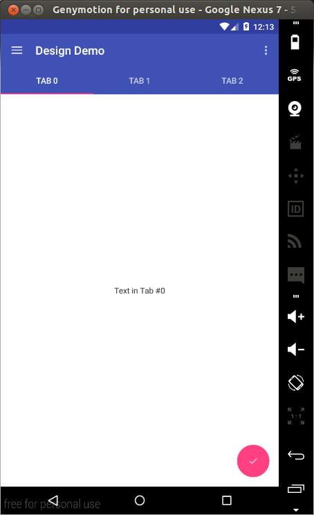
tabLayout.setupWithViewPager(viewPager);在上面代码中,我们创建了一个带有TextView的Fragment,然后创建一个FragmentStatePagerAdapter作为ViewPager的adapter,其中DesignDemoPagerAdapter的getCount函数可以返回pages的页数,getItem(int)返回放置在显示页的Fragment,getPageTitle(int) 返回显示在Tab上的标题,上面的这些在我们在TabLayout中使用setupWithViewPager就会起作用,运行这个程序,运行效果如下:
CoordinatorLayout
CoordinatorLayout这个布局对孩子view的触摸事件提供了额外的控制级别,在设计库中的很多组件都可以使用这个。其中一个例子就是将FloatingActionButton作为CoordinatorLayout的一个孩子,然后将CoordinatorLayout传递给你的Snackbar.make()调用。
在之前的效果中我们的snackbar的显示是覆盖在浮悬按钮的上面,当snackbar向上移动时,FloatingActionButton可以利用CoordinatorLayout提供的这种额外的回调跟着上移,当snackbar下移消失时,浮悬按钮也会相应的下移。它只能用在Android 3.0及其之上的系统上。
在res/layout/activity_main.xml 的布局文件中使用CoordinatorLayout.
<android.support.v4.widget.DrawerLayout
    android:id="@+id/drawer_layout"
    xmlns:android="http://schemas.android.com/apk/res/android"
    xmlns:app="http://schemas.android.com/apk/res-auto"
    android:layout_width="match_parent"
    android:layout_height="match_parent"
    android:fitsSystemWindows="true">

    <android.support.design.widget.CoordinatorLayout
        android:id="@+id/coordinator"
        android:layout_width="match_parent"
        android:layout_height="match_parent">

        <LinearLayout
            android:layout_width="match_parent"
            android:layout_height="match_parent"
            android:orientation="vertical">

            <android.support.v7.widget.Toolbar
                android:id="@+id/toolbar"
                android:layout_width="match_parent"
                android:layout_height="?attr/actionBarSize"
                android:background="?attr/colorPrimary"
                android:theme="@style/ThemeOverlay.AppCompat.Dark" />

            <android.support.design.widget.TabLayout
                android:id="@+id/tablayout"
                android:layout_width="match_parent"
                android:layout_height="wrap_content"
                android:background="?attr/colorPrimary"
                app:tabGravity="fill"
                android:theme="@style/ThemeOverlay.AppCompat.Dark" />

            <android.support.v4.view.ViewPager
                android:id="@+id/viewpager"
                android:layout_width="match_parent"
                android:layout_height="0dp"
                android:layout_weight="1"/>

        </LinearLayout>

        <android.support.design.widget.FloatingActionButton
            android:id="@+id/fab"
            android:layout_width="wrap_content"
            android:layout_height="wrap_content"
            android:layout_alignParentBottom="true"
            android:layout_gravity="bottom|right"
            android:layout_marginBottom="@dimen/activity_vertical_margin"
            android:layout_marginRight="@dimen/activity_horizontal_margin"
            android:src="@drawable/ic_done"/>

    </android.support.design.widget.CoordinatorLayout>

    <android.support.design.widget.NavigationView
        android:id="@+id/navigation_view"
        android:layout_width="wrap_content"
        android:layout_height="match_parent"
        android:layout_gravity="start"
        app:headerLayout="@layout/drawer_header"
        app:menu="@menu/drawer"/>
</android.support.v4.widget.DrawerLayout>
从上面我们可以看到,FAB是CoordinatorLayout的一个孩子,我们将RelativeLayout替换成了CoordinatorLayout,另外我们将FAB的位置设置成了android:layout_gravity=”bottom|right”。
接下来,在MainActivity.java中,当构建Snackbar,我们只需要传递CoordinatorLayout作为作为它的第一个参数。
Snackbar.make(findViewById(R.id.coordinator), "I'm a Snackbar", Snackbar.LENGTH_LONG).setAction("Action", new View.OnClickListener() {
                @Override
                public void onClick(View v) {
                    Toast.makeText(MainActivity.this, "Snackbar Action", Toast.LENGTH_LONG).show();
                }
            }).show();
运行程序,我们可以看到下面的效果:
对应CoordinatorLayout的另一个主要的用法是关于app bar和滚动特性。设计库中提供了AppBarLayout,它运行ToolBar和其他的View(例如TabLayout中的tabs)在标记了ScrollingViewBehavior的兄弟View之间去交互一个滚动事件。
如果需要看到这种效果,我们需要创建可以滚动的视图,我们将使用RecyclerView去创建一个可以滚动的列表。
在build.gradle (Module: app)文件中添加下面内容,另外跟上面一样同步更新。
compile 'com.android.support:recyclerview-v7:21.0.2'在res/layout文件夹下创建fragment_list_view.xml并且添加下面内容:
<?xml version="1.0" encoding="utf-8"?>
<android.support.v7.widget.RecyclerView
    xmlns:android="http://schemas.android.com/apk/res/android"
    android:id="@+id/recyclerview"
    android:layout_width="match_parent"
    android:layout_height="match_parent"/>
在res/layout文件夹下创建list_row.xml文件并且添加下面内容:
<?xml version="1.0" encoding="utf-8"?>
<LinearLayout xmlns:android="http://schemas.android.com/apk/res/android"
          android:orientation="vertical"
          android:padding="16dp"
          android:layout_width="match_parent"
          android:layout_height="56dp">

    <TextView
        android:id="@+id/list_item"
        android:layout_width="wrap_content"
        android:layout_height="wrap_content"/>

</LinearLayout>
创建一个Java文件并且命名为DesignDemoRecyclerAdapter.java
package com.echessa.designdemo; // Rename as Appropriate

import android.support.v7.widget.RecyclerView;
import android.view.LayoutInflater;
import android.view.View;
import android.view.ViewGroup;
import android.widget.TextView;

import java.util.List;

/**
 * Created by echessa on 7/24/15.
 */
public class DesignDemoRecyclerAdapter extends RecyclerView.Adapter<DesignDemoRecyclerAdapter.ViewHolder> {

    private List<String> mItems;

    DesignDemoRecyclerAdapter(List<String> items) {
        mItems = items;
    }

    @Override
    public ViewHolder onCreateViewHolder(ViewGroup viewGroup, int i) {
        View v = LayoutInflater.from(viewGroup.getContext()).inflate(R.layout.list_row, viewGroup, false);

        return new ViewHolder(v);
    }

    @Override
    public void onBindViewHolder(ViewHolder viewHolder, int i) {
        String item = mItems.get(i);
        viewHolder.mTextView.setText(item);
    }

    @Override
    public int getItemCount() {
        return mItems.size();
    }

    public class ViewHolder extends RecyclerView.ViewHolder {

        private final TextView mTextView;

        ViewHolder(View v) {
            super(v);
            mTextView = (TextView)v.findViewById(R.id.list_item);
        }
    }

}
在MainActivity.java中修改DesignDemoFragment.onCreateView()的内容:
@Nullable
@Override
public View onCreateView(LayoutInflater inflater, ViewGroup container, Bundle savedInstanceState) {
Bundle args = getArguments();
int tabPosition = args.getInt(TAB_POSITION);
ArrayList<String> items = new ArrayList<String>();
for (int i = 0; i < 50; i++) {
items.add("Tab #" + tabPosition + " item #" + i);
}
View v = inflater.inflate(R.layout.fragment_list_view, container, false);
RecyclerView recyclerView = (RecyclerView)v.findViewById(R.id.recyclerview);
recyclerView.setLayoutManager(new LinearLayoutManager(getActivity()));
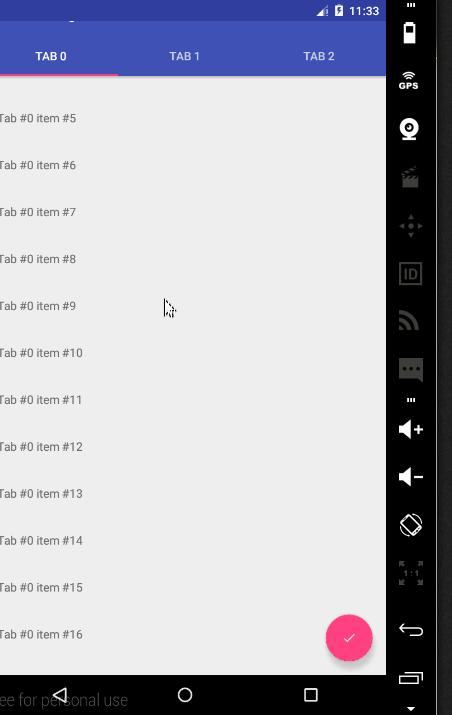
recyclerView.setAdapter(new DesignDemoRecyclerAdapter(items));
return v;
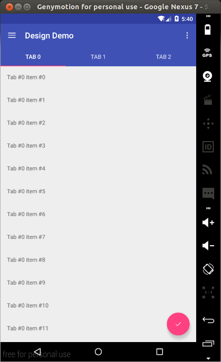
}运行程序,可以看到下面的执行效果:
下面我们来看看CoordinatorLayout提供的滚动行为:
修改activity_main.xml文件:
<android.support.v4.widget.DrawerLayout
    android:id="@+id/drawer_layout"
    xmlns:android="http://schemas.android.com/apk/res/android"
    xmlns:app="http://schemas.android.com/apk/res-auto"
    android:layout_width="match_parent"
    android:layout_height="match_parent"
    android:fitsSystemWindows="true">

    <android.support.design.widget.CoordinatorLayout
        android:id="@+id/coordinator"
        android:layout_width="match_parent"
        android:layout_height="match_parent">

        <android.support.design.widget.AppBarLayout
            android:layout_width="match_parent"
            android:layout_height="wrap_content"
            android:theme="@style/ThemeOverlay.AppCompat.Dark">

            <android.support.v7.widget.Toolbar
                android:id="@+id/toolbar"
                android:layout_width="match_parent"
                android:layout_height="?attr/actionBarSize"
                android:background="?attr/colorPrimary"
                app:layout_scrollFlags="scroll|enterAlways"/>

            <android.support.design.widget.TabLayout
                android:id="@+id/tablayout"
                android:layout_width="match_parent"
                android:layout_height="wrap_content"
                android:background="?attr/colorPrimary"
                app:tabGravity="fill"/>

        </android.support.design.widget.AppBarLayout>

        <android.support.v4.view.ViewPager
            android:id="@+id/viewpager"
            android:layout_width="match_parent"
            android:layout_height="match_parent"
            app:layout_behavior="@string/appbar_scrolling_view_behavior"/>

        <android.support.design.widget.FloatingActionButton
            android:id="@+id/fab"
            android:layout_width="wrap_content"
            android:layout_height="wrap_content"
            android:layout_alignParentBottom="true"
            android:layout_gravity="bottom|right"
            android:layout_marginBottom="@dimen/activity_vertical_margin"
            android:layout_marginRight="@dimen/activity_horizontal_margin"
            android:src="@drawable/ic_done"/>

    </android.support.design.widget.CoordinatorLayout>

    <android.support.design.widget.NavigationView
        android:id="@+id/navigation_view"
        android:layout_width="wrap_content"
        android:layout_height="match_parent"
        android:layout_gravity="start"
        app:headerLayout="@layout/drawer_header"
        app:menu="@menu/drawer"/>
</android.support.v4.widget.DrawerLayout>
上面,我们把Toolbar和TabLayout包含在AppBarLayout中,AppBarLayout允许Toolbar和标记了ScrollingViewBehavior的其他兄弟View(例如:TabLayout的tabs)之间交互滚动事件。
当用户滚动RecyclerView,AppBarLayout通过使用它的孩子的滚动便签去控制它们是如何滑入和滑出。
标签包括:
scroll: 这个标签设置给所有希望滚出屏幕的view,如果不设置这个标签,它们将保持不动。
enterAlways:这个标签确保任何向下滚动将导致view变得可见。
enterAlwaysCollapsed:当你的View设置了最小的高度minHeight,你就可以使用这个标签,你的view就可以随着滚动在最小高度和原有高度之间变化。
exitUntilCollapsed:这个标签导致标签滚出,当收缩到最小高度。
注意:在ViewPager中我们使用了app:layout_behavior=”@string/appbar_scrolling_view_behavior”,这个支持库包含了一些特殊的字符串资源@string/appbar_scrolling_view_behavior,它们会被映射到AppBarLayout.ScrollingViewBehavior,使用这个是为了通知AppBarLayout,当在某一个view中进行滚动的时候.
运行效果如下:
CollapsingToolbarLayout
CollapsingToolbarLayour对AppBar提供了另一种类型的滚动行为,为了看到这个效果,我们需要创建一个包含Toolbar却不包含TabLayout的Activity。
创建一个Activity命名为SecondActivity.
在res/layout/activity_second.xml中修改布局:
<android.support.design.widget.CoordinatorLayout
    xmlns:android="http://schemas.android.com/apk/res/android"
    xmlns:app="http://schemas.android.com/apk/res-auto"
    android:layout_width="match_parent"
    android:layout_height="match_parent">

    <android.support.design.widget.AppBarLayout
        android:layout_width="match_parent"
        android:layout_height="250dp"
        android:theme="@style/ThemeOverlay.AppCompat.Dark.ActionBar">

        <android.support.design.widget.CollapsingToolbarLayout
            android:id="@+id/collapsing_toolbar"
            android:layout_width="match_parent"
            android:layout_height="match_parent"
            app:contentScrim="?attr/colorPrimary"
            app:layout_scrollFlags="scroll|exitUntilCollapsed">

            <ImageView
                android:layout_width="match_parent"
                android:layout_height="match_parent"
                android:scaleType="centerCrop"
                android:src="@drawable/image"
                app:layout_collapseMode="parallax"/>

            <android.support.v7.widget.Toolbar
                android:id="@+id/toolbar"
                android:layout_width="match_parent"
                android:layout_height="?attr/actionBarSize"
                app:layout_collapseMode="pin"/>

        </android.support.design.widget.CollapsingToolbarLayout>

    </android.support.design.widget.AppBarLayout>

    <android.support.v4.widget.NestedScrollView
        android:layout_width="match_parent"
        android:layout_height="match_parent"
        app:layout_behavior="@string/appbar_scrolling_view_behavior">

        <LinearLayout
            android:layout_width="match_parent"
            android:layout_height="match_parent"
            android:orientation="vertical"
            android:paddingTop="24dp">

            <android.support.v7.widget.CardView
                android:layout_width="match_parent"
                android:layout_height="wrap_content"
                android:layout_margin="16dp">

                <LinearLayout
                    android:layout_width="match_parent"
                    android:layout_height="wrap_content"
                    android:orientation="vertical"
                    android:padding="16dp">

                    <TextView
                        android:layout_width="match_parent"
                        android:layout_height="wrap_content"
                        android:text="Lorem ipsum"/>

                    <TextView
                        android:layout_width="match_parent"
                        android:layout_height="wrap_content"
                        android:text="@string/second_activity_text"/>

                </LinearLayout>

            </android.support.v7.widget.CardView>

            <android.support.v7.widget.CardView
                android:layout_width="match_parent"
                android:layout_height="wrap_content"
                android:layout_marginBottom="16dp"
                android:layout_marginLeft="16dp"
                android:layout_marginRight="16dp">

                <LinearLayout
                    android:layout_width="match_parent"
                    android:layout_height="wrap_content"
                    android:orientation="vertical"
                    android:padding="16dp">

                    <TextView
                        android:layout_width="match_parent"
                        android:layout_height="wrap_content"
                        android:text="Sed quam eros"/>

                    <TextView
                        android:layout_width="match_parent"
                        android:layout_height="wrap_content"
                        android:text="@string/second_activity_text"/>

                </LinearLayout>

            </android.support.v7.widget.CardView>

            <android.support.v7.widget.CardView
                android:layout_width="match_parent"
                android:layout_height="wrap_content"
                android:layout_marginBottom="16dp"
                android:layout_marginLeft="16dp"
                android:layout_marginRight="16dp">

                <LinearLayout
                    android:layout_width="match_parent"
                    android:layout_height="wrap_content"
                    android:orientation="vertical"
                    android:padding="16dp">

                    <TextView
                        android:layout_width="match_parent"
                        android:layout_height="wrap_content"
                        android:text="Sed a euismod dui"/>

                    <TextView
                        android:layout_width="match_parent"
                        android:layout_height="wrap_content"
                        android:text="@string/second_activity_text"/>

                </LinearLayout>

            </android.support.v7.widget.CardView>

            <android.support.v7.widget.CardView
                android:layout_width="match_parent"
                android:layout_height="wrap_content"
                android:layout_marginBottom="16dp"
                android:layout_marginLeft="16dp"
                android:layout_marginRight="16dp">

                <LinearLayout
                    android:layout_width="match_parent"
                    android:layout_height="wrap_content"
                    android:orientation="vertical"
                    android:padding="16dp">

                    <TextView
                        android:layout_width="match_parent"
                        android:layout_height="wrap_content"
                        android:text="Fusce nec lacinia mi"/>

                    <TextView
                        android:layout_width="match_parent"
                        android:layout_height="wrap_content"
                        android:text="@string/second_activity_text"/>

                </LinearLayout>

            </android.support.v7.widget.CardView>

            <android.support.v7.widget.CardView
                android:layout_width="match_parent"
                android:layout_height="wrap_content"
                android:layout_marginBottom="16dp"
                android:layout_marginLeft="16dp"
                android:layout_marginRight="16dp">

                <LinearLayout
                    android:layout_width="match_parent"
                    android:layout_height="wrap_content"
                    android:orientation="vertical"
                    android:padding="16dp">

                    <TextView
                        android:layout_width="match_parent"
                        android:layout_height="wrap_content"
                        android:text="Praesent hendrerit"/>

                    <TextView
                        android:layout_width="match_parent"
                        android:layout_height="wrap_content"
                        android:text="@string/second_activity_text"/>

                </LinearLayout>

            </android.support.v7.widget.CardView>

        </LinearLayout>

    </android.support.v4.widget.NestedScrollView>

</android.support.design.widget.CoordinatorLayout>
在SecondActivity.java中修改onCreate(Bundle)内容:
@Override
protected void onCreate(Bundle savedInstanceState) {
super.onCreate(savedInstanceState);
setContentView(R.layout.activity_second);
Toolbar toolbar = (Toolbar) findViewById(R.id.toolbar);
setSupportActionBar(toolbar);
getSupportActionBar().setDisplayHomeAsUpEnabled(true);
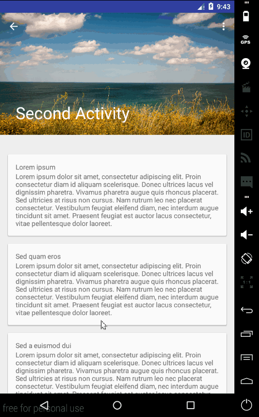
CollapsingToolbarLayout collapsingToolbar = (CollapsingToolbarLayout) findViewById(R.id.collapsing_toolbar);
collapsingToolbar.setTitle("Second Activity");
}在manifest中,添加下面内容在SecondActivity里面。
<meta-data
            android:name="android.support.PARENT_ACTIVITY"
            android:value="com.echessa.designdemo.MainActivity" />
在DesignDemoRecyclerAdapter.java中修改onBindViewHolder()的内容:
@Override
public void onBindViewHolder(ViewHolder viewHolder, int i) {
    String item = mItems.get(i);
    viewHolder.mTextView.setText(item);

    viewHolder.mTextView.setOnClickListener(new View.OnClickListener() {
        @Override
        public void onClick(View view) {
            Context context = view.getContext();
            context.startActivity(new Intent(context, SecondActivity.class));
        }
    });
}
运行程序,运行效果如下:
Floating Labels for EditText
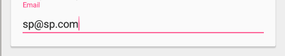
在activity_second.xml的一个CardViews内部,加入如下代码:
<android.support.design.widget.TextInputLayout
                    android:layout_width="match_parent"
                    android:layout_height="wrap_content">

    <EditText
        android:layout_width="match_parent"
        android:layout_height="wrap_content"
        android:inputType="textEmailAddress"
        android:hint="Email" />

</android.support.design.widget.TextInputLayout>
另外,你可以显示错误信息在EditText的下面通过调用setError().
运行效果如下:
原文链接:
Material Design with the Android Design Support Library
可参考文章:
Design Support Library
Android Design Support Library


 3072
3072


 被折叠的 条评论
为什么被折叠?
被折叠的 条评论
为什么被折叠?
 到【灌水乐园】发言


