


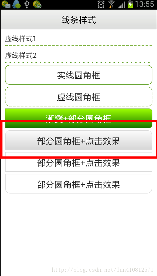
点击效果:
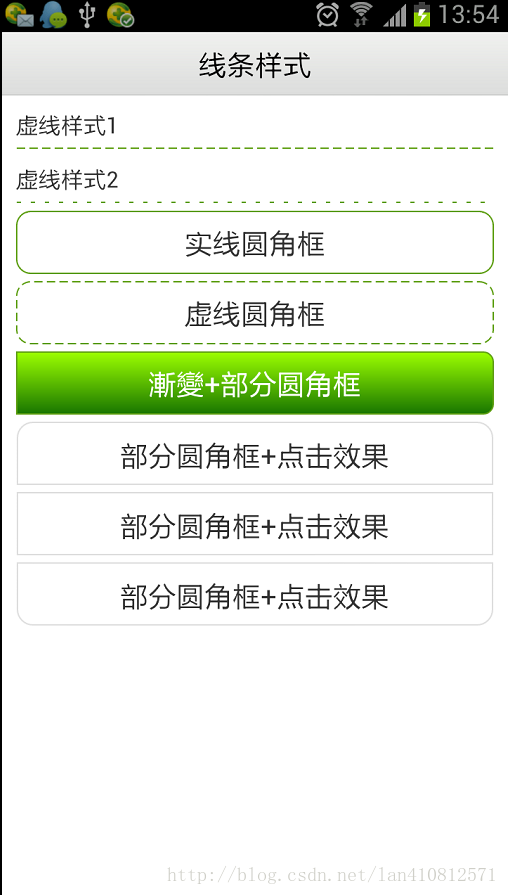
设置虚线:
- <?xml version="1.0" encoding="utf-8"?>
- <shape xmlns:android="http://schemas.android.com/apk/res/android"
- android:shape="line" >
- <stroke
- android:dashGap="3dp"
- android:dashWidth="6dp"
- android:width="1dp"
- android:color="#63a219" />
- <!-- 虚线的高度 -->
- <size android:height="1dp" />
- </shape>
其中,破折线的宽度为dashWith,破折线之间的空隙的宽度为dashGap,当dashGap=0dp时,为实线
建立dotted_line_gray.xml文件放在drawable文件夹下面。
android:shape="line" 可以修改你想要的形状
- <?xml version="1.0" encoding="utf-8"?>
- <shape xmlns:android="http://schemas.android.com/apk/res/android"
- android:shape="line">
- <!-- 显示一条虚线,破折线的宽度为dashWith,破折线之间的空隙的宽度为dashGap,当dashGap=0dp时,为实线 -->
- <stroke android:width="1dp" android:color="#D5D5D5"
- android:dashWidth="2dp" android:dashGap="3dp" />
- <!-- 虚线的高度 -->
- <size android:height="2dp" />
- </shape>
然后在布局的xml里面:
作为ImageView或者Linearlayout等作为背景源就可以了。
- <LinearLayout
- android:id="@+id/activity_line"
- android:layout_width="fill_parent"
- android:layout_height="wrap_content"
- android:layout_marginLeft="5dip"
- android:layout_marginRight="5dip"
- android:background="@drawable/dotted_line_gray" />
画直线:
<View
android:layout_height="1px"
android:layout_width="fill_parent"
android:background="#c8c8c8"
></View>
设置圆角:
- <?xml version="1.0" encoding="utf-8"?>
- <shape xmlns:android="http://schemas.android.com/apk/res/android"
- android:shape="rectangle">
- <!-- 填充颜色 -->
- <solid android:color="#FFFFFF"></solid>
- <!-- 线的宽度,颜色灰色 -->
- <stroke android:width="1dp" android:color="#63a219"></stroke>
- <!-- 矩形的圆角半径 -->
- <corners android:radius="10dp" />
- </shape>
设置渐变填充和四个圆角半径:
- <shape xmlns:android="http://schemas.android.com/apk/res/android"
- android:shape="rectangle">
- <!--分別對應上面左圆角的半径,上面右圆角的半径,下面左圆角的半径,下面右圆角的半径-->
- <corners
- android:topLeftRadius="0dp"
- android:topRightRadius="7dp"
- android:bottomLeftRadius="0dp"
- android:bottomRightRadius="7dp"/>
- <!--設置漸變-->
- <gradient android:startColor="#9cff00"
- android:endColor="#197600"
- android:angle="270"/>
- <stroke
- android:width="1dp"
- android:color="#63a219" />
- </shape>
- <style name="list_item_top">
- <item name="android:clickable">true</item>
- <item name="android:focusable">true</item>
- <item name="android:paddingTop">10dip</item>
- <item name="android:paddingBottom">10dip</item>
- <item name="android:paddingLeft">10dip</item>
- <item name="android:paddingRight">10dip</item>
- <item name="android:gravity">center_vertical</item>
- <item name="android:background">@drawable/background_view_rounded_top</item>
- </style>
- <?xml version="1.0" encoding="UTF-8"?>
- <inset xmlns:android="http://schemas.android.com/apk/res/android"
- android:insetLeft="1.0px"
- android:insetRight="1.0px" >
- <selector>
- <item android:state_pressed="true">
- <shape>
- <gradient
- android:angle="270.0"
- android:endColor="@color/base_end_color_pressed"
- android:startColor="@color/base_start_color_pressed" />
- <corners
- android:bottomLeftRadius="0.0dip"
- android:bottomRightRadius="0.0dip"
- android:radius="2.0dip"
- android:topLeftRadius="10.0dip"
- android:topRightRadius="10.0dip" />
- <stroke
- android:width="1dp"
- android:color="#eededede" />
- </shape>
- </item>
- <item>
- <shape>
- <gradient
- android:angle="270.0"
- android:endColor="@color/base_end_color_default"
- android:startColor="@color/base_start_color_default" />
- <corners
- android:bottomLeftRadius="0.0dip"
- android:bottomRightRadius="0.0dip"
- android:radius="2.0dip"
- android:topLeftRadius="11.0dip"
- android:topRightRadius="11.0dip" />
- <stroke
- android:width="1dp"
- android:color="#eededede" />
- </shape>
- </item>
- </selector>
- </inset>


 240
240


 被折叠的 条评论
为什么被折叠?
被折叠的 条评论
为什么被折叠?
 到【灌水乐园】发言


