


我觉得根据框架的API,就能够修改样式,得到你想要的结果,灵活运用就好。
这两天做了’带图例还百分比的饼图‘,‘堆叠状的柱状图’,‘折线图’。
我使用的是highcharts这个框架,我觉得还是不错的,有详细的介绍和api。
另外,我在查资料的过程中,还发现的图表类的框架有jfreechart, echarts.以后可以尝试使用。
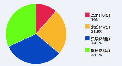
1,饼图
<pre name="code" class="html"><!DOCTYPE HTML>
<html>
<head>
    <meta http-equiv="Content-Type" content="text/html; charset=utf-8">
    <title>Highcharts Example</title>
    <style>
        g.highcharts-grid:nth-child(6) > path {
            stroke-width: 0;
        }
    </style>
    <script src="js/jquery-1.8.1.min.js"></script>
    <script type="text/javascript">
            $(function () {
                $('#container_1').highcharts({
                chart: {
                    type: 'pie',
					backgroundColor:"#EEF3FA",
                    x:-200,
                    height: 250,
                    marginLeft:-150

                },
                credits: {
                    enabled: false   //右下角不显示LOGO
                },
                title: {
                    text: '',
                },
                subtitle: {
                    text: '',
                },
                exporting: {//Highcharts 图表导出功能模块。
                    enabled: false
                },
                colors: ['#E2214E', '#F7B52B', '#0749C3', '#66FE17',
                         '#24CBE5', '#64E572', '#FF9655', '#FFF263', '#6AF9C4'],
                legend: {
                    layout: 'vertical',
                    floating: true,
                    backgroundColor: '#EEF3FA',
                    align: 'right',
                    verticalAlign: 'top',
                    y: 35,
                    x: -20,
                    itemMarginBottom :5,//图例的上下间距
                    maxHeight: 200,
                    symbolHeight: 14,//高度
                    symbolWidth:14
                },

                plotOptions: {
                    pie: {
                        allowPointSelect: false,
                        cursor: 'pointer',
                        dataLabels: {
                            enabled: false
                        },
                        showInLegend: true,
                        symbolWidth: 24,
                        point: {
                            events: {
                                legendItemClick: function (e) {
                                    return false; // 直接 return false 即可禁用图例点击事件
                                }
                            }
                        }
                    }
                },

                series: [{
                    data: [
                        ['高危'+'(10盘)' +'<br><span style="text-align:center;">10%</span>', 10.0],
                        ['危险'+'(22盘)'+'<br><span style="text-align:center;">21.9%</span>',     21.9],
                        ['只读'+'(28盘)'+'<br><span style="text-align:center;">28.1%</span>',28.1],
                        ['健康'+'(28盘)'+'<br><span style="text-align:center;">28.1%</span>',     28.1]
                    ]
                }]
            });
        });

    </script>
    <script src="js/highcharts.js"></script>
    <script src="js/info_alert.js"></script>
</head>
<body>
    <div id="container_1" style="width:100%; margin: 0 auto;background-color:#EEF3FA"></div>

</body>
</html>
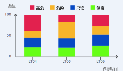
2,堆叠柱状图
<!DOCTYPE HTML>
<html>
<head>
    <meta http-equiv="Content-Type" content="text/html; charset=utf-8">
    <title>Highcharts Example</title>
    <link rel="stylesheet" type="text/css" href="css/column_diagram.css" />
    <link rel="stylesheet" type="text/css" href="css/info_report.css" />
	<style>
	g.highcharts-grid:nth-child(6) > path{
		stroke-width:0;
	}
    .highcharts-legend{
        margin-top:-30px;
    }
  g.highcharts-series:nth-child(7) > rect{
      width:32px !important;
  }
	</style>
    <script src="js/jquery-1.8.1.min.js"></script>
    <script type="text/javascript">
$(function () {
    $('#container').highcharts({
        chart: {
            type: 'column',    //指定图表的类型,默认是折线图(line)

        },
        credits: {
            enabled: false   //右下角不显示LOGO
        },
        title: {
            text: '',
        },
        subtitle: {
            text: '',
        },
        exporting: {//Highcharts 图表导出功能模块。
            enabled: false
        },
        plotOptions: {
            column: {
                stacking: 'percent'
            }
        },
        xAxis: {
            title: {
                text: '保存时间',
                align: 'high',
                rotation: 0,
            },
            categories: ['LT04', 'LT05', 'LT06'],
            labels: {
                align: 'center',
            },
            lineColor: '#000000',
            lineWidth: '2',
            tickColor: '#000000',
            tickWidth: 1,
            type: 'linear',
            tickmarkPlacement: 'on',


        },
        yAxis: {
            title: {
                align: 'high',
                offset: 0,
                text: '数量',
                rotation: 0,
                y: -25
            },
            plotLines: [{//通过颜色线横贯在绘图区域上标记轴中的一个特定值
                value: 0,
                width: 1,
                color: '#808080'
            }],
            lineColor: 'black',
            lineWidth: '2'
        },
        legend: { //图例说明是包含图表中数列标志和名称的容器
            align: 'center',
            verticalAlign: 'top',
            x: 20,
            y: 10,
            symbolHeight: 14,//高度
            symbolWidth:14
        },
        //禁用点击图例隐藏
        series: [{
            name: '高危',
            data: [5, 3, 4],
            color: '#E2214E',
        }, {
            name: '危险',
            data: [2, 7, 3],
            color: '#F7B52B'
        }, {
            name: '只读',
            data: [3, 4, 4],
            color: '#0749C3'
        },{
            name: '健康',
            data: [3, 4, 4],
            color: '#66FE17'
        }
    ]});
});
    </script>
    <script src="js/highcharts.js"></script>
    <script src="js/exporting.js"></script>
</head>
<body style="position:relative;">
    <div id="container" style="width:90%; height:250px; margin: 0 auto">
    </div>
    <div class="axis">
        <i></i>
    </div>
    <div class="axisy">
        <i class="y"></i>
    </div>
</body>
</html>
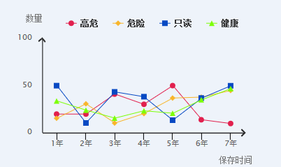
3,折线图
<!DOCTYPE HTML>
<html>
<head>
    <meta http-equiv="Content-Type" content="text/html; charset=utf-8">
    <title>Highcharts Example</title>
    <link rel="stylesheet" type="text/css" href="css/info_report.css" />
    <link rel="stylesheet" type="text/css" href="css/broken_line.css" />
	<style>
		g.highcharts-grid:nth-child(6) > path{
			stroke-width:0;
		}
        #container{
             width:100%;
        }
        .highcharts-background{
            width:100%;
        }
      .highcharts-series-group{
          margin-top:-100px;
      }

     g.highcharts-axis{
         margin-top:-10%;
     }
     g.highcharts-axis:nth-child(7) > path:nth-child(1){
         margin-top:-10%;
     }
	</style>
    <script src="js/jquery-1.8.1.min.js"></script>
    <script type="text/javascript">
$(function () {
    $('#container').highcharts({
        chart: {
            type: 'line',    //指定图表的类型,默认是折线图(line)
        },
        credits: {
            enabled: false   //右下角不显示LOGO
        },
        title: {
            text: '',
        },
        subtitle: {
            text: '',
        },
        exporting: {//Highcharts 图表导出功能模块。
            enabled: false
        },
        xAxis: {
            title: {
                text: '保存时间',
                align: 'high',
                rotation: 0,
                x:10,
                y:0,
            },
            categories: ['1年', '2年', '3年', '4年', '5年', '6年','7年'],
            labels: {
                align: 'center',
            },
            lineColor: '#000000',
            lineWidth: '2',
            tickColor: '#000000',
            tickWidth: 1,
            type: 'linear',
            tickmarkPlacement: 'on',


        },
        yAxis: {
            title: {
                align: 'high',
                offset: 0,
                text: '数量',
                rotation: 0,
                y: -25,
            },
            plotLines: [{//通过颜色线横贯在绘图区域上标记轴中的一个特定值
                value: 0,
                width: 1,
                color: '#808080'
            }],
            lineColor: 'black',
            lineWidth: '2',
            max:100
        },

        legend: { //图例说明是包含图表中数列标志和名称的容器
            align: 'center',
            verticalAlign: 'top',
            x: 30,
            y: 10,//修改距离上面的高度
        },
        //禁用点击图例隐藏
        plotOptions: {
            series: {
                events: {
                    legendItemClick: function(e) {
                        return false; // 直接 return false 即可禁用图例点击事件
                    }
                }
            }
        } ,
        series: [{
            name: '高危',
            color: '#E1204E',
            data: [20.0, 20.0, 41.2, 30.4, 50.2, 14.0, 10.0],
        }, {
            name: '危险',
            color: '#F8B52A',
            data: [15.6, 30.9, 10.5, 20.5, 37.0, 38.0, 45.0]
        }, {
            name: '只读',
            color: '#0749C3',
            data: [50.1, 10.6, 43.5, 38.4, 13.5, 37.0, 50.0]
        }, {
            name: '健康',
            color: '#7CFF06',
            data: [33.9, 24.2, 15.7, 23.5, 20.9, 35.2, 47.0]
        },
    ]});
});
    </script>
    <script src="js/highcharts.js"></script>
    <script src="js/exporting.js"></script>
</head>
<body>
    <div id="container" style="width:90%; height:250px; margin: 0 auto">
    </div>
    <div class="axis">
        <i></i>
    </div>
    <div class="axisy">
        <i class="y"></i>
    </div>
</body>
</html>
http://www.hcharts.cn/demo/highcharts


 9638
9638


 被折叠的 条评论
为什么被折叠?
被折叠的 条评论
为什么被折叠?
 到【灌水乐园】发言


