


首先,关于dp,px,dpi 等这些老生常谈的单位就不做详细的介绍了。这些个单位的介绍百度一抓一大把。
再讲解我自己对安卓3.0以上屏幕适配问题的理解以前,先介绍一下谷歌对安卓开发屏幕适配提的一些建议
Using new size qualifiers
The different resource configurations that you can specify based on the space available for your layout are summarized in table 2. These new qualifiers offer you more control over the specific screen sizes your application supports, compared to the traditional screen size groups (small, normal, large, and xlarge).
Note: The sizes that you specify using these qualifiers are not the actual screen sizes. Rather, the sizes are for the width or height in dp units that are available to your activity's window. The Android system might use some of the screen for system UI (such as the system bar at the bottom of the screen or the status bar at the top), so some of the screen might not be available for your layout. Thus, the sizes you declare should be specifically about the sizes needed by your activity—the system accounts for any space used by system UI when declaring how much space it provides for your layout. Also beware that the Action Bar is considered a part of your application's window space, although your layout does not declare it, so it reduces the space available for your layout and you must account for it in your design.
Table 2. New configuration qualifers for screen size (introduced in Android 3.2).
Screen configuration Qualifier values Description smallestWidth sw<N>dp
Examples:
sw600dp
sw720dp
The fundamental size of a screen, as indicated by the shortest dimension of the available screen area. Specifically, the device's smallestWidth is the shortest of the screen's available height and width (you may also think of it as the "smallest possible width" for the screen). You can use this qualifier to ensure that, regardless of the screen's current orientation, your application's has at least
<N>dps of width available for its UI.For example, if your layout requires that its smallest dimension of screen area be at least 600 dp at all times, then you can use this qualifer to create the layout resources,
res/layout-sw600dp/. The system will use these resources only when the smallest dimension of available screen is at least 600dp, regardless of whether the 600dp side is the user-perceived height or width. The smallestWidth is a fixed screen size characteristic of the device;the device's smallestWidth does not change when the screen's orientation changes.The smallestWidth of a device takes into account screen decorations and system UI. For example, if the device has some persistent UI elements on the screen that account for space along the axis of the smallestWidth, the system declares the smallestWidth to be smaller than the actual screen size, because those are screen pixels not available for your UI.
This is an alternative to the generalized screen size qualifiers (small, normal, large, xlarge) that allows you to define a discrete number for the effective size available for your UI. Using smallestWidth to determine the general screen size is useful because width is often the driving factor in designing a layout. A UI will often scroll vertically, but have fairly hard constraints on the minimum space it needs horizontally. The available width is also the key factor in determining whether to use a one-pane layout for handsets or multi-pane layout for tablets. Thus, you likely care most about what the smallest possible width will be on each device.
Available screen width w<N>dp
Examples:
w720dp
w1024dp
Specifies a minimum available width in dp units at which the resources should be used—defined by the
<N>value. The system's corresponding value for the width changes when the screen's orientation switches between landscape and portrait to reflect the current actual width that's available for your UI.This is often useful to determine whether to use a multi-pane layout, because even on a tablet device, you often won't want the same multi-pane layout for portrait orientation as you do for landscape. Thus, you can use this to specify the minimum width required for the layout, instead of using both the screen size and orientation qualifiers together.
Available screen height h<N>dp
Examples:
h720dp
h1024dp
etc.Specifies a minimum screen height in dp units at which the resources should be used—defined by the
<N>value. The system's corresponding value for the height changes when the screen's orientation switches between landscape and portrait to reflect the current actual height that's available for your UI.Using this to define the height required by your layout is useful in the same way as
w<N>dpis for defining the required width, instead of using both the screen size and orientation qualifiers. However, most apps won't need this qualifier, considering that UIs often scroll vertically and are thus more flexible with how much height is available, whereas the width is more rigid.
While using these qualifiers might seem more complicated than using screen size groups, it should actually be simpler once you determine the requirements for your UI. When you design your UI, the main thing you probably care about is the actual size at which your application switches between a handset-style UI and a tablet-style UI that uses multiple panes. The exact point of this switch will depend on your particular design—maybe you need a 720dp width for your tablet layout, maybe 600dp is enough, or 480dp, or some number between these. Using these qualifiers in table 2, you are in control of the precise size at which your layout changes.
For more discussion about these size configuration qualifiers, see the Providing Resources document.
Configuration examples
To help you target some of your designs for different types of devices, here are some numbers for typical screen widths:
- 320dp: a typical phone screen (240x320 ldpi, 320x480 mdpi, 480x800 hdpi, etc).
- 480dp: a tweener tablet like the Streak (480x800 mdpi).
- 600dp: a 7” tablet (600x1024 mdpi).
- 720dp: a 10” tablet (720x1280 mdpi, 800x1280 mdpi, etc).
Using the size qualifiers from table 2, your application can switch between your different layout resources for handsets and tablets using any number you want for width and/or height. For example, if 600dp is the smallest available width supported by your tablet layout, you can provide these two sets of layouts:
   res

   /

   layout

   /

   main_activity

   .

   xml

   # For handsets
   res

   /

   layout

   -

   sw600dp

   /

   main_activity

   .

   xml

   # For tablets
In this case, the smallest width of the available screen space must be 600dp in order for the tablet layout to be applied.
For other cases in which you want to further customize your UI to differentiate between sizes such as 7” and 10” tablets, you can define additional smallest width layouts:
   res

   /

   layout

   /

   main_activity

   .

   xml

   # For handsets (smaller than 600dp available width)
   res

   /

   layout

   -

   sw600dp

   /

   main_activity

   .

   xml

   # For 7” tablets (600dp wide and bigger)
   res

   /

   layout

   -

   sw720dp

   /

   main_activity

   .

   xml

   # For 10” tablets (720dp wide and bigger)
Notice that the previous two sets of example resources use the "smallest width" qualifer,
sw<N>dp, which specifies the smallest of the screen's two sides, regardless of the device's current orientation. Thus, usingsw<N>dpis a simple way to specify the overall screen size available for your layout by ignoring the screen's orientation.
However, in some cases, what might be important for your layout is exactly how much width or height iscurrently available. For example, if you have a two-pane layout with two fragments side by side, you might want to use it whenever the screen provides at least 600dp of width, whether the device is in landscape or portrait orientation. In this case, your resources might look like this:
   res

   /

   layout

   /

   main_activity

   .

   xml

   # For handsets (smaller than 600dp available width)
   res

   /

   layout

   -

   w600dp

   /

   main_activity

   .

   xml

   # Multi-pane (any screen with 600dp available width or more)
Notice that the second set is using the "available width" qualifier,
w<N>dp. This way, one device may actually use both layouts, depending on the orientation of the screen (if the available width is at least 600dp in one orientation and less than 600dp in the other orientation).
If the available height is a concern for you, then you can do the same using the
h<N>dpqualifier. Or, even combine thew<N>dpandh<N>dpqualifiers if you need to be really specific.
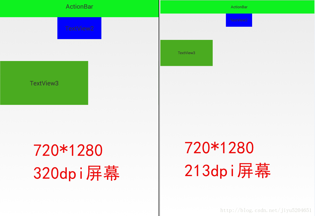
这是我用相同的布局文件在屏幕分辨率都是720*1280但屏幕密度分别是320dpi与213dpi两款手机上显示出来的效果。显然只使用dp来设置控件的宽高还是不够的,那么为什么会这样呢?
上图中 ActionBar 布局为 layout_width = "match_parent",layout_height="50dp",TextView2 布局为 layout_width = "100dp' ,layout_height = "50dp" ,TextView3 布局为 layout_width = "200dp" ,layout_height = "100dp";
ActionBar在屏幕1中所占高度 = 50 * ( 320/160 )= 100px,ActionBar在屏幕2中所占高度 = 50 * ( 213/160 )= 66.5625 px.


 4615
4615


 被折叠的 条评论
为什么被折叠?
被折叠的 条评论
为什么被折叠?
 到【灌水乐园】发言


