


import matplotlib.pyplot as plt
import csv
x = []
y = []with open('data.csv','r') as csvfile:
plots = csv.reader(csvfile, delimiter = ',')
for row in plots:
x.append(int(row[1]))
y.append(int(row[2]))
plt.scatter(x,y,label='Loaded form file1')
从网络中读取文件:
import matplotlib.pyplot as plt
import numpy as np
import urllib.request
import matplotlib.dates as mdates
def bytespdate2num(fmt, encoding='utf-8'):
strconverter = mdates.strpdate2num(fmt)
def bytesconverter(b):
s = b.decode(encoding)
return strconverter(s)
return bytesconverter
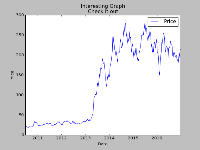
def graph_data(stock):
stock_price_url = 'http://chartapi.finance.yahoo.com/instrument/1.0/'+stock+'/chartdata;type=quote;range=10y/csv'
source_code = urllib.request.urlopen(stock_price_url).read().decode()
stock_data = []
split_source = source_code.split('\n')
for line in split_source:
split_line = line.split(',')
if len(split_line) == 6:
if 'values' not in line and 'labels' not in line:
stock_data.append(line)
date, closep, highp, lowp, openp, volume = np.loadtxt(stock_data,
delimiter=',',
unpack=True,
converters={0: bytespdate2num('%Y%m%d')})
plt.plot_date(date, closep,'-', label='Price')
plt.xlabel('Date')
plt.ylabel('Price')
plt.title('Interesting Graph\nCheck it out')
plt.legend()
plt.show()
graph_data('TSLA')
基本配置matplotlib:
import matplotlib.pyplot as plt
import numpy as np
import datetime as dt
import urllib.request
import matplotlib.dates as mdates
def bytespdate2num(fmt, encoding='utf-8'):
strconverter = mdates.strpdate2num(fmt)
def bytesconverter(b):
s = b.decode(encoding)
return strconverter(s)
return bytesconverter
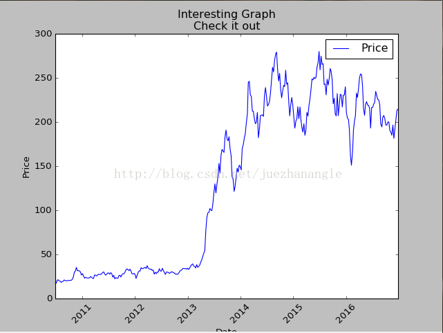
def graph_data(stock):
fig = plt.figure()
ax1 = plt.subplot2grid((1,1),(0,0)) #设置子窗体的起始位置,大小
# ax1.grid(True, linestyle='-' ,color='g')
stock_price_url = 'http://chartapi.finance.yahoo.com/instrument/1.0/'+stock+'/chartdata;type=quote;range=10y/csv'
source_code = urllib.request.urlopen(stock_price_url).read().decode()
stock_data = []
split_source = source_code.split('\n')
for line in split_source:
split_line = line.split(',')
if len(split_line) == 6:
if 'values' not in line and 'labels' not in line:
stock_data.append(line)
date, closep, highp, lowp, openp, volume = np.loadtxt(stock_data,
delimiter=',',
unpack=True,
)
dateconv = np.vectorize(dt.datetime.fromtimestamp) #修改UNIX时间,成为正常时间
date = dateconv(date) #转换时间
ax1.plot_date(date, closep, '-', label='Price')
for label in ax1.xaxis.get_ticklabels():
label.set_rotation(45)
plt.xlabel('Date')
plt.ylabel('Price')
plt.title('Interesting Graph\nCheck it out')
plt.grid(True, color='r') #添加背景格,并设置颜色
plt.legend()
plt.subplots_adjust(left=0.09, bottom=0.20, right=0.94, top=0.90, wspace=0.2, hspace=0.0) #设置子窗体的大小和位置
plt.show()
graph_data('TSLA')
知识点fill,填充图形中的对比反差:
import matplotlib.pyplot as plt
import numpy as np
import urllib
import datetime as dt
import matplotlib.dates as mdates
def bytespdate2num(fmt, encoding='utf-8'):
strconverter = mdates.strpdate2num(fmt)
def bytesconverter(b):
s = b.decode(encoding)
return strconverter(s)
return bytesconverter
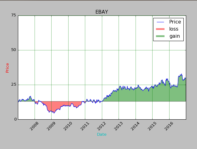
def graph_data(stock):
fig = plt.figure()
ax1 = plt.subplot2grid((1,1), (0,0)) #配置子窗口的大小和定位
stock_price_url = 'http://chartapi.finance.yahoo.com/instrument/1.0/'+stock+'/chartdata;type=quote;range=10y/csv'
source_code = urllib.request.urlopen(stock_price_url).read().decode()
stock_data = []
split_source = source_code.split('\n')
for line in split_source:
split_line = line.split(',')
if len(split_line) == 6:
if 'values' not in line and 'labels' not in line:
stock_data.append(line)
date, closep, highp, lowp, openp, volume = np.loadtxt(stock_data,
delimiter=',',
unpack=True,
converters={0: bytespdate2num('%Y%m%d')})
ax1.plot_date(date, closep,'-', label='Price') #date作为x轴,closep作为y轴,以横线画出曲线
ax1.plot([],[],linewidth=5, label='loss', color='r',alpha=0.5) #只是作为标记
ax1.plot([],[],linewidth=5, label='gain', color='g',alpha=0.5)
ax1.fill_between(date, closep, closep[0],where=(closep > closep[0]), facecolor='g', alpha=0.5) #大小不同来画线显示不同的颜色
ax1.fill_between(date, closep, closep[0],where=(closep < closep[0]), facecolor='r', alpha=0.5) #和上面是相同的
for label in ax1.xaxis.get_ticklabels():
label.set_rotation(45) #将子窗口的x轴上的标签旋转45
ax1.grid(True, color='g', linestyle='-') #linewidth=5) #为子窗口添加格子
ax1.xaxis.label.set_color('c') #将子窗口的x轴上的标签颜色换成c颜色
ax1.yaxis.label.set_color('r') #将子窗口的x轴上的标签颜色换成r颜色
ax1.set_yticks([0,25,50,75]) #设置y轴的区间范围
plt.xlabel('Date')
plt.ylabel('Price')
plt.title(stock)
plt.legend()
plt.subplots_adjust(left=0.09, bottom=0.20, right=0.94, top=0.90, wspace=0.2, hspace=0) #调节子窗体和母版之间的距离
plt.show()
graph_data('EBAY')


 577
577


 被折叠的 条评论
为什么被折叠?
被折叠的 条评论
为什么被折叠?
 到【灌水乐园】发言


