


介绍
使用Python进行数据分析,数据的可视化是数据分析结果最好的展示方式,这里从Analytic Vidhya中找到的相关数据,进行一系列图形的展示,从中得到更多的经验。
强烈推荐:Analytic Vidhya
Python数据可视化库
- Matplotlib:其能够支持所有的2D作图和部分3D作图。能通过交互环境做出印刷质量的图像。
- Seaborn:基于Matplotlib,seaborn提供许多功能,比如:内置主题、颜色调色板、函数和提供可视化单变量、双变量、线性回归的工具。其能帮助我们构建复杂的可视化。
数据集
| EMPID | Gender | Age | Sales | BMI | Income |
|---|---|---|---|---|---|
| E001 | M | 34 | 123 | Normal | 350 |
| E002 | F | 40 | 114 | Overweight | 450 |
| E003 | F | 37 | 135 | Obesity | 169 |
| E004 | M | 30 | 139 | Underweight | 189 |
| E005 | F | 44 | 117 | Underweight | 183 |
| E006 | M | 36 | 121 | Normal | 80 |
| E007 | M | 32 | 133 | Obesity | 166 |
| E008 | F | 26 | 140 | Normal | 120 |
| E009 | M | 32 | 133 | Normal | 75 |
| E010 | M | 36 | 133 | Underweight | 40 |
作图
# -*- coding:UTF-8 -*-

import matplotlib.pyplot as plt
import pandas as pd
import seaborn as sns
import numpy as np

# 0、导入数据集
df = pd.read_excel('first.xlsx', 'Sheet1')
# 1、直方图
fig = plt.figure()
ax = fig.add_subplot(111)
ax.hist(df['Age'], bins=7)
plt.title('Age distribution')
plt.xlabel('Age')
plt.ylabel('Employee')
plt.show()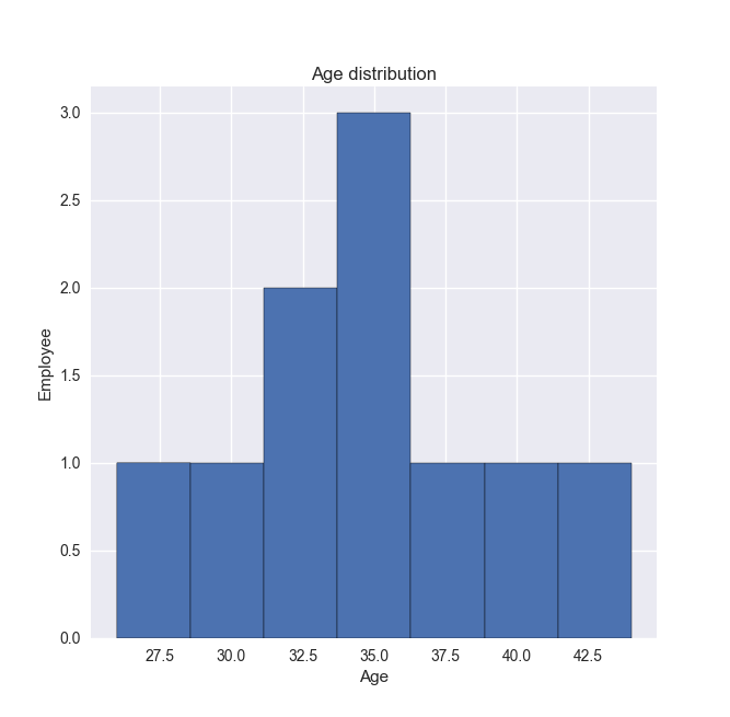
# 2、箱线图
fig = plt.figure()
ax = fig.add_subplot(111)
ax.boxplot(df['Age'])
plt.show()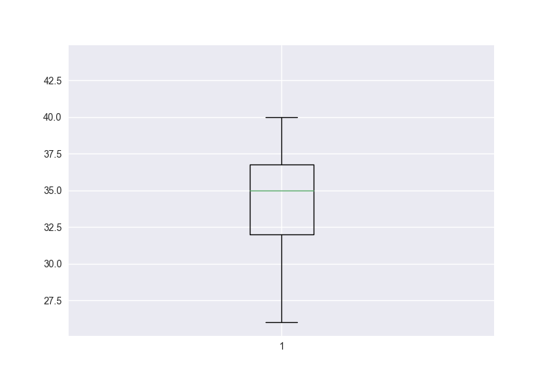
# 3、小提琴图
sns.violinplot(df['Age'], df['Gender'])
sns.despine()
plt.show()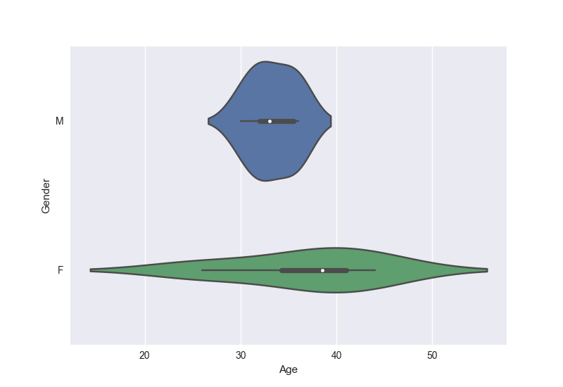
# 4、条形图
var = df.groupby('Gender').Sales.sum()
fig = plt.figure()
ax1 = fig.add_subplot(111)
ax1.set_xlabel('Gender')
ax1.set_ylabel('Sum of Sales')
ax1.set_title('Gender wise Sum of Sales')
var.plot(kind='bar')
plt.show()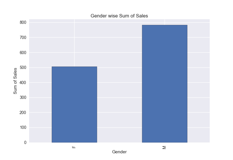
# 5、折线图
var = df.groupby('BMI').Sales.sum()
fig = plt.figure()
ax = fig.add_subplot(111)
ax.set_xlabel('BMI')
ax.set_ylabel('Sum of Sales')
ax.set_title('BMI wise Sum of Sales')
var.plot(kind='line')
plt.show()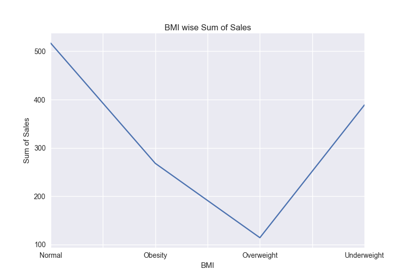
# 6、堆积柱形图
var = df.groupby(['BMI', 'Gender']).Sales.sum()
var.unstack().plot(kind='bar', stacked=True, color=['red', 'blue'])
plt.show()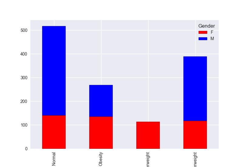
# 7、散点图
fig = plt.figure()
ax = fig.add_subplot(111)
ax.scatter(df['Age'], df['Sales'])
plt.show()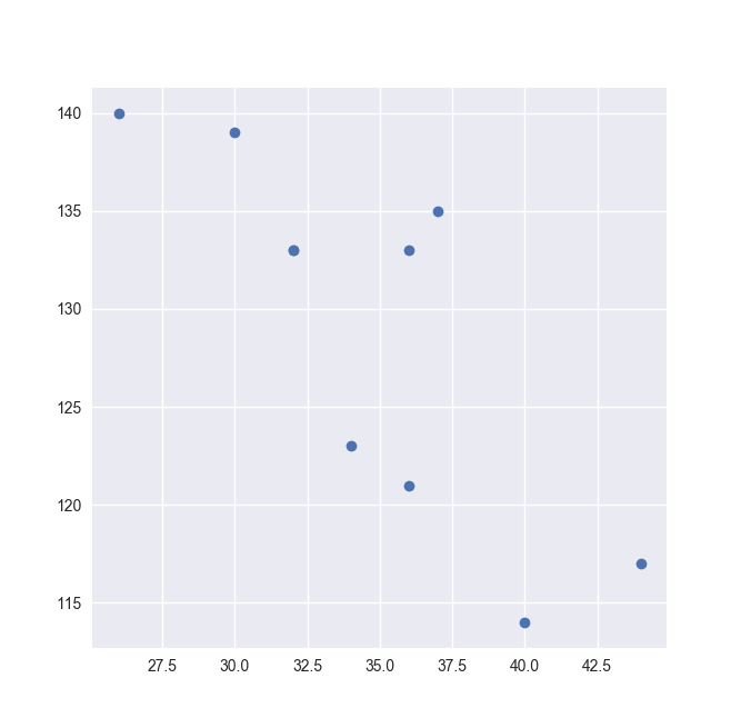
# 8、气泡图
fig = plt.figure()
ax = fig.add_subplot(111)
ax.scatter(df['Age'], df['Sales'], s=df['Income'])  # 第三个变量表明根据收入气泡的大小
plt.show()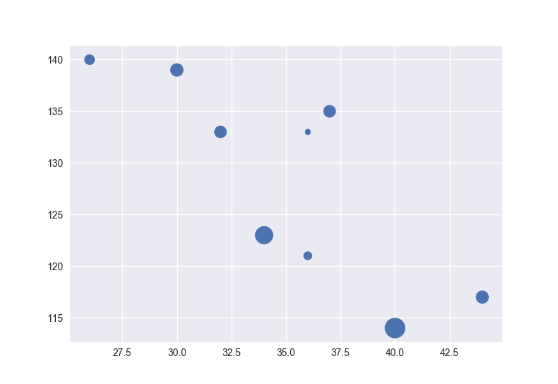
# 9、饼图
var = df.groupby(['Gender']).sum().stack()
temp = var.unstack()
type(temp)
x_list = temp['Sales']
label_list = temp.index
plt.axis('equal')
plt.pie(x_list, labels=label_list, autopct='%1.1f%%')
plt.title('expense')
plt.show()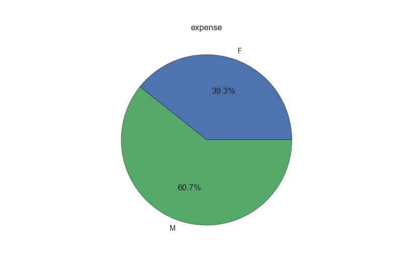
# 10、热图
data = np.random.rand(4, 2)
rows = list('1234')
columns = list('MF')
fig, ax = plt.subplots()
ax.pcolor(data, cmap=plt.cm.Reds, edgecolor='k')
ax.set_xticks(np.arange(0, 2)+0.5)
ax.set_yticks(np.arange(0, 4)+0.5)
ax.xaxis.tick_bottom()
ax.yaxis.tick_left()
ax.set_xticklabels(columns, minor=False, fontsize=20)
ax.set_yticklabels(rows, minor=False, fontsize=20)
plt.show()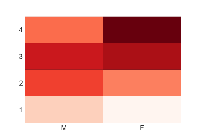


 2万+
2万+


 被折叠的 条评论
为什么被折叠?
被折叠的 条评论
为什么被折叠?
 到【灌水乐园】发言


