import matplotlib.pyplot as plt
#%matplotlib inline
#Using the different pyplot functions, we can create, customize, and display a plot. For example, we can use 2 functions to :
plt.plot()
plt.show()
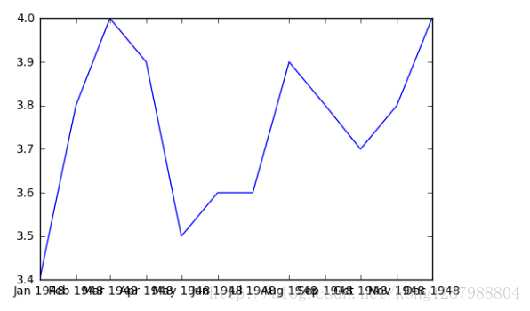
#While the y-axis looks fine, the x-axis tick labels are too close together and are unreadable#We can rotate the x-axis tick labels by 90 degrees so they don't overlap#We can specify degrees of rotation using a float or integer value.
plt.plot(first_twelve['DATE'], first_twelve['VALUE'])
plt.xticks(rotation=45)
#print help(plt.xticks)
plt.show()
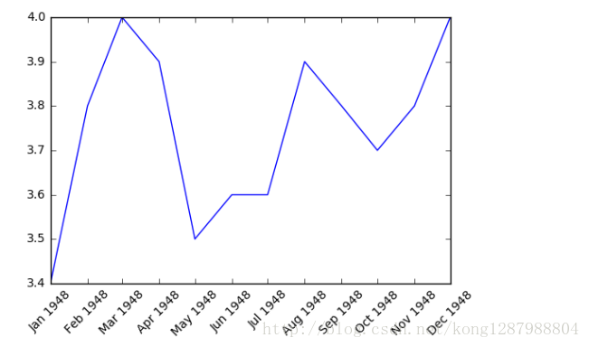
#xlabel(): accepts a string value, which gets setas the x-axis label.
#ylabel(): accepts a string value, which issetas the y-axis label.
#title(): accepts a string value, which issetas the plot title.
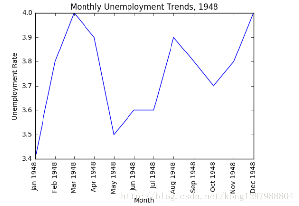
plt.plot(first_twelve['DATE'], first_twelve['VALUE'])
plt.xticks(rotation=90)
plt.xlabel('Month')
plt.ylabel('Unemployment Rate')
plt.title('Monthly Unemployment Trends, 1948')
plt.show()
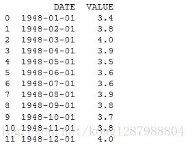
import pandas as pdunrate = pd.read_csv('unrate.csv')unrate['DATE'] = pd.to_datetime(unrate['DATE'])print(unrate.head(12))import matplotlib.pyplot as plt#%matplotlib inline#Using the different pyp


 3731
3731


 被折叠的 条评论
为什么被折叠?
被折叠的 条评论
为什么被折叠?
 到【灌水乐园】发言


