


1.圆角图片:
也就是一个左右下角带圆角,上方不带圆角的白色背景矩形,而且只有左、右和下边框,颜色为浅灰色。
当然,切一个.9图片作为背景也能实现,但是能用代码实现的还是尽量用代码实现,因为图片过多一个消耗内存,另一个还增加apk大小。
这种效果可以通过layer-lsit来实现,在drawable文件夹下面建一个xml文件,具体代码如下:

 1 <?xml version="1.0" encoding="utf-8"?>
 2 <layer-list xmlns:android="http://schemas.android.com/apk/res/android">
 3     <!--
 4         layer-list中的item是按照顺序从下往上叠加的,即先定义的item在下面,后面的依次往上面叠放
 5     -->
 6     <!-- 这里定义一个下面带圆角,上面不带圆角的矩形,边框颜色为@color/line_color -->
 7     <item>
 8          <shape>
 9                <corners android:bottomLeftRadius="5dp"
10                    android:bottomRightRadius="5dp" />
11                <stroke android:width="1px" android:color="@color/line_color" />
12          </shape>
13     </item>
14     <!--
15         这里定义一个下面带圆角,上面不带圆角的矩形,背景为白色
16         这里设置了android:right="1px" android:left="1px" android:bottom="1px"属性
17         android:right="1px"表示该item右边往里面缩了1px
18         android:left="1px"表示该item左边往里面缩了1px
19         android:bottom="1px"表示该item下面往里面缩了1px
20         这样,左、右、下都比原来缩小了1px,这缩小出来的郑刚是上面一个item的边框的左、右、下边框
21         而top没有缩小,所以覆盖了上面一个item的边框的上边框。
22         所以这个item叠加上面一个item之后的效果就是一个只含左、右、下灰色边框,下面带圆角,上面不带圆角的白色背景矩形
23      -->
24     <item android:right="1px" android:left="1px" android:bottom="1px">
25          <shape>
26                <corners android:bottomLeftRadius="5dp"
27                    android:bottomRightRadius="5dp" />
28                <solid android:color="@color/white" />
29          </shape>
30     </item>
31 </layer-list>
layer-lsit的用法注释中也讲的比较详细。
然后在View中设置背景为改drawable即可。
当然也可以直接用sharp来实现:
<?xml version="1.0" encoding="utf-8"?>
<shape xmlns:android="http://schemas.android.com/apk/res/android">
    <corners android:bottomLeftRadius="5dp" android:bottomRightRadius="5dp"/>
    <solid android:color="#ffffff" />
    <stroke android:color="#66000000" android:width="1dp"/>


</shape>
2.两个图片叠加:
- <layer-list
- xmlns:android="http://schemas.android.com/apk/res/android">
- <!--图片1-->
- <item android:id="@+id/user_faceback_drawable"
- android:drawable="@drawable/faceback" />
- <!--图片2-->
- <item android:id="@+id/user_face_drawable"
- android:drawable="@drawable/h001"
- android:left="10.0dip"
- android:top="18.0dip"
- android:right="25.0dip"
- android:bottom="35.0dip" />
- </layer-list>
- <!--2个图片的叠加-->
 +
+  =
= 
3.旋转叠加:
创建drawable xml文件
<layer-list xmlns:android="http://schemas.android.com/apk/res/android">
</layer-list>
布局文件中添加创建的图片
<RelativeLayout xmlns:android="http://schemas.android.com/apk/res/android"
</RelativeLayout>
4.圆形按钮:
<?xml version="1.0" encoding="utf-8"?>
<layer-list xmlns:android="http://schemas.android.com/apk/res/android">

    <item>
        <shape android:shape="oval" >

            <solid android:color="#ffffff" />
            <size android:width="170dp" android:height="170dp"/>
        </shape>
    </item>

    <item android:bottom="8dp" android:right="8dp" android:top="8dp" android:left="8dp" >
        <selector xmlns:android="http://schemas.android.com/apk/res/android">
            <item android:state_pressed="true">
                <shape android:shape="oval" >

                    <solid android:color="#e66b4f" />
                    <size android:width="162dp" android:height="162dp"/>
                </shape>
            </item>

            <item>
                <shape android:shape="oval" >

                    <solid android:color="#f3876f" />
                    <size android:width="162dp" android:height="162dp"/>
                </shape>
            </item>

        </selector>
    </item>

</layer-list>
5.使用layerlist定义seekbar样式(也可定义progressbar,rattingbar样式):
5.1.layerlist中使用图片:
<?xml version="1.0" encoding="utf-8"?>
<layer-list xmlns:android="http://schemas.android.com/apk/res/android">
    <item android:drawable="@drawable/seekbar_bg" android:id="@android:id/background"/>
    <item  android:id="@android:id/progress" android:drawable="@drawable/seekbar_front"/>

    <item android:drawable="@drawable/seekbar_front" android:id="@android:id/secondaryProgress"/>

</layer-list>
seekbar_front.png如下图:

seekbar_bg.png如下图:

图片没必要这么长的,只要颜色和样子一样即可,这种短图片也会自动根据进度拉长


<?xml version="1.0" encoding="utf-8"?>
<RelativeLayout xmlns:android="http://schemas.android.com/apk/res/android"
    xmlns:tools="http://schemas.android.com/tools"
    android:layout_width="match_parent"
    android:layout_height="match_parent"

    tools:context="com.example.zhouyi.layerlisttest.MainActivity">

   <SeekBar

       android:layout_width="match_parent"
       android:layout_height="wrap_content"
       android:max="100"
       android:layout_centerInParent="true"
       android:progress="40"
       android:secondaryProgress="70"
       android:progressDrawable="@drawable/layerlist_seekbar"
       android:maxHeight="10dp"
       android:minHeight="10dp"
       />

</RelativeLayout>
maxHeight和minHeight定义为layerlist重最高图片的高度,否则会出现thumb不居中的问题
定义thumb:
selector:
<?xml version="1.0" encoding="UTF-8"?>
<selector xmlns:android="http://schemas.android.com/apk/res/android">
    <!-- 按下状态 -->
    <item android:state_pressed="true"
        android:drawable="@drawable/thumb_dn" />


    <!-- 默认状态 -->
    <item android:drawable="@drawable/thumb_up" />

</selector>
thumb_up.png如下图:

thumb_dn.png如下图:

<?xml version="1.0" encoding="utf-8"?>
<RelativeLayout xmlns:android="http://schemas.android.com/apk/res/android"
    xmlns:tools="http://schemas.android.com/tools"
    android:layout_width="match_parent"
    android:layout_height="match_parent"

    tools:context="com.example.zhouyi.layerlisttest.MainActivity">

   <SeekBar

       android:layout_width="match_parent"
       android:layout_height="wrap_content"
       android:max="100"
       android:layout_centerInParent="true"
       android:progress="40"
       android:secondaryProgress="70"
       android:progressDrawable="@drawable/layerlist_seekbar"
       android:thumb="@drawable/sel_seekbarthumb"
       android:maxHeight="10dp"
       android:minHeight="10dp"
       />

</RelativeLayout>
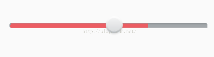
效果:
5.2 layerlist中使用sharp:
<?xml version="1.0" encoding="utf-8"?>
<layer-list xmlns:android="http://schemas.android.com/apk/res/android">
    <item android:id="@android:id/background">
        <shape android:shape="rectangle">
            <solid android:color="@color/colorAccent" />

        </shape>
    </item>
    <item android:id="@android:id/progress">
        <clip>
        <shape android:shape="rectangle">
            <solid android:color="#00ff00" />

        </shape>
        </clip>
    </item>
    <item android:id="@android:id/secondaryProgress">
        <clip>
        <shape android:shape="rectangle">
            <solid android:color="#55000000" />

        </shape>
        </clip>
    </item>

</layer-list>
后面两个progress对应的item,一定要用clip包裹起来

<?xml version="1.0" encoding="utf-8"?>
<RelativeLayout xmlns:android="http://schemas.android.com/apk/res/android"
    xmlns:tools="http://schemas.android.com/tools"
    android:layout_width="match_parent"
    android:layout_height="match_parent"

    tools:context="com.example.zhouyi.layerlisttest.MainActivity">

   <SeekBar

       android:layout_width="match_parent"
       android:layout_height="wrap_content"
       android:max="100"
       android:layout_centerInParent="true"
       android:progress="40"
       android:secondaryProgress="70"
       android:progressDrawable="@drawable/layerlist_seekbar"
       android:thumb="@drawable/sel_seekbarthumb"
       android:maxHeight="10dp"
       android:minHeight="10dp"
       />

</RelativeLayout>
也要用max/minheight限定其大小,否则会出现进度条过大的情况


 被折叠的 条评论
为什么被折叠?
被折叠的 条评论
为什么被折叠?
 到【灌水乐园】发言


