


Media Queries是CSS3有关媒体查询的属性,有了CSS3 之媒体查询Media Queries就可以进行媒体查询,针对每个不同的媒体进行不同的样式编写。传说中的Web响应式布局就可以毫无压力的做出来了。下面我们就一起来看看CSS3 之媒体查询Media Queries的相关知识吧。
一、Media Query之引入方法
1、外部引用
<link rel="stylesheet" type="text/css" href="../css/print.css" media="print" />2、@media引入
@media screen{
     选择器{
	属性:属性值;
     }
   }
3、xml方式引入
<?xml-stylesheet rel="stylesheet" media="screen" href="css/style.css" ?>4、@import方式引入
@import url("css/reset.css") screen;
@import url("css/print.css") print;
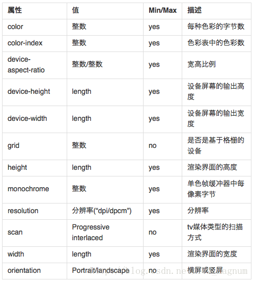
二、Media Query的Media中的值
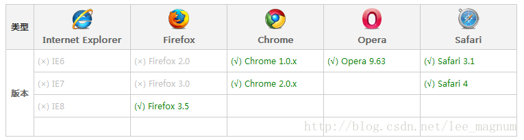
三、Media Query之兼容情况
四、Media Query之实例
1、最大宽度Max Width——当屏幕小于或等于600px时,将采用small.css样式来渲染Web页面
<link rel="stylesheet" media="screen and (max-width:600px)" href="small.css" type="text/css" />2、最小宽度Min Width——当屏幕大于或等于900px时,将采用big.css样式来渲染Web页面
<link rel="stylesheet" media="screen and (min-width:900px)" href="big.css" type="text/css" />3、多个Media Queries——当屏幕在600px-900px之间时采用style.css样式来渲染web页面
<link rel="stylesheet" media="screen and (min-width:600px) and (max-width:900px)" href="style.css" type="text/css" />4、设备屏幕的输出宽度Device Width——iphone.css样式适用于最大设备宽度为480px,比如说iPhone上的显示,这里的max-device-width所指的是设备的实际分辨率,也就是指可视面积分辨率
<link rel="stylesheet" media="screen and (max-device-width: 480px)" href="iphone.css" type="text/css" />5、iPhone4
<link rel="stylesheet" media="only screen and (-webkit-min-device-pixel-ratio: 2)" type="text/css" href="iphone4.css" />6、iPad——在纵向(portrait)时采用portrait.css来渲染页面;在横向(landscape)时采用landscape.css来渲染页面
<link rel="stylesheet" media="all and (orientation:portrait)" href="portrait.css" type="text/css" />
<link rel="stylesheet" media="all and (orientation:landscape)" href="landscape.css"  type="text/css" />
7、Android
<!--240px的宽度-->
  <link rel="stylesheet" media="only screen and (max-device-width:240px)" href="android240.css" type="text/css" />
<!--360px的宽度-->
  <link rel="stylesheet" media="only screen and (min-device-width:241px) and (max-device-width:360px)" href="android360.css" type="text/css" />
<!--480px的宽度-->
<link rel="stylesheet" media="only screen and (min-device-width:361px) and (max-device-width:480px)" href="android480.css" type="text/css" />8、not关键字——排除某种制定的媒体类型
<link rel="stylesheet" media="not print and (max-width: 1200px)" href="print.css" type="text/css" />9、only关键字
only用来定某种特定的媒体类型,可以用来排除不支持媒体查询的浏览器。其实only很多时候是用来对那些不支持Media Query但却支持Media Type的设备隐藏样式表的。其主要有:支持媒体特性(Media Queries)的设备,正常调用样式,此时就当only不存在;对于不支持媒体特性(Media Queries)但又支持媒体类型(Media Type)的设备,这样就会不读了样式,因为其先读only而不是screen;另外不支持Media Qqueries的浏览器,不论是否支持only,样式都不会被采用。
<link rel="stylesheet" media="only screen and (max-device-width:240px)" href="android240.css" type="text/css" />10、逗号——style.css样式被用在宽度小于或等于480px的手持设备上,或者被用于屏幕宽度大于或等于960px的设备上
<link rel="stylesheet" type="text/css" href="style.css" media="handheld and (max-width:480px), screen and (min-width:960px)" />
11、禁止屏幕缩放
在移动设备浏览器上,通过为viewport meta标签添加user-scalable=no可以禁用其缩放(zooming)功能。这样禁用缩放功能后,用户只能滚动屏幕,就能让你的网站看上去更像原生应用的感觉。注意,这种方式我们并不推荐所有网站使用,还是要看你自己的情况而定!
<meta name="viewport" content="width=device-width, initial-scale=1.0, maximum-scale=1.0, user-scalable=no">CSS3 之媒体查询Media Query的介绍就在上面了,希望大家看过之后,非常轻松的能够掌握媒体查询这个小小的CSS3属性。
2013年12月19日更新
在这里简单介绍一下media标签的一些使用方法:
    常用设备类型

    all-所有设备
    screen-电脑显示器
    handheld-便携设备
    print-打印用纸或者打印预览图
    projection-各种摄影设备
    tv -电视类型的设备


    常用设备特性:

    width | min-width | max-width |
    说明:浏览器窗口的宽度

    height | min-height | max-height |
    说明:浏览器窗口的 高度

    device-width | min-device-width | max-device-width |
    说明:设备屏幕分辨率的宽度值

    device-height | min-device-height | max-device-height |
    说明:设备屏幕分辨率的高度值

    orientation有两个值 portrait|landscape。
    说明:浏览器窗口的方向是纵向还是横向。当窗口的高度大于等于宽度时,是portrait,否则为landscape.

    一些常用:

    1、查询指定媒体依赖CSS来负载的HTML
    <link href='css/480.css' media='only screen and (max-width: 480px)' rel='stylesheet' type='text/css'>

    2、查询指定媒体直接在CSS本身
    @media only screen and (max-width: 768px) { }
    @media only screen and (min-width: 480px) { }


    @media handheld and (max-width: 480px), screen and (max-device-width: 480px), screen and (max-width: 600px)
    3、Orientation 依赖CSS
    @media (orientation: portrait) { }
    @media (orientation: landscape) { }

    4、Orientation 依赖CSS
    <link rel="stylesheet" media="all and (orientation:portrait)" href="portrait.css">
    <link rel="stylesheet" media="all and (orientation:landscape)" href="landscape.css">
2014年4月21日更新
and

示例如下所示:

@media screen and (min-width: 800px) {样式代码} >800

@media screen and (min-width: 600px) and (max-width: 800px) {样式代码} 600

@media screen and (max-width: 600px) {样式代码} <600

外部样式表引用方式:

上面将设备分成3种,分别是宽度大于800px时,应用styleA,宽度在600px到800px之间时应用styleB,以及宽度小于600px时应用styleC。

not 和all

@media not handheld and (color){样式代码} //用于除便携之外的其他设备或非彩色便携设备中

@media all and (not color){样式代码} //用于所有非彩色设备中

only

only 关键字可能显得有些多余,对支持Media Queries的浏览器来说确实是这样,但很多时候only是用来对那些不支持Media Queries但是却读取Media Type的设备隐藏样式表的

@media only screen add (color){样式代码}

支持Media Queries的设备,正确应用样式,就仿佛only不存在

不支持Media Queries但正确读取Media Type的设备,由于先读取到only而不是screen,将忽略这个样式

不支持Media Queries的IE不论是否有only,都忽略样式


 扫一扫
扫一扫


 被折叠的 条评论
为什么被折叠?
被折叠的 条评论
为什么被折叠?
 到【灌水乐园】发言


