


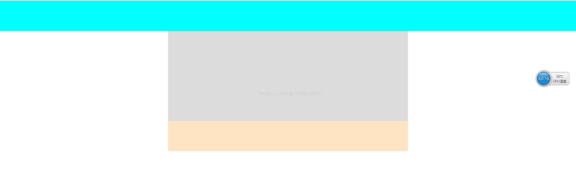
1、一列布局
  <meta charset="UTF-8">
    <title>Title</title>
    <style type="text/css">
        body{
            margin: 0;
            padding: 0;
        }
        .top{
            height: 100px;
            background-color: aqua;
        }
        .main{
            width: 800px;
            height: 300px;
            background-color: gainsboro;
            margin:0 auto ;
        }
        .foot{
            width: 800px;
            height: 100px;
            background-color: bisque;
            margin: 0 auto;
        }
    </style>
</head>
<body>
    <div class="top"></div>
    <div class="main"></div>
    <div class="foot"></div>
</body>
</html>
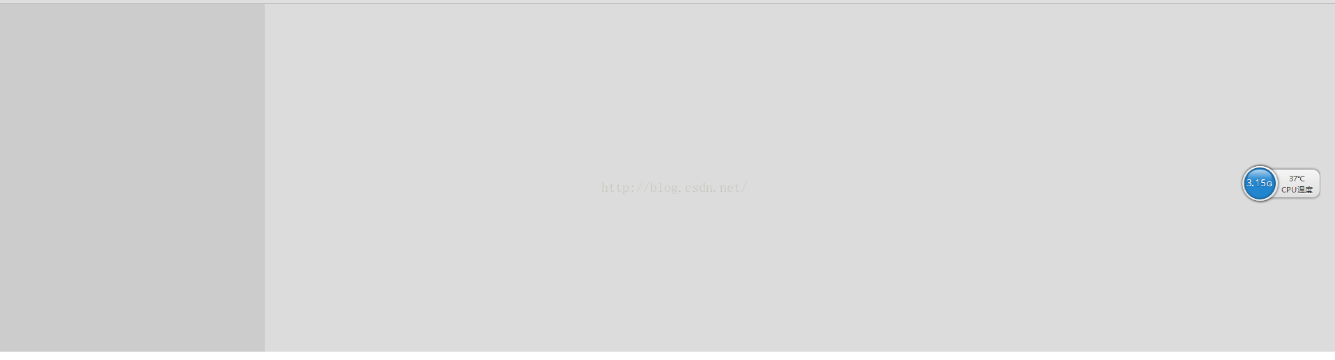
2、自适应宽度及固定宽度的二列布局
2.1自适应宽度
<!DOCTYPE html>
<html lang="en">
<head>
    <meta charset="UTF-8">
    <title>Title</title>
    <style type="text/css">
        body{
            margin: 0;
            padding: 0;
        }
        .left{
            height: 500px;
            width: 20%;
            float: left;
            background: #ccc;
        }
        .right{
            width: 80%;
            height: 500px;
            background-color: gainsboro;
            float: right;
        }

    </style>
</head>
<body>
    <div class="left"></div>
    <div class="right"></div>
</body>
</html>
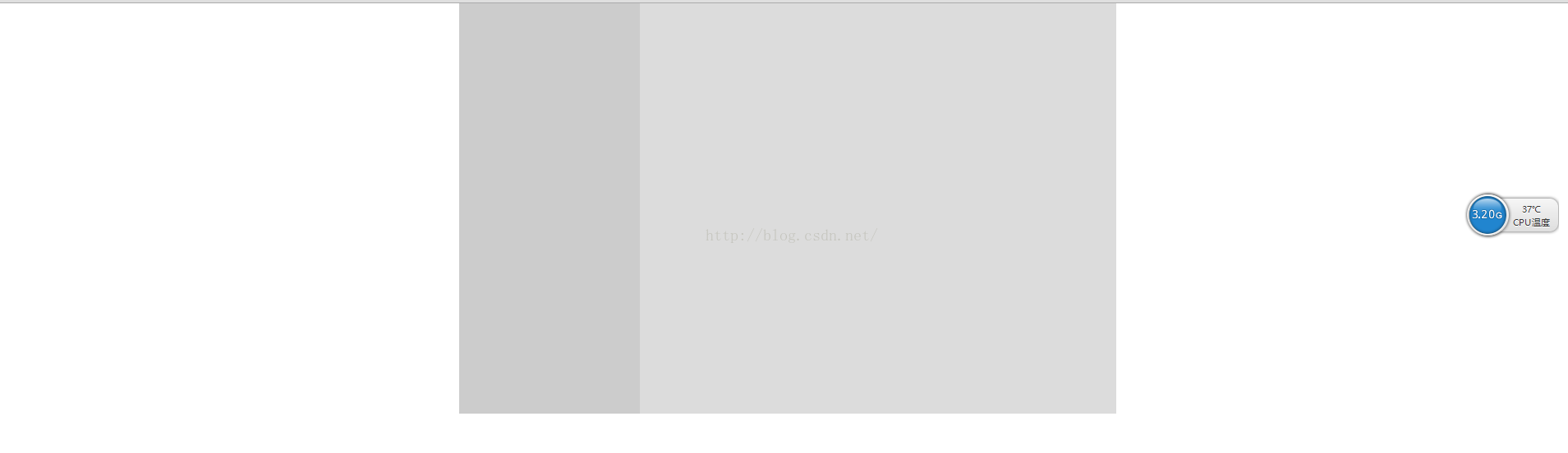
2.2固定宽度
<!DOCTYPE html>
<html lang="en">
<head>
    <meta charset="UTF-8">
    <title>Title</title>
    <style type="text/css">
        body{
            margin: 0;
            padding: 0;
        }
        .main{
            width: 800px;
            margin: 0 auto;
        }
        .left{
            height: 500px;
            width: 220px;
            float: left;
            background: #ccc;
        }

        .right{
            width: 580px;
            height: 500px;
            background-color: gainsboro;
            float: right;
        }

    </style>
</head>
<body>
<div class="main">
    <div class="left"></div>
    <div class="right"></div>
</div>
</body>
</html>
2.3 使用absolute实现横向两列布局(常用于一列用于固定宽度,另一列宽度自适应)
主要应用技能:
relative——父元素相对定位
absolute——自适应宽度元素绝对定位
注意:固定宽度列的高度>自适应宽度的列
3、三列布局
3.1 全部自适应
<!DOCTYPE html>
<html lang="en">
<head>
    <meta charset="UTF-8">
    <title>Title</title>
    <style type="text/css">
        body{
            margin: 0;
            padding: 0;
        }
        .left{
            height: 500px;
            width: 33.33%;
            float: left;
            background: #ccc;
        }
        .middle{
            height: 500px;
            width: 33.33%;
            float: left;
            background: #999999;
        }
        .right{
            width: 33.33%;
            height: 500px;
            background:#000000;
            float: right;
        }

    </style>
</head>
<body>
    <div class="left"></div>
    <div class="middle"></div>
    <div class="right"></div>
</body>
</html>

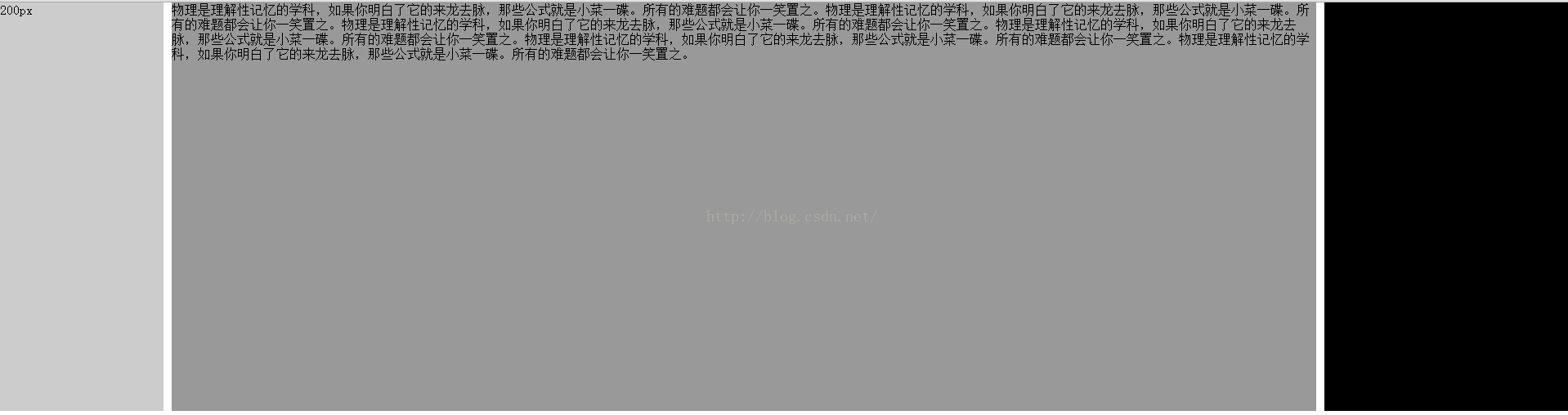
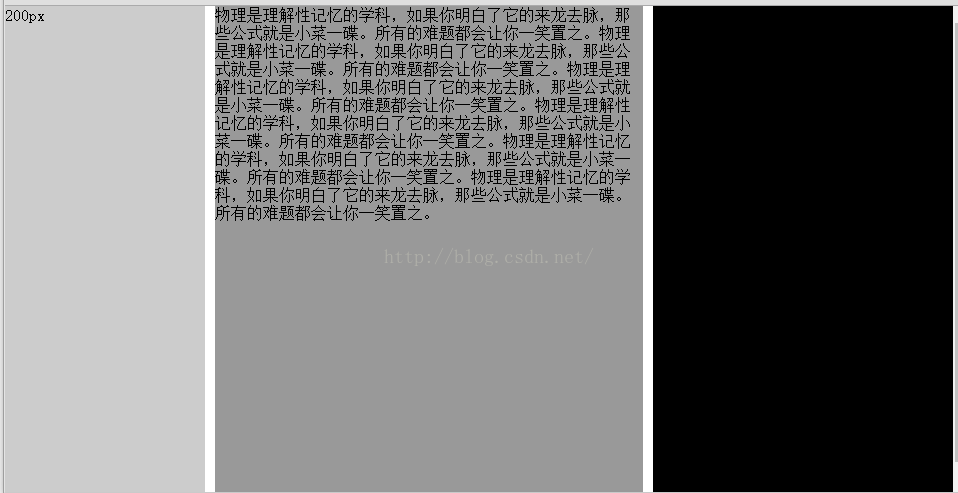
3.2 两边固定宽度,中间自适应(用到绝对定位)
<!DOCTYPE html>
<html lang="en">
<head>
    <meta charset="UTF-8">
    <title>Title</title>
    <style type="text/css">
        body{
            margin: 0;
            padding: 0;
        }
        .left{
            height: 500px;
            width: 200px;
            position: absolute;
            left: 0px;
            top: 0px;
            background: #ccc;
        }
        .middle{
            height: 500px;
            margin: 0 310px 0 210px;
            background: #999999;
        }
        .right{
            width: 300px;
            height: 500px;
            background:#000000;
            position: absolute;
            right: 0px;
            top: 0px;
        }

    </style>
</head>
<body>
    <div class="left">200px</div>
    <div class="middle">物理是理解性记忆的学科,如果你明白了它的来龙去脉,那些公式就是小菜一碟。所有的难题都会让你一笑置之。物理是理解性记忆的学科,如果你明白了它的来龙去脉,那些公式就是小菜一碟。所有的难题都会让你一笑置之。物理是理解性记忆的学科,如果你明白了它的来龙去脉,那些公式就是小菜一碟。所有的难题都会让你一笑置之。物理是理解性记忆的学科,如果你明白了它的来龙去脉,那些公式就是小菜一碟。所有的难题都会让你一笑置之。物理是理解性记忆的学科,如果你明白了它的来龙去脉,那些公式就是小菜一碟。所有的难题都会让你一笑置之。物理是理解性记忆的学科,如果你明白了它的来龙去脉,那些公式就是小菜一碟。所有的难题都会让你一笑置之。</div>
    <div class="right">300px</div>
</body>
</html>
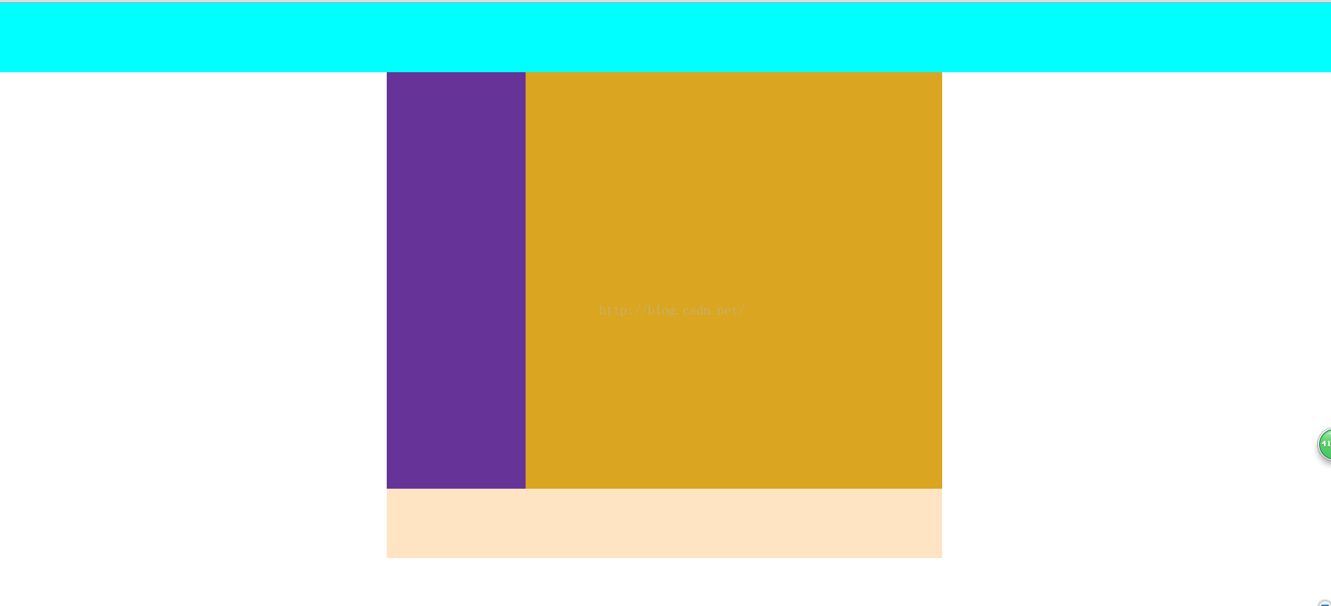
4、混合布局
4.1 混合布局1
<meta charset="UTF-8">
<title>Title</title>
<style type="text/css">
    body{
        margin: 0;
        padding: 0;
    }
    .top{
        height: 100px;
        background-color: aqua;
    }
    .main{
        width: 800px;
        height: 600px;
        background-color: gainsboro;
        margin:0 auto ;
    }
    .left{
        width: 200px;
        height: 600px;
        background: rebeccapurple;
        float: left;
    }
    .right{
        width: 600px;
        height: 600px;
        background: goldenrod;
        float: left;
    }
    .foot{
        width: 800px;
        height: 100px;
        background-color: bisque;
        margin: 0 auto;
    }
</style>
</head>
<body>
<div class="top"></div>
<div class="main">
    <div class="left"></div>
    <div class="right"></div>
</div>
<div class="foot"></div>
</body>
</html>
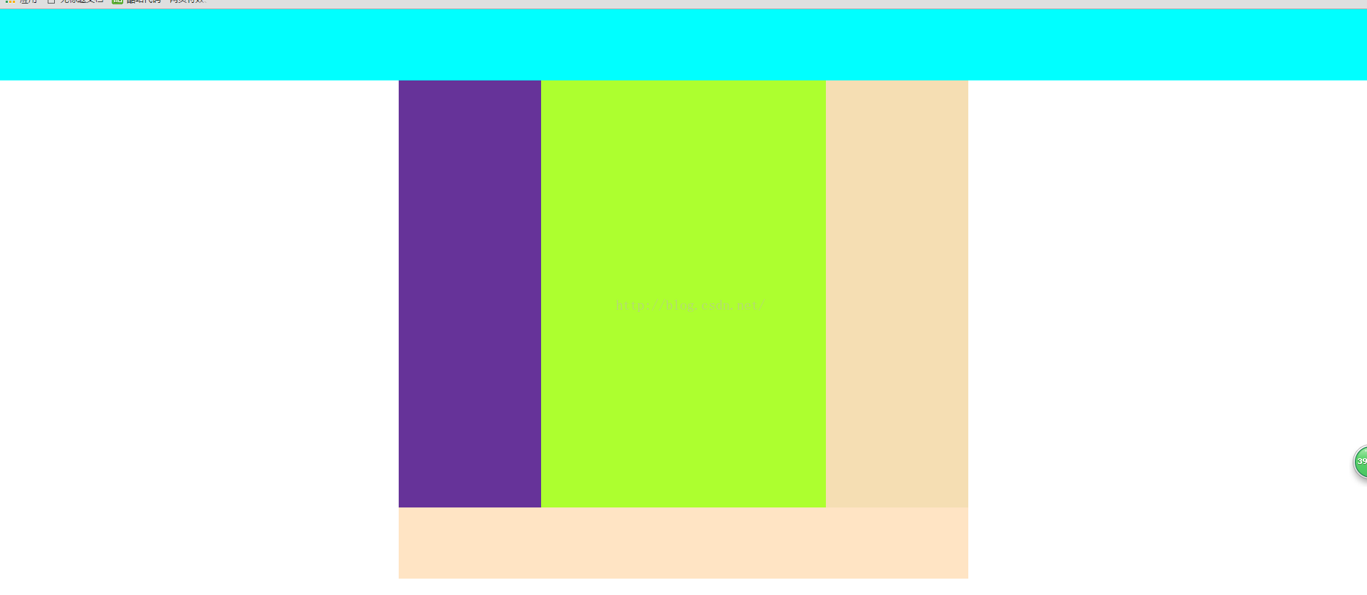
4.2 混合布局2
<meta charset="UTF-8">
<title>Title</title>
<style type="text/css">
    body{
        margin: 0;
        padding: 0;
    }
    .top{
        height: 100px;
        background-color: aqua;
    }
    .main{
        width: 800px;
        height: 600px;
        background-color: gainsboro;
        margin:0 auto ;
    }
    .left{
        width: 200px;
        height: 600px;
        background: rebeccapurple;
        float: left;
    }
    .right{
        width: 600px;
        height: 600px;
        background: goldenrod;
        float: left;
    }
    .sub_l{
        width: 400px;
        height: 600px;
        background: greenyellow;
        float: left;
    }
    .sub_2{
        width: 200px;
        height: 600px;
        background: wheat;
        float: left;
    }
    .foot{
        width: 800px;
        height: 100px;
        background-color: bisque;
        margin: 0 auto;
    }
</style>
</head>
<body>
<div class="top"></div>
<div class="main">
    <div class="left"></div>
    <div class="right">
        <div class="sub_l"></div>
        <div class="sub_2"></div>
    </div>
</div>
<div class="foot"></div>
</body>
</html>
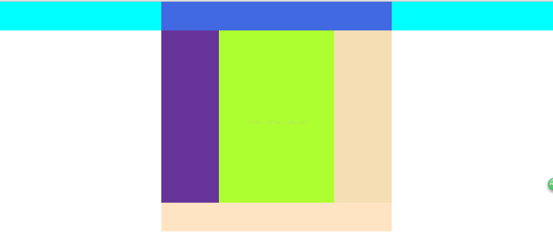
4.3 混合布局3
<meta charset="UTF-8">
<title>Title</title>
<style type="text/css">
    body{
        margin: 0;
        padding: 0;
    }
    .top{
        height: 100px;
        background-color: aqua;
    }
    .head{
        height: 100px;
        width: 800px;
        background: royalblue;
        margin: 0 auto;
    }
    .main{
        width: 800px;
        height: 600px;
        background-color: gainsboro;
        margin:0 auto ;
    }
    .left{
        width: 200px;
        height: 600px;
        background: rebeccapurple;
        float: left;
    }
    .right{
        width: 600px;
        height: 600px;
        background: goldenrod;
        float: left;
    }
    .sub_l{
        width: 400px;
        height: 600px;
        background: greenyellow;
        float: left;
    }
    .sub_2{
        width: 200px;
        height: 600px;
        background: wheat;
        float: left;
    }
    .foot{
        width: 800px;
        height: 100px;
        background-color: bisque;
        margin: 0 auto;
    }
</style>
</head>
<body>
<div class="top">
    <div class="head"></div>
</div>
<div class="main">
    <div class="left"></div>
    <div class="right">
        <div class="sub_l"></div>
        <div class="sub_2"></div>
    </div>
</div>
<div class="foot"></div>
</body>
</html>
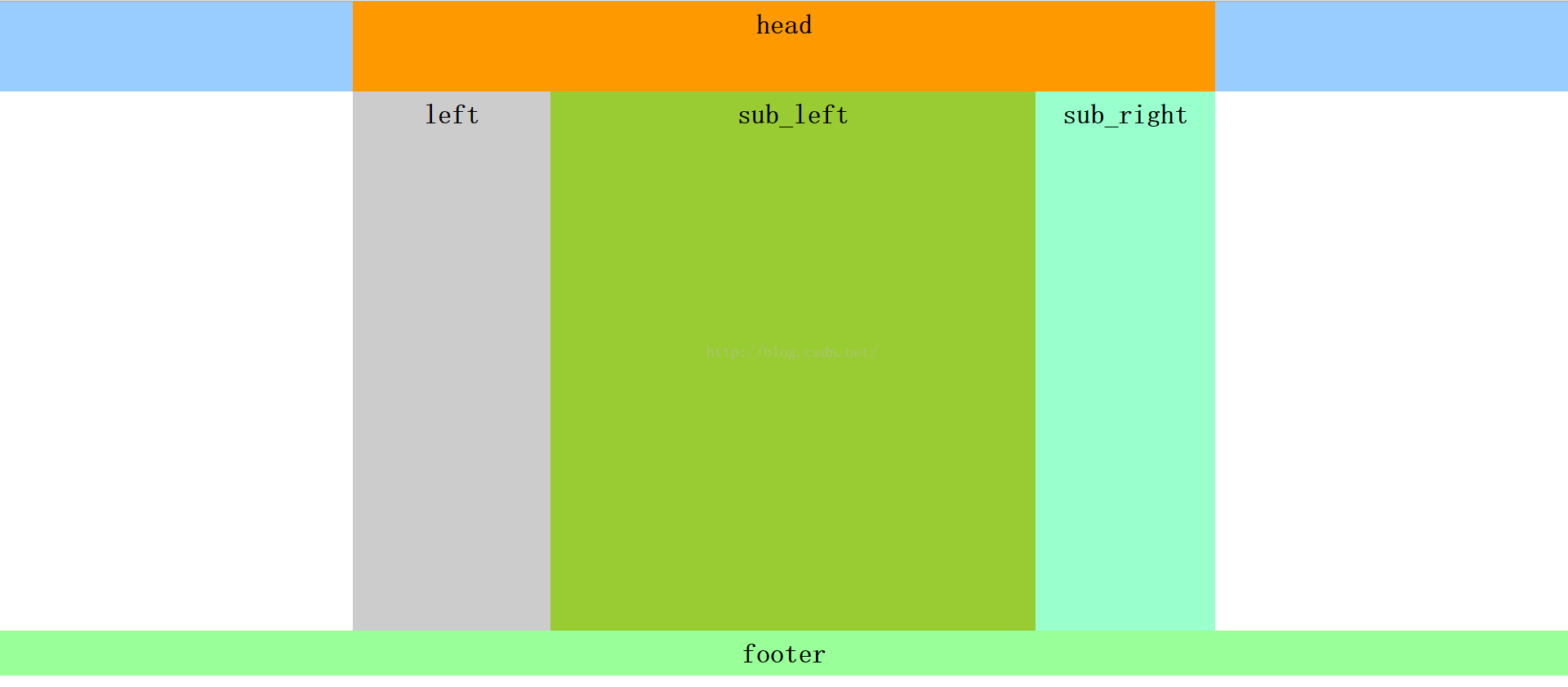
4.4 混合布局4
<!DOCTYPE html PUBLIC "-//W3C//DTD XHTML 1.0 Transitional//EN" "http://www.w3.org/TR/xhtml1/DTD/xhtml1-transitional.dtd">
<html xmlns="http://www.w3.org/1999/xhtml">
<head>
    <meta http-equiv="Content-Type" content="text/html; charset=utf-8" />
    <title>混合布局</title>
    <style>
        body{ margin:0; padding:0; font-size:30px; font-weight:bold}
        div{ text-align:center; line-height:50px}
        .top{ height:100px;background:#9CF}
        .head,.main{ width:960px; margin:0 auto;}
        .head{ height:100px; background:#F90}
        .left{ width:220px; height:600px; background:#ccc; float:left;}
        .right{ width:740px; height:600px;background:#FCC; float:right}
        .r_sub_left{ width:540px; height:600px; background:#9C3; float:left}
        .r_sub_right{ width:200px; height:600px; background:#9FC; float:left;}
        .footer{ height:50px; background:#9F9;clear:both; }
    </style>
</head>

<body>
<div class="top">
    <div class="head">head</div>
</div>
<div class="main">
    <div class="left">left</div>
    <div class="right">
        <div class="r_sub_left">sub_left
        </div>
        <div class=" r_sub_right">sub_right
        </div>
    </div>
</div>
<div class="footer">footer</div>
</body>
</html>


 2656
2656


 被折叠的 条评论
为什么被折叠?
被折叠的 条评论
为什么被折叠?
 到【灌水乐园】发言


