


原文链接:http://www.cnblogs.com/denny402/p/5686067.html
使用python接口来运行caffe程序,主要的原因是python非常容易可视化。所以不推荐大家在命令行下面运行python程序。如果非要在命令行下面运行,还不如直接用 c++算了。
推荐使用jupyter notebook,spyder等工具来运行python代码,这样才和它的可视化完美结合起来。
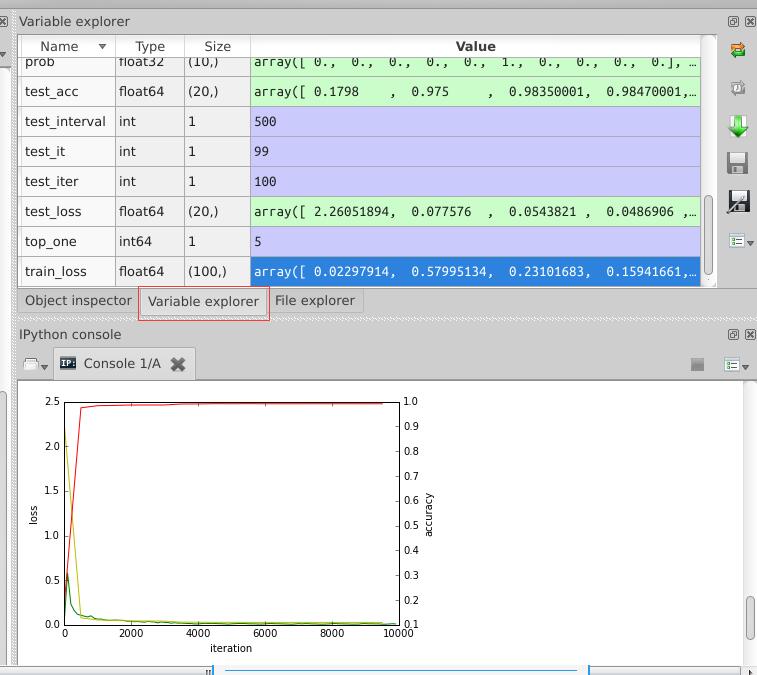
因为我是用anaconda来安装一系列python第三方库的,所以我使用的是spyder,与matlab界面类似的一款编辑器,在运行过程中,可以查看各变量的值,便于理解,如下图:
只要安装了anaconda,运行方式也非常方便,直接在终端输入spyder命令就可以了。
在caffe的训练过程中,我们如果想知道某个阶段的loss值和accuracy值,并用图表画出来,用python接口就对了。

# -*- coding: utf-8 -*-
"""
Created on Tue Jul 19 16:22:22 2016

@author: root
"""
from numpy import *
import sys
sys.path.indert(0,'/home/xxx/caffe/python')
import matplotlib.pyplot as plt
import caffe
caffe.set_device(0)
caffe.set_mode_gpu()
# 使用SGDSolver,即随机梯度下降算法
solver = caffe.SGDSolver('./mnist/solver.prototxt')

# 等价于solver文件中的max_iter,即最大解算次数
niter = 9380
# 每隔100次收集一次数据
display= 100

# 每次测试进行100次解算,10000/100
test_iter = 100
# 每500次训练进行一次测试(100次解算),60000/64
test_interval =938

#初始化
train_loss = zeros(ceil(niter * 1.0 / display))
test_loss = zeros(ceil(niter * 1.0 / test_interval))
test_acc = zeros(ceil(niter * 1.0 / test_interval))

# iteration 0,不计入
solver.step(1)

# 辅助变量
_train_loss = 0; _test_loss = 0; _accuracy = 0
# 进行解算
for it in range(niter):
    # 进行一次解算
    solver.step(1)
    # 每迭代一次,训练batch_size张图片
    _train_loss += solver.net.blobs['loss'].data
    if it % display == 0:
        # 计算平均train loss
        train_loss[it // display] = _train_loss / display
        _train_loss = 0

    if it % test_interval == 0:
        for test_it in range(test_iter):
            # 进行一次测试
            solver.test_nets[0].forward()
            # 计算test loss
            _test_loss += solver.test_nets[0].blobs['loss'].data
            # 计算test accuracy
            _accuracy += solver.test_nets[0].blobs['accuracy'].data
        # 计算平均test loss
        test_loss[it / test_interval] = _test_loss / test_iter
        # 计算平均test accuracy
        test_acc[it / test_interval] = _accuracy / test_iter
        _test_loss = 0
        _accuracy = 0

# 绘制train loss、test loss和accuracy曲线
print '\nplot the train loss and test accuracy\n'
_, ax1 = plt.subplots()
ax2 = ax1.twinx()

# train loss -> 绿色
ax1.plot(display * arange(train_loss.size), train_loss, 'g')
# test loss -> 黄色
ax1.plot(test_interval * arange(test_loss.size), test_loss, 'y')
# test accuracy -> 红色
ax2.plot(test_interval * arange(test_acc.size), test_acc, 'r')

ax1.set_xlabel('iteration')
ax1.set_ylabel('loss')
ax2.set_ylabel('accuracy')
plt.show()
最后生成的图表在上图中已经显示出来了。
补充说明1:
ubuntu中使用pycharm IDE,导入matplotlib库。竟然无法显示出图片。。。
代码如下:

解决方法是:
首先import pylab,然后在需要显示图片的代码下一行加上pylab.show()
这种方法可以显示图片,但是不关掉这个图片窗口,代码就不会继续运行下去,暂时还没有找到更合适的方法。
补充说明2:
matplotlib绘图实例:pyplot、pylab模块及作图参数
原文链接:http://blog.csdn.net/pipisorry/article/details/40005163
Matplotlib.pyplot绘图实例
{使用pyplot模块}
matplotlib绘制直线、条形/矩形区域
import numpy as np
import matplotlib.pyplot as plt
t = np.arange(-1, 2, .01)
s = np.sin(2 * np.pi * t)

plt.plot(t,s)
# draw a thick red hline at y=0 that spans the xrange
l = plt.axhline(linewidth=4, color='r')
plt.axis([-1, 2, -1, 2])
plt.show()
plt.close()

# draw a default hline at y=1 that spans the xrange
plt.plot(t,s)
l = plt.axhline(y=1, color='b')
plt.axis([-1, 2, -1, 2])
plt.show()
plt.close()

# draw a thick blue vline at x=0 that spans the upper quadrant of the yrange
plt.plot(t,s)
l = plt.axvline(x=0, ymin=0, linewidth=4, color='b')
plt.axis([-1, 2, -1, 2])
plt.show()
plt.close()

# draw a default hline at y=.5 that spans the the middle half of the axes
plt.plot(t,s)
l = plt.axhline(y=.5, xmin=0.25, xmax=0.75)
plt.axis([-1, 2, -1, 2])
plt.show()
plt.close()

plt.plot(t,s)
p = plt.axhspan(0.25, 0.75, facecolor='0.5', alpha=0.5)
p = plt.axvspan(1.25, 1.55, facecolor='g', alpha=0.5)
plt.axis([-1, 2, -1, 2])
plt.show()
效果图展示
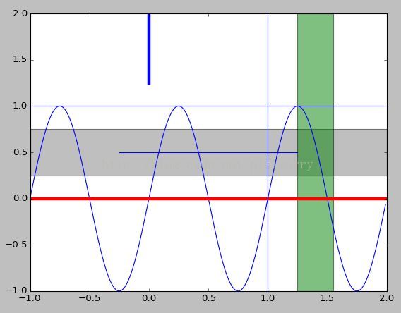
Note: 设置直线对应位置的值显示:plt.text(max_x, 0, str(round(max_x, 2))),也就是直接在指定坐标写文字,不知道有没有其它方法?
另一种绘制直线的方式
plt.hlines(hline, xmin=plt.gca().get_xlim()[0], xmax=plt.gca().get_xlim()[1], linestyles=line_style, colors=color)
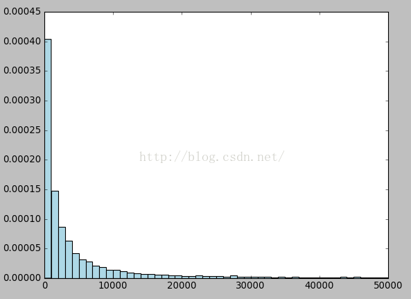
直方图
plt.hist(songs_plays, bins=50,range=(0, 50000), color='lightblue',normed=True)
Note: normed是将y坐标按比例绘图,而不是数目。
hist转换成plot折线图
plt.hist直接绘制数据是hist图
plt.hist(z, bins=500, normed=True)hist图转换成折线图
cnts, bins = np.histogram(z, bins=500, normed=True)
bins = (bins[:-1] + bins[1:]) / 2
plt.plot(bins, cnts)
[ numpy教程 - 统计函数 :histogram]
散点图、梯形图、柱状图、填充图
散列图scatter()
使用plot()绘图时,如果指定样式参数为仅绘制数据点,那么所绘制的就是一幅散列图。但是这种方法所绘制的点无法单独指定颜色和大小。
scatter()所绘制的散列图却可以指定每个点的颜色和大小。
scatter()的前两个参数是数组,分别指定每个点的X轴和Y轴的坐标。
s参数指定点的大 小,值和点的面积成正比。它可以是一个数,指定所有点的大小;也可以是数组,分别对每个点指定大小。
c参数指定每个点的颜色,可以是数值或数组。这里使用一维数组为每个点指定了一个数值。通过颜色映射表,每个数值都会与一个颜色相对应。默认的颜色映射表中蓝色与最小值对应,红色与最大值对应。当c参数是形状为(N,3)或(N,4)的二维数组时,则直接表示每个点的RGB颜色。
marker参数设置点的形状,可以是个表示形状的字符串,也可以是表示多边形的两个元素的元组,第一个元素表示多边形的边数,第二个元素表示多边形的样式,取值范围为0、1、2、3。0表示多边形,1表示星形,2表示放射形,3表示忽略边数而显示为圆形。
alpha参数设置点的透明度。
lw参数设置线宽,lw是line width的缩写。
facecolors参数为“none”时,表示散列点没有填充色。
柱状图bar()
用每根柱子的长度表示值的大小,它们通常用来比较两组或多组值。
bar()的第一个参数为每根柱子左边缘的横坐标;第二个参数为每根柱子的高度;第三个参数指定所有柱子的宽度,当第三个参数为序列时,可以为每根柱子指定宽度。bar()不自动修改颜色。
n = np.array([0,1,2,3,4,5])
x = np.linspace(-0.75, 1., 100)

fig, axes = plt.subplots(1, 4, figsize=(12,3))

axes[0].scatter(x, x + 0.25*np.random.randn(len(x)))

axes[1].step(n, n**2, lw=2)

axes[2].bar(n, n**2, align="center", width=0.5, alpha=0.5)

axes[3].fill_between(x, x**2, x**3, color="green", alpha=0.5);

Note: axes子图设置title: axes.set_title("bar plot")
散点图(改变颜色,大小)
import numpy as np import matplotlib.pyplot as plt
N = 50
x = np.random.rand(N)
y = np.random.rand(N)
area = np.pi * (15 * np.random.rand(N))**2 # 0 to 15 point radiuses
color = 2 * np.pi * np.random.rand(N)
plt.scatter(x, y, s=area, c=color, alpha=0.5, cmap=plt.cm.hsv)
plt.show()

matplotlib绘制散点图给点加上注释
plt.scatter(data_arr[:, 0], data_arr[:, 1], c=class_labels)
for i, class_label in enumerate(class_labels):
    plt.annotate(class_label, (data_arr[:, 0][i], data_arr[:, 1][i]))
[
matplotlib scatter plot with different text at each data point
]
对数坐标图
plot()所绘制图表的X-Y轴坐标都是算术坐标。
绘制对数坐标图的函数有三个:semilogx()、semilogy()和loglog(),它们分别绘制X轴为对数坐标、Y轴为对数坐标以及两个轴都为对数坐标时的图表。
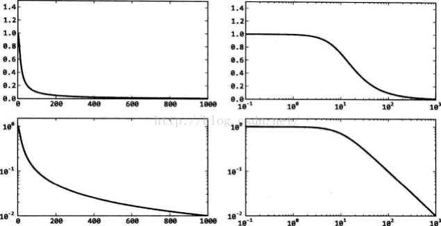
下面的程序使用4种不同的坐标系绘制低通滤波器的频率响应曲线。
其中,左上图为plot()绘制的算术坐标系,右上图为semilogx()绘制的X轴对数坐标系,左下图 为semilogy()绘制的Y轴对数坐标系,右下图为loglog()绘制的双对数坐标系。使用双对数坐标系表示的频率响应曲线通常被称为波特图。
import numpy as np
import matplotlib.pyplot as plt
w = np.linspace(0.1, 1000, 1000)
p = np.abs(1/(1+0.1j*w)) # 计算低通滤波器的频率响应
plt.subplot(221)
plt.plot(w, p, linewidth=2)
plt.ylim(0,1.5)
plt.subplot(222)
plt.semilogx(w, p, linewidth=2)
plt.ylim(0,1.5)
plt.subplot(223)
plt.semilogy(w, p, linewidth=2)
plt.ylim(0,1.5)
plt.subplot(224)
plt.loglog(w, p, linewidth=2)
plt.ylim(0,1.5)
plt.show()
极坐标图
极坐标系是和笛卡尔(X-Y)坐标系完全不同的坐标系,极坐标系中的点由一个夹角和一段相对中心点的距离来表示。polar(theta, r, **kwargs)
可以polar()直接创建极坐标子图并在其中绘制曲线。也可以使用程序中调用subplot()创建子图时通过设 polar参数为True,创建一个极坐标子图,然后调用plot()在极坐标子图中绘图。
示例1
fig = plt.figure()
ax = fig.add_axes([0.0, 0.0, .6, .6], polar=True)
t = linspace(0, 2 * pi, 100)
ax.plot(t, t, color='blue', lw=3);

示例2
import numpy as np
import matplotlib.pyplot as plt
theta = np.arange(0, 2*np.pi, 0.02)
plt.subplot(121, polar=True)
plt.plot(theta, 1.6*np.ones_like(theta), linewidth=2) #绘制同心圆
plt.plot(3*theta, theta/3, "--", linewidth=2)
plt.subplot(122, polar=True)
plt.plot(theta, 1.4*np.cos(5*theta), "--", linewidth=2)
plt.plot(theta, 1.8*np.cos(4*theta), linewidth=2)
plt.rgrids(np.arange(0.5, 2, 0.5), angle=45)
plt.thetagrids([0, 45])
plt.show()
Note:rgrids()设置同心圆栅格的半径大小和文字标注的角度。因此右图中的虚线圆圈有三个, 半径分别为0.5、1.0和1.5,这些文字沿着45°线排列。
Thetagrids()设置放射线栅格的角度, 因此右图中只有两条放射线,角度分别为0°和45°。
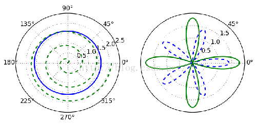
[matplotlib.pyplot.polar(*args, **kwargs)]
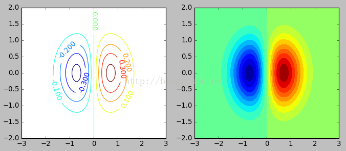
等值线图
使用等值线图表示二元函数z=f(x,y)
所谓等值线,是指由函数值相等的各点连成的平滑曲线。等值线可以直观地表示二元函数值的变化趋势,例如等值线密集的地方表示函数值在此处的变化较大。
matplotlib中可以使用contour()和contourf()描绘等值线,它们的区别是:contourf()所得到的是带填充效果的等值线。
import numpy as np
import matplotlib.pyplot as plt
y, x = np.ogrid[-2:2:200j, -3:3:300j]
z = x * np.exp( - x**2 - y**2)
extent = [np.min(x), np.max(x), np.min(y), np.max(y)]
plt.figure(figsize=(10,4))
plt.subplot(121)
cs = plt.contour(z, 10, extent=extent)
plt.clabel(cs)
plt.subplot(122)
plt.contourf(x.reshape(-1), y.reshape(-1), z, 20)
plt.show()
为了更淸楚地区分X轴和Y轴,这里让它们的取值范围和等分次数均不相同.这样得 到的数组z的形状为(200, 300),它的第0轴对应Y轴、第1轴对应X轴。
调用contour()绘制数组z的等值线图,第二个参数为10,表示将整个函数的取值范围等分为10个区间,即显示的等值线图中将有9条等值线。可以使用extent参数指定等值线图的X轴和Y轴的数据范围。
contour()所返回的是一个QuadContourSet对象, 将它传递给clabel(),为其中的等值线标上对应的值。
调用contourf(),绘制将取值范围等分为20份、带填充效果的等值线图。这里演示了另外一种设置X、Y轴取值范围的方法,它的前两个参数分别是计算数组z时所使用的X轴和Y轴上的取样点,这两个数组必须是一维的。
使用等值线绘制隐函数f(x,y)=0曲线
显然,无法像绘制一般函数那样,先创建一个等差数组表示变量的取值点,然后计算出数组中每个x所对应的y值。
可以使用等值线解决这个问题,显然隐函数的曲线就是值等于0的那条等值线。
程序绘制函数在f(x,y)=0和 f(x,y)-0.1 = 0时的曲线。
import numpy as np
import matplotlib.pyplot as plt
y, x = np.ogrid[-1.5:1.5:200j, -1.5:1.5:200j]
f = (x**2 + y**2)**4 - (x**2 - y**2)**2
plt.figure(figsize=(9,4))
plt.subplot(121)
extent = [np.min(x), np.max(x), np.min(y), np.max(y)]
cs = plt.contour(f, extent=extent, levels=[0, 0.1], colors=["b", "r"], linestyles=["solid", "dashed"], linewidths=[2, 2])
plt.subplot(122)
for c in cs.collections:
data = c.get_paths()[0].vertices
plt.plot(data[:,0], data[:,1], color=c.get_color()[0], linewidth=c.get_linewidth()[0])
plt.show()
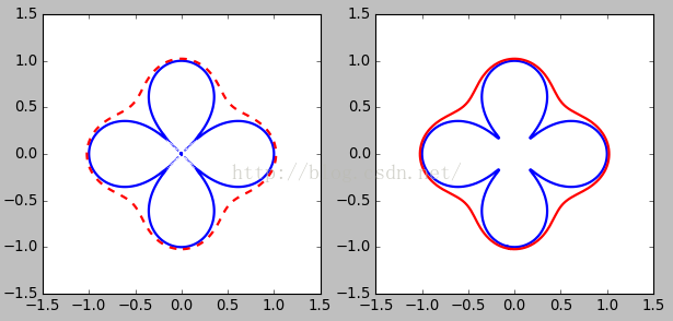
contour() levels参数指定所绘制等值线对应的函数值,这里设置levels参数为[0,0.1],因此最终将绘制两条等值线。
观察图会发现,表示隐函数f(x)=0蓝色实线并不是完全连续的,在图的中间部分它由许多孤立的小段构成。因为等值线在原点附近无限靠近,因此无论对函数f的取值空间如何进行细分,总是会有无法分开的地方,最终造成了图中的那些孤立的细小区域。
而表示隐函数f(x,y)=0的红色虚线则是闭合且连续的。
contour()返回对象QuadContourSet
可以通过contour()返回对象获得等值线上每点的数据,下面我们在IPython中观察变量cs,它是一个 QuadContourSet 对象:
cs对象的collections属性是一个等值线列表,每条等值线用一个LineCollection对象表示:
>>> cs.collections
<a list of 2 collections.LineCollection objects>
每个LineCollection对象都有它自己的颜色、线型、线宽等属性,注意这些属性所获得的结果外面还有一层封装,要获得其第0个元素才是真正的配置:
>>> c0.get_color()[0]
array([ 0., 0., 1., 1.])
>>> c0.get_linewidth()[0]
2
由类名可知,LineCollection对象是一组曲线的集合,因此它可以表示像蓝色实线那样由多条线构成的等值线。它的get_paths()方法获得构成等值线的所有路径,本例中蓝色实线
所表示的等值线由42条路径构成:
>>> len(cs.collections[0].get_paths())
42
路径是一个Path对象,通过它的vertices属性可以获得路径上所有点的坐标:
>>> path = cs.collections[0].get_paths()[0]
>>> type(path)
<class 'matplotlib.path.Path'>
>>> path.vertices
array([[-0.08291457, -0.98938936],
[-0.09039269, -0.98743719],
…,
[-0.08291457, -0.98938936]])
上面的程序plt.subplot(122)就是从等值线集合cs中找到表示等值线的路径,并使用plot()将其绘制出来。
Matplotlib.pylab绘图实例
{使用pylab模块}
matplotlib还提供了一个名为pylab的模块,其中包括了许多NumPy和pyplot模块中常用的函数,方便用户快速进行计算和绘图,十分适合在IPython交互式环境中使用。这里使用下面的方式载入pylab模块:
>>> import pylab as plNote :import pyplot as plt也同样可以
两种常用图类型
Line and scatter plots(使用plot()命令), histogram(使用hist()命令)
1 折线图&散点图 Line and scatter plots
折线图 Line plots(关联一组x和y值的直线)
import numpy as np
import pylab as pl
x = [1, 2, 3, 4, 5]# Make an array of x values
y = [1, 4, 9, 16, 25]# Make an array of y values for each x value
pl.plot(x, y)# use pylab to plot x and y
pl.show()# show the plot on the screen

plot(x, y)        # plot x and y using default line style and color
plot(x, y, 'bo')  # plot x and y using blue circle markers
plot(y)           # plot y using x as index array 0..N-1
plot(y, 'r+')     # ditto, but with red plusses
plt.plot(ks, wssses, marker='*', markerfacecolor='r', linestyle='-', color='b')
散点图 Scatter plots
把pl.plot(x, y)改成pl.plot(x, y, 'o')

美化 Making things look pretty
线条颜色 Changing the line color
红色:把pl.plot(x, y, 'o')改成pl.plot(x, y, ’or’)
线条样式 Changing the line style
虚线:plot(x,y, '--')
marker样式 Changing the marker style
蓝色星型markers:plot(x,y, ’b*’)
具体见附录 - matplotlib中的作图参数
图和轴标题以及轴坐标限度 Plot and axis titles and limits
import numpy as np
import pylab as pl
x = [1, 2, 3, 4, 5]# Make an array of x values
y = [1, 4, 9, 16, 25]# Make an array of y values for each x value
pl.plot(x, y)# use pylab to plot x and y
pl.title(’Plot of y vs. x’)# give plot a title
pl.xlabel(’x axis’)# make axis labels
pl.ylabel(’y axis’)
pl.xlim(0.0, 7.0)# set axis limits
pl.ylim(0.0, 30.)
pl.show()# show the plot on the screen

一个坐标系上绘制多个图 Plotting more than one plot on the same set of axes
依次作图即可
import numpy as np
import pylab as pl
x1 = [1, 2, 3, 4, 5]# Make x, y arrays for each graph
y1 = [1, 4, 9, 16, 25]
x2 = [1, 2, 4, 6, 8]
y2 = [2, 4, 8, 12, 16]
pl.plot(x1, y1, ’r’)# use pylab to plot x and y
pl.plot(x2, y2, ’g’)
pl.title(’Plot of y vs. x’)# give plot a title
pl.xlabel(’x axis’)# make axis labels
pl.ylabel(’y axis’)
pl.xlim(0.0, 9.0)# set axis limits
pl.ylim(0.0, 30.)
pl.show()# show the plot on the screen

图例 Figure legends
pl.legend((plot1, plot2), (’label1, label2’),loc='best’, numpoints=1)
第三个参数loc=表示图例放置的位置:'best’‘upper right’, ‘upper left’, ‘center’, ‘lower left’, ‘lower right’.
如果在当前figure里plot的时候已经指定了label,如plt.plot(x,z,label=" cos(x2) "),直接调用plt.legend()就可以了。
import numpy as np
import pylab as pl
x1 = [1, 2, 3, 4, 5]# Make x, y arrays for each graph
y1 = [1, 4, 9, 16, 25]
x2 = [1, 2, 4, 6, 8]
y2 = [2, 4, 8, 12, 16]
plot1 = pl.plot(x1, y1, ’r’)# use pylab to plot x and y : Give your plots names
plot2 = pl.plot(x2, y2, ’go’)
pl.title(’Plot of y vs. x’)# give plot a title
pl.xlabel(’x axis’)# make axis labels
pl.ylabel(’y axis’)
pl.xlim(0.0, 9.0)# set axis limits
pl.ylim(0.0, 30.)
pl.legend([plot1, plot2], (’red line’, ’green circles’), ’best’, numpoints=1)# make legend
pl.show()# show the plot on the screen

2 直方图 Histograms
import numpy as np
import pylab as pl
# make an array of random numbers with a gaussian distribution with
# mean = 5.0
# rms = 3.0
# number of points = 1000
data = np.random.normal(5.0, 3.0, 1000)
# make a histogram of the data array
pl.hist(data)
# make plot labels
pl.xlabel(’data’)
pl.show()
如果不想要黑色轮廓可以改为pl.hist(data, histtype=’stepfilled’)

自定义直方图bin宽度 Setting the width of the histogram bins manually
增加两行
bins = np.arange(-5., 16., 1.) #浮点数版本的range
pl.hist(data, bins, histtype=’stepfilled’)

同一画板上绘制多幅子图 Plotting more than one axis per canvas
如果需要同时绘制多幅图表的话,可以是给figure传递一个整数参数指定图标的序号,如果所指定
序号的绘图对象已经存在的话,将不创建新的对象,而只是让它成为当前绘图对象。
fig1 = pl.figure(1)
pl.subplot(211)
subplot(211)把绘图区域等分为2行*1列共两个区域, 然后在区域1(上区域)中创建一个轴对象. pl.subplot(212)在区域2(下区域)创建一个轴对象。

You can play around with plotting a variety of layouts. For example, Fig. 11 is created using the following commands:
f1 = pl.figure(1)
pl.subplot(221)
pl.subplot(222)
pl.subplot(212)

当绘图对象中有多个轴的时候,可以通过工具栏中的Configure Subplots按钮,交互式地调节轴之间的间距和轴与边框之间的距离。如果希望在程序中调节的话,可以调用subplots_adjust函数,它有left, right, bottom, top, wspace, hspace等几个关键字参数,这些参数的值都是0到1之间的小数,它们是以绘图区域的宽高为1进行正规化之后的坐标或者长度。
pl.subplots_adjust(left=0.08, right=0.95, wspace=0.25, hspace=0.45)
绘制圆形Circle和椭圆Ellipse
1. 调用包函数
参见Matplotlib.pdf Release 1.3.1文档
p187
18.7 Ellipses (see arc)
p631class matplotlib.patches.Ellipse(xy, width, height, angle=0.0, **kwargs)Bases: matplotlib.patches.PatchA scale-free ellipse.xy center of ellipsewidth total length (diameter) of horizontal axisheight total length (diameter) of vertical axisangle rotation in degrees (anti-clockwise)p626class matplotlib.patches.Circle(xy, radius=5, **kwargs)
或者参见Matplotlib.pdf Release 1.3.1文档contour绘制圆
p478
Axes3D. contour (X, Y, Z, *args, **kwargs)
Create a 3D contour plot.
Argument Description
X, Y, Data values as numpy.arrays
Z
extend3d
stride
zdir
offset
Whether to extend contour in 3D (default: False)
Stride (step size) for extending contour
The direction to use: x, y or z (default)
If specified plot a projection of the contour lines on this position in plane normal to zdir
The positional and other
p1025
matplotlib.pyplot.axis(*v, **kwargs)Convenience method to get or set axis properties.
或者参见demo【pylab_examples example code: ellipse_demo.py】
2. 直接绘制
[http://www.zhihu.com/question/25273956/answer/30466961?group_id=897309766#comment-61590570]
绘图小技巧
控制坐标轴的显示——使x轴显示名称字符串而不是数字的两种方法
plt.xticks(range(len(list)), x, rotation='vertical')
Note:x代表一个字符串列表,如x轴上要显示的名称。
axes.set_xticklabels(x, rotation='horizontal', lod=True)
Note:这里axes是plot的一个subplot()
获取x轴上坐标最小最大值
xmin, xmax = plt.gca().get_xlim()
在指定坐标写文字
plt.text(max_x, 0, str(round(max_x, 2)))
其他进阶[matplotlib绘图进阶]
附录 - matplotlib中的作图参数
a set of tables that show main properties and styles
在IPython中输入 "plt.plot?" 可以查看格式化字符串的详细配置。
plot(x, y, color='green', linestyle='dashed', marker='o', markerfacecolor='blue', markersize=12).
颜色(color 简写为 c):
- 蓝色: 'b' (blue)
- 绿色: 'g' (green)
- 红色: 'r' (red)
- 蓝绿色(墨绿色): 'c' (cyan)
- 红紫色(洋红): 'm' (magenta)
- 黄色: 'y' (yellow)
- 黑色: 'k' (black)
- 白色: 'w' (white)
- 灰度表示: e.g. 0.75 ([0,1]内任意浮点数)
- RGB表示法: e.g. '#2F4F4F' 或 (0.18, 0.31, 0.31)
- 任意合法的html中的颜色表示: e.g. 'red', 'darkslategray'
遍历使用颜色:colors = plt.cm.Spectral(np.linspace(0, 1, len(unique_labels)))
线属性Line properties
| Property | Description | Appearance |
|---|---|---|
| alpha (or a) | alpha transparency on 0-1 scale |  |
| antialiased | True or False - use antialised rendering |   |
| color (or c) | matplotlib color arg |  |
| linestyle (or ls) | see Line properties | |
| linewidth (or lw) | float, the line width in points |  |
| solid_capstyle | Cap style for solid lines |  |
| solid_joinstyle | Join style for solid lines |  |
| dash_capstyle | Cap style for dashes |  |
| dash_joinstyle | Join style for dashes |  |
| marker | see Markers | |
| markeredgewidth (mew) | line width around the marker symbol |  |
| markeredgecolor (mec) | edge color if a marker is used |  |
| markerfacecolor (mfc) | face color if a marker is used |  |
| markersize (ms) | size of the marker in points |  |
线型Line styles(简写为 ls):
- 实线: '-'
- 虚线: '--'
- 虚点线: '-.'
- 点线: ':'
- 点: '.'
| Symbol | Description | Appearance |
|---|---|---|
| - | solid line |  |
| -- | dashed line |  |
| -. | dash-dot line |  |
| : | dotted line |  |
| . | points |  |
| , | pixels |  |
| o | circle |  |
| ^ | triangle up |  |
| v | triangle down |  |
| < | triangle left |  |
| > | triangle right |  |
| s | square |  |
| + | plus |  |
| x | cross |  |
| D | diamond |  |
| d | thin diamond |  |
| 1 | tripod down |  |
| 2 | tripod up |  |
| 3 | tripod left |  |
| 4 | tripod right |  |
| h | hexagon |  |
| H | rotated hexagon |  |
| p | pentagon |  |
| | | vertical line |  |
| _ | horizontal line |  |
点型Markers(标记):
- 像素: ','
- 圆形: 'o'
- 上三角: '^'
- 下三角: 'v'
- 左三角: '<'
- 右三角: '>'
- 方形: 's'
- 加号: '+'
- 叉形: 'x'
- 棱形: 'D'
- 细棱形: 'd'
- 三脚架朝下: '1'(就是丫)
- 三脚架朝上: '2'
- 三脚架朝左: '3'
- 三脚架朝右: '4'
- 六角形: 'h'
- 旋转六角形: 'H'
- 五角形: 'p'
- 垂直线: '|'
- 水平线: '_'
- gnuplot 中的steps: 'steps' (只能用于kwarg中)
| Symbol | Description | Appearance |
|---|---|---|
| 0 | tick left |  |
| 1 | tick right |  |
| 2 | tick up |  |
| 3 | tick down |  |
| 4 | caret left |  |
| 5 | caret right |  |
| 6 | caret up |  |
| 7 | caret down |  |
| o | circle |  |
| D | diamond |  |
| h | hexagon 1 |  |
| H | hexagon 2 |  |
| _ | horizontal line |  |
| 1 | tripod down |  |
| 2 | tripod up |  |
| 3 | tripod left |  |
| 4 | tripod right |  |
| 8 | octagon |  |
| p | pentagon |  |
| ^ | triangle up |  |
| v | triangle down |  |
| < | triangle left |  |
| > | triangle right |  |
| d | thin diamond |  |
| , | pixel |  |
| + | plus |  |
| . | point |  |
| s | square |  |
| * | star |  |
| | | vertical line |  |
| x | cross |  |
| r'$\sqrt{2}$' | any latex expression |  |
标记大小(markersize 简写为 ms):
- markersize: 实数
标记边缘宽度(markeredgewidth 简写为 mew):
- markeredgewidth:实数
标记边缘颜色(markeredgecolor 简写为 mec):
- markeredgecolor:颜色选项中的任意值
标记表面颜色(markerfacecolor 简写为 mfc):
- markerfacecolor:颜色选项中的任意值
透明度(alpha):
- alpha: [0,1]之间的浮点数
线宽(linewidth):
- linewidth: 实数
from:http://blog.csdn.net/pipisorry/article/details/40005163
ref:matplotlib Plotting commands summary*
Gallery:Click on any image to see full size image and source code
用Python做科学计算-基础篇——matplotlib-绘制精美的图表
matplotlib绘图手册 /subplot
matplotlib - 2D and 3D plotting in Python
matplotlib绘图库入门绘制精美的图表
使用 python Matplotlib 库绘图
barChart:http://www.cnblogs.com/qianlifeng/archive/2012/02/13/2350086.html
matplotlib--python绘制图表 | PIL--python图像处理
魔法(Magic)命令%magic -%matplotlibinline
Gnuplot的介绍
IBM: 基于 Python Matplotlib 模块的高质量图形输出 (2005年的文章有点旧)matplotlib技巧集(绘制不连续函数的不连续点;参数曲线上绘制方向箭头;修改缺省刻度数目;Y轴不同区间使用不同颜色填充的曲线区域。)
Python:使用matp绘制不连续函数的不连续点;参数曲线上绘制方向箭头;修改缺省刻度数目;Y轴不同区间使用不同颜色填充的曲线区域。lotlib绘制图表


 99
99


 被折叠的 条评论
为什么被折叠?
被折叠的 条评论
为什么被折叠?
 到【灌水乐园】发言


