


CSS3 动画
通过 CSS3,我们能够创建动画,这可以在许多网页中取代动画图片、Flash 动画以及 JavaScript。
CSS3 @keyframes 规则
如需在 CSS3 中创建动画,您需要学习 @keyframes 规则。
@keyframes 规则用于创建动画。在 @keyframes 中规定某项 CSS 样式,就能创建由当前样式逐渐改为新样式的动画效果。
CSS3 动画属性
下面的表格列出了 @keyframes 规则和所有动画属性:
| 属性 | 描述 | CSS |
|---|---|---|
| @keyframes | 规定动画。 | 3 |
| animation | 所有动画属性的简写属性,除了 animation-play-state 属性。 | 3 |
| animation-name | 规定 @keyframes 动画的名称。 | 3 |
| animation-duration | 规定动画完成一个周期所花费的秒或毫秒。默认是 0。 | 3 |
| animation-timing-function | 规定动画的速度曲线。默认是 "ease"。 | 3 |
| animation-delay | 规定动画何时开始。默认是 0。 | 3 |
| animation-iteration-count | 规定动画被播放的次数。默认是 1。 | 3 |
| animation-direction | 规定动画是否在下一周期逆向地播放。默认是 "normal"。 | 3 |
| animation-play-state | 规定动画是否正在运行或暂停。默认是 "running"。 | 3 |
| animation-fill-mode | 规定对象动画时间之外的状态。 | 3 |
CSS3 动画代码
<!DOCTYPE html PUBLIC "-//W3C//DTD XHTML 1.0 Transitional//EN" "http://www.w3.org/TR/xhtml1/DTD/xhtml1-transitional.dtd">
<html xmlns="http://www.w3.org/1999/xhtml">
<head>
<meta http-equiv="Content-Type" content="text/html; charset=utf-8" />
<style>
div{
color:#ffffff;
font-weight:bold;
font:bold 14px '微软雅黑', Verdana, Arial, Helvetica, sans-serif;
padding:20px 10px 0px 10px;
border-radius:5px;
-webkit-border-radius:5px;
width:100px;
height:100px;
background:#F00;
position:relative;
animation-name:myfirst;
animation-duration:5s;
animation-timing-function:linear;
animation-delay:2s;
animation-direction:alternate;
animation-iteration-count:infinite;
animation-play-state:running;
-moz-animation-name:myfirst;
-moz-animation-duration:5s;
-moz-animation-timing-function:linear;
-moz-animation-delay:2s;
-moz-animation-direction:alternate;
-moz-animation-iteration-count:infinite;
-moz-animation-play-state:running;
-o-animation-name:myfirst;
-o-animation-duration:5s;
-o-animation-timing-function:linear;
-o-animation-delay:2s;
-o-animation-direction:alternate;
-o-animation-iteration-count:infinite;
-o-animation-play-state:running;
-webkit-animation-name:myfirst;
-webkit-animation-duration:5s;
-webkit-animation-timing-function:linear;
-webkit-animation-delay:2s;
-webkit-animation-direction:alternate;
-webkit-animation-iteration-count:infinite;
-webkit-animation-play-state:running;
}
/*
@keyframes myfirst{
form{background:#F00;}
to {background:#0F0;}
}
*/
@keyframes myfirst{
0% { transform:rotate(0deg); background:#F00; color:#0F0; left:0px; top:0px;}
25% {transform:rotate(10deg);background:#0F0; color:#F00; left:200px; top:0px;}
50% {transform:rotate(20deg); background:#F0F; color:#FF0; left:200px; top:200px}
75% {transform:rotate(0deg); background:#999; color:#FFF; left:0px; top:200px;}
100% {transform:rotate(-360deg); background:#00F; color:#0FF; left:0px; top:0px;}
}
@-moz-keyframes myfirst{
0% { transform:rotate(0deg); background:#F00; color:#0F0; left:0px; top:0px;}
25% {transform:rotate(10deg);background:#0F0; color:#F00; left:200px; top:0px;}
50% {transform:rotate(20deg); background:#F0F; color:#FF0; left:200px; top:200px}
75% {transform:rotate(0deg); background:#999; color:#FFF; left:0px; top:200px;}
100% {transform:rotate(-360deg); background:#00F; color:#0FF; left:0px; top:0px;}
}
@-o-keyframes myfirst{
0% { transform:rotate(0deg); background:#F00; color:#0F0; left:0px; top:0px;}
25% {transform:rotate(10deg);background:#0F0; color:#F00; left:200px; top:0px;}
50% {transform:rotate(20deg); background:#F0F; color:#FF0; left:200px; top:200px}
75% {transform:rotate(0deg); background:#999; color:#FFF; left:0px; top:200px;}
100% {transform:rotate(-360deg); background:#00F; color:#0FF; left:0px; top:0px;}
}
@-webkit-keyframes myfirst{
0% { transform:rotate(0deg); background:#F00; color:#0F0; left:0px; top:0px;}
25% {transform:rotate(10deg);background:#0F0; color:#F00; left:200px; top:0px;}
50% {transform:rotate(20deg); background:#F0F; color:#FF0; left:200px; top:200px}
75% {transform:rotate(0deg); background:#999; color:#FFF; left:0px; top:200px;}
100% {transform:rotate(-360deg); background:#00F; color:#0FF; left:0px; top:0px;}
}
</style>
<title>无标题文档</title>
</head>
<body>
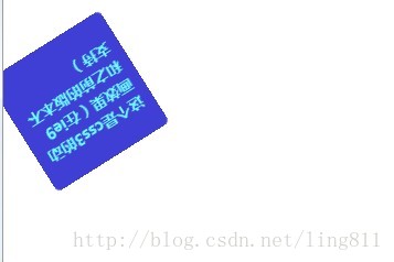
<div>这个是css3的动画效果(在ie9和之前的版本不支持)</div>
</body>
</html>CSS3 动画效果图
移动中的效果图:


 7720
7720


 被折叠的 条评论
为什么被折叠?
被折叠的 条评论
为什么被折叠?
 到【灌水乐园】发言


