


不多说,先上效果图:
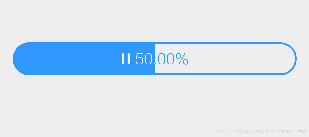
Android内置的ProgressBar很鸡肋,样式过于简单,现在需要一个内部能显示图标和文字的ProgressBar,同时,当进度条与图标和文字重叠时,图标和文字会相应变化颜色。这里的关键效果就在于变色的处理,我这里是通过设置相交模式实现这一效果的,应用了SrcIn模式,在图标和文字上方绘制一层白色图层,随progress进度调整图层宽度,当白色图层与图标和文字相交时,会将图标和文字显示为白色。
下面看一下主要实现代码:
public class CustomProgressBar extends ProgressBar {
private Context mContext;
private Paint mPaint;
private PorterDuffXfermode mPorterDuffXfermode;
private float mProgress;
private int mState;
// IconTextProgressBar的状态
private static final int STATE_DEFAULT = 101;
private static final int STATE_DOWNLOADING = 102;
private static final int STATE_PAUSE = 103;
private static final int STATE_DOWNLOAD_FINISH = 104;
// IconTextProgressBar的文字大小(sp)
private static final float TEXT_SIZE_SP = 17f;
// IconTextProgressBar的图标与文字间距(dp)
private static final float ICON_TEXT_SPACING_DP = 5f;
public CustomProgressBar(Context context) {
super(context, null, android.R.attr.progressBarStyleHorizontal);
mContext = context;
init();
}
public CustomProgressBar(Context context, AttributeSet attrs) {
super(context, attrs);
mContext = context;
init();
}
/**
* 设置下载状态
*/
public synchronized void setState(int state) {
mState = state;
invalidate();
}
/**
* 设置下载进度
*/
public synchronized void setProgress(float progress) {
super.setProgress((int) progress);
mProgress = progress;
}
@Override
protected void onDraw(Canvas canvas) {
super.onDraw(canvas);
switch (mState) {
case STATE_DEFAULT:
drawIconAndText(canvas, STATE_DEFAULT, false);
break;
case STATE_DOWNLOADING:
drawIconAndText(canvas, STATE_DOWNLOADING, false);
break;
case STATE_PAUSE:
drawIconAndText(canvas, STATE_PAUSE, false);
break;
case STATE_DOWNLOAD_FINISH:
drawIconAndText(canvas, STATE_DOWNLOAD_FINISH, true);
break;
default:
drawIconAndText(canvas, STATE_DEFAULT, false);
break;
}
}
private void init() {
setIndeterminate(false);
setIndeterminateDrawable(ContextCompat.getDrawable(mContext,
android.R.drawable.progress_indeterminate_horizontal));
setProgressDrawable(ContextCompat.getDrawable(mContext,
R.drawable.pb_shape_blue));
setMax(100);
mPaint = new Paint();
mPaint.setDither(true);
mPaint.setAntiAlias(true);
mPaint.setStyle(Paint.Style.FILL_AND_STROKE);
mPaint.setTextAlign(Paint.Align.LEFT);
mPaint.setTextSize(MeasureUtil.sp2px(mContext, TEXT_SIZE_SP));
mPaint.setTypeface(Typeface.MONOSPACE);
mPorterDuffXfermode = new PorterDuffXfermode(PorterDuff.Mode.SRC_IN);
}
private void initForState(int state) {
switch (state) {
case STATE_DEFAULT:
setProgress(100);
mPaint.setColor(Color.WHITE);
break;
case STATE_DOWNLOADING:
mPaint.setColor(ContextCompat.getColor(mContext, R.color.pb_blue));
break;
case STATE_PAUSE:
mPaint.setColor(ContextCompat.getColor(mContext, R.color.pb_blue));
break;
case STATE_DOWNLOAD_FINISH:
setProgress(100);
mPaint.setColor(Color.WHITE);
break;
default:
setProgress(100);
mPaint.setColor(Color.WHITE);
break;
}
}
private void drawIconAndText(Canvas canvas, int state, boolean onlyText) {
initForState(state);
String text = getText(state);
Rect textRect = new Rect();
mPaint.getTextBounds(text, 0, text.length(), textRect);
if (onlyText) {
// 仅绘制文字
float textX = (getWidth() / 2) - textRect.centerX();
float textY = (getHeight() / 2) - textRect.centerY();
canvas.drawText(text, textX, textY, mPaint);
} else {
// 绘制图标和文字
Bitmap icon = getIcon(state);
float textX = (getWidth() / 2) -
getOffsetX(icon.getWidth(), textRect.centerX(), ICON_TEXT_SPACING_DP, true);
float textY = (getHeight() / 2) - textRect.centerY();
canvas.drawText(text, textX, textY, mPaint);
float iconX = (getWidth() / 2) - icon.getWidth() -
getOffsetX(icon.getWidth(), textRect.centerX(), ICON_TEXT_SPACING_DP, false);
float iconY = (getHeight() / 2) - icon.getHeight() / 2;
canvas.drawBitmap(icon, iconX, iconY, mPaint);
if (state == STATE_DEFAULT) return;
Bitmap bufferBitmap = Bitmap.createBitmap(getWidth(), getHeight(), Bitmap.Config.ARGB_8888);
Canvas bufferCanvas = new Canvas(bufferBitmap);
bufferCanvas.drawBitmap(icon, iconX, iconY, mPaint);
bufferCanvas.drawText(text, textX, textY, mPaint);
// 设置混合模式
mPaint.setXfermode(mPorterDuffXfermode);
mPaint.setColor(Color.WHITE);
RectF rectF = new RectF(0, 0, getWidth() * mProgress / 100, getHeight());
// 绘制源图形
bufferCanvas.drawRect(rectF, mPaint);
// 绘制目标图
canvas.drawBitmap(bufferBitmap, 0, 0, null);
// 清除混合模式
mPaint.setXfermode(null);
if (!icon.isRecycled()) {
icon.isRecycled();
}
if (!bufferBitmap.isRecycled()) {
bufferBitmap.recycle();
}
}
}
private Bitmap getIcon(int state) {
Bitmap icon;
switch (state) {
case STATE_DEFAULT:
icon = BitmapFactory.decodeResource(getResources(), R.drawable.pb_download);
break;
case STATE_DOWNLOADING:
icon = BitmapFactory.decodeResource(getResources(), R.drawable.pb_pause_blue);
break;
case STATE_PAUSE:
icon = BitmapFactory.decodeResource(getResources(), R.drawable.pb_continue_blue);
break;
default:
icon = BitmapFactory.decodeResource(getResources(), R.drawable.pb_download);
break;
}
return icon;
}
private String getText(int state) {
String text;
switch (state) {
case STATE_DEFAULT:
text = getResources().getString(R.string.pb_download);
break;
case STATE_DOWNLOADING:
DecimalFormat decimalFormat = new DecimalFormat("#0.00");
text = decimalFormat.format(mProgress) + "%";
break;
case STATE_PAUSE:
text = getResources().getString(R.string.pb_continue);
break;
case STATE_DOWNLOAD_FINISH:
text = getResources().getString(R.string.pb_open);
break;
default:
text = getResources().getString(R.string.pb_download);
break;
}
return text;
}
private float getOffsetX(float iconWidth, float textHalfWidth, float spacing, boolean isText) {
float totalWidth = iconWidth + MeasureUtil.dip2px(mContext, spacing) + textHalfWidth * 2;
// 文字偏移量
if (isText) return totalWidth / 2 - iconWidth - spacing;
// 图标偏移量
return totalWidth / 2 - iconWidth;
}
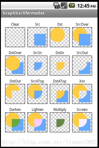
}这里再补充一种思路,相交模式中还有一种SrcATop,可以通过这种模式叠加绘制两层形状相同进度满格的ProgressBar,蓝色背景的在底部,显示白色字体,白色背景的在顶部,显示蓝色字体,然后利用canvas的clip方法再结合progress进度,将白色的ProgressBar从左往右一点点裁减掉,令底部蓝色的ProgressBar慢慢显示出来,达到一种动态增加的效果。注意这里与前一种实现方式相比还需要多准备一套白色的图标,具体实现可以自行动手尝试。


 4319
4319


 被折叠的 条评论
为什么被折叠?
被折叠的 条评论
为什么被折叠?
 到【灌水乐园】发言


