


文章开头直接给出最终效果,一个很简单的圆形progressBar:
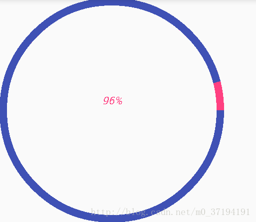
很简单的一个实现效果,如果是初学自定义view的小白可以跟着一起起撸一遍这个简单效果:
首先是自定义的属性的提前准备,这块应该没什么难点,在values文件夹下面创建一个attrs的xml文件,填入自己设置的自定义属性:
<?xml version="1.0" encoding="utf-8"?>
<resources>
    <declare-styleable name="CustomProgressBar">
        <attr name="roundProgressColor" format="color"></attr>
        <attr name="roundColor" format="color"></attr>
        <attr name="roundWidth" format="dimension"></attr>
        <attr name="textsize" format="dimension"></attr>
        <attr name="max" format="integer"></attr>
        <attr name="textColor" format="color"></attr>
        <attr name="textShow" format="boolean"></attr>
        <attr name="style">
            <enum name="Stroke" value="0"></enum>
            <enum name="Filee" value="1"></enum>
        </attr>
    </declare-styleable>
</resources>
这里设置的自定义属性有点多啊,大致的意思大家应该都能看懂,我这就不一一述说了,后面敲代码时会有注释的。
直接上自定义view的代码了:
  private int roundProgressColor;//外围进度走时变化的颜色
    private int roundColor;//初始化时圆本来的颜色
    private int textColor;//中间文字的颜色
    private float textSize;//文字的大小
    private float roundWidth;//外围的宽
    private int max;//最大,这里直接设置为100
    private boolean textShow;//是否显示文字

    private Paint paint;

    public CustomProgressBar(Context context, @Nullable AttributeSet attrs) {
        super(context, attrs);
        paint=new Paint();
        TypedArray typeArray = context.obtainStyledAttributes(attrs, R.styleable.CustomProgressBar);
        roundProgressColor=typeArray.getColor(R.styleable.CustomProgressBar_roundProgressColor,Color.YELLOW);
        roundColor=typeArray.getColor(R.styleable.CustomProgressBar_roundColor,Color.YELLOW);
        textColor=typeArray.getColor(R.styleable.CustomProgressBar_textColor,Color.YELLOW);
        textSize=typeArray.getDimension(R.styleable.CustomProgressBar_textsize,21f);
        roundWidth=typeArray.getDimension(R.styleable.CustomProgressBar_roundWidth,21f);
        max=typeArray.getInteger(R.styleable.CustomProgressBar_max,100);
        textShow=typeArray.getBoolean(R.styleable.CustomProgressBar_textShow,false);
        typeArray.recycle();
    }
在两个参数的构造方法中进行自定义属性的获取,记得最后将typeArray进行recycler回收。这里默认style
为Stroke的。将自定义属性获取到之后就可以在ondraw()方法中进行绘制了。当然了绘制之前为了更加的规范化,可以提前准备好各种的set和get方法。例如:
 public synchronized int getProgress(){
        return progress;
    }

    public synchronized void setProgress(int progress){
        if(progress<0){
            throw new IllegalArgumentException("progress不能小于0");
        }
        if(progress>max){
            progress = max;
        }
        if(progress <=max){
            this.progress = progress;
            postInvalidate();
        }
    }

    public int getRoundProgressColor() {
        return roundProgressColor;
    }

    public void setRoundProgressColor(int roundProgressColor) {
        this.roundProgressColor = roundProgressColor;
    }

    public int getRoundColor() {
        return roundColor;
    }
这里着重讲一下setProgress()方法。这个方法很显然是用来重绘整个view的,外界通过setProgress()来调用postInvalidate()进行重绘,使得整个progressBar跑起来。
话不多说看核心的onDraw()内部的方法:
 @Override
    protected void onDraw(Canvas canvas) {
        super.onDraw(canvas);
        //画默认的大圆环
        int center = getWidth()/2;//中心坐标点

        float radius =  center-roundWidth/2;//半径
        paint.setColor(roundColor);
        paint.setStyle(Paint.Style.STROKE);
        paint.setStrokeWidth(roundWidth);
        canvas.drawCircle(center,center,radius,paint);
这没什么好讲的,就是绘制了一个圆,将宽度的一半设置为中心点进行绘制。
  //画文字
        paint.setTextSize(textSize);
        paint.setTextSkewX(-0.25f);
        paint.setStrokeWidth(0);
        int percent=progress*100/max;
        String percentStr=percent+"%";
        if(textShow)
        canvas.drawText(percentStr,(getWidth()-paint.measureText(percentStr))/2f,
                getWidth()/2f-(paint.descent()-paint.ascent())/2f,paint);
画文字这块计算坐标如果是没有做过文本测量的可能会看不太懂,大家可以查一下这方面的东西补一下,不难,另外需要注意的是你需要将paint.setStrokeWidth(0)重新进行set,不然最终得到的中心显示百分比的会是一团乱,因为你将文字也添加了StrokeWidth。
这里我将文字的一下显示方位画下来可以给大家看一下,方便大家理解:
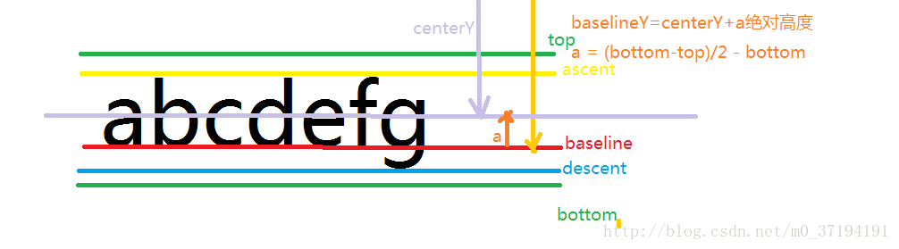
OK,大家可以去看一下文字的一些绘制资料来丰富自己的知识,这块在自定义中也是很重要的,我们直接看下面的:
//画圆弧
        RectF rectF=new RectF(center-radius,center-radius,center+radius,center+radius);
        paint.setColor(roundProgressColor);
        paint.setStrokeWidth(roundWidth);
        canvas.drawArc(rectF,0,360*progress/max,false,paint);
画圆弧的代码中我用的是canvas.drawArc(rectF,0,360*progress/max,false,paint)的方法来绘制圆弧。
这个方法第一个参数是一个区域的坐标限制,参数的表达意思依次为左上右下,咱们是在一个应该是正方形中进行的圆弧的绘制,所以计算很方便。
在布局文件中的布局代码如下:
<?xml version="1.0" encoding="utf-8"?>
<android.support.constraint.ConstraintLayout xmlns:android="http://schemas.android.com/apk/res/android"
    xmlns:app="http://schemas.android.com/apk/res-auto"
    xmlns:tools="http://schemas.android.com/tools"
    android:layout_width="match_parent"
    android:layout_height="match_parent"
    tools:context="com.example.administrator.costompaint.MainActivity">

  <com.example.administrator.costompaint.CustomProgressBar
      android:layout_width="300dp"
      android:layout_height="300dp"
      android:id="@+id/progressbar"
      app:roundColor="@color/colorAccent"
      app:roundProgressColor="@color/colorPrimary"
      app:textColor="#00ff00"
      app:textShow="true"
      app:roundWidth="10dp"
      />
</android.support.constraint.ConstraintLayout>
可以看到,Android Studio真的很强大,不需要咱们再去定义命名空间就可以直接使用app:来进行自定义属性的添加,赞一个。
那么最后一步呢就是让它转起来了,在MainActivity中设置一个监听,让他去不断的setProgress()不就能跑起来了吗?
 CustomProgressBar customProgressBar;
    private int progress;
    @Override
    protected void onCreate(Bundle savedInstanceState) {
        super.onCreate(savedInstanceState);
        setContentView(R.layout.activity_main);
        customProgressBar= (CustomProgressBar) findViewById(R.id.progressbar);
        customProgressBar.setOnClickListener(new View.OnClickListener() {
            @Override
            public void onClick(View v) {
                new Thread(){
                    @Override
                    public void run() {
                        while(progress<=100) {
                            progress+=3;
                            customProgressBar.setProgress(progress);
                            try {
                                Thread.sleep(500);
                            } catch (InterruptedException e) {
                                e.printStackTrace();
                            }
                        }
                    }
                }.start();
            }
        });
    }
是不是很简单?其实任何的高深的自定义view都是从这些基础开始的,多练多敲肯定可以啃下这块硬骨头的。


 扫一扫
扫一扫
 956
956

 被折叠的 条评论
为什么被折叠?
被折叠的 条评论
为什么被折叠?
 到【灌水乐园】发言


