


CoordinatorLayout是2015 I/O大会发布的一种布局,它可以说是一个非常强大的FrameLayout,主要用于协调(Coordinate)子控件,来帮助实现它们之间的一些交互效果。它适合用于应用的顶层布局,或是View之间交互的一个容器。
本篇主要是对CoordinatorLayout的相关内容进行一个初步的认识,看看CoordinatorLayout都提供了哪些特性来帮助完成View之间的交互。
Behavior
这是CoordinatorLayout被提到得最多的一个特性。由于Behavior的灵活性,使得它可以被用来实现各种复杂的交互。
Behavior用于实现子View的交互,这些交互包括拖动,滑动,滚动或其他手势等,也包括一些子View的变化。
我们来写一个简单的例子。
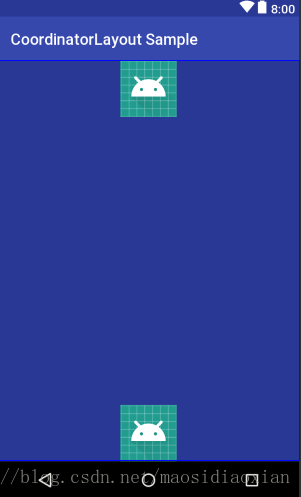
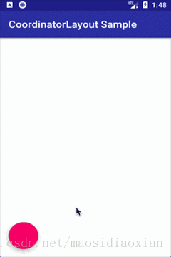
我们在CoordinatorLayout内声明一个FrameLayout,里面放两个ImageView,一个在顶部,一个在底部,如图:
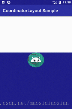
然后我们稍改一下代码,给FrameLayout设置一个behavior,布局代码如下:
<?xml version="1.0" encoding="utf-8"?>
<android.support.design.widget.CoordinatorLayout xmlns:android="http://schemas.android.com/apk/res/android"
    xmlns:app="http://schemas.android.com/apk/res-auto"
    android:id="@+id/main_content"
    android:layout_width="match_parent"
    android:layout_height="match_parent">

    <FrameLayout
        android:layout_width="match_parent"
        android:layout_height="match_parent"
        android:background="@color/colorPrimaryDark"
        app:layout_behavior="@string/bottom_sheet_behavior">

        <ImageView
            android:layout_width="wrap_content"
            android:layout_height="wrap_content"
            android:layout_gravity="center_horizontal"
            android:src="@mipmap/ic_launcher" />

        <ImageView
            android:layout_width="wrap_content"
            android:layout_height="wrap_content"
            android:layout_gravity="center_horizontal|bottom"
            android:src="@mipmap/ic_launcher" />
    </FrameLayout>

</android.support.design.widget.CoordinatorLayout>
运行,可以看到界面只显示了一部分,但可以通过上拉将它们拉出来,效果如下。
如果是自定义控件,我们也可以通过在类声明上面增加一个@CoordinatorLayout.DefaultBehavior注解,来声明它的默认Behavior。
Behavior提供了一系列的行为回调,通过对这这些回调方法的实现,使得复杂的交互成为了可能,并且高度解耦,对所使用的布局对象和你的业务代码零入侵。也就是说,把上面的FrameLayout换成其他的布局容器或控件,也同样可以实现这样的效果,而且可以不需要在你的Activity或Fragment中引入额外的代码来完成交互。
Anchor
通过设置anchor及anchorGravity,可以让一个View与另一个View相关联,使其跟随另一个View移动而移动。
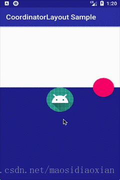
将上面的代码修改一下,增加一个FloatingActionButton,并且设置其anchor属性,如下所示:
<?xml version="1.0" encoding="utf-8"?>
<android.support.design.widget.CoordinatorLayout xmlns:android="http://schemas.android.com/apk/res/android"
    xmlns:app="http://schemas.android.com/apk/res-auto"
    android:layout_width="match_parent"
    android:layout_height="match_parent">

    <FrameLayout
        android:id="@+id/frame_layout"
        android:layout_width="match_parent"
        android:layout_height="match_parent"
        android:background="@color/colorPrimaryDark"
        app:layout_behavior="@string/bottom_sheet_behavior">

        <ImageView
            android:layout_width="wrap_content"
            android:layout_height="wrap_content"
            android:layout_gravity="center_horizontal"
            android:src="@mipmap/ic_launcher" />

        <ImageView
            android:layout_width="wrap_content"
            android:layout_height="wrap_content"
            android:layout_gravity="center_horizontal|bottom"
            android:src="@mipmap/ic_launcher" />
    </FrameLayout>

    <android.support.design.widget.FloatingActionButton
        android:layout_width="wrap_content"
        android:layout_height="wrap_content"
        android:layout_margin="16dp"
        app:layout_anchor="@id/frame_layout"
        app:layout_anchorGravity="right" />
</android.support.design.widget.CoordinatorLayout>
运行效果如下,可以看到我们的FloatingActionButton的位置始终随着FrameLayout的变化而变化:
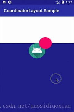
anchor属性的View Id可以对应为CoordinatorLayout内的任意一个View,除了不能设置为这个View自己或在它之内的View。比如在上面的例子中,我们也可以把layout_anchor属性设置为FrameLayout的一个子View。如下:
<?xml version="1.0" encoding="utf-8"?>
<android.support.design.widget.CoordinatorLayout xmlns:android="http://schemas.android.com/apk/res/android"
    xmlns:app="http://schemas.android.com/apk/res-auto"
    android:layout_width="match_parent"
    android:layout_height="match_parent">

    <FrameLayout
        android:id="@+id/frame_layout"
        android:layout_width="match_parent"
        android:layout_height="match_parent"
        android:background="@color/colorPrimaryDark"
        app:layout_behavior="@string/bottom_sheet_behavior">

        <ImageView
            android:id="@+id/icon"
            android:layout_width="wrap_content"
            android:layout_height="wrap_content"
            android:layout_gravity="center_horizontal"
            android:src="@mipmap/ic_launcher" />

        <ImageView
            android:layout_width="wrap_content"
            android:layout_height="wrap_content"
            android:layout_gravity="center_horizontal|bottom"
            android:src="@mipmap/ic_launcher" />
    </FrameLayout>

    <android.support.design.widget.FloatingActionButton
        android:layout_width="wrap_content"
        android:layout_height="wrap_content"
        android:layout_margin="16dp"
        app:layout_anchor="@id/icon"
        app:layout_anchorGravity="right" />
</android.support.design.widget.CoordinatorLayout>
运行如下:
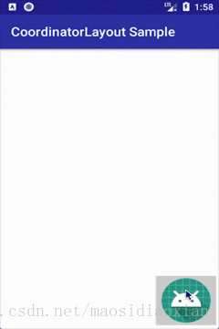
dodgeInsetEdges
我们在CoordinatorLayout中放一个FloatingActionButton,并且设置点击这个FloatingActionButton的时候弹出一个Snackbar,代码如下:
<?xml version="1.0" encoding="utf-8"?>
<android.support.design.widget.CoordinatorLayout xmlns:android="http://schemas.android.com/apk/res/android"
    xmlns:app="http://schemas.android.com/apk/res-auto"
    android:layout_width="match_parent"
    android:layout_height="match_parent">

    <android.support.design.widget.FloatingActionButton
        android:id="@+id/fab"
        android:layout_width="wrap_content"
        android:layout_height="wrap_content"
        android:layout_gravity="bottom"
        android:layout_margin="16dp"
        android:onClick="onClick" />

</android.support.design.widget.CoordinatorLayout>
运行之后,可以看到当Snackbar弹起来的时候,FloatingActionButton也会往内移动以避免它被遮挡,如下图:
这并不是FloatingActionButton所独有的特性,而是由CoordinatorLayout所提供。通过设置dodgeInsetEdges,可以让子View能够避让而不被其他View遮挡。
我们把上面的FloatingActionButton换成ImageButton,并且设置dodgeInsetEdges属性,代码如下:
<?xml version="1.0" encoding="utf-8"?>
<android.support.design.widget.CoordinatorLayout xmlns:android="http://schemas.android.com/apk/res/android"
    xmlns:app="http://schemas.android.com/apk/res-auto"
    android:layout_width="match_parent"
    android:layout_height="match_parent">

    <ImageButton
        android:id="@+id/image"
        android:layout_width="wrap_content"
        android:layout_height="wrap_content"
        android:layout_gravity="right|bottom"
        android:layout_margin="16dp"
        android:onClick="onClick"
        android:src="@mipmap/ic_launcher"
        app:layout_dodgeInsetEdges="bottom" />

</android.support.design.widget.CoordinatorLayout>这里dodgeInsetEdges设置的是所避让的方向,可以是一个或多个方向,也可以设置为all,即避让所有方向。
运行起来,我们发现ImageButton也可以避开而不被Snackbar遮挡了。
Design library 对CoordinatorLayout 的支持
在Design library中,提供了大量的material design 组件,其中一些组件可以和CoordinatorLayout配合使用,以快速实现交互。除了前面提到的Snackbar, FloatingActionButton之外,还有CollapsingToolbarLayout,AppBarLayout这些布局。除了这些布局,design library也实现了一些behavior,可以被直接使用,比如appbar_scrolling_view_behavior,还有前面使用到的bottom_sheet_behavior。这些例子网上较多,这里就不赘述了。
下一篇将对CoordinatorLayout的源码一探究竟,以分析和理解它的实现原理。
本文内容所涉及的完整代码见:https://github.com/msdx/CoordinatorLayout-Sample


 201
201


 被折叠的 条评论
为什么被折叠?
被折叠的 条评论
为什么被折叠?
 到【灌水乐园】发言


