


JavaFx初探(颜色选择器)
本章介绍ColorPicker 控件、设计概要、以及如何在应用中使用。
颜色选择器可以让用户在一个颜色区域内选择一个适合的颜色,也可以通过设置RGB或HSB值来获取一个颜色。
设计概要
ColorPicker 控件包括颜色选择、调色板以及自定义颜色窗口。看下图:
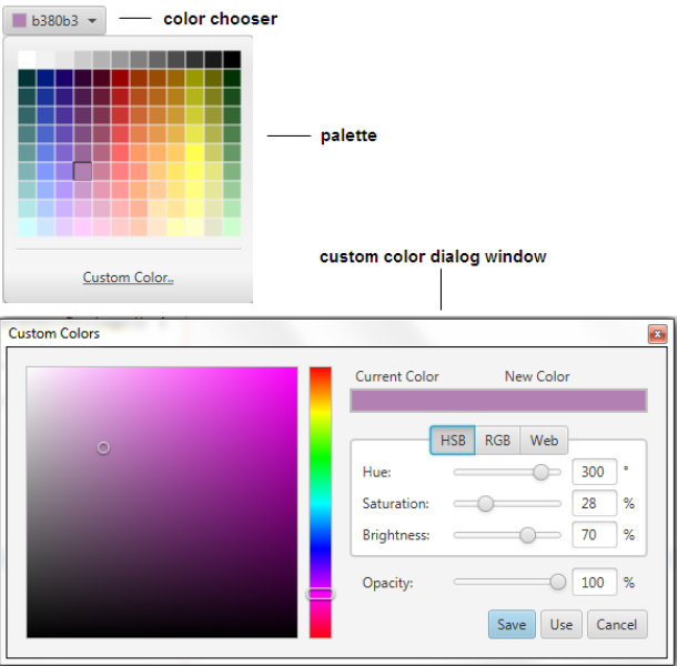
颜色选择器
颜色选择器是一个组合框,包括了所有可以选择的颜色和颜色指示器。颜色指示器显示了当前选中的颜色。
有3中样式的颜色选择器,如下图所示:
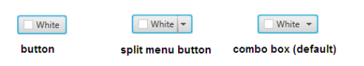
第一种只是一个按钮,包含了颜色指示器和一个Label。第二种是用竖线分开的形式,把按钮和下拉菜单分开。第三种是默认的形式,它也包含一个下拉菜单,但是并没有使用竖线分开。
我们可以使用CSS样式来修饰颜色选择器,具体信息下面会讲到。
调色板
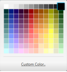
调色板包含了预定义的颜色集合以及自定义颜色的链接。默认的表现形式如下图所示:
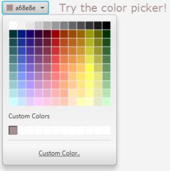
如你你定义了自己的颜色,那么这些颜色将显示在自定义颜色区域,如下图所示:
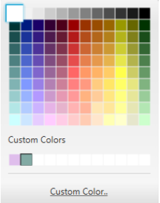
调色面板支持使用键盘上的方向键来导航。
如果应用重新启动了,那么自定义颜色将会消失,除非你在应用中保存了。每一个被选择的颜色都会出现在颜色选择器中。并会显示这个颜色的十六进制的值。
自定义颜色窗口
自定义颜色窗口是一个模式窗口,可以通过点击调色板上的链接打开。当自定义颜色窗口打开的时候,它的值就是颜色指示器中显示的颜色的值,用户可以通过在颜色区域移动鼠标来定义一个新的颜色或者移动颜色条,这些改变都会同步到ColorPicker 相应的属性上。自定义颜色窗口如下所示:
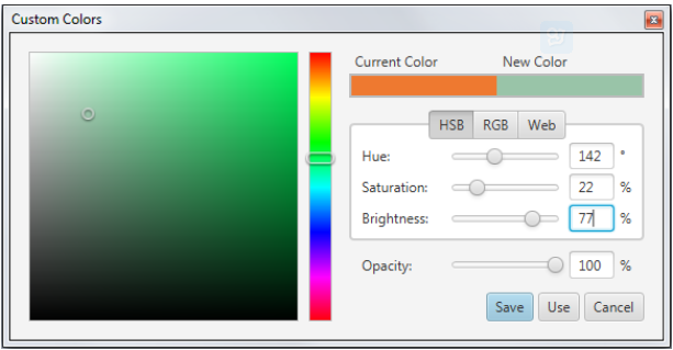
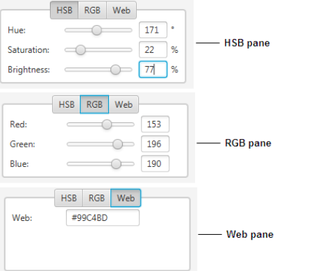
另外一种方式去定义一个颜色就是设置HSB或RGB值,或者直接填写一个web颜色,如下图所示:
你还可以通过透明度滑块设置透明度,或者直接填一个透明度值。
当所有的这些都设置好了,那么一个自定义颜色就有了,然后可以点击Use按钮来使用它,或者保存在自定义颜色中。
使用颜色选择器
使用ColorPicker 类来创建颜色选择器。你可以直接把它添加到场景中,或者布局容器中,或者工具栏中。下面代码展示了创建ColorPicker 对象的方法:
//Empty contructor, the control appears with the default color, which is WHITE
ColorPicker colorPicker1 = new ColorPicker();
//Color constant set as the currently selected color
ColorPicker colorPicker2 = new ColorPicker(Color.BLUE);
//Web color value set as the currently selected color
ColorPicker colorPicker3 = new ColorPicker(Color.web("#ffcce6"));
下面我们在项目中使用一下:
import javafx.application.Application;
import javafx.event.*;
import javafx.scene.Scene;
import javafx.scene.control.ColorPicker;
import javafx.geometry.Insets;
import javafx.scene.layout.HBox;
import javafx.scene.paint.Color;
import javafx.scene.text.*;
import javafx.stage.Stage;

public class ColorPickerSample extends Application {
    public static void main(String[] args) {
        launch(args);
    }

    @Override
    public void start(Stage stage) {
        stage.setTitle("ColorPicker");
        Scene scene = new Scene(new HBox(20), 400, 100);
        HBox box = (HBox) scene.getRoot();
        box.setPadding(new Insets(5, 5, 5, 5));
        final ColorPicker colorPicker = new ColorPicker();
        colorPicker.setValue(Color.CORAL);

        final Text text = new Text("Try the color picker!");
        text.setFont(Font.font ("Verdana", 20));
        text.setFill(colorPicker.getValue());


        colorPicker.setOnAction((ActionEvent t) -> {
            text.setFill(colorPicker.getValue());
        });

        box.getChildren().addAll(colorPicker, text);

        stage.setScene(scene);
        stage.show();
    }
}
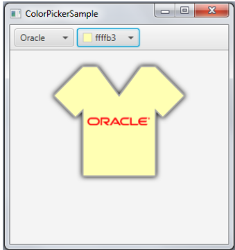
这个例子创建了一个颜色选择器,并且指定了当颜色改变后的行为:通过getValue获取颜色值,然后传给了Text的setFill方法。遮掩文本的颜色就会改变。编译运行这段代码,如下图所示:
当然,你也可以把选中的颜色指定给一个图像节点,下面我们展示怎么给一个T恤改变颜色:
import javafx.application.Application;
import javafx.scene.Scene;
import javafx.scene.control.ColorPicker;
import javafx.beans.value.ChangeListener;
import javafx.beans.value.ObservableValue;
import javafx.event.ActionEvent;
import javafx.scene.control.ComboBox;
import javafx.scene.control.ToolBar;
import javafx.scene.effect.DropShadow;
import javafx.scene.image.Image;
import javafx.scene.image.ImageView;
import javafx.scene.layout.StackPane;
import javafx.scene.layout.VBox;
import javafx.scene.paint.Color;
import javafx.scene.shape.SVGPath;
import javafx.stage.Stage;

public class ColorPickerSample extends Application {

    ImageView logo = new ImageView(
        new Image(getClass().getResourceAsStream("OracleLogo.png"))
    );

    public static void main(String[] args) {
        launch(args);
    }

    @Override
    public void start(Stage stage) {
        stage.setTitle("ColorPicker");

        Scene scene = new Scene(new VBox(20), 300, 300);
        VBox box = (VBox) scene.getRoot();

        ToolBar tb = new ToolBar();
        box.getChildren().add(tb);

        final ComboBox logoSamples = new ComboBox();
        logoSamples.getItems().addAll(
                "Oracle",
                "Java",
                "JavaFX",
                "Cup");
        logoSamples.setValue("Oracle");

        logoSamples.valueProperty().addListener(new ChangeListener<String>() {
            @Override
            public void changed(ObservableValue ov, String t, String t1) {
                logo.setImage(
                    new Image(getClass().getResourceAsStream(t1+"Logo.png"))
                );
            }
        });
        final ColorPicker colorPicker = new ColorPicker();
        tb.getItems().addAll(logoSamples, colorPicker);

        StackPane stack = new StackPane();
        box.getChildren().add(stack);

        final SVGPath svg = new SVGPath();
        svg.setContent("M70,50 L90,50 L120,90 L150,50 L170,50"
            + "L210,90 L180,120 L170,110 L170,200 L70,200 L70,110 L60,120 L30,90"
            + "L70,50");
        svg.setStroke(Color.DARKGREY);
        svg.setStrokeWidth(2);
        svg.setEffect(new DropShadow());
        svg.setFill(colorPicker.getValue());
        stack.getChildren().addAll(svg, logo);

        colorPicker.setOnAction((ActionEvent t) -> {
            svg.setFill(colorPicker.getValue());
        });

        stage.setScene(scene);
        stage.show();
    }
}
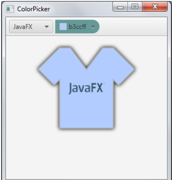
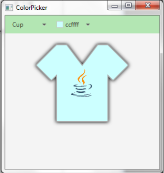
在这个例子中,我们通过getValue获取颜色选择器的值,然后把这个值赋给了SVGPath的对象。这个例子的输出如下:
当我们使用颜色选择器的时候,我们可以通过getCustomsColors方法获取自定义颜色,返回一个ObservableList ,你可以在应用启动的时候,把这些颜色设置上。当然你也可以使用自定义颜色设置颜色选择器的值:
ObservableList<Color> customColors = colorPicker.getCustomColors();
colorPicker.setValue(customColors.get(index));
改变颜色选择器的外观
默认的颜色选择器的外观定义在com.sun.javafx.scene.control.skin.ColorPickerSkin 类中,我们可以使用CSS定义-fx-skin 属性的值来改变颜色选择器的皮肤。
.color-picker {
    -fx-skin: "CustomSkin";
}
使用split-button和arrow-button CSS样式来改变颜色选择器的外观。
//Sets the split-menu-button
colorPicker.getStyleClass().add("split-button");
//Sets the button
colorPicker.getStyleClass().add("button");
我们可以是用CSS样式来改变颜色选择器的样式,默认的样式定义在modena文件中。所以我们需要修改modena文件中定义的样式。如下:
.color-picker {
    -fx-background-color: #669999;
    -fx-background-radius: 0 15 15 0;
}
.color-picker .color-picker-label .text {
    -fx-fill: #ccffcc;
}
把上面的样式加入ControlStyle.css文件中,然后生效。scene.getStylesheets().add(“colorpickersample/ControlStyle.css”);, 编译运行后结果如下:
修改ControlStyle文件内容如下:
.tool-bar:horizontal {
    -fx-background-color: #b3e6b3;
}

.combo-box-base  {
    -fx-background-color: null;
}

.combo-box-base:hover  {
    -fx-effect: dropshadow( three-pass-box , rgba(0,0,0,0.6) , 8, 0.0 , 0 , 0 );
}
编译运行如下图所示:


 417
417


 被折叠的 条评论
为什么被折叠?
被折叠的 条评论
为什么被折叠?
 到【灌水乐园】发言


