


Switch:开关控件
主要属性:
value:是否打开。默认为false
disabled:是否禁用 默认false
onTintColor:打开时背景色
thumbTintColor:圆形按钮的背景颜色
tintColor:关闭时的边框颜色(iOS)或者背景颜色(Android)。
onValueChange:value值发生变化时的回调,参数为当前Switch的值。提示:如果想要切换Switch,必须改变value值,否则Switch保持不变。
Demo:
import React, {Component} from 'react';
import {
StyleSheet,
View,
Switch,
Text,
Button,
} from 'react-native';
export default class SwitchDemo extends Component {
state = {
value: false,
disabled: false,
changeTxt:'切换Switch',
}
render() {
return (
<View style={{flex:1}}>
<View style={{flexDirection:'row',paddingLeft:20}}>
<Button title={this.state.value?'关闭':'打开'}
onPress={()=>{this.setState({value:!this.state.value});}}></Button>
<Switch style={{marginLeft:20}} value={this.state.value} onTintColor='red' tintColor='blue'
thumbTintColor='black'/>
</View>
<View style={{flexDirection:'row',paddingLeft:20,marginTop:20}}>
<Button title={this.state.disabled?'启用':'禁用'}
onPress={()=>{this.setState({disabled:!this.state.disabled});}}></Button>
<Switch style={{marginLeft:20}} value={true} disabled={this.state.disabled}/>
</View>
<View style={{flexDirection:'row',paddingLeft:20,marginTop:20}}>
<Text>{this.state.changeTxt}</Text>
<Switch value={this.state.value} onValueChange={(value)=>{
this.setState({
value:value,
changeTxt:value?'switch 打开了':'switch 关闭了'
});
}}/>
</View>
</View>
);
}
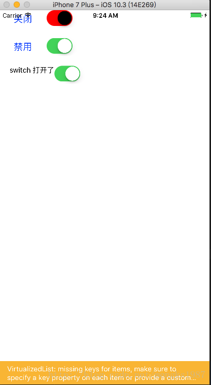
}效果图


 7607
7607


 被折叠的 条评论
为什么被折叠?
被折叠的 条评论
为什么被折叠?
 到【灌水乐园】发言


