


距上一次发表菜鸟学安卓已经好长时间了,最近脑子一热又开始了我的博客学习所以我抽抽时间把这一系列的博文也更新几篇。这里面主要放一些基础知识(控件,布局,生命周期之类),重点是学会用,而不深究其源码。希望能帮到大家~
话不多说我们继续来看我们没讲完的几个基础布局
帧布局
FrameLayout
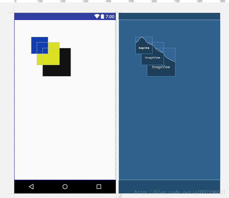
其特点为在默认情况下(与RelativeLayout相同)所有组件都是放在左上角,并且只能看到最上面的组件,也就是代码按顺序下来最下面的那个组件。可能大家会觉得这是他最不好用的地方,而且FrameLayout下面组件可用的方法并没有很多。但FrameLayout存在就一定有其用处,等之后用到了我们再仔细讲。
下面是一段简单的FrameLayout代码:
<?xml version="1.0" encoding="utf-8"?>
<FrameLayout xmlns:android="http://schemas.android.com/apk/res/android"
    android:layout_width="match_parent"
    android:layout_height="match_parent">

    <ImageView
        android:layout_width="100dp"
        android:layout_height="100dp"
        android:background="#111111"/>

    <ImageView
        android:layout_width="80dp"
        android:layout_height="80dp"
        android:background="#dae123"/>

    <ImageView
        android:layout_width="60dp"
        android:layout_height="60dp"
        android:background="#123dae"/>

</FrameLayout>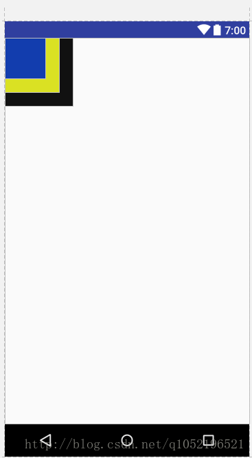
这个显示效果跟我们之前讲的一样,后面的ImageView覆盖前面的ImageView。FrameLayout也有其指定组件位置的方式,通过layout_gravity,marginXXX等属性也可以。但一般都如果要通过marginXXX来指定位置的话屏幕的适配性就不是很好。很有可能在这只手机上是你想要的效果,到了另外一只分辨率,dpi不同的手机上显示效果就截然不同。所以一般都不会在FrameLayout来刻意指定组件位置,明明有更好的LinearLayout的weight属性,RelativeLayout的相对属性可以用,为什么要用FrameLayout呢?
但在这里要说一点:如果要实现各组件重叠的效果,用FrameLayout比RelativeLayout性能高很多。这也是FrameLayout比较杰出的优点之一,性能高。
google api:
FrameLayout is designed to block out an area on the screen to display a single item. Generally, FrameLayout should be used to hold a single child view, because it can be difficult to organize child views in a way that’s scalable to different screen sizes without the children overlapping each other. You can, however, add multiple children to a FrameLayout and control their position within the FrameLayout by assigning gravity to each child, using the android:layout_gravity attribute.
(FrameLayout设计出来用于在屏幕上开辟出一块区域放置一个单独的组件,FrameLayout应该被用来存放一个单独的字控件,因为它很难以一个可扩展的方式把各个子控件从重叠的状态分离开来。然而,你可以在FrameLayout里面放多个控件,并用android:layout_gravity属性来控制各个子控件的位置)
Child views are drawn in a stack, with the most recently added child on top. The size of the FrameLayout is the size of its largest child (plus padding), visible or not (if the FrameLayout’s parent permits). Views that are GONE are used for sizing only if setConsiderGoneChildrenWhenMeasuring() is set to true.
(子控件的视图是栈里面绘制的,最近绘制的子控件放在最上面。FrameLayout的大小是最大子控件的大小+FrameLayout的padding属性里面指定的值(还要看子控件是否可见),控件的visible属性的GONE只在setConsiderGoneChildrenWhenMeasuring()设定为true的情况下用于测量大小)
最后一段我来解释一下吧,可能看的不是很懂。FrameLayout的大小是自己的最大子控件的大小加上自己本身的padding属性,从另一个方面讲其实也就是自己最大的子控件加上所有控件的margin效果。
padding:表示自己与自己里面的控件距离。
margin:表示自己与自己外面的父布局边界的距离。
如果最大的控件的visible指定为GONE,那么默认情况下是不参与测量的。除非setConsiderGoneChildrenWhenMeasuring()指定为true。因为GONE表示这个控件不占用空间位置,不同于invisiable(只是看不见但还是占用空间位置)。setConsiderGoneChildrenWhenMeasuring()大家看名字就知道这个什么意思了,在测量的时候考虑GONE的子控件。
绝对布局
AbsoluteLayout
这个就一个特点,所有控件的位置可以用layout_x,layout_y来表示。现在已经被废弃掉了~~~
<?xml version="1.0" encoding="utf-8"?>
<AbsoluteLayout xmlns:android="http://schemas.android.com/apk/res/android"
    android:layout_width="match_parent"
    android:layout_height="match_parent">

    <ImageView
        android:layout_width="100dp"
        android:layout_height="100dp"
        android:layout_x="100dp"
        android:layout_y="100dp"
        android:background="#111111" />

    <ImageView
        android:layout_width="80dp"
        android:layout_height="80dp"
        android:layout_x="80dp"
        android:layout_y="80dp"
        android:background="#dae123" />

    <ImageView
        android:layout_width="60dp"
        android:layout_height="60dp"
        android:layout_x="60dp"
        android:layout_y="60dp"
        android:background="#123dae" />

</AbsoluteLayout>
google api
A layout that lets you specify exact locations (x/y coordinates) of its children. Absolute layouts are less flexible and harder to maintain than other types of layouts without absolute positioning.
(一个能让你明确规定子控件xy坐标的布局,AbsoluteLayout有很小的灵活性以及缺少绝对定位的情况下比其他布局更难保持)
This class was deprecated in API level 3.
Use FrameLayout, RelativeLayout or a custom layout instead.
(这个类在api level3之后就被反对了,使用FrameLayout, RelativeLayout或者自定义布局来替代它)
连官方都这么说了,我们还能怎么样呢?果断票了它!
表格布局
TableLayout
顾名思义,就是按表格的排版方式放置各个组件。话不多说,直接上代码~
<?xml version="1.0" encoding="utf-8"?>
<TableLayout xmlns:android="http://schemas.android.com/apk/res/android"
    android:layout_width="match_parent"
    android:layout_height="match_parent"
    android:stretchColumns="1">//拉伸第0行

    <TableRow>
        <TextView
            android:layout_column="0"//表示这是第0行
            android:text="用户名"
            android:textSize="20sp" />

        <EditText/>

    </TableRow>

    <TableRow>

        <TextView
            android:text="密码"
            android:textSize="20sp" />

        <EditText/>

    </TableRow>
</TableLayout>
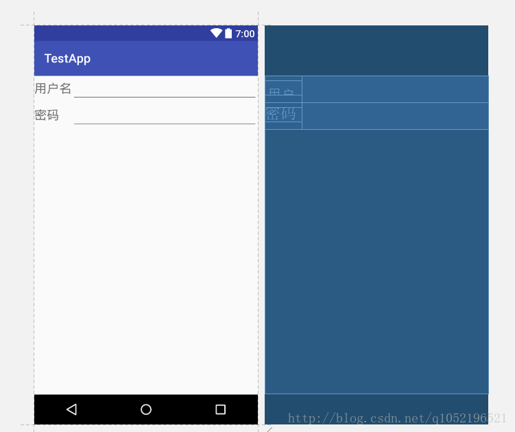
这一般来说就是我们想要实现的样子了。在TableLayout里面一个标签表示一行(不管是不是TableRow),在TableRow里面一个标签表示一列。如果你在TableRow里面放一个layout,然后layout里面再放1000个东西,也只占一列。大家可以自己试一试,看到结果了才能记得住嘛~大家对上面代码有些不懂的,可以先看看下面的google api。
google api
A layout that arranges its children into rows and columns. A TableLayout consists of a number of TableRow objects, each defining a row (actually, you can have other children, which will be explained below). TableLayout containers do not display border lines for their rows, columns, or cells. Each row has zero or more cells; each cell can hold one View object. The table has as many columns as the row with the most cells. A table can leave cells empty. Cells can span columns, as they can in HTML.
(一个把子控件们编排成行列的布局,一个TableLayout存在几个TableRow组件,每一个定义了一行(当然了,你可以有其他的子控件,下面会解释)。TableLayout容器不会显示行边界,列边界,格子的边界,每一行有0或者多个格子,每个格子可以放一个view控件。表格的列数跟有最多格子的行的列数相等。表格里单元格可以是空的。格子能像在HTML里那样跨越列。)
The width of a column is defined by the row with the widest cell in that column. However, a TableLayout can specify certain columns as shrinkable or stretchable by calling setColumnShrinkable() or setColumnStretchable(). If marked as shrinkable, the column width can be shrunk to fit the table into its parent object. If marked as stretchable, it can expand in width to fit any extra space. The total width of the table is defined by its parent container. It is important to remember that a column can be both shrinkable and stretchable. In such a situation, the column will change its size to always use up the available space, but never more. Finally, you can hide a column by calling setColumnCollapsed()
(某一列的宽度跟这一列最长的格子的宽度相等。然而,一个TableLayout能明确指定某一列收缩或者拉伸通过调用setColumnShrinkable()和setColumnStretchable()。如果某一列标记为shrinkable(收缩),那么这一列会收缩到来适应其父布局,如果某一列标记为stretchable(拉伸),那么这一列会扩展来充满其他额外的空间。在这种情况下,这一列会改变其大小来总是用完可用的空间,但不会使用更多的其他空间。最后你可以通过调用setColumnCollapsed()来隐藏某一列).
The children of a TableLayout cannot specify the layout_width attribute. Width is always MATCH_PARENT. However, the layout_height attribute can be defined by a child; default value is WRAP_CONTENT. If the child is a TableRow, then the height is always WRAP_CONTENT.
(TableLayout的子控件不能指定layout_width属性,因为宽度总是MATCH_PARENT的。然而,子控件能指定 the layout_height属性,默认是WRAP_CONTENT但如果子控件是TableRow,那么高度总是WRAP_CONTENT)
Cells must be added to a row in increasing column order, both in code and XML. Column numbers are zero-based. If you don’t specify a column number for a child cell, it will autoincrement to the next available column. If you skip a column number, it will be considered an empty cell in that row. See the TableLayout examples in ApiDemos for examples of creating tables in XML.
(每一个单元格都应该通过增加列数来指明自己是第几列的,在代码和xml里面都一样,列数是从0开始的,如果你不为单元格显示指定列号,它会自动往下+1,如果你跳过了一个列号,那么会自动在跳过的列号的格子那里放一个空的格子)
Although the typical child of a TableLayout is a TableRow, you can actually use any View subclass as a direct child of TableLayout. The View will be displayed as a single row that spans all the table columns.
(虽然TableLayout典型的子控件是TableRow,实际上你也可以用任何View的子类作为TableLayout的直接子控件。你写的View都会在表格中以单独一行的方式展示出来并且会跨越所有的列)
好长的话,终于翻译完了,不过确实收获颇丰。大家对于哪一块不懂的可以自己试验一下,
我贴一下自己的实验代码。
<?xml version="1.0" encoding="utf-8"?>
<TableLayout xmlns:android="http://schemas.android.com/apk/res/android"
    android:layout_width="match_parent"
    android:layout_height="match_parent"
    android:stretchColumns="1">

    <TableRow>
        <TextView
            android:layout_column="0"
            android:text="用户名"
            android:textSize="20sp" />
        <!--这个默认列号是1-->
        <EditText/>
    </TableRow>

    <TableRow
        android:layout_height="1000dp">//无论指定什么一定是wrap_content

        <!--这个默认列号是0-->
        <TextView
            android:text="密码"
            android:textSize="20sp" />
        <!--中间空了一个格子-->
        <EditText
            android:layout_column="2"/>
    </TableRow>

    <TextView
        android:gravity="center"
        android:text="跨列"/>

</TableLayout>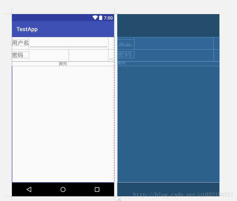
网格布局
GridLayout
这个也挺简单的,就是把所有的控件按网格一样通过指定行列号来放置。还是照惯例放一段满足日常需求的代码:
<?xml version="1.0" encoding="utf-8"?>
<GridLayout xmlns:android="http://schemas.android.com/apk/res/android"
    android:layout_width="match_parent"
    android:layout_height="match_parent"
    android:columnCount="3"//指定列数为3
    android:orientation="horizontal"
    android:rowCount="3">//指定行数为3

    <TextView
        android:layout_columnSpan="2"//跨越两列
        android:layout_width="40dp"
        android:layout_height="40dp"
        android:gravity="center"
        android:text="1"
        android:textSize="20sp" />

    <TextView
        android:layout_width="40dp"
        android:layout_height="40dp"
        android:layout_rowSpan="2"//跨越两行
        android:gravity="center"
        android:text="2"
        android:textSize="20sp" />

    <TextView
        android:layout_width="40dp"
        android:layout_height="40dp"
        android:gravity="center"
        android:text="3"
        android:textSize="20sp" />

    <TextView
        android:layout_width="40dp"
        android:layout_height="40dp"
        android:gravity="center"
        android:text="4"
        android:textSize="20sp" />

    <TextView
        android:layout_width="40dp"
        android:layout_height="40dp"
        android:gravity="center"
        android:text="5"
        android:textSize="20sp" />

</GridLayout>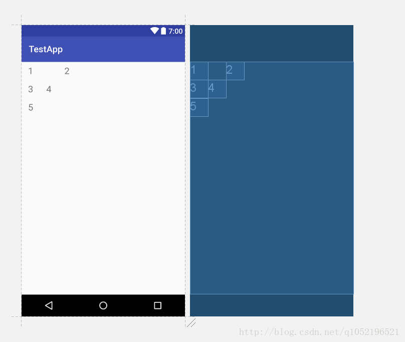
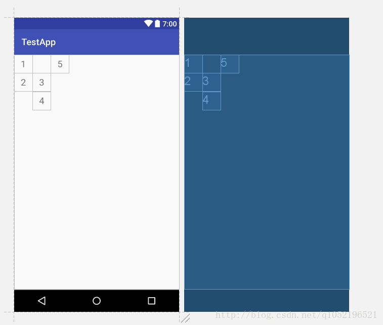
上面的代码里面我在控件里没有指定layout_column和layout_row这两个是用来显示指定控件在网格里摆放的位置的,不写的话就默认按orientation顺序摆放下去,若把上面的orientation属性改为vertical(不指定默认horizontal)那么会有以下的效果:
google api:
A layout that places its children in a rectangular grid.
(一个把它的子控件们放置在长方形网格的布局)
The grid is composed of a set of infinitely thin lines that separate the viewing area into cells. Throughout the API, grid lines are referenced by grid indices. A grid with N columns has N + 1 grid indices that run from 0 through N inclusive. Regardless of how GridLayout is configured, grid index 0 is fixed to the leading edge of the container and grid index N is fixed to its trailing edge (after padding is taken into account).
(网格通过一系列无限长的细线分割成许多小格子,在API里面网格线作为网格指数的参考。一个有N个列的网格,网格号从0到N有N+1个数。不管GridLayout是怎么指定的,网格号0永远被指定为网格容器的开始,网格号N永远被指定为时网格容器的最后(在padding被考虑进去之后))
Children occupy one or more contiguous cells, as defined by their rowSpec and columnSpec layout parameters. Each spec defines the set of rows or columns that are to be occupied; and how children should be aligned within the resulting group of cells. Although cells do not normally overlap in a GridLayout, GridLayout does not prevent children being defined to occupy the same cell or group of cells. In this case however, there is no guarantee that children will not themselves overlap after the layout operation completes.
(子控件们可以通过指定他们的rowSpec 参数和columnSpec 参数来占领一个或者多个临近的格子。每个参数定义了要被占领的一系列行或者列并且定义了子控件们应该怎么样与方格组对齐,虽然格子一般不会在一个GridLayout里面重叠,但GridLayout也没有阻止子控件们重叠在同一个格子或者一组格子里面。但在这种情况下不能保证在布局操作完成以后,子控件们会不会重叠)
If a child does not specify the row and column indices of the cell it wishes to occupy, GridLayout assigns cell locations automatically using its: orientation, rowCount and columnCount properties.
(如果子控件没有明确指定所要占领的格子的行列号,GridLayout会自动根据orientation,rowCount和columnCount参数来自动分配)
Space between children may be specified either by using instances of the dedicated Space view or by setting the leftMargin, topMargin, rightMargin and bottomMargin layout parameters. When the useDefaultMargins property is set, default margins around children are automatically allocated based on the prevailing UI style guide for the platform. Each of the margins so defined may be independently overridden by an assignment to the appropriate layout parameter. Default values will generally produce a reasonable spacing between components but values may change between different releases of the platform.
(子控件们之间的空间可以通过专门用来占领空间的实例或者margin属性来指定,当指定了useDefaultMargins 属性之后,子控件周围的默认margin会自动根据平台UI的风格来分配,这样定义的margin属性能够被适当的布局参数独立的覆盖。默认值会一般性地产生一个组件间合理的距离,但值有可能会因为平台版本的不同而改变)
GridLayout’s distribution of excess space is based on priority rather than weight.
(GridLayout的多余空间的分配时基于优先级而不是权重)
A child’s ability to stretch is inferred from the alignment properties of its row and column groups (which are typically set by setting the gravity property of the child’s layout parameters). If alignment was defined along a given axis then the component is taken as flexible in that direction. If no alignment was set, the component is instead assumed to be inflexible.
(一个子控件的拉伸能力是由其行和列的对齐属性来决定的(通常由子控件的布局参数的gravity属性来指定)。如果沿着给定的轴对准,则组件在该方向上被认为是灵活的。如果没有设置对齐,则认为该组件是不灵活的)
Multiple components in the same row or column group are considered to act in parallel. Such a group is flexible only if all of the components within it are flexible. Row and column groups that sit either side of a common boundary are instead considered to act in series. The composite group made of these two elements is flexible if one of its elements is flexible.
(在同一行或者同一列有多个组件的时候会被考虑以平行的方式展示。这样的一组控件只有当里面所有的控件是灵活的时候才被视为是灵活的。在公共边界的两个控件组被视为是串联的。这个由两个元素构成的混合组当其中一个元素是灵活的时候就被视为是灵活的)
To make a column stretch, make sure all of the components inside it define a gravity. To prevent a column from stretching, ensure that one of the components in the column does not define a gravity.
(为了使列能够伸展,确保这一列里面所有的组价都定义了gravity属性。为了防止一列伸展,确保这一列的其中一个组件没有定义gravity就好了)
When the principle of flexibility does not provide complete disambiguation, GridLayout’s algorithms favour rows and columns that are closer to its right and bottom edges.
(当灵活性原则没有提供一个完整的歧义说明,GridLayout更倾向于接近右边和底部的行列 )
For layout purposes, GridLayout treats views whose visibility status is GONE, as having zero width and height. This is subtly different from the policy of ignoring views that are marked as GONE outright. If, for example, a gone-marked view was alone in a column, that column would itself collapse to zero width if and only if no gravity was defined on the view. If gravity was defined, then the gone-marked view has no effect on the layout and the container should be laid out as if the view had never been added to it. These statements apply equally to rows as well as columns, and to groups of rows or columns.
(为了布局,GridLayout把那些visibility定义为GONE的组件试做0高度和宽度,这跟完全忽视那些定义了GONE的组件有所不同。比如:一个gone的组件单独构成一列,那么当且仅当在组件里未定义gravity 时这一列会自动收缩到0宽度。如果定义了gravity,那么标注的组件对于布局没有影响,并且容器应该像组件没有添加上去那样进行布局。这段话对于行来说也是一样的)
GridLayout does not provide support for the principle of weight, as defined in weight. In general, it is not therefore possible to configure a GridLayout to distribute excess space between multiple components.
(GridLayout 不支持使用weight属性,一般来说不会在GridLayout 里面指定分配组件之间的空间)
Some common use-cases may nevertheless be accommodated as follows. To place equal amounts of space around a component in a cell group; use CENTER alignment (or gravity). For complete control over excess space distribution in a row or column; use a LinearLayout subview to hold the components in the associated cell group. When using either of these techniques, bear in mind that cell groups may be defined to overlap.
(一些常见的用例如下所示。在单元格组中的组件周围放置等量的空间; 使用CENTER对齐(或gravity)。完全控制一行或多列的多余空间分布; 使用LinearLayout子视图来保存关联单元组中的组件。当使用这些技术之一时,请记住可以将单元格组定义为重叠)
不知道大家有没有耐心把上面我翻译的文字看完。。。我翻译完也感觉有点拗口,云里雾里的感觉。。不过不看也没什么关系,因为我们也不是很常用这个布局的,而且只要会最最基础的根据xy来摆放组件就可以啦!


 1694
1694


 被折叠的 条评论
为什么被折叠?
被折叠的 条评论
为什么被折叠?
 到【灌水乐园】发言


