


最近在看一些关于Material Design的东西,还记得在博客《你所不知道的Activity转场动画——ActivityOptions》中,我们介绍了一种优雅的activity过度动画。如果大家看了最后给出的参考链接,会发现还有很多内容是值得我们学习的,所以这篇博客,我们来学习一下这一页上剩下的东西。
一、触摸反馈
大家都知道,在Material Design中,触摸反馈的效果非常绚丽,是一种涟漪的效果,令我们高兴的是,这种效果也是可以自定义的。
<LinearLayout xmlns:android="http://schemas.android.com/apk/res/android"
xmlns:tools="http://schemas.android.com/tools"
android:layout_width="match_parent"
android:layout_height="match_parent"
android:paddingBottom="@dimen/activity_vertical_margin"
android:paddingLeft="@dimen/activity_horizontal_margin"
android:paddingRight="@dimen/activity_horizontal_margin"
android:paddingTop="@dimen/activity_vertical_margin"
android:orientation="vertical"
android:dividerPadding="20dp"
tools:context=".MainActivity">
<Button
android:background="?android:attr/selectableItemBackground"
android:layout_width="wrap_content"
android:layout_height="wrap_content"
android:text="@string/hello_world" />
<Button
android:background="?android:attr/selectableItemBackgroundBorderless"
android:layout_width="wrap_content"
android:layout_height="wrap_content"
android:text="@string/hello_world" />
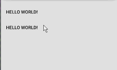
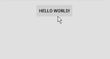
</LinearLayout>上面的代码,我们定义了两个Button,不同的是它们的background属性,selectableItemBackground代表了当点击后会在当前Button区域发生一个涟漪效果,而selectableItemBackgroundBorderless的效果不会局限于Button本身的大小。当然,虽然是大白话,但是还是不容易理解,我们来看看效果就一目了然了。
恩,效果很赞,但是这个背景能不能自定义呢?答案是当然能了,那么这里要引进一个新的Drawable-RippleDrawable了。RippleDrawable是android5新增加的一种Drawable,它的效果就是我们一直在提及的涟漪效果,下面我们来学习一下RippleDrawable的时候。既然RippleDrawable也是一种Drawable,那么它肯定也是可以在xml中定义的,来看代码,
<?xml version="1.0" encoding="utf-8"?>
<!-- drawable/ripple_no_mask.xml-->
<ripple xmlns:android="http://schemas.android.com/apk/res/android"
    android:color="#FF00FF00">
    <item android:drawable="@mipmap/ic_launcher" />
</ripple>

<?xml version="1.0" encoding="utf-8"?>
<!-- drawable/ripple_mask.xml-->
<ripple xmlns:android="http://schemas.android.com/apk/res/android"
    android:color="#FF00FF00">
    <item android:id="@android:id/mask" android:drawable="@mipmap/ic_launcher" />
</ripple>我们在drawable目录中创建两个xml文件,这两个drawable都是ripple类型的,可以看到他们的根节点都是一个ripple。这两个文件唯一的区别在于第二个的id指定了一个id是@android:id/mask,这两者的区别在于,
如果不指定id为
@android:id/mask,那么在显示的时候会首页显示出item指定的drawable。
如果指定id为@android:id/mask,那么默认是不会显示该drawable,而是在点击的时候出现。
如何使用呢? 只需要指定控件的background就ok.
<Button
android:background="@drawable/ripple_no_mask"
android:layout_width="wrap_content"
android:layout_height="wrap_content"
android:text="@string/hello_world" />
<Button
android:background="@drawable/ripple_mask"
android:layout_width="wrap_content"
android:layout_height="wrap_content"
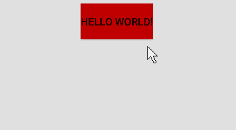
android:text="@string/hello_world" />看一下效果怎么样,
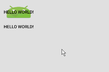
通过观察效果,我们可以发现,
- 涟漪的效果是在我们给item的drawable的非透明区域发生的。
- 当我们指定item的id为
@android:id/mask时,默认背景是不显示的。
ok,到这里,我们已经学会自定义点击的涟漪效果了。我们继续学习,接下来就来到了一个更赞的效果。
二、Reveal Effect 显示效果
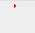
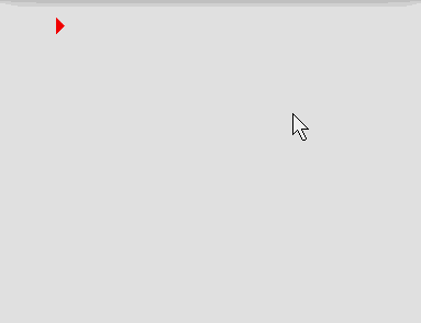
新的sdk给我们提供了一个类-ViewAnimationUtils,该类就提供了一个静态的方法createCircularReveal,通过这个方法,我们可以给任何一个layout或者view一个涟漪的显示或者消失过程。首先我们来看看要实现的效果,
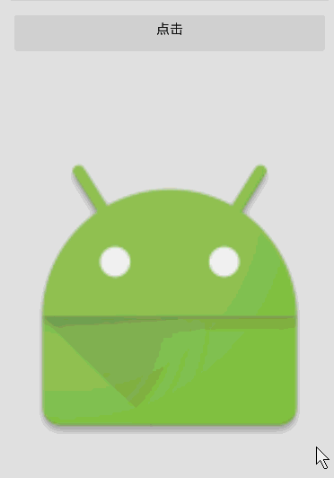
效果确实很赞,代码应该怎么写呢? 其实也很简单,主要还是我们将要学习的ViewAnimationUtils和它唯一的方法createCircularReveal,
public void change(View view) {
    int centerX = mImageView.getWidth() / 2;
    int centerY = mImageView.getHeight() / 2;
    int maxRadius = Math.max(mImageView.getWidth(), mImageView.getHeight());

    if(mImageView.getVisibility() == View.VISIBLE) {
        Animator anim = ViewAnimationUtils.createCircularReveal(mImageView,
                centerX, centerY, maxRadius, 0);
        anim.setDuration(1000);
        anim.addListener(new AnimatorListenerAdapter() {
            @Override
            public void onAnimationEnd(Animator animation) {
                super.onAnimationEnd(animation);
                mImageView.setVisibility(View.GONE);
            }
        });
        anim.start();
    }else {
        Animator anim = ViewAnimationUtils.createCircularReveal(mImageView,
                centerX, centerY, 0, maxRadius);
        anim.setDuration(1000);
        mImageView.setVisibility(View.VISIBLE);
        anim.start();
    }
}
在解释代码之前,我们来看看这个方法的详细说明:
public static Animator createCircularReveal (View view, int centerX, int centerY, float startRadius, float endRadius)
参数部分,
- View view, 指定了为哪个View执行动画
- int centerX, 涟漪效果的中心x轴位置
- int centerY, 涟漪效果的中心y轴位置
- float startRadius, 开始的半径
- float endRadius, 结束的半径
在解释完了参数之后,发现也不难,那么下面我们就来看上面的代码了。
首先,我们计算了centerX、centerY,还有一个最大的半径,最小的半径就不需要计算了,因为我们知道我们需要的效果就是到0.
接下来一个判断是判断ImageView的显示状态,如果为显示状态,那么肯定就是一个从有到无的动画,如果是隐藏状态,那么就是一个从无到有的动画。
第一个状态中,我们首先调用ViewAnimationUtils.createCircularReveal()方法创建了一个Animator,半径是从maxRadius到0的变化。
然后就是对Animator的操作了,并且监听了动画的结束,在动画结束后,我们会将该View的状态设置为隐藏,最后启动动画,这里就是我们刚才看到的那个隐藏的效果了。
那么显示呢?其实和隐藏是一样的,只不过显示半径是从0到maxRadius。
三、Activity过度动画
这一部分我们在前面的博客《你所不知道的Activity转场动画——ActivityOptions》
中介绍过了,大家可以去参考这篇博客,这里就不再重复介绍了。
四、路径动画
什么是路径动画? 其实在官方文档上,这一节叫自作Curved Motion,我把它叫做路径动画,是因为这一节的内容的核心是基于Path实现的。
Android 5 的sdk中给我们提供了一个新的插值器PathInterpolator, 利用该插值器,我们可以轻松的定义出路径动画,
<pathInterpolator xmlns:android="http://schemas.android.com/apk/res/android"
    android:controlX1="0.4"
    android:controlY1="0"
    android:controlX2="1"
    android:controlY2="1"/>
这段代码定义了一个x和y分别从0.4和0到1的动画,不过我认为这种方式局限性太大,所以这里不过多介绍,重点我们放在在java代码中如果利用Path去构建一个路径动画。
在新的sdk中,ObjectAnimator多了很多带有Path参数的方法,这些方法中我们可以传递一个Path对象,然后我们就可以在动画中获取基于这个Path的值。
public static ObjectAnimator ofFloat(Object target, String xPropertyName, String yPropertyName, Path path);
这个构造中需要我们传递两个属性值,这里对象这Path中x和y, 最后一个参数就是最重要的那个路径了。来看看我们的demo,这个demo,我们想让一段文字沿着一个Z的路径移动,最后还原到原来的位置。
TextView tv = (TextView) findViewById(R.id.tv);
tv.setOnClickListener(new View.OnClickListener() {
    @Override
    public void onClick(View v) {
        Path path = new Path();
        path.moveTo(100, 100);
        path.lineTo(600, 100);
        path.lineTo(100, 600);
        path.lineTo(600, 600);
        path.close();

        ObjectAnimator anim = ObjectAnimator.ofFloat(v, View.X, View.Y, path);
        anim.setDuration(5000);
        anim.start();
    }
});代码很简单,首先我们构建了一个简单的Path,然后利用ObjectAnimator的新的ofFloat方法为为该View的x和y指定了沿path移动,最后让动画跑起来。
五、View状态动画
在之前,我们在使用selector定义状态时,仅仅只能提供一个生硬的状态变化,在新的sdk中这里发生了改变,我们完全可以定义一个带动画效果的状态!
首先我们定义一个drawable文件,
<?xml version="1.0" encoding="utf-8"?>
<selector xmlns:android="http://schemas.android.com/apk/res/android">
    <item android:state_pressed="true">
        <set>
            <objectAnimator
                android:propertyName="translationZ"
                android:duration="@android:integer/config_shortAnimTime"
                android:valueFrom="0"
                android:valueTo="20dp"
                android:valueType="floatType"/>
        </set>
    </item>

    <item>
        <set>
            <objectAnimator
                android:propertyName="translationZ"
                android:duration="100"
                android:valueTo="0"
                android:valueType="floatType"/>
        </set>
    </item>
</selector>还是我们熟悉的selector,不过它的item是一个objectAnimator, 这里我们指定了translationZ的变化,然后我们在布局中使用它,
<Button
    android:layout_width="wrap_content"
    android:layout_height="wrap_content"
    android:stateListAnimator="@drawable/view_state"
android:text="@string/hello_world" />这里我们引入了一个新的属性android:stateListAnimator,我们通过这个属性来设置我们刚才定义的selector, 来看看效果,
仔细观察效果,我们在点击的过程中Button的translationZ有一个动画的效果。
说到这里,如果我们可以给它的背景一个动画就更爽了, 当然这也是可以办到的!首先还是定义一个drawablew文件,不过这里的文件是一个AnimatedStateListDrawable,我们在xml中使用animated-selector。
<?xml version="1.0" encoding="utf-8"?>
<animated-selector xmlns:android="http://schemas.android.com/apk/res/android">
    <item
        android:id="@+id/press"
        android:state_pressed="true"
        android:drawable="@android:color/holo_blue_dark" />
    <item
        android:id="@+id/focus"
        android:state_focused="true"
        android:drawable="@android:color/holo_purple" />
    <item
        android:id="@+id/normal"
        android:drawable="@android:color/holo_red_dark" />

    <transition
        android:fromId="@id/normal"
        android:toId="@id/press">
        <animation-list>
            <item android:duration="200" android:drawable="@android:color/holo_red_dark" />
            <item android:duration="200" android:drawable="@android:color/holo_blue_dark" />
        </animation-list>
    </transition>
</animated-selector>
在这里,我们首先定义了三个item, 对应了三种状态,并且都制定了id, 接下来是一个transition节点,这个节点下我们制定了fromId和toId,这里代表了动画从哪个状态到哪个状态执行,这个节点下又是一个animation-list节点,我们指定了两个item,这里要注意一下这两个item的执行顺序,如果是从fromId到toId,这里是从正常状态到按下,则会正序执行,如果从toId到fromId,这里是从按下状态到正常,则会反序执行。这里我们给每个item 200ms的停留时间。
从效果中可能看不出我何时点击何时松开的,这里每个颜色都会有一段停留时间的。
六、 SVG矢量动画
在新的sdk中, Google终于提供了原生的对SVG的支持,而这一切都是一个VectorDrawable的功劳, 当然, VectorDrawable也是一个Drawable,
所以我们还是可以在xml中定义它,
<?xml version="1.0" encoding="utf-8"?>
<vector xmlns:android="http://schemas.android.com/apk/res/android"
    android:width="64dp"
    android:height="64dp"
    android:viewportHeight="600"
    android:viewportWidth="600">

    <group
        android:name="group"
        android:pivotX="300"
        android:pivotY="300"
        android:rotation="0">

        <path
            android:name="path"
            android:fillColor="#FFFF0000"
            android:pathData="M300,70 l 0,-70 70,70 0,0 -70,70z"/>
    </group>
</vector>这里我们定义了一个drawable文件,它的根节点是一个vector,代表着它是一个VectorDrawable,看看它的内容,又一个group和多个path组成,一个group可以包含多个path,当然这里我们仅仅写了一个,值得注意的是path的android:pathData属性,这里定义了我们图形的形状。怎么使用呢? 就像正常的图片一样,给ImageView的src属性赋值就ok。 这是一个什么形状呢?
当然,我们可以借助一些工具很轻松的实现一些pathData。
好了, 现在仅仅是一个简单的图形,并没有动画效果, 现在我们想让这个图形动起来,而且颜色也要不断变化,该怎么做?这里又要引入一个新的东西-animated-vector。
利用它,我们可以根据上面书写的name值指定不同的动画了。
首先,我们定义两个动画,一个是旋转的动画,一个是颜色值变化的动画。
<?xml version="1.0" encoding="utf-8"?>
<objectAnimator xmlns:android="http://schemas.android.com/apk/res/android"
    android:duration="5000"
    android:propertyName="rotation"
    android:valueFrom="0"
    android:valueTo="360"
    android:valueType="floatType"/>

<?xml version="1.0" encoding="utf-8"?>
<objectAnimator xmlns:android="http://schemas.android.com/apk/res/android"
    android:duration="5000"
    android:propertyName="fillColor"
    android:valueFrom="#FFFF0000"
    android:valueTo="#FF000000"
android:valueType="intType"/>这里我们定义了两个Animator,需要注意的是他的android:propertyName的值, 仔细观察一下,他们分别就是上面我们定义的那个vector的group
和path标签的其中一个属性,这两个动画分别是一个旋转和颜色变化的动画, 那怎么用呢? 我们还需要一个animated-vector的drawable文件。
<?xml version="1.0" encoding="utf-8"?>
<animated-vector xmlns:android="http://schemas.android.com/apk/res/android"
    android:drawable="@drawable/svg">

    <target
        android:animation="@animator/rotation"
        android:name="group" />
    <target
        android:animation="@animator/color"
        android:name="path" />
</animated-vector>在这个文件中,我们指定了drawable为我们先前定义的那个vector文件, 并且写了两个target标签,这里很简单,只有两个属性,他们分别指定了所用的动画和这个动画该给谁(还记得我们之前给group和path指定的name属性吗)! ok, 现在将ImageView的src指定为这个animated-vector文件, 运行一下,你可能会感到沮丧,因为没有任何动画! 那怎么让动画跑起来呢? 很简单。
final ImageView iv = (ImageView) findViewById(R.id.iv);
iv.setOnClickListener(new View.OnClickListener() {
    @Override
    public void onClick(View v) {
        Drawable d = iv.getDrawable();
        if(d instanceof Animatable) ((Animatable) d).start();
    }
});我们在点击ImageView的时候,去获取这个ImageView的图片资源,然后判断它是不是Animatable类型的,如果是,直接调用它的start方法!
最后,我们来看看这时候的效果。
有一个旋转的动画, 在旋转的过程中还伴随着颜色的变化,棒棒哒。 ok, 到这里,Material Design动画,我们就学习完了
最后是demo的代码下载和参考资料。
参考资料:https://developer.android.com/training/material/animations.html


 扫一扫
扫一扫


 404
404

 被折叠的 条评论
为什么被折叠?
被折叠的 条评论
为什么被折叠?
 到【灌水乐园】发言


