


注意这里我只是转载过来的(来自 jQuery之家 的分享),然后加以整理。嘻嘻~
纯CSS3制作逼真的iphone 6手机模型
iphone.html
		<div class="iphone">
		    <div class="iphone-top">
		      <span class="camera"></span>
		      <span class="sensor"></span>
		      <span class="speaker"></span>
		    </div>
		    <div class="top-bar"></div>
		    <div class="iphone-screen">
		      <img src="img/Awesome-iPhone-Wallpapers.jpg" alt="" />
		    </div>
		    <div class="buttons">
		      <span class="on-off"></span>
		      <span class="sleep"></span>
		      <span class="up"></span>
		      <span class="down"></span>
		    </div>
		    <div class="bottom-bar"></div>
		    <div class="iphone-bottom">
		      <span></span>
		    </div>
		  </div>
/* 样式1 */
.iphone {
box-shadow: inset 0 0 3px 0 rgba(0, 0, 0, 0.2), 0 0 0 1px #999, 0 0 30px 0px rgba(0, 0, 0, 0.7);
border: 5px solid #d9dbdc;
background: #f8f8f8;
padding: 15px;
border-radius: 50px;
height: 877px;
width: 423px;
position: relative;
-webkit-transform: scale(0.8);
transform: scale(0.8);
}
.iphone-top {
padding: 5px 110px 40px;
position: relative;
}
.iphone-top .speaker {
display: block;
width: 70px;
height: 6px;
margin: 0 auto;
border-radius: 6px;
background: #292728;
}
.iphone-top .camera {
display: block;
margin: 0 auto;
height: 10px;
width: 10px;
border-radius: 50%;
margin-bottom: 13px;
background: #333;
}
.iphone-top .sensor {
display: block;
width: 15px;
height: 15px;
float: left;
background: #333;
margin-top: -5px;
border-radius: 50%;
}
.iphone .top-bar, .iphone .bottom-bar {
display: block;
width: 423px;
height: 15px;
border-left: 5px solid #BBB;
border-right: 5px solid #BBB;
position: absolute;
left: -5px;
}
.iphone .top-bar {
top: 65px;
}
.iphone .bottom-bar {
bottom: 65px;
}
.iphone-screen {
background: #eee;
border: 1px solid #fff;
height: 677px;
width: 375px;
margin: 0 auto;
border: 2px solid rgba(0, 0, 0, 0.9);
border-radius: 3px;
overflow: hidden;
}
.iphone-screen img {
width: 100%;
}
.iphone .buttons .on-off, .iphone .buttons .up, .iphone .buttons .down, .iphone .buttons .sleep {
display: block;
background: #CCC;
position: absolute;
border-radius: 2px 0px 0px 2px;
}
.iphone .buttons .on-off {
height: 40px;
width: 3px;
top: 100px;
left: -8px;
}
.iphone .buttons .up, .iphone .buttons .down, .iphone .buttons .sleep {
height: 60px;
width: 5px;
left: -10px;
}
.iphone .buttons .up {
top: 170px;
}
.iphone .buttons .down {
top: 250px;
}
.iphone .buttons .sleep {
left: auto;
right: -10px;
top: 170px;
border-radius: 0px 2px 2px 0px;
}
.iphone-bottom {
padding: 10px 0 0;
}
.iphone-bottom span {
display: block;
margin: 0 auto;
width: 68px;
height: 68px;
background: #ccc;
border-radius: 50%;
background: -webkit-linear-gradient(315deg, #303233 0%, #b5b7b9 50%, #f0f2f2 69%, #303233 100%);
background: linear-gradient(135deg, #303233 0%, #b5b7b9 50%, #f0f2f2 69%, #303233 100%);
position: relative;
}
.iphone-bottom span:after {
content: "";
display: block;
width: 60px;
height: 60px;
background: #fff;
border-radius: 50%;
position: absolute;
left: 4px;
top: 4px;
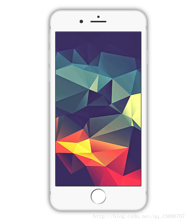
}结果它看起来大概像这样:
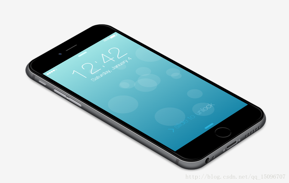
当然还有像下面这种3D效果的:
纯css3绘制超逼真iPhone6动画效果
iphone.html
<div id="wrapper">
            <div id="iphone">
                <div id="side"></div>
                <div id="lines">
                    <div>
                        <div>
                            <div></div>
                        </div>
                    </div>
                    <div>
                        <div>
                            <div></div>
                        </div>
                    </div>
                </div>
                <div id="toggler">
                    <div></div>
                </div>
                <div id="aux"></div>
                <div id="lightning"></div>
                <div id="bottom-speaker">
                    <div></div>
                    <div></div>
                    <div></div>
                    <div></div>
                    <div></div>
                    <div></div>
                    <div></div>
                </div>
                <div id="skrews">
                    <div></div>
                    <div></div>
                </div>
                <div id="volume">
                    <div></div>
                    <div></div>
                </div>
                <div id="front">
                    <div id="front-cover"></div>
                    <div id="camera">
                        <div></div>
                    </div>
                    <div id="speaker"></div>
                    <div id="screen">
                        <div id="reminder">
                            <div></div>
                            <div>Made by @_fbrz</div>
                            <div>now</div>
                        </div>
                        <div id="circle"></div>
                        <div id="time">12:42</div>
                        <div id="date">Saturday, January 4</div>
                        <div id="bottom"></div>
                        <div id="top"></div>
                        <div id="slide">
                            <div></div>
                            slide to unlock
                        </div>
                        <div id="signal">
                            <div></div>
                            <div></div>
                            <div></div>
                            <div></div>
                            <div></div>
                        </div>
                        <div id="battery">
                            <div>86%</div>
                            <div>
                                <div></div>
                                <div></div>
                            </div>
                        </div>
                    </div>
                    <div id="home">
                        <div></div>
                    </div>
                </div>
                <div id="shadow"></div>
            </div>
</div>/* 样式2 */
#wrapper {
height: 520px;
width: 800px;
/*margin-left: -400px;
margin-top: -260px;
position: absolute;*/
-webkit-perspective: 6000px;
perspective: 6000px;
top: 50%;
left: 50%;
}
#iphone {
height: 760px;
width: 372px;
border-radius: 50px;
position: absolute;
background: none;
box-shadow: none;
left: 206px;
top: -140px;
-webkit-transform: rotateX(54deg) rotateZ(-46deg);
transform: rotateX(54deg) rotateZ(-46deg);
-webkit-transform-style: preserve-3d;
transform-style: preserve-3d;
}
#side {
background: #CDD0D5;
width: 393px;
height: 780px;
border-top-left-radius: 77px;
border-bottom-left-radius: 49px;
border-bottom-right-radius: 86px;
border-top-right-radius: 70px;
position: absolute;
top: 5px;
left: -26px;
box-shadow: inset #3D3E42 0 0 15px 9px;
}
#front {
width: 362px;
height: 750px;
border-radius: 49px;
position: absolute;
background-image: -webkit-linear-gradient(-27deg,#444,#000 10%, #000 42%, #333, #000 57%, #000 91%, #444);
left: 5px;
top: 5px;
box-shadow: inset #000 0 0 0 4px, #555 0px 0 3px 0px, #222 -3px 2px, #000 -5px 5px, #E0E0E0 -7px 6px 1px, #6D6D6D -7px 6px 9px;
-webkit-transform: translateZ(1px);
transform: translateZ(1px);
}
#front-cover {
width: 344px;
height: 734px;
background: #000;
border-radius: 39px;
position: absolute;
top: 8px;
left: 9px;
}
#home {
position: absolute;
width: 52px;
height: 52px;
border-radius: 50%;
background: -webkit-linear-gradient(58deg, #666, #000, #666);
background: linear-gradient(32deg,#666,#000,#666);
top: 684px;
left: 160px;
}
#home div {
background: #000;
border-radius: 50%;
width: 46px;
height: 46px;
position: absolute;
left: 3px;
top: 3px;
}
#camera {
width: 11px;
height: 11px;
background: #000;
position: absolute;
top: 35px;
left: 124px;
border-radius: 50%;
box-shadow: inset #666 -5px 2px 9px -2px;
}
#camera div {
width: 6px;
height: 6px;
background: -webkit-radial-gradient(#E1E4F5, #0D2B69 33%);
background: radial-gradient(#E1E4F5,#0D2B69 33%);
background-position: -1px -1px;
position: absolute;
top: 3px;
left: 3px;
border-radius: 50%;
}
#speaker {
width: 50px;
height: 4px;
border-radius: 2px;
background: #555;
position: absolute;
top: 39px;
left: 156px;
box-shadow: inset #222 0 0px 4px;
}
#volume {
height: 128px;
width: 11px;
border-radius: 10px;
position: absolute;
background: #F9F9FA;
top: 171px;
left: -20px;
-webkit-transform: rotateY(95deg);
transform: rotateY(95deg);
-webkit-transform-style: preserve-3d;
transform-style: preserve-3d;
box-shadow: inset #292A2F 4px 0 8px 1px, #D5D5D5 -1px 0px 2px;
}
#volume div {
width: 8px;
height: 55px;
background: #BBBCC0;
border-radius: 10px;
position: absolute;
box-shadow: #eee -1px 1px, #777 -1px 3px, #505057 -3px 3px, inset #909197 -3px 0 3px;
}
#volume div:first-child {
top: 2px;
left: 4px;
}
#volume div:last-child {
top: 69px;
left: 4px;
}
#toggler {
height: 34px;
width: 8px;
border-radius: 10px;
position: absolute;
background: #2B2C31;
top: 105px;
left: -20px;
-webkit-transform: rotateY(95deg);
transform: rotateY(95deg);
-webkit-transform-style: preserve-3d;
transform-style: preserve-3d;
box-shadow: inset #292A2F 4px 0 8px 1px, #D5D5D5 -1px 0px 2px;
}
#toggler div {
width: 4px;
height: 31px;
background: #BBBCC0;
border-radius: 10px;
position: absolute;
box-shadow: #eee -1px 1px, #777 -2px 3px, #505057 -3px 3px, inset #909197 -3px 0 3px;
top: -1px;
left: 3px;
}
#aux {
width: 19px;
height: 19px;
background: #3B3B3B;
border-radius: 50%;
-webkit-transform: rotateX(90deg) translateZ(1px);
transform: rotateX(90deg) translateZ(1px);
-webkit-transform-style: preserve-3d;
transform-style: preserve-3d;
position: absolute;
top: 766px;
left: 45px;
box-shadow: inset #000 6px -3px 10px 1px, #C7C7C7 1px 0px 1px;
}
#lightning {
width: 48px;
height: 12px;
border-radius: 10px;
background: #3F3F3F;
-webkit-transform: rotateX(90deg) translate3d(0px,1px,0px);
transform: rotateX(90deg) translate3d(0px,1px,0px);
top: 771px;
position: absolute;
left: 139px;
box-shadow: inset #8E8F94 -1px 1px 0px 2px, #515258 0px 0px 0 1px, inset #000 0 -3px 10px, #DADADA 1px 0 0 1px;
}
#bottom-speaker {
position: absolute;
-webkit-transform: rotateX(90deg);
transform: rotateX(90deg);
top: 781px;
left: 70px;
}
#bottom-speaker div {
width: 8px;
height: 8px;
border-radius: 50%;
background: #6C6D72;
position: absolute;
box-shadow: inset #000 1px -1px 4px 1px, #DADADA 1px 0px;
}
#bottom-speaker div:nth-child(2) { left: 150px; }
#bottom-speaker div:nth-child(3) { left: 162px; }
#bottom-speaker div:nth-child(4) { left: 174px; }
#bottom-speaker div:nth-child(5) { left: 186px; }
#bottom-speaker div:nth-child(6) { left: 198px; }
#bottom-speaker div:nth-child(7) { left: 210px; }
#skrews {
position: absolute;
top: 780px;
left: 120px;
-webkit-transform: rotateX(90deg);
transform: rotateX(90deg);
}
#skrews div {
position: absolute;
width: 8px;
height: 8px;
background: rgb(95, 92, 92);
border-radius: 50%;
top: 0;
z-index: 4;
box-shadow: inset #999AA0 0 0 0px 2px, #444 1px 0px;
}
#skrews div:last-child {
left: 70px;
}
#lines {
position: absolute;
top: 82px;
left: -32px;
}
#lines > div:last-child {
top: 634px;
}
#lines div {
width: 7px;
height: 11px;
position: absolute;
-webkit-transform-style: preserve-3d;
transform-style: preserve-3d;
-webkit-transform-origin: 100% 100%;
-ms-transform-origin: 100% 100%;
transform-origin: 100% 100%;
}
#lines > div {
background: -webkit-linear-gradient(right, #393A3C, #5A595E);
background: linear-gradient(right,#393A3C,#5A595E);
-webkit-transform: rotateY(90deg);
transform: rotateY(90deg);
}
#lines > div > div {
background: -webkit-linear-gradient(right, #5A595E, #87868A);
background: linear-gradient(right,#5A595E,#87868A);
-webkit-transform: rotateY(17deg);
transform: rotateY(17deg);
left: -6px;
}
#lines > div > div > div {
background: -webkit-linear-gradient(right, #87868A, #A8A6AD);
background: linear-gradient(right,#87868A,#A8A6AD);
-webkit-transform: rotateY(17deg);
transform: rotateY(17deg);
left: -6px;
}
#shadow {
width: 350px;
height: 755px;
background: black;
position: absolute;
top: 5px;
left: 0;
-webkit-transform: translateZ(-17px);
transform: translateZ(-17px);
-webkit-transform-style: preserve-3d;
transform-style: preserve-3d;
box-shadow: #000 0 0 10px 15px;
opacity: 0.4;
border-top-left-radius: 76px;
border-top-right-radius: 200px;
border-bottom-left-radius: 40px;
border-bottom-right-radius: 56px;
}
#screen {
background: -webkit-linear-gradient(#A1E5E5, #1987AA);
background: linear-gradient(#A1E5E5,#1987AA);
width: 336px;
height: 589px;
position: absolute;
top: 80px;
left: 13px;
font-weight: 300;
color: #fff;
background-size: 200% 100%;
overflow: hidden;
}
#time {
font-size: 86px;
left: 57px;
top: 37px;
position: absolute;
}
#date {
font-size: 20px;
left: 85px;
top: 130px;
position: absolute;
}
#bottom {
width: 37px;
height: 7px;
border-radius: 5px;
background: #2AB1DB;
position: absolute;
top: 573px;
left: 149px;
}
#top {
width: 37px;
height: 7px;
border-radius: 5px;
background: #D7FFFF;
position: absolute;
top: 10px;
left: 149px;
}
#slide {
position: absolute;
top: 489px;
left: 88px;
font-size: 28px;
color: #2AB1DB;
background: -webkit-linear-gradient(left, #2EC4F3 30%, #fff, #2EC4F3 70%);
background: linear-gradient(left,#2EC4F3 30%,#fff,#2EC4F3 70%);
-webkit-background-clip: text;
-webkit-text-fill-color: transparent;
background-size: 350px;
-webkit-animation: slide 5s linear infinite;
animation: slide 5s linear infinite;
}
@-webkit-keyframes slide {
0% { background-position: 100px 0; }
40% { background-position: 440px 0; }
100% { background-position: 440px 0; }
}
@keyframes slide {
0% { background-position: 100px 0; }
40% { background-position: 440px 0; }
100% { background-position: 440px 0; }
}
#slide div {
-webkit-transform: rotate(135deg);
-ms-transform: rotate(135deg);
transform: rotate(135deg);
border-left: 2px solid #2AB1DB;
border-top: 2px solid #2AB1DB;
width: 15px;
height: 15px;
position: absolute;
left: -29px;
top: 10px;
}
#signal {
position: absolute;
top: 9px;
left: 7px;
}
#signal div {
width: 6px;
height: 6px;
border-radius: 50%;
background: #fff;
border: 1px solid #fff;
position: absolute;
}
#signal div:nth-child(2) {
left: 9px;
}
#signal div:nth-child(3) {
left: 18px;
}
#signal div:nth-child(4) {
left: 27px;
}
#signal div:nth-child(5) {
left: 36px;
background: none;
}
#battery {
position: absolute;
top: 3px;
left: 270px;
font-size: 13px;
}
#battery > div:last-child {
width: 27px;
height: 9px;
border: 1px solid #fff;
position: absolute;
top: 4px;
left: 27px;
border-radius: 2px;
}
#battery div div:first-child {
width: 21px;
height: 7px;
background: #fff;
position: absolute;
top: 1px;
left: 1px;
}
#battery div div:last-child {
width: 1px;
height: 6px;
background: #FFF;
position: absolute;
left: 29px;
top: 2px;
border-radius: 0 1px 1px 0;
}
#fabrizio {
border-top: 100px solid black;
border-right: 63px solid transparent;
width: 0;
-webkit-transform: scale(.33);
-ms-transform: scale(.33);
transform: scale(.33);
-webkit-transform-origin: 0 0;
-ms-transform-origin: 0 0;
transform-origin: 0 0;
margin: 20px;
opacity:.6;
position: absolute;
bottom: -130px;
}
#fabrizio:before {
background: black;
width: 20px;
height: 30px;
content: '';
display: block;
-webkit-transform: skewX(-32deg);
-ms-transform: skewX(-32deg);
transform: skewX(-32deg);
position: relative;
top: -65px;
left: 29px;
}
#fabrizio:after {
background: black;
width: 40px;
height: 36px;
content: '';
display: block;
-webkit-transform: skewX(-32deg);
-ms-transform: skewX(-32deg);
transform: skewX(-32deg);
position: relative;
top: -130px;
left: 49px;
}
#circle {
width: 50px;
height: 50px;
background: none;
border-radius: 50%;
box-shadow: rgba(255,255,255,0.1) 160px 335px,rgba(255,255,255,0.1) 120px 275px 0 12px,rgba(255,255,255,0.1) 60px 355px 0 23px,rgba(255,255,255,0.1) 230px 445px 0 -8px,rgba(255,255,255,0.1) 60px 125px,rgba(255,255,255,0.1) 260px 145px 0 12px,rgba(255,255,255,0.1) 300px 145px 0 23px,rgba(255,255,255,0.1) 100px 85px 0 -8px,rgba(255,255,255,0.1) 50px 155px,rgba(255,255,255,0.1) 150px 273px 0 -2px,rgba(255,255,255,0.1) 50px 555px 0 23px,rgba(255,255,255,0.1) 180px 5px 0 -8px;
-webkit-animation: circle 30s linear infinite alternate;
animation: circle 30s linear infinite alternate;
}
@-webkit-keyframes circle {
0%{
box-shadow: rgba(255,255,255,0.1) 160px 335px,rgba(255,255,255,0.1) 120px 275px 0 12px,rgba(255,255,255,0.1) 60px 355px 0 23px,rgba(255,255,255,0.1) 230px 445px 0 -8px,rgba(255,255,255,0.1) 60px 125px,rgba(255,255,255,0.1) 260px 145px 0 12px,rgba(255,255,255,0.1) 300px 145px 0 23px,rgba(255,255,255,0.1) 100px 85px 0 -8px,rgba(255,255,255,0.1) 350px 555px,rgba(255,255,255,0.1) 350px 273px 0 -2px,rgba(255,255,255,0.1) 150px 355px 0 23px,rgba(255,255,255,0.1) 180px 205px 0 -8px,rgba(255,255,255,0.1) 0px 0px 0 -8px,rgba(255,255,255,0.1) 100px 555px 0 10px;
}
100%{
box-shadow: rgba(255,255,255,0.1) 70px 10px,rgba(255,255,255,0.1) 300px 205px 0 12px,rgba(255,255,255,0.1) 0px 155px 0 23px,rgba(255,255,255,0.1) 330px 45px 0 -8px,rgba(255,255,255,0.1) 460px 325px,rgba(255,255,255,0.1) 0px 445px 0 12px,rgba(255,255,255,0.1) 300px 145px 0 23px,rgba(255,255,255,0.1) 100px 85px 0 -8px,rgba(255,255,255,0.1) 50px 155px,rgba(255,255,255,0.1) 150px 273px 0 -2px,rgba(255,255,255,0.1) 0px 555px 0 23px,rgba(255,255,255,0.1) 180px 5px 0 -8px,rgba(255,255,255,0.1) 300px 555px 0 -8px,rgba(255,255,255,0.1) 350px 355px 0 10px;
}
}
@keyframes circle {
0%{
box-shadow: rgba(255,255,255,0.1) 160px 335px,rgba(255,255,255,0.1) 120px 275px 0 12px,rgba(255,255,255,0.1) 60px 355px 0 23px,rgba(255,255,255,0.1) 230px 445px 0 -8px,rgba(255,255,255,0.1) 60px 125px,rgba(255,255,255,0.1) 260px 145px 0 12px,rgba(255,255,255,0.1) 300px 145px 0 23px,rgba(255,255,255,0.1) 100px 85px 0 -8px,rgba(255,255,255,0.1) 350px 555px,rgba(255,255,255,0.1) 350px 273px 0 -2px,rgba(255,255,255,0.1) 150px 355px 0 23px,rgba(255,255,255,0.1) 180px 205px 0 -8px,rgba(255,255,255,0.1) 0px 0px 0 -8px,rgba(255,255,255,0.1) 100px 555px 0 10px;
}
100%{
box-shadow: rgba(255,255,255,0.1) 70px 10px,rgba(255,255,255,0.1) 300px 205px 0 12px,rgba(255,255,255,0.1) 0px 155px 0 23px,rgba(255,255,255,0.1) 330px 45px 0 -8px,rgba(255,255,255,0.1) 460px 325px,rgba(255,255,255,0.1) 0px 445px 0 12px,rgba(255,255,255,0.1) 300px 145px 0 23px,rgba(255,255,255,0.1) 100px 85px 0 -8px,rgba(255,255,255,0.1) 50px 155px,rgba(255,255,255,0.1) 150px 273px 0 -2px,rgba(255,255,255,0.1) 0px 555px 0 23px,rgba(255,255,255,0.1) 180px 5px 0 -8px,rgba(255,255,255,0.1) 300px 555px 0 -8px,rgba(255,255,255,0.1) 350px 355px 0 10px;
}
}
#reminder {
position: absolute;
top: 230px;
left: 40px;
width: 296px;
height: 50px;
border-top: 1px solid #86E2F0;
border-bottom: 1px solid #86E2F0;
line-height: 50px;
font-weight: 400;
opacity: 0;
-webkit-animation: reminder .1s linear forwards 15s;
animation: reminder .1s linear forwards 15s;
}
#reminder div:first-child {
background: #fff;
width: 16px;
height: 16px;
border-radius: 3px;
position: absolute;
top: 18px;
}
#reminder div:nth-child(2) {
position: absolute;
left: 30px;
}
#reminder div:last-child{
position: absolute;
left: 251px;
font-size: 11px;
color: #86E2F0;
}
@-webkit-keyframes reminder {
100% {
opacity: 1;
}
}
@keyframes reminder {
100% {
opacity: 1;
}
}
#awwwards {
position: absolute;
bottom: 30px;
left: 70px;
}
#awwwards a {
color: #444;
text-decoration: none;
border-bottom: 1px solid #888;
}
#coolors {
position: absolute;
bottom: 30px;
right: 30px;
color: #fff;
text-decoration: none;
border-bottom: 1px solid #888;
-webkit-animation: coolors 1s infinite;
animation: coolors 1s infinite;
opacity: 1;
}
@-webkit-keyframes coolors {
50% { right: 40px; }
}
@keyframes coolors {
50% { right: 40px; }
}那么它看起来像这样:
当然,可能我更喜欢在“手机”的屏幕上放置图片,那就要对上面的html、css进行少许的修改了(顺便删除一些不需要的css),我后面再整理咯。先到这。


 277
277


 被折叠的 条评论
为什么被折叠?
被折叠的 条评论
为什么被折叠?
 到【灌水乐园】发言


