


1.实训介绍
本次教程主要通过手把手的从零开始编码一个在线商城的静态网页来将大家已经学过的html、div+css、js、jquery融会贯通。
很多同学学习了有关网页编程的一些基础知识,也知道什么是html、什么是css,但很难系统的把这些知识变成一个有用的项目,或者从来没有做过一个完整的、好看的静态网页出来。本次教程将演示从一张美工画好的psd图片转变成一个html网页的过程,包括编写代码时候思路都会一一演示。
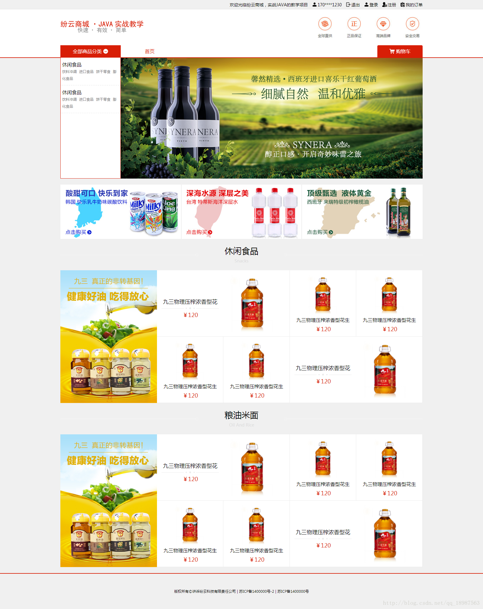
我们要完成的网页是一个在线商城,这个商场包含9到10个页面,分别是首页、商品列表页、商品详细页、购物车页面、订单生成页、登录、注册、我的订单页面等。
项目完成时,我们应该得到的是这个每个页面的html代码。
2.使用到的关键技术
2.1 html
什么是 HTML?
HTML 是用来描述网页的一种语言。
HTML 指的是超文本标记语言 (Hyper Text Markup Language)
HTML 不是一种编程语言,而是一种标记语言 (markup language)
标记语言是一套标记标签 (markup tag)
HTML 使用标记标签来描述网页
2.2 div+css
div+css包含div和css两个部分,其中div是HTML语言中的一个标记,而css是层叠样式表(Cascading Style
Sheets)的缩写,用于定义HTML元素的显示形式,是W3C推出的格式化网页内容的标准技术。网页设计者必须掌握的技术之一。
2.3 js
JavaScript 是脚本语言 JavaScript 是一种轻量级的编程语言。
JavaScript 是可插入 HTML 页面的编程代码。
JavaScript 插入 HTML 页面后,可由所有的现代浏览器执行。
2.4 jquery
jQuery 是一个 JavaScript 库。
jQuery 极大地简化了 JavaScript 编程。
3.搭建框架
我们编写好的网页最终是要交给后端网页工程师制作成动态网页的,后端可能是java的,也可能是php的,无论后端是用什么,我们交付的代码需要尽量的易懂易读,这样别人在拿到我们写的网页的时候才能更快的使用起来。
我们的第一步是建立一个目录结构。我们可以使用dreamweaver软件直接新建一个网页项目,这样dreamweaver会直接帮我们把目录结构搭建出来;另外我们也可以直接手工创建各个目录。
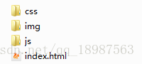
这是我建立的目录,其中css文件夹主要存放css样式表文件,img文件夹主要存放网页中要使用到的图片,js文件夹存放js脚本文件,index.html是一个网页。
我们的首页将直接编写到index.html中。
4.首页的代码编写
当我们创建index.html文件时,dreamweaver或eclipse可能会帮我们把部分代码写好,如果没写,我们可以自己写进去,最初的代码是这样的:
<!DOCTYPE html>
<html>
    <head>
        <meta charset="utf-8" />
        <title></title>
    </head>
    <body>
    </body>
</html>我们首先新建一个css文件,并引入到网页里,以后我们的所有css内容都写到这个css文件里。我们在css文件夹里新建一个文件,起名为pc.css,然后在<title></title>标签下引入css文件:<link rel="stylesheet" href="css/pc.css" />。
css文件里,我们先把最基础的一些属性给写出来,比如像是对html、body的属性:
@charset "utf-8";
html {
    width: 100%;
    height: 100%;
}

body {
    width: 100%;
    overflow-x: hidden;
    padding: 0;
    margin: 0;

}

* {
    padding: 0;
    margin: 0;
    -webkit-appearance: none;
    font-family: "微软雅黑";
    font-size: 14px;
}

a {
    text-decoration: none;
    color: black;
}其次我们的网页还需要引入jquery,我们先前往jquery官网下载一个jquery文件,网址是:http://jquery.com/。下载完成后,把jquery的文件放在js文件夹下,并在<body></body>标签里引入jquery文件:<script type="text/javascript" src="js/jquery.min.js"></script>。这里注意,jquery版本超过1.9的已经不再支持IE6-8,这肯定不是我们想看到的结果,所以暂时还是下载1.9版本就好。
编写网页通常情况下都需要考虑浏览器的兼容性问题,因为浏览器的版本、型号有很多种,比如IE6、IE7、IE8、firefox、chrome等等,浏览器兼容性问题一直是编写网页最头疼的问题;但近几年国产浏览器发力,国内的电脑上网时大多数采用360浏览器、百度浏览器等等,虽然国内浏览器数量庞大,但它们都使用和chrome相同的内核webkit,也就是国内浏览器的极速模式。如果我们的网页只是在国内被用户浏览,那我们其实可以不去考虑占有率非常少的ie6-8和firefox这些浏览器,让网页运行在浏览器的极速模式下;我们可以在<head>标签里增加一句话,让浏览器默认选择极速模式:<meta name="renderer" content="webkit">
现在完整的网页是这样的:
<!DOCTYPE html>
<html>
    <head>
        <meta charset="utf-8" />
        <meta name="renderer" content="webkit">
        <title></title>
        <link rel="stylesheet" href="css/pc.css" />
    </head>
    <body>

        <script type="text/javascript" src="js/jquery.min.js"></script>
    </body>
</html>
下面我们分析首页的布局,根据布局把网页分成几个部分,再单独完成每一个部分。
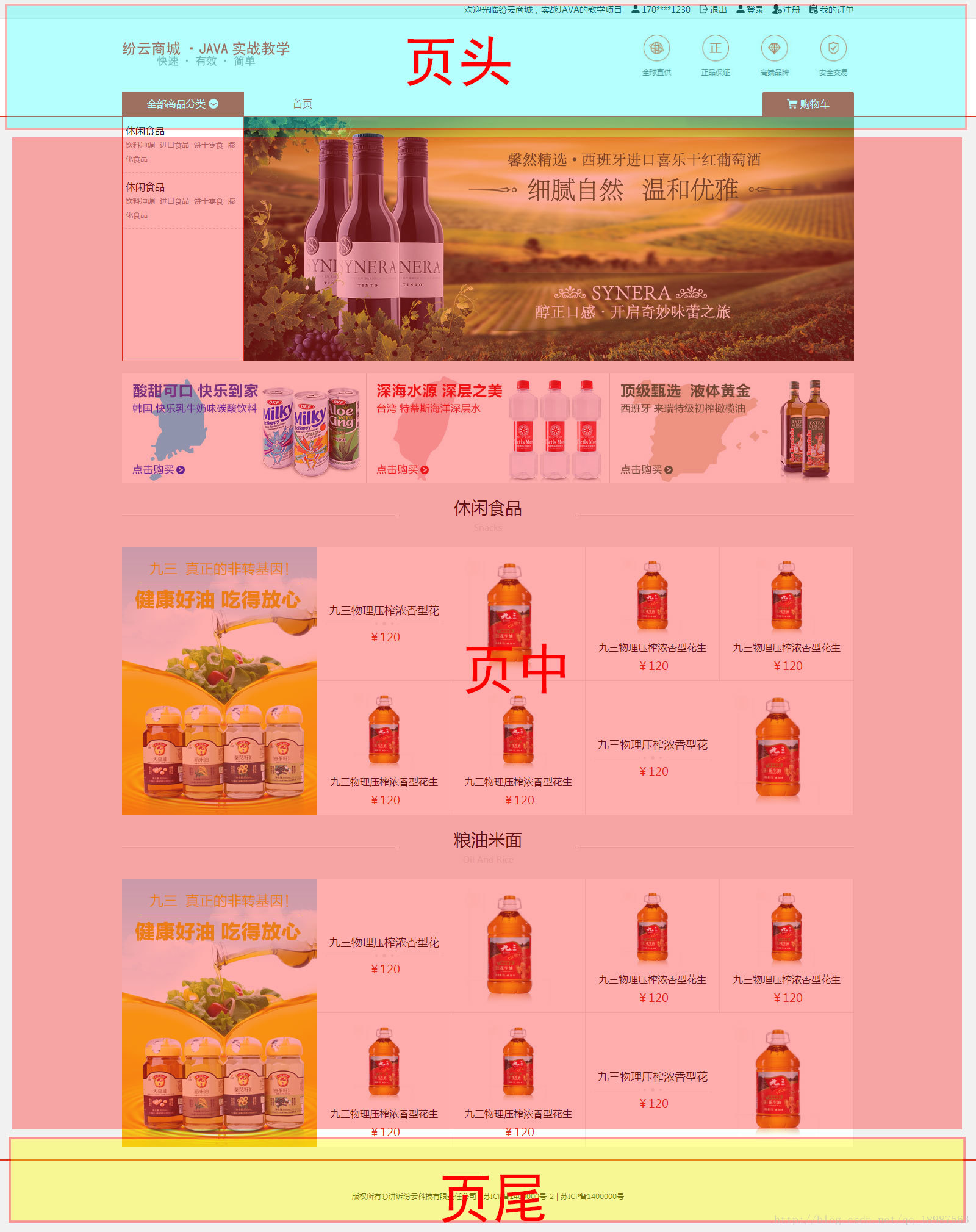
根据美工所提供的图片,我们可以把首页分成上中下三部分,如图片所示。我们可以使用三个div标签来划分这三个区域。
<div class="fy-header">页头</div>
<div class="fy-main">页中</div>
<div class="fy-bottom">页尾</div>
这里class的起名,我都加了fy-,之所以这样做,主要是为了区别开其他项目,比如我们这个网页要引入bootstrap,我们如果直接把class起名为header,可能会和bootstrap中的header重名。
下面我们只需要分别完成这三个div就可以完成网页了。
编写网页前先把网页划分出来,我们可以更容易的进行网页开发,不至于一头脑做很多,最后哪部分都做不好。当原先一堆的工作被划分成几块以后,我们每完成一部分都会有成就感,也能更好的激励我们继续工作。
4.1 页头的编码
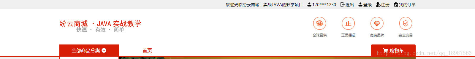
我们来看下,页头是这样的,根据图片我们还可以对页头进行分块。
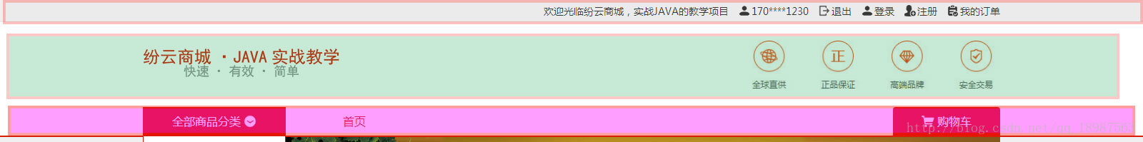
我们把页头又划分成了上中下三部分,我们先把div给写好
<div class="fy-header">
        <div class="top">上</div>
        <div class="bottom">中</div>
        <div class="menu">下</div>
</div>
其中上部分是一些超链接,我们先把超链接写进去:
<div class="top">
    <a><icon class="icon-order"></icon>我的订单</a>
    <a><icon class="icon-register"></icon>注册</a>
    <a><icon class="icon-login"></icon>登录</a>
    <a><icon class="icon-logout"></icon>退出</a>
    <a><icon class="icon-user"></icon>170****1230</a>
    <a>欢迎光临纷云商城,实战JAVA的教学项目</a>
</div>
我们看图片,这里的灰色宽度是100%的,但里面的超链接内容其实是在网页中间的,根据测量,这个页面的所有有效内容其实都在1200px内,水平居中,所以我们还需要把超链接的内容放在1200px内,做一次水平居中:
<div class="top">
    <div class="ctx">
        <a><icon class="icon-order"></icon>我的订单</a>
        <a><icon class="icon-register"></icon>注册</a>
        <a><icon class="icon-login"></icon>登录</a>
        <a><icon class="icon-logout"></icon>退出</a>
        <a><icon class="icon-user"></icon>170****1230</a>
        <a>欢迎光临纷云商城,实战JAVA的教学项目</a>
    </div>
</div>
其中class是ctx的div就是负责水平居中的。
写到这里,页头的上部分的html代码我们就写好,是时候去填充css文件,让div像图片中的样子展示出来。
首先是对fy-header的属性,它有宽度、高度,另外还有白色的背景:
.fy-header {
    width: 100%;
    height: 192px;
    background-color: white;
}
有些同学看到fy-header的高度是192像素,会问:“你怎么知道高度是192像素的?”,其实比较靠谱正规的美工,发来的网页图是包含尺寸信息的,我们拿到的图片并没有,所以我使用photoshop的标尺工具测量了一下。
不会用photoshop的同学可以跟我学一下,首先打开photoshop软件,然后打开图片,在要测量的部分拉上参考线,然后用标尺工具测量,如图:
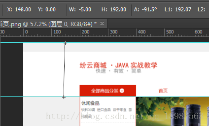
其中H:192.00就是我们要测量的height: 192px;。
下面是.fy-header .top 的属性,它有高度、背景颜色、下边框:
.fy-header .top {
    width: 100%;
    height: 30px;
    background-color: #f0f0f0;
    border-bottom: 1px solid #e5e5e5;
}我们要使.fy-header .top .ctx水平居中,在css里想让一个div水平居中,可以使用margin: 0px auto;来做,对应css是:
.fy-header .top .ctx {
    width: 1200px;
    height: 100%;
    line-height: 30px;
    margin: 0px auto;
    overflow: hidden;
}
最后里面的超链接:
.fy-header .top .ctx a {
    float: right;
    margin-left: 14px;
    height: 30px;
    line-height: 30px;
}
写到这里,我们发现每个超链接前都有一个小图片,并且鼠标移动上去的时候图片和字都会变成红色;鼠标移动上去字的颜色改变我们知道是
.fy-header .top .ctx a:hover {
    color: #d81e06;
}
但,如何才能让图标的颜色也改变呢?css里可以改变background-image,但改不了img的src,所以我们刚刚写的超链接里放的不是img,而是一个我们自己定的标签叫icon:
<a><icon class="icon-order"></icon>我的订单</a>我们可以把icon标签的背景图片弄成我们想要的图片,然后在鼠标移动上去的时候改变背景图片:
.fy-header .top .ctx a icon {
    width: 16px;
    height: 16px;
    background-image: url(../img/login.png);
    background-position: center;
    background-size: 100% 100%;
    display: inline-block;
    margin-bottom: -2px;
    margin-right: 2px;
}
另外每个超链接的图片都不同,我们需要给每个icon定义不同的class,来分别指定图片:
.fy-header .top .ctx a .icon-login {
    background-image: url(../img/login.png);
}
.fy-header .top .ctx a .icon-logout {
    background-image: url(../img/logout.png);
}
.fy-header .top .ctx a .icon-register {
    background-image: url(../img/register.png);
}
.fy-header .top .ctx a .icon-order {
    background-image: url(../img/order.png);
}
再给每个icon加上鼠标hover后的图片改变效果:
.fy-header .top .ctx a:hover .icon-login {
    background-image: url(../img/login_light.png);
}
.fy-header .top .ctx a:hover .icon-logout {
    background-image: url(../img/logout_light.png);
}
.fy-header .top .ctx a:hover .icon-register {
    background-image: url(../img/register_light.png);
}
.fy-header .top .ctx a:hover .icon-order {
    background-image: url(../img/order_light.png);
}
这样我们就把页头的上部分完成了,我们可以在浏览器里打开index.html来查看我们做好的效果,如果效果不满意,再修改css的属性来微调。
下面我们来看页头的中间部分,就是这部分:

这部分是左边一张图片,右边也是一张图片,div就这样写:
<div class="bottom">
    <a class="logo">
        <img src="img/logo.png" />
    </a>
    <img src="img/logo_ad.jpg" class="ad" />
</div>
css这样写:
.fy-header .bottom {
    width: 1200px;
    height: 119px;
    margin: 0px auto;
    overflow: hidden;
}

.fy-header .bottom .logo {
    float: left;
    height: 47px;
    margin-top: 36px;
}

.fy-header .bottom .ad {
    float: right;
    height: 69px;
    margin-top: 25px;
}
我们下面做页头的第三部分:

这个部分包含三个元素,分别是向左对齐的分类和首页两个按钮,和向右对齐的购物车按钮,其中首页和购物车是超链接。
<div class="menu">
    <div class="ctx">
        <div class="bigmenu">全部商品分类<img src="img/down.png" /></div>
        <a class="homemenu">首页</a>
        <a class="cart"><img src="img/cart.png" />购物车</a>
    </div>
</div>
.fy-header .menu {
width: 100%;
height: 40px;
border-bottom: 2px solid #d81e06;
}
.fy-header .menu .ctx {
width: 1200px;
height: 100%;
margin: 0px auto;
position: relative;
}
.fy-header .menu .ctx .bigmenu {
float: left;
height: 40px;
line-height: 40px;
color: white;
background-color: #D81E06;
text-align: center;
font-size: 16px;
cursor: pointer;
width: 200px;
}
.fy-header .menu .ctx .bigmenu img {
width: 18px;
height: 18px;
margin-bottom: -3px;
margin-left: 4px;
}
.fy-header .menu .ctx .homemenu {
float: left;
padding: 0px 80px;
height: 40px;
line-height: 40px;
color: #D81E06;
font-size: 16px;
}
.fy-header .menu .ctx .cart {
float: right;
padding: 0px 40px;
height: 40px;
line-height: 40px;
color: white;
background-color: #D81E06;
text-align: center;
font-size: 16px;
border-top-left-radius: 4px;
border-top-right-radius: 4px;
}
.fy-header .menu .ctx .cart img {
width: 18px;
height: 18px;
margin-bottom: -3px;
margin-right: 4px;
}
下面我们再来做这个浮动的div:
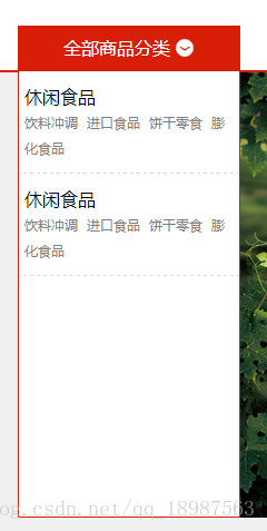
这个div的position: absolute;,我们把.fy-header .menu .ctx 设为了父节点,即将.fy-header .menu .ctx 的position: relative;,所以浮动div的左对齐是0;
<div class="floatmenu">
<div class="padding-top">
<div class="box">
<div class="title">休闲食品</div>
<div class="link">
<a>饮料冲调</a>
<a>进口食品</a>
<a>饼干零食</a>
<a>膨化食品</a>
</div>
</div>
<div class="box">
<div class="title">休闲食品</div>
<div class="link">
<a>饮料冲调</a>
<a>进口食品</a>
<a>饼干零食</a>
<a>膨化食品</a>
</div>
</div>
</div>
</div>.fy-header .menu .floatmenu {
position: absolute;
left: 0px;
width: 198px;
border: 1px solid #D81E06;
height: 440px;
top: 0px;
display: none;
overflow: hidden;
z-index: 99;
}
.fy-header .menu .floatmenu .padding-top {
margin-top: 40px;
height: 400px;
overflow: hidden;
width: 100%;
background-color: white;
}
.fy-header .menu .floatmenu .padding-top .box {
border-bottom: 1px dashed gainsboro;
padding: 10px 0;
}
.fy-header .menu .floatmenu .padding-top .box .title {
width: 178px;
margin-left: 5px;
font-size: 16px;
line-height: 25px;
}
.fy-header .menu .floatmenu .padding-top .box .link {
width: 188px;
margin-left: 5px;
}
.fy-header .menu .floatmenu .padding-top .box .link a {
line-height: 22px;
color: gray;
font-size: 12px;
margin-right: 4px;
cursor: pointer;
}
.fy-header .menu .floatmenu .padding-top .box .link a:hover {
color: black;
}现在浮动div的样式已经完成了,也和图片上的一模一样,剩下就是使用js代码实现鼠标移动到分类按钮上显示div,鼠标离开div再隐藏div的功能。
我们给分类按钮.fy-header .menu .ctx .bigmenu绑定mouseover事件,当触发mouseover事件时,让浮动的div.fy-header .menu .floatmenu显示出来:
$(".fy-header .menu .ctx .bigmenu").bind("mouseover",function(){
$(".fy-header .menu .floatmenu").fadeIn();
});我们再给浮动的div.fy-header .menu .floatmenu添加mouseleave事件,mouseleave是指鼠标离开该div时触发的事件:
$(".fy-header .menu .floatmenu").bind("mouseleave",function(){
$(this).fadeOut()
});这里很多人会被mouseover与mouseenter或mouseout与mouseleave搞糊涂,不知道应该使用哪一个:
mouseover与mouseenter
不论鼠标指针穿过被选元素或其子元素,都会触发 mouseover 事件。
只有在鼠标指针穿过被选元素时,才会触发 mouseenter 事件。
mouseout与mouseleave
不论鼠标指针离开被选元素还是任何子元素,都会触发 mouseout 事件。
只有在鼠标指针离开被选元素时,才会触发 mouseleave 事件。
大家可以多试试看几个事件,就能看出区别来。
到此,我们的整个页头就都完成了,在浏览器运行一下,看下效果。
当前完整的网页是这样的:
<!DOCTYPE html>
<html>
<head>
<meta charset="utf-8" />
<meta name="renderer" content="webkit">
<title>纷云商城·JAVA实战教学</title>
<link rel="stylesheet" href="css/pc.css" />
</head>
<body class="fy-home">
<!--网站顶部,所有页面引入-->
<div class="fy-header">
<div class="top">
<div class="ctx">
<a>
<icon class="icon-order"></icon>我的订单</a>
<a>
<icon class="icon-register"></icon>注册</a>
<a>
<icon class="icon-login"></icon>登录</a>
<a>
<icon class="icon-logout"></icon>退出</a>
<a>
<icon class="icon-user"></icon>170****1230</a>
<a>欢迎光临纷云商城,实战JAVA的教学项目</a>
</div>
</div>
<div class="bottom">
<a class="logo">
<img src="img/logo.png" />
</a>
<img src="img/logo_ad.jpg" class="ad" />
</div>
<div class="menu">
<div class="ctx">
<div class="bigmenu">全部商品分类<img src="img/down.png" /></div>
<a class="homemenu">首页</a>
<a class="cart"><img src="img/cart.png" />购物车</a>
<div class="floatmenu">
<div class="padding-top">
<div class="box">
<div class="title">休闲食品</div>
<div class="link">
<a>饮料冲调</a>
<a>进口食品</a>
<a>饼干零食</a>
<a>膨化食品</a>
</div>
</div>
<div class="box">
<div class="title">休闲食品</div>
<div class="link">
<a>饮料冲调</a>
<a>进口食品</a>
<a>饼干零食</a>
<a>膨化食品</a>
</div>
</div>
</div>
</div>
</div>
</div>
</div>
<script type="text/javascript" src="js/jquery.min.js"></script>
<script type="text/javascript">
//显示浮动菜单
$(".fy-header .menu .ctx .bigmenu").bind("mouseover",function(){
$(".fy-header .menu .floatmenu").fadeIn()
});
$(".fy-header .menu .floatmenu").bind("mouseleave",function(){
$(this).fadeOut()
});
</script>
</body>
</html>css文件是这样的:
@charset "utf-8";
html {
width: 100%;
height: 100%;
}
body {
width: 100%;
overflow-x: hidden;
padding: 0;
margin: 0;
}
* {
padding: 0;
margin: 0;
-webkit-appearance: none;
font-family: "微软雅黑";
font-size: 14px;
}
a {
text-decoration: none;
color: black;
}
.fy-home{
background-color: #f0f0f0;
}
.fy-header {
width: 100%;
height: 192px;
background-color: white;
}
.fy-header .top {
width: 100%;
height: 30px;
background-color: #f0f0f0;
border-bottom: 1px solid #e5e5e5;
}
.fy-header .top .ctx {
width: 1200px;
height: 100%;
line-height: 30px;
margin: 0px auto;
overflow: hidden;
}
.fy-header .top .ctx a {
float: right;
margin-left: 14px;
height: 30px;
line-height: 30px;
}
.fy-header .top .ctx a icon {
width: 16px;
height: 16px;
background-image: url(../img/login.png);
background-position: center;
background-size: 100% 100%;
display: inline-block;
margin-bottom: -2px;
margin-right: 2px;
}
.fy-header .top .ctx a:hover {
color: #d81e06;
}
.fy-header .top .ctx a:hover icon {
background-image: url(../img/login_light.png);
}
.fy-header .top .ctx a .icon-login {
background-image: url(../img/login.png);
}
.fy-header .top .ctx a:hover .icon-login {
background-image: url(../img/login_light.png);
}
.fy-header .top .ctx a .icon-logout {
background-image: url(../img/logout.png);
}
.fy-header .top .ctx a:hover .icon-logout {
background-image: url(../img/logout_light.png);
}
.fy-header .top .ctx a .icon-register {
background-image: url(../img/register.png);
}
.fy-header .top .ctx a:hover .icon-register {
background-image: url(../img/register_light.png);
}
.fy-header .top .ctx a .icon-order {
background-image: url(../img/order.png);
}
.fy-header .top .ctx a:hover .icon-order {
background-image: url(../img/order_light.png);
}
.fy-header .bottom {
width: 1200px;
height: 119px;
margin: 0px auto;
overflow: hidden;
}
.fy-header .bottom .logo {
float: left;
height: 47px;
margin-top: 36px;
}
.fy-header .bottom .ad {
float: right;
height: 69px;
margin-top: 25px;
}
.fy-header .menu {
    width: 100%;
    height: 40px;
    border-bottom: 2px solid #d81e06;
}

.fy-header .menu .ctx {
    width: 1200px;
    height: 100%;
    margin: 0px auto;
    position: relative;
}

.fy-header .menu .ctx .bigmenu {
    float: left;
    height: 40px;
    line-height: 40px;
    color: white;
    background-color: #D81E06;
    text-align: center;
    font-size: 16px;
    cursor: pointer;
    width: 200px;
}

.fy-header .menu .ctx .bigmenu img {
    width: 18px;
    height: 18px;
    margin-bottom: -3px;
    margin-left: 4px;
}

.fy-header .menu .ctx .homemenu {
    float: left;
    padding: 0px 80px;
    height: 40px;
    line-height: 40px;
    color: #D81E06;
    font-size: 16px;
}

.fy-header .menu .ctx .cart {
    float: right;
    padding: 0px 40px;
    height: 40px;
    line-height: 40px;
    color: white;
    background-color: #D81E06;
    text-align: center;
    font-size: 16px;
    border-top-left-radius: 4px;
    border-top-right-radius: 4px;
}

.fy-header .menu .ctx .cart img {
    width: 18px;
    height: 18px;
    margin-bottom: -3px;
    margin-right: 4px;
}
.fy-header .menu .floatmenu {
    position: absolute;
    left: 0px;
    width: 198px;
    border: 1px solid #D81E06;
    height: 440px;
    top: 0px;
    display: none;
    overflow: hidden;
    z-index: 99;
}

.fy-header .menu .floatmenu .padding-top {
    margin-top: 40px;
    height: 400px;
    overflow: hidden;
    width: 100%;
    background-color: white;
}

.fy-header .menu .floatmenu .padding-top .box {
    border-bottom: 1px dashed gainsboro;
    padding: 10px 0;
}

.fy-header .menu .floatmenu .padding-top .box .title {
    width: 178px;
    margin-left: 5px;
    font-size: 16px;
    line-height: 25px;
}

.fy-header .menu .floatmenu .padding-top .box .link {
    width: 188px;
    margin-left: 5px;
}

.fy-header .menu .floatmenu .padding-top .box .link a {
    line-height: 22px;
    color: gray;
    font-size: 12px;
    margin-right: 4px;
    cursor: pointer;
}

.fy-header .menu .floatmenu .padding-top .box .link a:hover {
    color: black;
}
4.2首页中间部分的编码
下面我们来编码下图部分:

这里左边我们已经编写好,就是浮动div;右边部分是一张图片:
        <div class="fy-swiper-ad">
            <div class="ad">
                <img src="img/ad_1.jpg" />
            </div>
        </div>
.fy-swiper-ad {
width: 1200px;
margin: 0px auto;
height: 400px;
overflow: hidden;
}
.fy-swiper-ad .ad {
width: 1000px;
height: 400px;
float: right;
}
.fy-swiper-ad .ad img{
width: 100%;
height: 100%;
}
这一部分是三个超链接,每个超链接里都有一张图片;三个超链接都向右对齐,组合起来的宽度刚好是1200像素:
        <div class="fy-home-ad">
            <a><img src="img/top_1.jpg" /></a>
            <a><img src="img/top_3.jpg" /></a>
            <a><img src="img/top_2.jpg" /></a>
        </div>
.fy-home-ad {
width: 1200px;
margin: 0px auto;
margin-top: 20px;
height: 180px;
overflow: hidden;
}
.fy-home-ad a {
width: 400px;
float: left;
height: 180px;
}
.fy-home-ad a img {
width: 100%;
height: 100%;
}
这里是中间有两排字,上排字大点,下排字小点,并且下排字体颜色是#DCDCDC;图片垂直正中有一根线,我们可以直接使用背景图片来实现这跟线:

        <div class="fy-home-title">
            <div class="text">
                <span class="title">休闲食品</span>
                <span class="en">Snacks</span>
            </div>
        </div>
.fy-home-title {
width: 1200px;
margin: 0 auto;
height: 64px;
margin-top: 20px;
overflow: hidden;
background-image: url(../img/home_title_bg.png);
background-position: center;
background-size: 100% 100%;
background-repeat: no-repeat;
}
.fy-home-title .text {
width: 300px;
height: 64px;
margin: 0px auto;
text-align: center;
}
.fy-home-title .text .title {
height: 38px;
line-height: 38px;
font-size: 28px;
float: left;
text-align: center;
width: 100%;
}
.fy-home-title .text .en {
height: 26px;
line-height: 28px;
font-size: 14px;
color: #DCDCDC;
float: left;
text-align: center;
width: 100%;
}下面是商品列表展示:
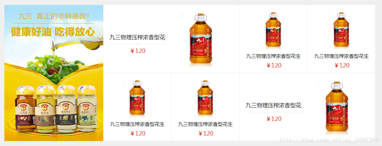
这个部分是左右布局:
右边的部分是6个div,每个都向左对齐:
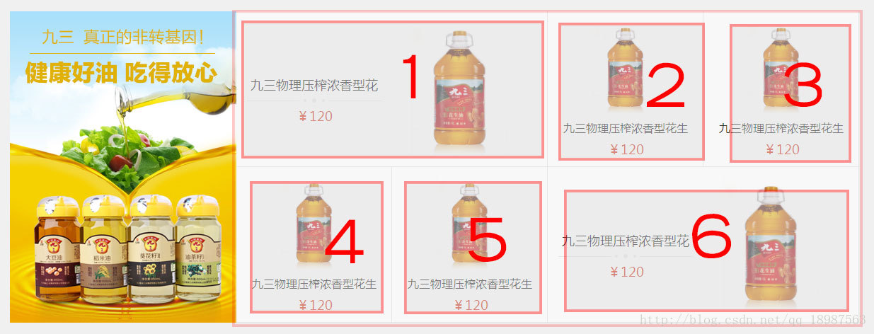
图片中1和6是相同的布局,为左右布局,其中左边里面的是上下布局;
2,3,4,5是相同的布局,为上中下布局;
        <div class="fy-home-product">
            <a class="hot"><img src="img/hot_1.jpg" /></a>
            <div class="other">
                <a class="big">
                    <div class="left">
                        <span class="title">九三物理压榨浓香型花生油</span>
                        <div class="line"></div>
                        <span class="price">¥120</span>
                    </div>
                    <img src="img/product_1.jpg" />
                </a>
                <a class="small">
                    <img src="img/product_1.jpg" />
                    <span class="title">九三物理压榨浓香型花生油</span>
                    <span class="price">¥120</span>
                </a>
                <a class="small">
                    <img src="img/product_1.jpg" />
                    <span class="title">九三物理压榨浓香型花生油</span>
                    <span class="price">¥120</span>
                </a>

                <a class="small">
                    <img src="img/product_1.jpg" />
                    <span class="title">九三物理压榨浓香型花生油</span>
                    <span class="price">¥120</span>
                </a>
                <a class="small">
                    <img src="img/product_1.jpg" />
                    <span class="title">九三物理压榨浓香型花生油</span>
                    <span class="price">¥120</span>
                </a>
                <a class="big">
                    <div class="left">
                        <span class="title">九三物理压榨浓香型花生油</span>
                        <div class="line"></div>
                        <span class="price">¥120</span>
                    </div>
                    <img src="img/product_1.jpg" />
                </a>
            </div>
        </div>
.fy-home-product {
width: 1200px;
margin: 0 auto;
height: 440px;
overflow: hidden;
margin-top: 20px;
}
.fy-home-product .hot {
float: left;
width: 320px;
height: 440px;
}
.fy-home-product .hot img {
width: 100%;
height: 100%;
}
.fy-home-product .other {
float: left;
width: 880px;
height: 440px;
overflow: hidden;
}
.fy-home-product .other a {
float: left;
height: 219px;
border: 1px solid #eaeaea;
border-top: none;
border-left: none;
overflow: hidden;
background-color: white;
}
.fy-home-product .other .big {
width: 439px;
}
.fy-home-product .other .small {
width: 219px;
}
.fy-home-product .other .big img {
width: 190px;
height: 190px;
float: left;
margin: 15px;
}
.fy-home-product .other .big .left {
width: 190px;
margin-left: 15px;
float: left;
height: 190px;
margin-top: 15px;
}
.fy-home-product .other .big .title {
width: 190px;
text-align: center;
float: left;
margin-top: 70px;
font-size: 18px;
text-overflow: ellipsis;
overflow: hidden;
height: 38px;
line-height: 38px;
}
.fy-home-product .other .big .price {
width: 190px;
text-align: center;
float: left;
font-size: 18px;
text-overflow: ellipsis;
overflow: hidden;
height: 38px;
line-height: 38px;
color: #D81E06;
}
.fy-home-product .other .big .line {
width: 190px;
text-align: center;
float: left;
height: 6px;
background-image: url(../img/bor-w.png);
background-repeat: no-repeat;
background-position: center;
}
.fy-home-product .other .small img {
width: 131px;
height: 131px;
float: left;
margin-left: 44px;
margin-top: 15px;
}
.fy-home-product .other .small .title {
width: 190px;
text-align: center;
float: left;
font-size: 16px;
text-overflow: ellipsis;
overflow: hidden;
height: 38px;
line-height: 38px;
margin-left: 15px;
}
.fy-home-product .other .small .price {
width: 190px;
text-align: center;
float: left;
font-size: 18px;
text-overflow: ellipsis;
overflow: hidden;
height: 22px;
line-height: 22px;
color: #D81E06;
margin-left: 15px;
}
这样我们中间部分就完成了,在浏览器里看一下效果:
4.3 页尾的制作

页尾的布局非常简单,就是一根线加上一行话,不多说,直接上代码:
        <div class="fy-bottom">
            <span>版权所有©讲诉纷云科技有限责任公司  |  苏ICP备1400000号-2  |  苏ICP备1400000号</span>
</div>.fy-bottom{
margin-top: 20px;
width: 100%;
border-top: 2px solid #D81E06;
text-align: center;
}
.fy-bottom span{
font-size: 12px;
display: block;
text-align: center;
margin: 50px auto;
}至此,整个首页就全部完成了。
5.商品列表页的代码编写
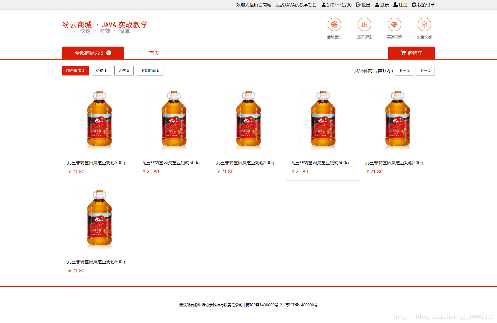
这个页面的页头和页尾与首页的完全相同,我们可以把index.html复制一份,改名为商品列表.html,并删除其中页中的部分代码。

这部分从左到右是几个超链接和一句话,我们可以使用<a>和<span>来实现,其中上一页、下一页、共16件商品,第1/2页都是向右对齐的:
        <div class="fy-list-top">
            <a class="active">综合排序<icon></icon></a>
            <a>价格<icon></icon></a>
            <a>人气<icon></icon></a>
            <a>上架时间<icon></icon></a>

            <a class="right">下一页</a>
            <a class="right">上一页</a>
            <span class="right">共16件商品,第1/2页</span>
</div>.fy-list-top{
width: 1200px;
margin: 20px auto;
height: 31px;
overflow: hidden;
}
.fy-list-top a{
float: left;
padding:6px 12px;
border: 1px solid #808080;
font-size: 12px;
margin-right: 10px;
cursor: pointer;
}
.fy-list-top a icon{
width: 10px;
height: 10px;
display:inline-block;
background-image: url(../img/rank.png);
background-repeat: no-repeat;
background-position: center;
background-size: 100% 100%;
margin-bottom: -1px;
margin-left: 2px;
}
.fy-list-top a:hover,.fy-list-top .active{
background-color: #D81E06;
border: 1px solid #D81E06;
color: white;
}
.fy-list-top a:hover icon,.fy-list-top .active icon{
background-image: url(../img/rank_white.png);
}
.fy-list-top span{
float: left;
display: block;
line-height: 31px;
}
.fy-list-top .right{
float: right;
margin-right: 0px;
margin-left: 5px;
}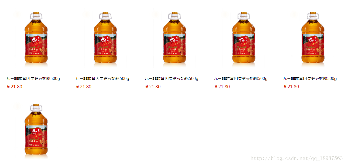
商品列表的部分是一次循环,每一个商品都是相同的一个<a></a>,我们只需要写一个,并使其向左对齐就可以了。
        <div class="fy-list">
            <a>
                <img src="img/product_1.jpg" />
                <span class="title">九三非转基因灵芝豆奶粉500g</span>
                <span class="price">¥21.80</span>
            </a>
            <a>
                <img src="img/product_1.jpg" />
                <span class="title">九三非转基因灵芝豆奶粉500g</span>
                <span class="price">¥21.80</span>
            </a>
            <a>
                <img src="img/product_1.jpg" />
                <span class="title">九三非转基因灵芝豆奶粉500g</span>
                <span class="price">¥21.80</span>
            </a>
            <a>
                <img src="img/product_1.jpg" />
                <span class="title">九三非转基因灵芝豆奶粉500g</span>
                <span class="price">¥21.80</span>
            </a>
            <a>
                <img src="img/product_1.jpg" />
                <span class="title">九三非转基因灵芝豆奶粉500g</span>
                <span class="price">¥21.80</span>
            </a>
            <a>
                <img src="img/product_1.jpg" />
                <span class="title">九三非转基因灵芝豆奶粉500g</span>
                <span class="price">¥21.80</span>
            </a>
</div>.fy-list{
width: 1200px;
overflow: hidden;
height: auto;
margin: 0px auto;
}
.fy-list a{
float: left;
width: 238px;
height: 317px;
border: 1px solid white;
overflow: hidden;
}
.fy-list a img{
width: 208px;
height: 208px;
margin: 15px;
}
.fy-list a .title{
width: 208px;
text-align: center;
line-height: 34px;
margin-left: 15px;
height: 34px;
overflow: hidden;
}
.fy-list a .price{
width: 208px;
text-align: center;
line-height: 24px;
color: #D81E06;
margin-left: 15px;
margin-bottom: 15px;
font-size: 16px;
}
.fy-list a:hover{
border: 1px solid #DCDCDC;
}这样商品列表页面就完成了。
6.商品详细页的编码实现
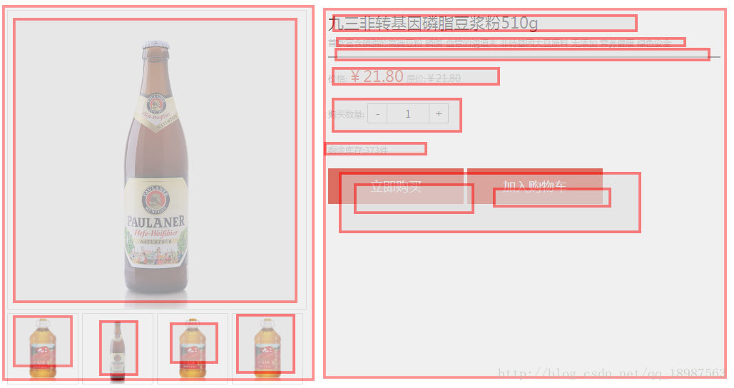
这是商品详细页,我们分块来处理,先做最上面的部分:
我们分析这张图片,画出div的层次图:
通过div层次图,我们可以在不写css的情况下完成div的编写:
        <div class="fy-pro">
            <div class="left">
                <div class="pic"><img src="img/product_1.jpg"/></div>
                <div class="sub-pic">
                    <img src="img/product_1.jpg"/>
                    <img src="img/product_2.jpg"/>
                    <img src="img/product_1.jpg"/>
                    <img src="img/product_1.jpg"/>
                </div>
            </div>
            <div class="right">
                <span class="title">九三非转基因磷脂豆浆粉510g</span>
                <span class="des">首款富含磷脂的高端豆粉 磷脂-血管的清道夫 非转基因大豆原料 无添加 营养健康 绿色安全</span>
                <div class="line"></div>
                <div class="params">
                    价格:<span class="price">¥21.80</span>
                    原价:<span class="oldprice">¥21.80</span>
                </div>
                <div class="params">
                    购买数量:
                    <div class="input">
                        <span>-</span>
                        <input type="text" value="1" />
                        <span>+</span>
                    </div>
                </div>
                <div class="params">
                    剩余库存:373件
                </div>
                <a class="bigbt">立即购买</a>
                <a class="bigbt">加入购物车</a>
            </div>
        </div>
这里左边的部分,鼠标移到到小图上时,上面的大图需要预览成小图的图片,我们可以在小图上加上mouseover方法,触发时改变大图的src,代码是:
//商品图片,鼠标点击切换展示
$('.fy-pro .left .sub-pic img').bind('mouseover',function(){
        $('.fy-pro .left .pic img').attr('src',$(this).attr('src'));
});
右边的购买数量按钮:
是向左对齐的span、input、span:
<span>-</span>
<input type="text" value="1" />
<span>+</span>
当点击两边的span的时候,加减input里的数值,我们先给input一个id,方便使用js时调用它
<input type="text" value="1" id="count" />给两个span增加点击事件,触发时加减input里的值:
<span onclick="if(parseInt($('#count').val())<=1)return;$('#count').val(parseInt($('#count').val())-1)">-</span>
<input type="text" value="1" id="count"/>
<span onclick="if(parseInt($('#count').val())>=373)return;$('#count').val(parseInt($('#count').val())+1)">+</span>
其余部分的css是:
.fy-pro{
    width: 1000px;
    margin: 0 auto;
    margin-top: 20px;
    height: auto;
    overflow: hidden;
}
.fy-pro .left{
    float: left;
    width: 420px;
    height: 525px;
    overflow: hidden;
}
.fy-pro .left .pic{
    width: 418px;
    height: 418px;
    border: 1px solid #DCDCDC;
}
.fy-pro .left .pic img{
    width: 100%;
    height: 100%;
}
.fy-pro .left .sub-pic{
    margin-top: 5px;
    width: 100%;
    height: 100px;
}
.fy-pro .left .sub-pic img{
    height: 98px;
    width: 98px;
    border: 1px solid #DCDCDC;float: left;margin-right: 5px;
    cursor: pointer;
}
.fy-pro .right{
    float: right;
    width: 550px;
    overflow: hidden;
}
.fy-pro .right .title{
    line-height: 35px;
    font-size: 22px;
    display: block;
}
.fy-pro .right .des{
    line-height: 20px;
    margin-top: 8px;
    color: #aaa;
    font-size: 12px;

}
.fy-pro .right .line{
    width: 100%;
    height: 2px;
    background-color: #808080;
    margin-top: 8px;
}
.fy-pro .right .params{
    height: auto;
    width: 100%;
    overflow: hidden;
    font-size: 12px;
    color: #aaa;
    line-height: 50px;
}

.fy-pro .right .params .price{
    font-size: 22px;
    color: #D81E06;
}
.fy-pro .right .params .oldprice{
    text-decoration: line-through;
}
.fy-pro .right .params .input{
    display: inline-block;
    width: 112px;
    height: 26px;
    border: 1px solid #AAAAAA;
    overflow: hidden;
    margin-bottom: -8px;
}
.fy-pro .right .params .input span{
    display: block;
    float: left;
    height: 26px;
    width: 26px;
    text-align: center;
    line-height: 26px;
    font-size: 16px;
    color: black;
    cursor: pointer;
}
.fy-pro .right .params .input input{
    width: 58px;
    height: 26px;
    outline: none;
    border: 1px solid #AAAAAA;
    border-top: none;
    border-bottom: none;
    display: block;
    float: left;
    text-align: center;
}
.fy-pro .bigbt{
    float: left;
    width: 190px;
    height: 50px;
    line-height: 50px;
    text-align: center;
    color: white;
    background-color: #D81E06;
    margin-right: 5px;
    font-size: 18px;
}
该页面的下半部分是左右布局,先分析下div层次:
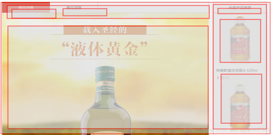
根据结构我们可以直接写出div部分代码:
        <div class="fy-detail">
            <div class="left">
                <div class="title">
                    <span class="active" i="page1">商品详细</span>
                    <span i="page2">售后保障</span>
                </div>
                <div class="detail page1">
                    <img src="img/1511041534461001000119.jpg" />
                    <img src="img/1511041534471001000120.jpg" />
                </div>
                <div class="detail page2">
                </div>
            </div>
            <div class="right">
                <div class="top">热卖产品推荐</div>
                <a>
                    <img src="img/product_1.jpg" />
                    <span class="title">特蒂斯海洋深层水 620ml</span>
                    <span class="price">¥16.00</span>
                </a>
                <a>
                    <img src="img/product_1.jpg" />
                    <span class="title">特蒂斯海洋深层水 620ml</span>
                    <span class="price">¥16.00</span>
                </a>
                <a>
                    <img src="img/product_1.jpg" />
                    <span class="title">特蒂斯海洋深层水 620ml</span>
                    <span class="price">¥16.00</span>
                </a>
                <a>
                    <img src="img/product_1.jpg" />
                    <span class="title">特蒂斯海洋深层水 620ml</span>
                    <span class="price">¥16.00</span>
                </a>
                <a>
                    <img src="img/product_1.jpg" />
                    <span class="title">特蒂斯海洋深层水 620ml</span>
                    <span class="price">¥16.00</span>
                </a>
            </div>
</div>其中商品详细和售后保障是两个标签,当点击标签时,底下的页面会出现切换,显示不同的内容,所以我们在div里写了两个<div class="detail">,但分别给了他们page1和page2的class名称,方便隐藏和显示其中一个页面;
下面我们给商品详细和售后保障 两个span添加点击事件,当鼠标点击它们的时候,显示标签里i属性指定class名称的div:
//商品详细和售后保障的标签切换
            $('.fy-detail .left .title span').bind("click",function(){
                $('.fy-detail .left .title span').removeClass('active');
                $(this).addClass('active');
                $('.fy-detail .left .detail').fadeOut(0)
                $('.fy-detail .left .'+$(this).attr('i')).fadeIn(0)
            })
最后我们根据图片,把div的css都补齐:
.fy-detail{
    width: 1000px;
    margin: 0 auto;
    margin-top: 20px;
    overflow: hidden;
    height: auto;
}
.fy-detail .left{
    float: left;
    width: 782px;
    overflow: hidden;
}
.fy-detail .left .title{
    width: 780px;
    height: 40px;
    border: 1px solid #AAAAAA;

}
.fy-detail .left .title span{
    width: 180px;
    height: 40px;
    float: left;
    text-align: center;
    line-height: 40px;
    border-right: 1px solid #AAAAAA;
    cursor: pointer;
}
.fy-detail .left .title .active{
    background-color: #D81E06;
    color: white;
}
.fy-detail .left .detail{
    width: 780px;
    margin-left: 1px;
    overflow: hidden;
    min-height: 200px;
}
.fy-detail .left .detail img{
    width: 100%;
}
.fy-detail .right{
    float: right;
    width: 200px;
    overflow: hidden;
    border: 1px solid #AAAAAA;
}
.fy-detail .right .top{
    height: 40px;
    line-height: 40px;
    border-bottom: 1px solid #D81E06;
    text-align: center;
}
.fy-detail .right a{
    width: 100%;
    float: left;
}
.fy-detail .right a img{
    width: 198px;
    height: 198px;
    margin-left: 1px;
}
.fy-detail .right a .title{
    width: 180px;
    margin-left: 10px;
    line-height: 32px;
}
.fy-detail .right a .price{
    margin-left: 10px;
    line-height: 24px;
    color: #D81E06;
}
这样我们把商品详细页面也完成了。


 1645
1645


 被折叠的 条评论
为什么被折叠?
被折叠的 条评论
为什么被折叠?
 到【灌水乐园】发言


