


第一种圆形loading,效果图如下:

实现的原理是利用CSS中的animation属性,无线循环播放动画能够达到旋转效果。具体的html和css实现代码如下
<!DOCTYPE html>
<html>
<head>
<title>loading样式1</title>
<style type="text/css">
.loading{
/*固定loading*/
position: fixed;
top: 50%;
left: 50%;
/*垂直水平居中*/
margin: -20px 0 0 -20px;
width: 40px;
height: 40px;
border: 2px solid;
border-color: #333 #333 transparent;
border-radius: 50%;
box-sizing: border-box;
/*动画时间1s,线性变化,无限循环*/
animation: loading 1s linear infinite;
}
@keyframes loading{
0%{
transform: rotate(0deg);
}
100%{
transform: rotate(360deg);
}
}
</style>
</head>
<body>
<div class="loading"></div>
</body>
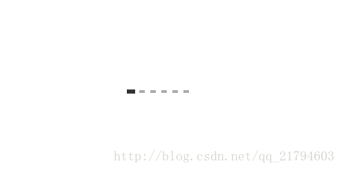
</html> 第二种loading的效果图如下所示:
实现原理也是利用css中的anmiation属性,具体实现在代码中能很直观的体现,代码如下:
<!DOCTYPE html>
<html>
<head>
    <title>loading2</title>
    <style type="text/css">
        .loading{
            position: fixed;
            top: 50%;
            left: 50%;
            margin: -6px 0 0 -48px;
            /*96=(8+4*2)*6*/
            width: 96px;
            height: 12px;
            overflow: hidden;
        }
        .loading .bar{
            /*176=(8+4*2)*11*/
            width:176px;
            /* 分成5步的动画来移动进度条 */
            animation: loading 1s steps(5,end) both infinite;
        }
        /*float元素的外边距不会合并*/
        .bar i{width: 8px;height: 4px;float: left;margin: 4px;background:#aaa;}
        /*设置第六个点高亮,这个点的两边都有5个点*/
        .bar i:nth-child(6){transform: scale(1.5);background:#333;}
        @keyframes loading{
            /*将第六个点移动到第一个点的位置*/
            0%{transform: translate(-80px);}
            80%,100%{transform: translate(0px);}

        }
    </style>
</head>
<body>
    <div class="loading">
        <div class="bar">
            <i></i>
            <i></i>
            <i></i>
            <i></i>
            <i></i>
            <i></i>
            <i></i>
            <i></i>
            <i></i>
            <i></i>
            <i></i>
        </div>
    </div>
</body>
</html>
这两种实现方法是为练习使用,没考虑兼容性问题,但在高版本的浏览器中都能实现效果图,具体的兼容性说明可参考MDN或w3cshool。


 1014
1014


 被折叠的 条评论
为什么被折叠?
被折叠的 条评论
为什么被折叠?
 到【灌水乐园】发言


