


在我们实际开发当中,会碰见一些布局结构类似或者相同的界面,例如应用的设置界面、tab按钮界面等。这时候,对于初学者来说,xml里面一个个绘制出来或许是最初的想法;可能随着经验的积累,又学会一招,就是使用include标签,导入类似或者相同的布局,提高了性能又减少了代码;再以后呢,自定义控件又可以实现这一目的。本文就是简单的使用自定义的组合控件模仿猫眼底部菜单栏。
1.自定义组合控件属性:在res/values目录下创建attrs.xml文件
- <declare-styleable name="TabItemView">
- <attr name="contentTextSize" format="dimension"/> <!-- 字体大小 -->
- <attr name="contentTextColor" format="color"/> <!-- 字体颜色 -->
- <attr name="contentTextString" format="string"/> <!-- 显示的默认文字 -->
- <attr name="contentLogoBack" format="reference"/> <!-- item背景 -->
- <attr name="contentLogoSize" format="dimension" />
- </declare-styleable>
<attr />某个属性的定义:如<attr name="contentTextSize" format="dimension"/>,定义的就是文字的大小,contentTextSize指属性名字(和我们xml中常用的textSize),format定义的是contentTextSize具体的属性类型。
下面简单的说下format的具体类型:
(1) reference:参考某一资源ID。 (2) color:颜色值。
(3) boolean:布尔值。 (4) dimension:尺寸值。
(5) float:浮点值。 (6) integer:整型值。
(7) string:字符串。 (8) fraction:百分数。
(9) enum:枚举值。 (10)flag:位或运算。
2.控件的属性定义完了,然后就是要在代码里面获取使用这些属性,看源代码的时候,你会发现系统定义的属性都是通过TypedArray这玩意获取的,获取方法如下:
- TypedArray ta = mContext.obtainStyledAttributes(attrs, R.styleable.TabItemView);
TypedArray属性集合得到之后,下面就是根据需要获取不同的属性,针对不同的属性有不同的获取方法,以下是几个比较常用到的属性获取方法:
(1)getDimensionPixelSize:获取尺寸的大小(间距,文字大小等)
(2)getResourceId:获取资源id(图片等)
(3)getString:获取字符串
(4)getBoolean:获取布尔值
(5)getColor:获取颜色值
(6)getFloat:获取浮点类型值
下面是TabItemView自定义组合控件的完整代码:
- package com.dandy.weights;
- import com.dandy.utils.PhoneUtils;
- import com.demo.dandy.R;
- import android.content.Context;
- import android.content.res.TypedArray;
- import android.text.TextUtils;
- import android.util.AttributeSet;
- import android.util.TypedValue;
- import android.view.InflateException;
- import android.view.View;
- import android.widget.ImageView;
- import android.widget.LinearLayout;
- import android.widget.TextView;
- import android.view.View.OnClickListener;
- public class TabItemView extends LinearLayout implements OnClickListener{
- private Context mContext;
- private ImageView contentLogo;//tab图片显示
- private TextView contentText;//tab文字提示
- private int logoBackResourceId;//图片资源id
- private String textString;//文字字符串
- private int textColor;//文字显示颜色
- private float textSize;//文字显示大小
- private int contentLogoSize;//显示图片大小
- private static final float defaultTextSize = 16;//文字默认大熊啊
- private int defaultColor,selectedColor;//默认颜色
- private TabClickListner mClickListner;//点击监听回调事件
- public TabItemView(Context context) {
- this(context, null);
- }
- public TabItemView(Context context, AttributeSet attrs) {
- this(context, attrs, 0);
- }
- public TabItemView(Context context, AttributeSet attrs, int defStyle) {
- super(context, attrs, defStyle);
- this.mContext = context;
- init(attrs);
- addView();
- }
- private void init(AttributeSet attrs){
- this.setOnClickListener(this);
- TypedArray ta = mContext.obtainStyledAttributes(attrs, R.styleable.TabItemView);//获取属性集合
- logoBackResourceId = ta.getResourceId(R.styleable.TabItemView_contentLogoBack, -1);//获取图片资源id
- textColor = ta.getColor(R.styleable.TabItemView_contentTextColor,<span style="font-family: Arial, Helvetica, sans-serif;">getResources().getColor(android.R.color.black));//获取文字颜色</span>
- textSize = ta.getDimensionPixelSize(R.styleable.TabItemView_contentTextSize,<span style="font-family: Arial, Helvetica, sans-serif;">PhoneUtils.dp2px(mContext, defaultTextSize));//获取显示的文字大小</span>
- textString = ta.getString(R.styleable.TabItemView_contentTextString);//获取显示的文字
- contentLogoSize = ta.getDimensionPixelSize(R.styleable.TabItemView_contentLogoSize,<span style="font-family: Arial, Helvetica, sans-serif;">LayoutParams.WRAP_CONTENT);//获取显示图片的尺寸大小</span>
- ta.recycle();
- defaultColor = mContext.getResources().getColor(R.color.textcolor_black_b3);
- selectedColor = mContext.getResources().getColor(R.color.textcolor_red_d);
- }
- //添加显示图片和文字的控件
- private void addView(){
- contentLogo = new ImageView(mContext);
- contentLogo.setFocusable(false);
- contentLogo.setClickable(false);
- LayoutParams logoParams = new LayoutParams(contentLogoSize,contentLogoSize);
- contentLogo.setLayoutParams(logoParams);
- if(logoBackResourceId != -1){
- contentLogo.setBackgroundResource(logoBackResourceId);
- }else{
- throw new InflateException("未设置填充图片资源");
- }
- this.addView(contentLogo);
- if(!TextUtils.isEmpty(textString)){
- contentText = new TextView(mContext);
- contentText.setFocusable(false);
- contentText.setClickable(false);
- LayoutParams textParams = new LayoutParams(LayoutParams.WRAP_CONTENT,LayoutParams.WRAP_CONTENT);
- textParams.topMargin = PhoneUtils.dp2px(mContext,3);
- contentText.setLayoutParams(textParams);
- contentText.setTextColor(textColor);
- contentText.setTextSize(TypedValue.COMPLEX_UNIT_PX,textSize);
- contentText.setText(textString);
- this.addView(contentText);
- }
- }
- @Override
- public void onClick(View v) {
- setTabSelected(true);
- if(mClickListner != null){
- mClickListner.onTabClick(this);//回调点击事件
- }
- }
- /**
- *设置点击监听事件
- */
- public void setTabClickListener(TabClickListner listner){
- this.mClickListner = listner;
- }
- /**
- *设置填充图片资源
- */
- public void setContentLogoBack(int resourceId){
- contentLogo.setBackgroundResource(resourceId);
- }
- /**
- *设置填充文字
- */
- public void setContentTextString(String text){
- if(contentText != null){
- contentText.setText(text);
- }
- }
- /**
- *设置选中状态
- */
- public void setTabSelected(boolean enable){
- if(contentLogo != null){
- contentLogo.setSelected(enable);
- }
- if(contentText != null){
- if(enable){
- contentText.setTextColor(selectedColor);
- }else{
- contentText.setTextColor(defaultColor);
- }
- }
- }
- public interface TabClickListner{
- void onTabClick(View view);
- }
TabClickListener:控件点击的回调接口
3.控件搞定,然后就是在布局里面的具体使用
在res/layout/中创建tab_layout.xml文件,具体代码如下:
- <?xml version="1.0" encoding="utf-8"?>
- <LinearLayout xmlns:android="http://schemas.android.com/apk/res/android"
- xmlns:tabItem="http://schemas.android.com/apk/res/com.demo.dandy"
- android:layout_width="match_parent"
- android:layout_height="wrap_content"
- android:orientation="horizontal"
- android:background="@color/background_bg7"
- android:paddingTop="@dimen/tab_padding"
- android:paddingBottom="@dimen/tab_padding">
- <com.dandy.weights.TabItemView
- android:id="@+id/movie"
- style="@style/TabItemStyle"
- android:layout_width="0dp"
- android:layout_height="wrap_content"
- android:layout_weight="1"
- android:gravity="center"
- android:orientation="vertical"
- tabItem:contentLogoBack="@drawable/selector_tab_movie"
- tabItem:contentTextString="@string/movie" />
- <com.dandy.weights.TabItemView
- android:id="@+id/cinema"
- style="@style/TabItemStyle"
- android:layout_width="0dp"
- android:layout_height="wrap_content"
- android:layout_weight="1"
- android:gravity="center"
- android:orientation="vertical"
- tabItem:contentLogoBack="@drawable/selector_tab_cinema"
- tabItem:contentTextString="@string/cinema" />
- <com.dandy.weights.TabItemView
- android:id="@+id/community"
- style="@style/TabItemStyle"
- android:layout_width="0dp"
- android:layout_height="wrap_content"
- android:layout_weight="1"
- android:gravity="center"
- android:orientation="vertical"
- tabItem:contentLogoBack="@drawable/selector_tab_community"
- tabItem:contentTextString="@string/community" />
- <com.dandy.weights.TabItemView
- android:id="@+id/mine"
- style="@style/TabItemStyle"
- android:layout_width="0dp"
- android:layout_height="wrap_content"
- android:layout_weight="1"
- android:gravity="center"
- android:orientation="vertical"
- tabItem:contentLogoBack="@drawable/selector_tab_mine"
- tabItem:contentTextString="@string/mine" />
- </LinearLayout>
代码当中:xmlns:tabItem="http://schemas.android.com/apk/res/com.demo.dandy",这段代码是关联你自定义属性的,其中com.demo.dandy是指你应用的包名,tabItem是引用名
其实就是拷贝xmlns:android="http://schemas.android.com/apk/res/android,替换一下android就ok了。
具体流程是:在构造函数中,获取TypedArray属性集合,然后获取所需的各个属性值,再通过动态添加控件ImageView和TextView,并且把相应定义的属性赋值给它们。
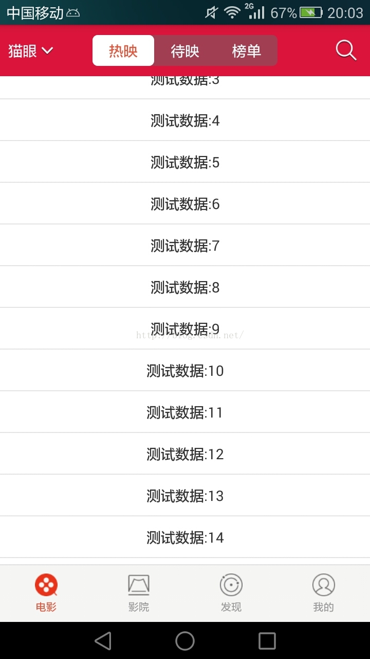
运行截图如下:


 5561
5561


 被折叠的 条评论
为什么被折叠?
被折叠的 条评论
为什么被折叠?
 到【灌水乐园】发言


