


今天总结的是CSS3的学习内容
一、CSS简介
CSS3是CSS技术的升级版本,CSS即层叠样式表(Cascading StyleSheet)。CSS3语言是朝着模块化发展的,把它分解成小的模块,并且加入 更多新的模块进来:
                    盒子模型
                    文字特效
                    边框圆角
                    动画
                    多列布局
                    用户界面
                    旋转
                    渐变
                    ...
二、CSS3的应用
2.1.超级选择器
CSS选择器:使用CSS对html页面中的元素实现一对一,一对多或者多对一的控制:
选择器
{
    样式
}
属性选择器
在CSS3中追加了三个选择器:[att*=val];[att^=val];[att$=val]–>att表示为属性,val表示为属性的属性值。[att*=val]:如果元素用att表示的属性的值中包含val指定的字符,那么该元素使用这个样式。
[att$=val]:如果元素用att表示的属性的属性值的结尾字符用val指定的字符,那么该元素使用这个样式。
[att^=val]:如果元素用att表示的属性的属性值的开头字符为用val指定的字符,那么该元素使用这个样式。
注意: /如果纯用数字的时候该样式不会显示成功,需要用\连接与数字最近的符号 注意!只有’-‘的字符需要加’\’/
<head>
    <meta charset="UTF-8">
    <title>css3中的属性选择器</title>
    <style>
        /*1.[att*=val] 此时只有id=section1A的div会拥有该样式*/
        [id*= section1]{
            background-color: blueviolet;
        }
        /*2.[att^=val] 此时只有id=footer的div会拥有该样式*/
        [id^= f]{
            background-color: blue;
        }
        /*3.[att$=val] 此时只有id=sectionB的div会拥有该样式*/
         [id$= B]{
            background-color: chartreuse;
        }
        /*注意!*/
        [id$= \-1]{
            background-color: crimson;
        }
    </style>
</head>
<body>
    <h1>CSS3中的属性选择器</h1>
    <div id="section1A">section1A</div>
    <div id="sectionB">sectionB</div>
    <div id="section2-1">section2-1</div>
    <div id="footer">footer</div>
</body>
2.结构性伪类选择器
(1)类选择器
使用类选择器把相同的元素定义成不同的样式,伪类选择器是已经定义好的不可以随便起名。
p.right{
    color:red;
}
p.left{
    colot:blue;
}
(2)伪类选择器—-最常见的伪类选择器:a(使用顺序为:未,已,悬,停)
        a:link{
            color: #ff6600;
        }
        a:visited{
            color: blueviolet;
        }
        a:hover{
            color: aqua;
        }
        /*鼠标点击时*/
        a:active{
            color: darkblue;
        }
(3)伪元素选择器
针对于CSS中已经定义好的伪元素使用的选择器(first-line;first-letter;before;after)。
选择器:伪元素{
    属性:值;
}
选择器.类名:伪元素{
    属性:值;
}- first-line伪元素选择器:向某个元素中的第一行文字使用样式。
- first-letter伪类选择器:向某个元素中的文字的首字母或者第一个文字使用样式。
- before:在某个元素之前插入一些内容。
- after:在某个元素之后插入一些内容。
- 可以使用before和after伪元素在页面中插入文字,图像,项目编号等。
- 插入文字:E:before/after
- 排除一些不需要插入内容的元素:E:none:before/after
- 插入图像
- 插入项目编号
a.在多个标题前加上编号:counter属性对项目追加编号
- 可以使用before和after伪元素在页面中插入文字,图像,项目编号等。
            元素:before{
                content:counter(计数器);
            }
            元素{
                counter-increment:content属性值中所指定的计数器名称;
            }
b.对编号中添加文字
c.指定编号的样式
d.指定编号的种类:list-style-type
e.编号嵌套,重置编号
要对哪一个元素进行重置,那么就在该元素的父元素上进行设置reset。
f.中编号中嵌入大编号
        h2:before{
            content:counter(大编号计数器)'-'conter(中编号计数器);
g.在字符串两边嵌套文字符号:open-quoter&close-quoter
<head>
    <meta charset="UTF-8">
    <title>伪元素选择器</title>
    <style>
         p:first-line{
            color: blueviolet;
        }
        p:first-letter{
            color: aqua;
        }
        li:before{
            content: "~~~";
            color: #000;
        }
        li:after{
            content: "~~~";
            color: darkred;
        }
    </style>
</head>
<body>
    <h1>CSS中主要有四个伪类选择器</h1>
    <p>
        CSS中主要有四个伪类选择器<br />
        first-line伪元素选择器:向某个元素中的第一行文字使用样式
    </p>
    <p>
        first-letter伪类选择器:向某个元素中的文字的首字母或者第一个文字使用样式
    </p>
    <h4>befor&after</h4>
    <ul>
        <li><a href="first.html">balabala</a></li>
    </ul>
</body>
(4)结构性伪类选择器
- root选择器:将样式绑定到页面的根元素中。
- not选择器:只对某个结构元素使用样式,但该元素下面的子结构元素不使用该样式。
- empty选择器:指定当元素中内容为空白时显示的样式。
<head>
    <style>
    /*empty选择器*/
        :empty{
            background-color: darkviolet;
        }
    </style>
</head>
<body>
    <table border="1" cellpadding="0" cellspacing="0" width="100%">
        <tr>
            <td>1</td>
            <td>2</td>
            <td>3</td>
            <td></td>
        </tr>
    </table>
</body>- target选择器:在用户点击了超链接并转到target元素后,对页面中某个target元素指定样式。
<head>
    <style>
        /*target选择器*/
        :target{
            background-color: blanchedalmond;
            color: brown;
        }
    </style>
</head>
<body>
    <h2>target选择器</h2>
    <a href="#A">A</a>
    <a href="#B">B</a>
    <div id="A">
        <h2>A标题</h2>
        <p>内容</p>
    </div>
    <div id="B">
        <h2>B标题</h2>
        <p>内容</p>
    </div>
</body>- first-child:单独指定第一个子元素的样式。
- last-child:单独指定最后一个子元素的样式。
- nth-child:选择器匹配正数下来的第N个子元素,nth-child(odd)为第奇数个子元素,nth-child(even)为第偶数个子元素。
- nth-last-child(n):匹配倒数数下来第n个子元素。
- nth-of-type:正数,当指定元素为标题加内容的时候,如果使用上面的方法会导致真正的指定元素不被成功指定,因此需要使用nth-first-type方法进行指定。
- nth-last-type:倒数,同nth-first-type。
- 循环使用样式:nth-child(An+B)–A 表示每次循环中共包括几种样式,B表示指定的样式在循环中所处的位置。
- only-child:只对一个元素起作用。
<head>
<meta charset="UTF-8">
<title>结构性伪类选择器</title>
<style>
/* 选择器first-child;last-child;nth-child;nth-last-child*/
li:first-child{
background-color: darkviolet;
}
li:last-child{
background-color: chartreuse;
}
li:nth-child(3){
background-color: cadetblue;
}
li:nth-child(odd){
background-color: aquamarine;
}
li:nth-child(even){
background-color: cornflowerblue;
}
li:nth-last-child(3){
background-color: darkgrey;
}
/*循环*/
li:nth-child(4n+1){
background-color: aquamarine;
}
li:nth-child(4n+2){
background-color: indianred;
}
/*唯一的*/
li:only-child{
background-color: hotpink;
}
/*存在的问题*/
h2:nth-child(2){
background-color: darkgoldenrod;
}
h2:nth-child(odd){
background-color: darkgoldenrod;
}
h2:nth-child(even){
background-color: darkgoldenrod;
}
h2:nth-of-type(odd){
background-color: chartreuse;
}
h2:nth-of-type(even){
background-color: aquamarine;
}
</style>
</head>
<body>
<h1>选择器first-child;last-child;nth-child;nth-last-child</h1>
<ul>
<li>No.1</li><li>No.2</li><li>No.3</li><li>No.4</li>
<li>No.5</li><li>No.6</li><li>No.7</li><li>No.8</li>
<li>No.9</li><li>No.10</li>
<li>No.11</li><li>No.12</li>
</ul>
<h1>唯一的</h1>
<ul>
<li>唯一,多加一个就没有啦</li>
</ul>
<div id="A">
<h2>A标题</h2><p>内容</p>
<h2>B标题</h2><p>内容</p>
</div>
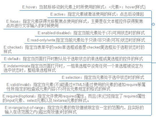
</body>3.UI元素状态伪类选择器
指定的样式只有在元素处于某种状态下才起作用,在默认状态下不起作用!
4.兄弟元素选择器
用来指定位于同一父元素之中的某个元素之后的所有其他某个种类的兄弟元素所使用的样式。一定要是之后的兄弟元素!
<子元素>~<子元素之后的同级兄弟元素>
    {
        样式
    }
2.2.文字阴影与自动换行
1.text-shadow
p{
    text-shadow:length(阴影离开文字的横方向距离) length(阴影离开文字的纵方向距离) length(阴影模糊半径) color(阴影颜色)
}- 位移距离:前两个参数代表的阴影离开文字的横(纵)方向距离,不可省略。
- 第三个参数代表模糊半径,代表阴影向外模糊时候的范围,数值越大越模糊。
- 当没有指定颜色值时,会使用默认文字的颜色。
- 指定多个阴影,并且可以针对每个阴影用逗号分隔。
2.word-break:浏览器文本自动换行。
3.word-wrap: 长单词与URL地址自动换行。
4.服务器端字体和@font-face属性
- 定义斜体或粗体:在定义字体的时候,可以把字体定义成斜体或者粗体,在使用服务器服务器端字体的时候,需要根据斜体还是粗体使用不同的汉字。
- 显示客户端字体:首先将font-family设置为本地的字体名,然后将src属性设置为local(‘字体’)。
- font-variant:设置文本是否大小写。
- font-weight:设置文本的粗细。
- font-stretch:设置文本是否横向的拉伸变形。
2.3.盒模型
1.各种盒模型
- inline-block类型
使用inline-block类型来执行分列显示
<head>
    <style>
    div.div1{
            background-color: #ff6600;
            width: 300px;
            height: 150px;
            float: left;
        }
        div.div2{
            background-color: #21fffc;
            width: 200px;
            height: 100px;
            float: left;
        }
        div.div3{
            background-color: #ef23ff;
            width: 500px;
            height: 100px;
            clear: both;
        }
        /*inline-block*/
        div.div4{
            background-color: #ff6600;
            display: inline-block;
            width: 300px;
        }
        div.div5{
            background-color: #21fffc;
            vertical-align: top;
            display: inline-block;
            width: 200px;
        }
        div.div6{
            background-color: #ef23ff;
            width: 500px;
            height: 100px;
        }
      </style>
</head>
<body>
    <h1>使用inline-block类型来执行分列显示-1.传统方式</h1>
    <div class="div1">div1</div>
    <div class="div2">div2</div>
    <div class="div3">div3</div>
    <hr color="darkred">
    <h1>使用inline-block类型来执行分列显示-1.inline-block方式</h1>
    <div class="div4">
        div1div1div1div1div1div1div1
        div1div1div1div1div1div1div1div1
        div1div1div1div1div1div1div1div1
    </div><div class="div5">
        div2div2div2div2div2div2div2
        div2div2div2div2div2div2div2div2
    </div>
    <div class="div6">
        div3
    </div>
</body>
使用inline-block类型来显示水平菜单
<head>
    <style>
        ul.ul1 li{
            float: left;
            list-style: none;
            padding:5px 20px;
            text-align: center;
            border-right: 1px solid darkviolet;
            width: 200px;
            color: wheat;
            background-color: mediumvioletred;
        }
        ul.ul2 li{
            list-style: none;
            display: inline-block;
            padding:5px 20px;
            text-align: center;
            border-right: 1px solid darkviolet;
            width: 200px;
            color: wheat;
            background-color: mediumvioletred;
        }
    </style>
</head>
<body>
    <h1>使用inline-block类型来显示水平菜单-inline-block</h1>
    <ul class="ul2">
        <li>A</li><li>B</li><li>C</li><li>D</li>
    </ul>
</body>
- inline-table类型
<head>
    <style>
        table{
           display: inline-table;
           vertical-align: bottom;
           border: 2px solid blueviolet;
           width: 400px;
           height: 200px;
           color: darkviolet;
       }
        td{
            border: 2px solid violet;
        }
    </style>
</head>
<body>
    <h1>使用inline-table类型-一个表格前后都有文字将其环绕</h1>
    巴拉巴拉
    <table cellspacing="0" cellpadding="0">
        <tr>
            <td>1</td>
            <td>2</td>
        </tr>
        <tr>
            <td>1</td>
            <td>2</td>
        </tr>
    </table>
    巴拉巴拉
</body>- list-item类型
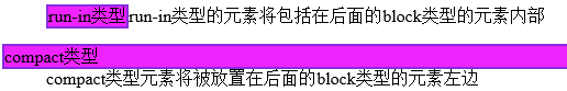
可以将多个元素作为列表显示,同时在元素的开头加上列表的标记。 - run-in类型和compact类型
- none类型
当元素被指定none后,该元素不会显示
2.显示不下的内容
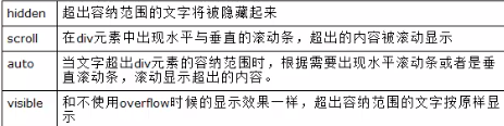
- overflow属性:指定对盒子中容纳不下的内容的显示办法
- overflow-x属性与overflow-y属性
- textoverflow:在盒子的末尾显示代表省略符号的‘…’,但是该属性只在内容在水平位置上超出时显示。
3.盒子阴影
box-shadow:让盒在显示的时候产生阴影的效果
对盒内子元素设置阴影
对一个文字或第一行设置阴影:通过first-line或者first-letter
对表格和对单元格使用阴影
4.box-sizing宽高计算
指定针对元素的宽度和高度的计算方法
(content)border-box:属性值表示元素的宽高度(不)包括内补白区域及边框的宽度高度<head>
<style>
div.a,div.b{
width: 300px;
padding: 30px;
margin: 20px auto;
border: 30px solid darkviolet;
background-color: violet;
}
div.a{
box-sizing: border-box;
}
div.b{
box-sizing: content-box;
}
</style>
</head>
<body>
<h2>box-sizing:content&border-box</h2>
<div class="ab">
<div class="a">
box-sizing:border-box代表宽度和高度包含内补白宽度高度,即虽然有padding和border,最终仍然为300px
</div>
<div class="b">
box-sizing:content-box:代表不包含宽高度内补白区域,即最后为300px+30px+30px
</div>
</div>
</body>2.4.边框和背景样式
1.新增的背景属性
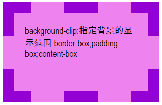
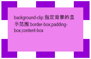
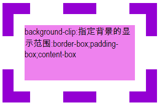
background-clip:指定背景的显示范围
border-box:从边框开始
padding-box:从内边框开始
content-box:从内容开始
background-orgin:指定绘制背景图像的起点
可以指定绘制时的起始位置,默认为padding,可以为border或者content左上角开始绘制。- background-size:指定背景中图像的尺寸
auto
length
percentage:以父元素的百分比设置背景图像的宽高度。
cover:全覆盖。
contain :与cover相反,主要将背景图片缩小,来适合布满整个容器。
2.显示多个背景属性: 第一个图像在最上面
3.圆角边框:border-radius
指定两个半径:左上右下+左下右上
当不显示边框的时候,浏览器会把四个角绘制成圆角
修改边框种类。
绘制四个不同半径的边框
4.图像边框:border-image
可以让元素的长度或宽度处于随时变化时,变化状态的边框统一使用一个图像文件来进行绘制。
2.5.CSS3变形功能
1.利用transform实现文字或图像的旋转,缩放,倾斜移动这四种类型的变形处理。
- 旋转:totate(角度)
- 缩放:scale(值):0.5即为缩放到50%
- 倾斜:skew(值),值为角度
- 移动:translate(值)
- 对一个元素使用多个方法
transform:方法1 方法2 方法 3 方法4 - 改变元素基点
transform-origin:
2.6.CSS3的动功能
1.transition功能:支持从一个属性值平滑到另外一个属性值
允许CSS属性值在一定的时间内平滑的过度,这种效果可以在单击,获得焦点,被点击或对元素任何改变中触发,并圆滑的以动画效果改变CSS属性值。
(1)执行变换的属性:transition-property:过渡即将开始
- none:没有属性会获得过渡效果
- all:所以属性会获得过渡效果
- property:定义应用过渡效果的CSS属性名称列表,以逗号分隔
(2)变换延续时间:transition-duration:规定完成过渡需要花费的时间,默认值零没有效果。
(3)在延续时间段,变换速率的变化:transition-timing-function。
(4)变换延迟时间:transition-delay:指定一个动画开始执行的时间,也就是当改变元素属性值后多长时间开始执行过渡效果。
<head>
    <meta charset="UTF-8">
    <title>CSS3中的动画效果</title>
    <style>
        div.transition1{
            width: 200px;
            height: 200px;
            background-color: blueviolet;
            -webkit-transition:all 1s linear 1s;
        }
    </style>
</head>
<body>
    <h2>transition</h2>
    <div class="transition1"></div>
</body>
2.Animations功能:支持通过关键帧的指定来在页面上产生更复杂的动画现象。
- name:指定合集名称
- duration:整个动画执行完成所需时间
- timing-function:实现动画方法
- iteration-count:重复播放次数
<head>
<style>
div.animation{
width: 20px;
height: 20px;
background-color: #ef23ff;
}
/*关键帧的封装*/
@-webkit-keyframes myan{
0%{
background-color: violet;
width: 50px;
}
10%{
background-color: palevioletred;
width: 100px;
}
30%{
background-color: mediumvioletred;
width: 200px;
}
50%{
background-color: blueviolet;
width: 40px;
}
70%{
background-color: darkviolet;
width: 400px;
}
90%{
background-color: #7300a4;
width: 600px;
}
100%{
background-color: #4a0068;
width: 800px;
}
}
</style>
</head>
<body>
<h2>animation</h2>
<div class="animation"></div>
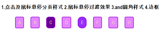
</body>2.7.CSS3的分页
1.点击及鼠标悬停分页样式
2.鼠标悬停过渡效果:transition: background-color .9s;
3.圆角样式:border-radius
4.边框:border:2px solid darkviolet;
2.8.布局相关样式
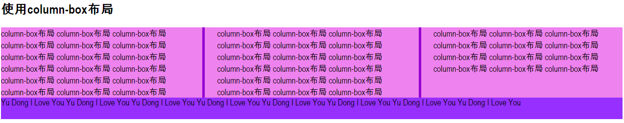
1.多栏布局
column-count属性:将一个元素中的内容分成多栏进行显示,要将元素的宽度设置成多个栏目的总宽度
column-width属性:指定栏目的宽度来生成分栏
column-gap属性:指定栏目之间的距离
column-rule:栏目之间添加分隔线
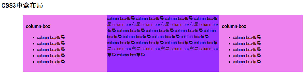
2.盒布局: 多栏布局的栏目宽度必须相等,指定栏目的宽度的时候也只能统一指定,但是栏目的宽度不可能全部都一样,所以多栏布局比较适合在文字内容页面显示,比如新闻。并不适合整个网页编排时使用。而盒布局就相对比较随意一些,可以定义成不同的页面。
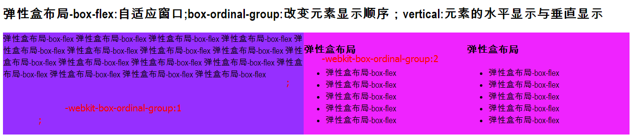
3.弹性盒子布局
(1)box-flex:使得盒子布局变成弹性布局:可以自适应窗口
(2)box-ordinal-group:改变元素的显示顺序
(3)box-orient:改变元素排列方向
- horizontal:在水平行中从左向右排列子元素
- vertical:从上向下垂直排列子元素
<style>
    div.all{
        display: -webkit-box;
        /*-webkit-box-orient: vertical;窗口垂直现实与水平显示*/
        }
        .left{
            width: 300px;
            background-color: #ef23ff;
            -webkit-box-ordinal-group:3;
        }
        .right{
            width: 300px;
            background-color: #ef23ff;
            -webkit-box-ordinal-group: 2;
        }
        .center{
            -webkit-box-flex:1;
            background-color: #962fff;
            -webkit-box-ordinal-group: 1;
        }
</style> 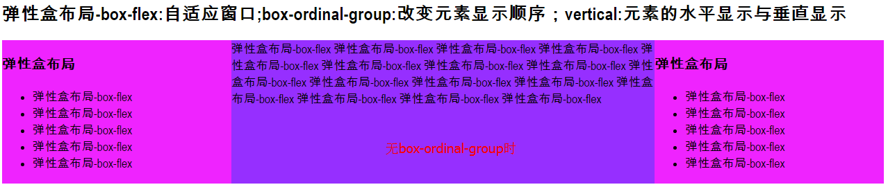
(4)元素的高度宽度自适应:就是元素的高度和宽度可以根据排列的方向改变而改变。
(5)使用弹性布局来消除空白:方法就是给子div中加入一个box-flex属性。
<style>
    .center1{
            display: -webkit-box;/*盒模型显示*/
            border: 5px solid darkviolet;
            -webkit-box-orient: horizontal;/*水平显示*/
            width: 600px;
            height: 400px;
        }
        .d1{
            background-color: #ff99e1;
            -webkit-box-flex: 2;
        }
        .d2{
            background-color: #962fff;
            -webkit-box-flex: 3;
        }
        .d3{
            background-color: #ef23ff;
            -webkit-box-flex: 4;
        }
        .d1,.d2,.d3{
            -webkit-box-sizing: border-box;
        }
    </style>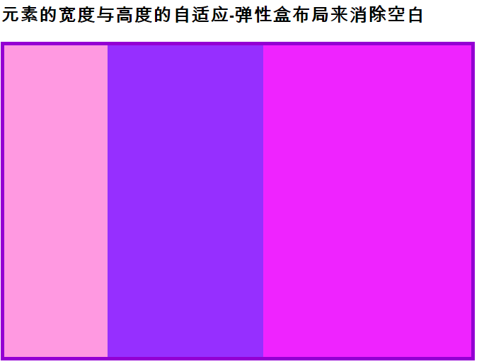
(6)对多个元素使用box-flex属性,让浏览器或者容器中的元素的总宽度或者总高度都等于浏览器或者容器高度。
(7)box-pack属性和box-align属性:指定水平方向与垂直方向的对齐方式(文字,图像,以及子元素的水平方向或是垂直方向上的对齐方式)
2.9.不同浏览器加载不同的CSS样式
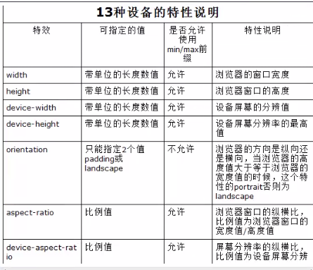
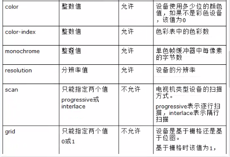
Media Queries模块是CSS3中的一个和各种媒体相关的重要模块
使用方法:@media 设备类型 and (设备特征) (样式代码)<head>
<style>
@media screen and (min-width:400px){
.a{
background-color: #ef23ff;
width: 400px;
height: 400px;
}
}
@media screen and (min-width: 800px){
.a{
background-color: #ff99e1;
width: 800px;
height: 800px;
}
}
</style>
</head>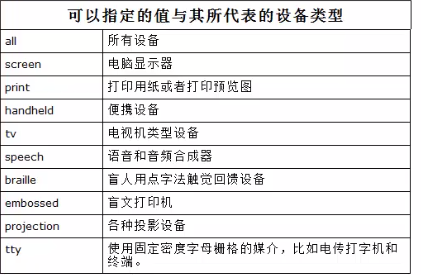


 扫一扫
扫一扫
 869
869

 被折叠的 条评论
为什么被折叠?
被折叠的 条评论
为什么被折叠?
 到【灌水乐园】发言


