


概述:本篇为自定义控件的三种实现方式第一种—组合控件,在此篇中,我将以一个例子的形式来展现组合控件的实现方式。
一组合控件的定义
自定义组合控件一般来说都是以ViewGroup及其子类(LinearLayout、RelativeLayout、FrameLayout等)为主,内部嵌套其他控件,来组合成一个新的控件,实现一些特定的需要,可以是代码简化,结构清晰,重用性较高。通常来说,我们会实现定义好一个Layout.xml文件,然后让我们的自定义控件去加载此xml,并获取子控件,然后设置属性(可以通过代码,也可以从资源文件中加载)、添加事件。
二 自定义组合控件注意要点:
1.加载xml文件是在构造方法中完成的,通过调用inflate(R.layout.my_layout,this,true),注意第二个和第三个参数;
2.如果需要从资源文件中加载自定义的属性,则必须重写Constructor(Context context, AttributeSet attrs)此构造方法,属性是定义在attrs.xml中的;
3.获取子控件对象,可以在构造方法中获取,也可以重写onFinishInflate()方法来获取,个人建议采用第二种,可以保证控件已经完全加载好了;
4.添加事件可以直接在控件中写,不过考虑到扩展性及复用性,建议对外暴露接口。
三 一个栗子
1 栗子说明
在很多项目中,我们都会用到app标题栏,几乎每个页面的形式都一样,左边 中间 右边 。但在每个页面中 左边 中间 右边的内容又是不一样的。如果我们在每个页面的布局中重新写的话,将是一个繁琐的工作。如果我们将所有的形式都融合在一个布局用 include来引用时 每个页面的逻辑不一样 要让不用的控件来显示和隐藏 就会显得特别的麻烦。所以在这里我们用自定义view的组合控件的方式简化我们的代码实现同样的效果。
2 栗子实现步骤
① 继承
自定义组合控件必须继承ViewGroup或者其子类。
CustomTitleBar extends RelativeLayout 在这里我们继承的是RelativeLayout 至于为什么继承RelativeLayout 我会在后面说明。先来看看我们的构造方法
 public CustomTitleBar(Context context) {
        this(context, null);
    }

    public CustomTitleBar(Context context, AttributeSet attrs) {
        this(context, attrs, 0);
    }

    public CustomTitleBar(Context context, AttributeSet attrs, int defStyleAttr) {
        super(context, attrs, defStyleAttr);
        init(context, attrs, defStyleAttr);
    }
一个参数的构造方法 调 二个参数的构造方法 两个参数的构造方法 调三个参数的构造方法 在三个参数的构造方法中 有一个init()的方法初始化 传入了 上下文 属性集合 默认样式
② 自定义属性
在res文件夹下的value文件中 生成 attrs文件
声明一组属性:
使用来定义一个属性集合,name就是属性集合的名字,这个名字一定要起的见名知意。
  <declare-styleable name="CustomTitleBar">
    <!--添加属性-->
   </declare-styleable>
然后就是定义属性值了,通过 方式定义属性值,属性名字同样也要起的见名知意,format表示这个属性的值的类型,类型有以下几种:
reference:引用资源

string:字符串

Color:颜色

boolean:布尔值

dimension:尺寸值

float:浮点型

integer:整型

fraction:百分数

enum:枚举类型

flag:位或运算
栗子的属性集合如下
<resources>
    <declare-styleable name="CustomTitleBar">
        <attr name="TitleBar_background_color" format="color|reference" />
        <!-- 左边 -->
        <attr name="TitleBar_left_text" format="string|reference" />
        <attr name="TitleBar_left_text_size" format="dimension|reference" />
        <attr name="TitleBar_left_text_color" format="color|reference" />
        <attr name="TitleBar_left_Drawable" format="reference" />

        <!-- 中间-->
        <attr name="TitleBar_center_text" format="string|reference" />
        <attr name="TitleBar_center_text_size" format="dimension|reference" />
        <attr name="TitleBar_center_text_color" format="color|reference" />
        <attr name="TitleBar_center_Drawable" format="reference" />

        <!-- 右边-->
        <attr name="TitleBar_right_text" format="string|reference" />
        <attr name="TitleBar_right_text_size" format="dimension|reference" />
        <attr name="TitleBar_right_text_color" format="color|reference" />
        <attr name="TitleBar_right_Drawable" format="reference" />
    </declare-styleable>
</resources>
③ 获取自定义属性
init()方法中 首先 初始化布局:
//初始化布局
LayoutInflater.from(getContext()).inflate(R.layout.layout_custom_titlebar, this, true);
我们来看看我们的布局文件
<merge xmlns:android="http://schemas.android.com/apk/res/android"
    android:layout_width="match_parent"
    android:layout_height="match_parent">

    <TextView
        android:id="@+id/left_tv"
        android:layout_width="wrap_content"
        android:layout_height="match_parent"
        android:layout_alignParentLeft="true"
        android:background="?android:attr/selectableItemBackground"
        android:gravity="center_vertical|left"
        android:minWidth="50dp"
        android:paddingLeft="@dimen/activity_horizontal_margin"
        android:paddingRight="10dp"
        android:singleLine="true"
        android:textColor="@android:color/white"
        android:textSize="16sp" />

    <TextView
        android:id="@+id/center_tv"
        android:layout_width="wrap_content"
        android:layout_height="match_parent"
        android:layout_centerHorizontal="true"
        android:layout_marginLeft="70dp"
        android:layout_marginRight="70dp"
        android:gravity="center_vertical"
        android:singleLine="true"
        android:text=""
        android:textColor="@android:color/white"
        android:textSize="18sp" />

    <TextView
        android:id="@+id/right_tv"
        android:layout_width="wrap_content"
        android:layout_height="match_parent"
        android:layout_alignParentRight="true"
        android:background="?android:attr/selectableItemBackground"
        android:gravity="center_vertical|right"
        android:minWidth="50dp"
        android:paddingLeft="10dp"
        android:paddingRight="@dimen/activity_horizontal_margin"
        android:singleLine="true"
        android:text=""
        android:textColor="@android:color/white"
        android:textSize="16sp" />

</merge>
可以看到在布局文件中 我们用到了 merge标签 不知道什么意思和用法的同学请自行Google(我鄙视百度) 因为为了 更好的控制布局 我们继承了RelativeLayout 也就是 我们把merge标签里的控件直接放在了RelativeLayout中 所以 在merger标签中的 控件 的属性 要按RelativeLayout布局来使用 比如
<TextView
        android:id="@+id/left_tv"
        android:layout_width="wrap_content"
        android:layout_height="match_parent"
        **android:layout_alignParentLeft="true"**
        android:background="?android:attr/selectableItemBackground"
        **android:gravity="center_vertical|left"**
        android:minWidth="50dp"
        android:paddingLeft="@dimen/activity_horizontal_margin"
        android:paddingRight="10dp"
        android:singleLine="true"
        android:textColor="@android:color/white"
        android:textSize="16sp" />
//获取自定义属性的集合
TypedArray array = context.obtainStyledAttributes(attrs, R.styleable.CustomTitleBar, defStyleAttr, 0);
//背景颜色
mBackgroundColor = array.getColor(R.styleable.CustomTitleBar_TitleBar_background_color, Color.WHITE);
//左边
mLeftText = array.getString(R.styleable.CustomTitleBar_TitleBar_left_text);
mLeftTextColor = array.getColor(R.styleable.CustomTitleBar_TitleBar_left_text_color, Color.BLACK);
mLeftTextSize = array.getDimension(R.styleable.CustomTitleBar_TitleBar_left_text_size, sp2px(16));
mLeftDrawable = array.getDrawable(R.styleable.CustomTitleBar_TitleBar_left_Drawable);
//中间
mCenterText = array.getString(R.styleable.CustomTitleBar_TitleBar_center_text);
mCenterTextColor = array.getColor(R.styleable.CustomTitleBar_TitleBar_center_text_color, Color.WHITE);
mCenterTextSize = array.getDimension(R.styleable.CustomTitleBar_TitleBar_center_text_size, sp2px(18));
mCenterDrawable = array.getDrawable(R.styleable.CustomTitleBar_TitleBar_center_Drawable);
//右边
mRightText = array.getString(R.styleable.CustomTitleBar_TitleBar_right_text);
mRightTextColor = array.getColor(R.styleable.CustomTitleBar_TitleBar_right_text_color, Color.WHITE);
mRightTextSize = array.getDimension(R.styleable.CustomTitleBar_TitleBar_right_text_size, sp2px(16));
mRightDrawable = array.getDrawable(R.styleable.CustomTitleBar_TitleBar_right_Drawable);
//释放资源 必须添加
array.recycle();④ 获取控件 设置空间属性
/**
     * 此方法中 代表布局一定初始化完成 不存在空指针问题
     */
    @Override
    protected void onFinishInflate() {
        super.onFinishInflate();
        tvLeft = (TextView) findViewById(R.id.left_tv);
        tvCenter = (TextView) findViewById(R.id.center_tv);
        tvRight = (TextView) findViewById(R.id.right_tv);

        //设置背景颜色
        setBackgroundColor(mBackgroundColor);
        //设置左边
        setLeft(mLeftText, mLeftTextColor, mLeftTextSize, mLeftDrawable);
        //设置中间
        setCenter(mCenterText, mCenterTextColor, mCenterTextSize, mCenterDrawable);
        //设置右边
        setRight(mRightText, mRightTextColor, mRightTextSize, mRightDrawable);
    }

 private void setLeft(CharSequence leftText, int leftTextColor, float leftTextSize, Drawable leftDrawable) {
        if (leftDrawable != null) {
            leftDrawable.setBounds(0, 0, leftDrawable.getMinimumWidth(), leftDrawable.getMinimumHeight());
            tvLeft.setCompoundDrawables(leftDrawable, null, null, null);
        }
        tvLeft.setText(leftText);
        tvLeft.setTextSize(TypedValue.COMPLEX_UNIT_PX, leftTextSize);
        tvLeft.setTextColor(leftTextColor);
        tvLeft.setClickable(!TextUtils.isEmpty(leftText) || leftDrawable != null);
    }

    private void setCenter(CharSequence centerText, int centerTextColor, float centerTextSize, Drawable centerDrawable) {
        if (centerDrawable != null) {
            centerDrawable.setBounds(0, 0, centerDrawable.getMinimumWidth(), centerDrawable.getMinimumHeight());
            tvCenter.setCompoundDrawables(centerDrawable, null, null, null);
        }
        tvCenter.setText(centerText);
        tvCenter.setTextSize(TypedValue.COMPLEX_UNIT_PX, centerTextSize);
        tvCenter.setTextColor(centerTextColor);
        tvCenter.setClickable(!TextUtils.isEmpty(centerText) || centerDrawable != null);
    }

    private void setRight(CharSequence rightText, int rightTextColor, float rightTextSize, Drawable rightDrawable) {
        if (rightDrawable != null) {
            rightDrawable.setBounds(0, 0, rightDrawable.getMinimumWidth(), rightDrawable.getMinimumHeight());
            tvRight.setCompoundDrawables(rightDrawable, null, null, null);
        }
        tvRight.setText(rightText);
        tvRight.setTextSize(TypedValue.COMPLEX_UNIT_PX, rightTextSize);
        tvRight.setTextColor(rightTextColor);
        tvRight.setClickable(!TextUtils.isEmpty(rightText) || rightDrawable != null);
    }

    /**
     * 将空间暴露出去 提供给外界
     * @return
     */
    public TextView getTvLeft() {
        return tvLeft;
    }

    /**
     * 将空间暴露出去 提供给外界
     * @return
     */
    public TextView getTvCenter() {
        return tvCenter;
    }

    /**
     * 将空间暴露出去 提供给外界
     * @return
     */
    public TextView getTvRight() {
        return tvRight;
    }

    //一些工具方法
    protected int dp2px(int dp) {
        return (int) TypedValue.applyDimension(TypedValue.COMPLEX_UNIT_DIP, dp, getResources().getDisplayMetrics());
    }

    protected int sp2px(int sp) {
        return (int) TypedValue.applyDimension(TypedValue.COMPLEX_UNIT_SP, sp, getResources().getDisplayMetrics());
    }
⑤ 引用自定义控件
千万不要忘了在跟节点 标记命名空间
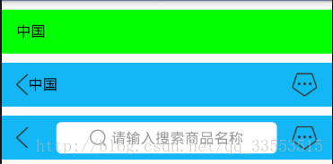
<LinearLayout xmlns:android="http://schemas.android.com/apk/res/android"
    ***xmlns:app="http://schemas.android.com/apk/res-auto"***
    android:id="@+id/activity_main"
    android:layout_width="match_parent"
    android:layout_height="match_parent"
    android:orientation="vertical">

    <com.jack.customtitleview.customView.CustomTitleBar
        android:layout_marginTop="10dp"
        android:layout_width="match_parent"
        android:layout_height="48dp"
        ***app:TitleBar_background_color="#00ff00"
        app:TitleBar_left_text="中国"***/>

    <com.jack.customtitleview.customView.CustomTitleBar
        android:layout_marginTop="10dp"
        android:layout_width="match_parent"
        android:layout_height="48dp"
        ***app:TitleBar_background_color="#12b7f5"***
        ***app:TitleBar_left_Drawable="@drawable/ic_back_gray"
        app:TitleBar_left_text="中国"***
        ***app:TitleBar_right_Drawable="@drawable/ic_msg_gray"*** />

    <com.jack.customtitleview.customView.CustomTitleBar
        android:layout_marginTop="10dp"
        android:layout_width="match_parent"
        android:layout_height="48dp"
        ***app:TitleBar_background_color="#12b7f5"***
        ***app:TitleBar_left_Drawable="@drawable/ic_back_gray"
        app:TitleBar_right_Drawable="@drawable/ic_msg_gray"***>

        ***<include layout="@layout/layout_search_view" />***

    </com.jack.customtitleview.customView.CustomTitleBar>

</LinearLayout>
因为 我们继承的RelativeLayout 也是一个容器 所以可以引用 include
四 效果显示
源码地址 源码地址


 被折叠的 条评论
为什么被折叠?
被折叠的 条评论
为什么被折叠?
 到【灌水乐园】发言


