利用CSS进行元素的水平居中,比较简单,行级元素设置其父元素的text-align center,块级元素设置其本身的left 和 right margins为auto即可。本文收集了六种利用css进行元素的垂直居中的方法,每一种适用于不同的情况,在实际的使用过程中选择某一种方法即可。
Line-Height Method
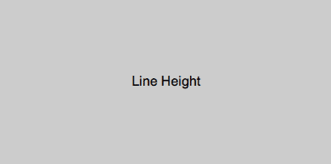
试用:单行文本垂直居中,demo
代码:
html
1
2
3
| <div id="parent">
<div id="child">Text here</div>
</div>div id="parent">
<div id="child">Text here</div>
</div>
|
css
1
2
3
| #child {
line-height: 200px;
} {
line-height: 200px;
}
|
垂直居中一张图片,代码如下
html
1
2
3
| <div id="parent">
<img src="image.png" alt="" />
</div>div id="parent">
<img src="image.png" alt="" />
</div>
|
css
1
2
3
4
5
6
| #parent {
line-height: 200px;
}
#parent img {
vertical-align: middle;
} {
line-height: 200px;
}
#parent img {
vertical-align: middle;
}
|
CSS Table Method
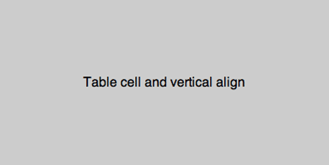
适用:通用,demo
代码:
html
1
2
3
| <div id="parent">
<div id="child">Content here</div>
</div>div id="parent">
<div id="child">Content here</div>
</div>
|
css
1
2
3
4
5
| #parent {display: table;}
#child {
display: table-cell;
vertical-align: middle;
} {display: table;}
#child {
display: table-cell;
vertical-align: middle;
}
|
低版本 IE fix bug:
1
2
3
| #child {
display: inline-block;
} {
display: inline-block;
}
|
Absolute Positioning and Negative Margin
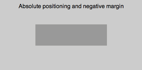
适用:块级元素,demo
代码:
html
1
2
3
| <div id="parent">
<div id="child">Content here</div>
</div>div id="parent">
<div id="child">Content here</div>
</div>
|
css
1
2
3
4
5
6
7
8
9
| #parent {position: relative;}
#child {
position: absolute;
top: 50%;
left: 50%;
height: 30%;
width: 50%;
margin: -15% 0 0 -25%;
} {position: relative;}
#child {
position: absolute;
top: 50%;
left: 50%;
height: 30%;
width: 50%;
margin: -15% 0 0 -25%;
}
|
Absolute Positioning and Stretching
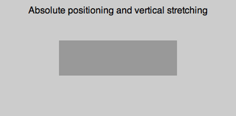
适用:通用,但在IE版本低于7时不能正常工作,demo
代码:
html
1
2
3
| <div id="parent">
<div id="child">Content here</div>
</div>div id="parent">
<div id="child">Content here</div>
</div>
|
css
1
2
3
4
5
6
7
8
9
10
11
| #parent {position: relative;}
#child {
position: absolute;
top: 0;
bottom: 0;
left: 0;
right: 0;
width: 50%;
height: 30%;
margin: auto;
} {position: relative;}
#child {
position: absolute;
top: 0;
bottom: 0;
left: 0;
right: 0;
width: 50%;
height: 30%;
margin: auto;
}
|
Equal Top and Bottom Padding
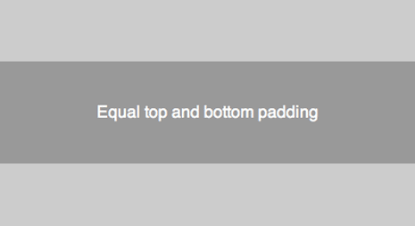
适用:通用,demo
代码:
html
1
2
3
| <div id="parent">
<div id="child">Content here</div>
</div>div id="parent">
<div id="child">Content here</div>
</div>
|
css
1
2
3
4
5
6
| #parent {
padding: 5% 0;
}
#child {
padding: 10% 0;
} {
padding: 5% 0;
}
#child {
padding: 10% 0;
}
|
Floater Div
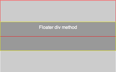
适用:通用,demo
代码:
html
1
2
3
4
| <div id="parent">
<div id="floater"></div>
<div id="child">Content here</div>
</div>div id="parent">
<div id="floater"></div>
<div id="child">Content here</div>
</div>
|
css
1
2
3
4
5
6
7
8
9
10
11
| #parent {height: 250px;}
#floater {
float: left;
height: 50%;
width: 100%;
margin-bottom: -50px;
}
#child {
clear: both;
height: 100px;
} {height: 250px;}
#floater {
float: left;
height: 50%;
width: 100%;
margin-bottom: -50px;
}
#child {
clear: both;
height: 100px;
}
|
以上就是六种方法,可以在实际的使用过程中合理选择,参考文章《vertical-centering》。
转载地址: http://blog.csdn.net/wolinxuebin/article/details/7615098


 2954
2954


 被折叠的 条评论
为什么被折叠?
被折叠的 条评论
为什么被折叠?
 到【灌水乐园】发言


