微信小程序—自定义模态对话框实例 由于官方API提供的显示模态弹窗,只能简单地显示文字内容,不能对对话框内容进行自定义,欠缺灵活性,所以自己从模态弹窗的原理角度来实现了自定义的模态对话框。
- wx.showModal(OBJECT)
- 自定义
- 模态对话框
涉及文件
- 界面
wxml - 样式
wxcss - 事件及方法
js
效果图 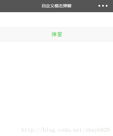 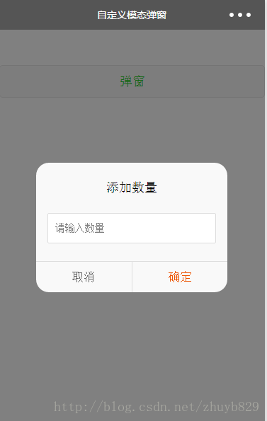 界面代码 .wxml <button class="show-btn" bindtap="showDialogBtn">弹窗</button>
<view class="modal-mask" bindtap="hideModal" catchtouchmove="preventTouchMove" wx:if="{{showModal}}"></view>
<view class="modal-dialog" wx:if="{{showModal}}">
<view class="modal-title">添加数量</view>
<view class="modal-content">
<view class="modal-input">
<input placeholder-class="input-holder" type="number" maxlength="10" bindinput="inputChange" class="input" placeholder="请输入数量"></input>
</view>
</view>
<view class="modal-footer">
<view class="btn-cancel" bindtap="onCancel" data-status="cancel">取消</view>
<view class="btn-confirm" bindtap="onConfirm" data-status="confirm">确定</view>
</view>
</view>
样式 .wxss .show-btn {
margin-top: 100rpx;
color: #22cc22;
}
.modal-mask {
width: 100%;
height: 100%;
position: fixed;
top: 0;
left: 0;
background: #000;
opacity: 0.5;
overflow: hidden;
z-index: 9000;
color: #fff;
}
.modal-dialog {
width: 540rpx;
overflow: hidden;
position: fixed;
top: 50%;
left: 0;
z-index: 9999;
background: #f9f9f9;
margin: -180rpx 105rpx;
border-radius: 36rpx;
}
.modal-title {
padding-top: 50rpx;
font-size: 36rpx;
color: #030303;
text-align: center;
}
.modal-content {
padding: 50rpx 32rpx;
}
.modal-input {
display: flex;
background: #fff;
border: 2rpx solid #ddd;
border-radius: 4rpx;
font-size: 28rpx;
}
.input {
width: 100%;
height: 82rpx;
font-size: 28rpx;
line-height: 28rpx;
padding: 0 20rpx;
box-sizing: border-box;
color: #333;
}
input-holder {
color: #666;
font-size: 28rpx;
}
.modal-footer {
display: flex;
flex-direction: row;
height: 86rpx;
border-top: 1px solid #dedede;
font-size: 34rpx;
line-height: 86rpx;
}
.btn-cancel {
width: 50%;
color: #666;
text-align: center;
border-right: 1px solid #dedede;
}
.btn-confirm {
width: 50%;
color: #ec5300;
text-align: center;
}
- 1
- 2
- 3
- 4
- 5
- 6
- 7
- 8
- 9
- 10
- 11
- 12
- 13
- 14
- 15
- 16
- 17
- 18
- 19
- 20
- 21
- 22
- 23
- 24
- 25
- 26
- 27
- 28
- 29
- 30
- 31
- 32
- 33
- 34
- 35
- 36
- 37
- 38
- 39
- 40
- 41
- 42
- 43
- 44
- 45
- 46
- 47
- 48
- 49
- 50
- 51
- 52
- 53
- 54
- 55
- 56
- 57
- 58
- 59
- 60
- 61
- 62
- 63
- 64
- 65
- 66
- 67
- 68
- 69
- 70
- 71
- 72
- 73
- 74
- 75
- 76
- 77
- 78
- 79
- 80
- 81
- 82
- 83
- 84
- 85
- 86
事件及方法 .js Page({
data: {
showModal: false,
},
onLoad: function () {
},
/**
* 弹窗
*/
    showDialogBtn: function() {
      this.setData({
        showModal: true
      })
},
/**
* 弹出框蒙层截断touchmove事件
*/
preventTouchMove: function () {
},
/**
* 隐藏模态对话框
*/
    hideModal: function () {
      this.setData({
        showModal: false
      });
},
/**
* 对话框取消按钮点击事件
*/
onCancel: function () {
this.hideModal();
},
/**
* 对话框确认按钮点击事件
*/
onConfirm: function () {
this.hideModal();
}
})
- 1
- 2
- 3
- 4
- 5
- 6
- 7
- 8
- 9
- 10
- 11
- 12
- 13
- 14
- 15
- 16
- 17
- 18
- 19
- 20
- 21
- 22
- 23
- 24
- 25
- 26
- 27
- 28
- 29
- 30
- 31
- 32
- 33
- 34
- 35
- 36
- 37
- 38
- 39
- 40
- 1
- 2
- 3
- 4
- 5
- 6
- 7
- 8
- 9
- 10
- 11
- 12
- 13
- 14
- 15
- 16
- 17
- 18
- 19
- 20
- 21
- 22
- 23
- 24
- 25
- 26
- 27
- 28
- 29
- 30
- 31
- 32
- 33
- 34
- 35
- 36
- 37
- 38
- 39
- 40
实现思路解读及原理
-
界面解读:
用一个蒙层+弹窗来组成,用绑定的数据{{showModal}}来控制弹窗的显示和隐藏 -
事件及方法解读:
让弹窗显示的方法:
showDialogBtn: function() {
this.setData({
showModal: true
})
}
让弹窗消失的方法: hideModal: function () {
this.setData({
showModal: false
});
}
这里有个要特别注意的地方,就是下面这个方法: preventTouchMove: function () {
}
为什么是空方法?因为要结合界面wxml看,蒙层view里有一个事件绑定catchtouchmove="preventTouchMove"。这养写的原因是阻断事件向下传递,避免在弹窗后还可以点击或者滑动蒙层下的界面。如果不这样写的话,如果主界面是一个可以滚动的界面,想想看,当弹窗弹出的时候用户还可以操作滚动列表,我想你的产品经理会来找你的。 3. 样式解读:(这个标题没加代码块标识,但还是像代码块一样被显示了,这是个bug!!!- -)
.modal-mask和.modal-dialog样式的写法需要特别注意。
主要是层级关系,弹窗要保证在最上层,不被界面遮挡,然后蒙层要遮挡住界面,但是不可遮挡弹窗。所以.modal-mask和.modal-dialog的z-index值要注意。 | 


 3万+
3万+

 非常没帮助
非常没帮助
 没帮助
没帮助
 一般
一般
 有帮助
有帮助
 非常有帮助
非常有帮助
 被折叠的 条评论
为什么被折叠?
被折叠的 条评论
为什么被折叠?
 到【灌水乐园】发言


