


WPF作为专门的用户界面技术,布局功能是它的核心功能之一。友好的用户界面和良好的用户体验离不开设计精良的布局。日常工作中,WPF设计师工作量最大的两部分就是布局和动画,除了点缀性的动画外,大部分动画也是布局间的转换,UI布局的重要性可见一斑。布局是静态的,动画是动态的,用户体验就是用户在这动静之中与软件功能产生交互时的感受。
每个布局元素都有自己的特点,有优点也有缺点。
1.布局元素总体介绍
Panel有个附加属性:
ZIndex:获取或设置一个值,该值表示元素在 z 平面上出现的顺序。如果一个子元素的 ZIndex 值较高,则表明此元素将显示在具有较低值的另一个子元素之上。
ZIndex:获取或设置一个值,该值表示元素在 z 平面上出现的顺序。如果一个子元素的 ZIndex 值较高,则表明此元素将显示在具有较低值的另一个子元素之上。
1.1 Canvas
Canvas是最基本的面板,Canvas布局和Windows Form布局基本一致。Windows Form开发时,通过设置控件的Left和Top来定位,Canvas布局中,可以通过设置Canvas的附加属性:Canvas.Top,Canvas.Left,Canvas.Bottom ,Canvas.Right来定位,但是Canvas只允许设置一个横向和纵向成对的坐标。附加属性 Canvas.Top 或 Canvas.Left 将优先于 Canvas.Bottom 或 Canvas.Right 属性。
<Canvas>
	<Label Canvas.Left="10" Canvas.Right="10" Canvas.Top="0" Content="Left:10,Top:0,Right:10" Background="Gray" />
	<Label Canvas.Right="10" Canvas.Top="0" Content="Right:10,Top:0" Background="Gray" />
</Canvas>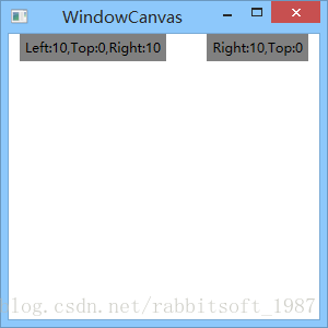
1.2 StackPanel
StackPanel布局将元素排列成一行,可纵向可横向,通过Orientation属性来控制。
关于FlowDirection,获取或设置文本和其他user interface (UI) 元素在控制它们布局的任何父元素中的流动方向,默认都是LeftToRight布局,假如为RightToLeft,StaticPanel的Orientation="Horizontal"时,StaticPane中的项也是从左向右布局的。
关于FlowDirection,获取或设置文本和其他user interface (UI) 元素在控制它们布局的任何父元素中的流动方向,默认都是LeftToRight布局,假如为RightToLeft,StaticPanel的Orientation="Horizontal"时,StaticPane中的项也是从左向右布局的。
<!--添加ScrollViewer以至出现滚动条-->
<ScrollViewer VerticalScrollBarVisibility="Auto" HorizontalScrollBarVisibility="Auto">
	<StackPanel Orientation="Horizontal" FlowDirection="RightToLeft">
		<Label Content="item1" Width="100" Height="50" Background="Gray" Margin="5" HorizontalAlignment="Left" FlowDirection="LeftToRight" />
		<Label Content="item2" Width="100" Height="50" Background="Gray" Margin="5" HorizontalAlignment="Left" />
		<Label Content="item3" Width="100" Height="50" Background="Gray" Margin="5" HorizontalAlignment="Left" />
		<Label Content="item4" Width="100" Height="50" Background="Gray" Margin="5" HorizontalAlignment="Left" />
		<Label Content="item5" Width="100" Height="50" Background="Gray" Margin="5" HorizontalAlignment="Left" />
		<Label Content="item6" Width="100" Height="50" Background="Gray" Margin="5" HorizontalAlignment="Left" />
	</StackPanel>
</ScrollViewer>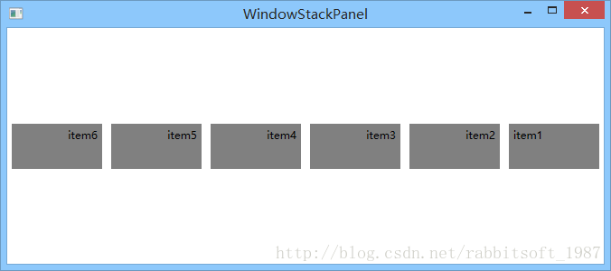
1.3 WrapPanel
WrapPanel和 StackPanel基本类似,区别在于元素一行(列)排列不下时,会另起新行(列)。
主要属性:
Orientation:与StaticPanel的功能一致,控制排列方向。
ItemHeight, ItemWidth:控制子元素的高度和宽度。
主要属性:
Orientation:与StaticPanel的功能一致,控制排列方向。
ItemHeight, ItemWidth:控制子元素的高度和宽度。
<WrapPanel Orientation="Horizontal" ItemHeight="50" ItemWidth="140" FlowDirection="RightToLeft">
	<Border BorderBrush="Red" BorderThickness="1">
		<Label Content="item1" Width="100" Height="50" Background="Gray" Margin="5" HorizontalAlignment="Left" FlowDirection="LeftToRight" />
	</Border>
	<Label Content="item2" Width="100" Height="50" Background="Gray" Margin="5" HorizontalAlignment="Left" />
	<Label Content="item3" Width="100" Height="50" Background="Gray" Margin="5" HorizontalAlignment="Left" />
	<Label Content="item4" Width="100" Height="50" Background="Gray" Margin="5" HorizontalAlignment="Left" />
	<Label Content="item5" Width="100" Height="50" Background="Gray" Margin="5" HorizontalAlignment="Left" />
	<Label Content="item6" Width="100" Height="50" Background="Gray" Margin="5" HorizontalAlignment="Left" />
</WrapPanel>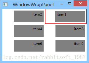
1.4 DockPanel
DockPanel可以使子元素停靠在面板的某一边上,然后拉伸元素以填满全部宽度或高度。默认最后一个元素填充余下的空间。
附加属性:
Dock:Left(默认)、Top、Right和Buttom。
依赖属性:
LastChildFill:指示 DockPanel 中的最后一个子元素是否拉伸以填满剩余可用空间。
附加属性:
Dock:Left(默认)、Top、Right和Buttom。
依赖属性:
LastChildFill:指示 DockPanel 中的最后一个子元素是否拉伸以填满剩余可用空间。
<DockPanel LastChildFill="False">
	<Label Content="Left" DockPanel.Dock="Left" Background="Gray" />
	<Label Content="Top" DockPanel.Dock="Top" Background="Blue" />
	<Label Content="Right" DockPanel.Dock="Right" Background="LightBlue" />
	<Label Content="Bottom" DockPanel.Dock="Bottom" Background="LightGray" />
	<!--默认DockPanel.Dock="Left"-->
	<Label Content="Last" Background="LightSkyBlue"/>
</DockPanel>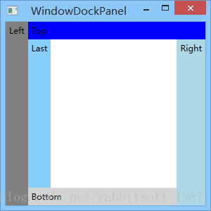
1.5 Grid
Grid是最通用的面板,允许在一个多行多列的表中排列子元素。如需要显示Grid表格线,使用ShowGridLines属性。
常用的4个附加属性:
Column:子元素在Grid中所在的列。
ColumnSpan:子元素在Grid中跨越的列数。
Row:子元素在Grid中所在的行。
RowSpan:子元素在Grid中跨越的行数数。
常用的4个附加属性:
Column:子元素在Grid中所在的列。
ColumnSpan:子元素在Grid中跨越的列数。
Row:子元素在Grid中所在的行。
RowSpan:子元素在Grid中跨越的行数数。
1.5.1 Grid行和列的尺寸(GridLength)
- 绝对尺寸:固定的宽度或高度。Grid改变时,对应的RowDefinition和ColumnDefinition尺寸不变。
单位:
| 英文名 | 中文名 | 简写 | 换算 |
| Pixel | 像素 | px(默认单位,可省略) |
|
| Inch | 英寸 | in | 1in=96px |
| Centimeter | 厘米 | cm | 1cm=(96/2.54)px |
| Point | 点 | pt | 1pt=(96/72)px |
- 自动尺寸:对应的RowDefinition和ColumnDefinition尺寸由其子元素决定,为子元素所需空间。
- 比例尺寸:将Grid剩余空间(Grid中空间-绝对尺寸和自动尺寸所占空间)按比例分配。
//绝对尺寸
GridLength gl1 = new GridLength(100);
GridLength gl2 = new GridLength(100,GridUnitType.Pixel);
//自动尺寸
GridLength gl3 = new GridLength(0,GridUnitType.Auto);
GridLength gl4 = GridLength.Auto;
//比例尺寸
GridLength gl5 = new GridLength(1, GridUnitType.Star);
1.5.2 GridSplitter的使用
GridSplitter是Grid 控件的列或行之间重新分配空间的控件。GridSplitter 可能与包含其他内容的行或列重叠,或者它本身可能会占据一行或一列。
GridSplitter的HorizontalAlignment默认值为Right,VerticalAlignment的默认值为Stretch。要使GridSplitter显示,必须在某一方向上是Stretch,不然就是一个小圆点;另外还需要有一定的高度或宽度。如果 HorizontalAlignment 和 VerticalAlignment 属性的设置没有实现所需的 GridSplitter 行为,则可以更改 ResizeDirection 和 ResizeBehavior 属性的设置。
GridSplitter 可能会被 Grid 的 Children 集合中包含的其他对象遮盖。通过设置Panel.ZIndex附加属性来控制z方向的位置。
1.5.3 共享行和列的尺寸
ColumnDefinition和RowDefinition有个
SharedSizeGroup属性,允许多行或多列与其他行或列保持一样的长度,即使其中的行或列在运行时(如使用GridSplitter)改变也是如此。SharedSizeGroup可以被设置为一个大小写敏感的字符串值,表示某个组的名称,其他拥有相同组名的行或列将保持同步。
SharedSizeGroup 属性值必须符合下列规则:
SharedSizeGroup 属性值必须符合下列规则:
- 不得为空;
- 必须只包含字母、数字和下划线字符;
- 不得以数值开头。
- 如需SharedSizeGroup共享大小生效,需设置IsSharedSizeScope属性,该属性是Grid的依赖属性,也是附加属性。由于一个共享组可以在多个Grid间使用,为避免可能的名称冲突(也为了减少需要遍历的逻辑树数量),同一个SharedSizeGroup必须在一个IsSharedSizeScope为true的共同的父元素下使用。
- 参与大小共享的列和行不遵循 Star 大小(比例尺寸)调整。 在大小共享方案中,Star 大小调整将作为 Auto 处理。
- 如果在某个资源模板内将 IsSharedSizeScope 设置为 true,并将 SharedSizeGroup 定义为在该模板的外部,则 Grid 大小共享不起作用。
<StackPanel Orientation="Vertical" Grid.IsSharedSizeScope="True">
	<Grid ShowGridLines="True">
		<Grid.ColumnDefinitions>
			<!--绝对尺寸-->
			<ColumnDefinition Width="100" />
			<!--自动尺寸-->
			<ColumnDefinition Width="auto" />
			<!--比例尺寸-->
			<ColumnDefinition Width="1*" />
			<ColumnDefinition Width="3*" />
		</Grid.ColumnDefinitions>
		<Grid.RowDefinitions>
			<RowDefinition Height="1in" SharedSizeGroup="myshare" />
			<RowDefinition Height="96" />
			<RowDefinition />
			<RowDefinition />
		</Grid.RowDefinitions>
		<Label Grid.Column="0" Grid.Row="1" Content="长度固定" Background="Gray"/>
		<Label Grid.Column="1" Grid.Row="1" Content="长度不定,我有多宽列有多宽" Background="LightBlue"/>
		<Label Grid.Column="2" Grid.Row="1" Content="长度不定,占据余下宽带的1/4" Background="LightGray"/>
		<GridSplitter Height="5" Grid.ColumnSpan="3" Grid.Row="1" Background="Red"
				  VerticalAlignment="Bottom" HorizontalAlignment="Stretch"
				  />
		<GridSplitter Height="5" Grid.Column="3" Grid.Row="1" Background="Black" VerticalAlignment="Bottom" HorizontalAlignment="Stretch"/>
		<GridSplitter Width="5" Grid.Column="1" Grid.Row="1" Background="Blue"
				  VerticalAlignment="Stretch" HorizontalAlignment="Right"
				  ResizeBehavior="BasedOnAlignment"/>
		<Label Grid.Row="3" Content="与第一行共享高度" Background="Gray" />

		<Label Content="share row" />
		<!--拖动此GridSplitter,查看共享行效果-->
		<GridSplitter VerticalAlignment="Bottom" HorizontalAlignment="Stretch" Height="5" Background="Red"
					  ToolTip="拖动此GridSplitter,查看共享行效果"/>
	</Grid>
	<Grid ShowGridLines="True">
		<Grid.RowDefinitions>
			<RowDefinition SharedSizeGroup="myshare" />
			<RowDefinition Height="100" />
		</Grid.RowDefinitions>
		<Label Content="share row" />
	</Grid>
</StackPanel>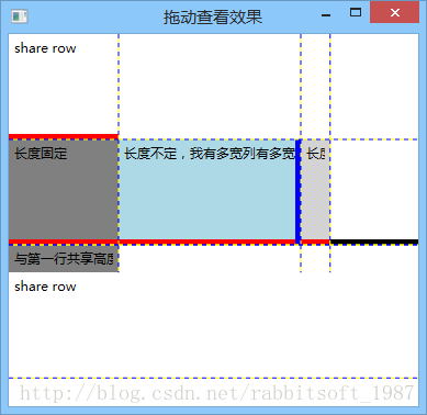
1.6 VirtualizingPanel
VirtualizingPanel为虚拟化其子数据集合的 Panel 元素提供一个框架。
详细后续介绍。
详细后续介绍。
1.7 TabPanel
TabPanel处理 TabControl 上的 TabItem 对象的布局。与WrapPanel类似,仅支持从上至下的换行,换行发生时会平均拉伸元素。
1.8 ToolBarOverflowPanel
ToolBarOverflowPanel用来排列溢出的 ToolBar 项。ToolBar 上可能没有足够的空间显示其所有项。 发生这种情况时,可以将 ToolBar 上的项放入 ToolBarOverflowPanel,它是在 ToolBar 的 ControlTemplate 中指定的。与WrapPanel相似,仅支持从左到右、从上至下的换行。
主要属性:
WrapWidth:在项溢出到下一行之前获取或设置溢出 ToolBar 的建议宽度。
主要属性:
WrapWidth:在项溢出到下一行之前获取或设置溢出 ToolBar 的建议宽度。
1.9 ToolBarPanel
ToolBarPanel派生自StackPanel,用于 ToolBar 中排列 ToolBar 项 。
1.10 UniformGrid
UniformGrid提供一种在所有单元格大小相同的网格中安排内容的方法。只需要定义行数和列数,UniformGrid会自动排列子元素。
主要属性:
Columns:网格的列数。
Rows:网格的行数。
FirstColumn:网格第一行中前导空白单元格的数量。
主要属性:
Columns:网格的列数。
Rows:网格的行数。
FirstColumn:网格第一行中前导空白单元格的数量。
<!--定义4列-->
<UniformGrid Columns="4" FirstColumn="1">
	<Label Content="item1" Background="Gray" Margin="5" HorizontalAlignment="Stretch" FlowDirection="RightToLeft" />
	<Label Content="item2" Background="Gray" Margin="5" HorizontalAlignment="Stretch" />
	<Label Content="item3" Background="Gray" Margin="5" HorizontalAlignment="Stretch" />
	<Label Content="item4" Background="Gray" Margin="5" HorizontalAlignment="Stretch" />
	<Label Content="item5" Background="Gray" Margin="5" HorizontalAlignment="Stretch" />
	<Label Content="item6" Background="Gray" Margin="5" HorizontalAlignment="Stretch" />
</UniformGrid>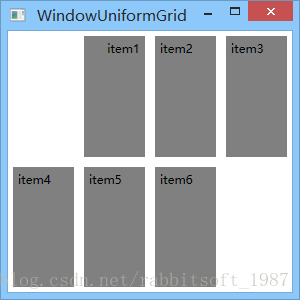
2. 自定义布局面板
要掌握自定义布局,必须了解布局的两个阶段。实际上确定控件最佳尺寸的经历了两个阶段,第1个阶段为测量(Measure)阶段,即父元素询问子元素所期望的尺寸,从而确定自身的尺寸;第2阶段为布置(Arrange)阶段,在这个期间每个父元素会告知子元素的尺寸和位置。
从编程模型来看,具体到两个重载函数,即MeasureOverride和ArrangeOverride。
从编程模型来看,具体到两个重载函数,即MeasureOverride和ArrangeOverride。
自定义面板代码:
//斜对角排列子元素
public class MyPanel : Panel
{
	public MyPanel()
		: base()
	{
	}

	//测量(Measure)阶段,即父元素询问子元素所期望的尺寸,从而确定自身的尺寸
	//MeasureOverride传递的参数为Size类型,实际是上一级父元素告知当前元素可分配的空间(availableSize);返回的参数Size类型,是该元素所期望的空间(desiredSize)
	protected override Size MeasureOverride(Size availableSize)
	{
		double maxWidth = 0.0;
		double maxHeight = 0.0;
		double sumHeight = 0.0;
		double l = Math.Sqrt(availableSize.Height * availableSize.Height + availableSize.Width * availableSize.Width);
		double heightratio = availableSize.Height / l;
		double widthratio = availableSize.Width / l;
		foreach (UIElement child in InternalChildren)
		{
			child.Measure(availableSize);
			maxWidth = Math.Max(child.DesiredSize.Width, maxWidth);
			maxHeight = Math.Max(child.DesiredSize.Height, maxHeight);
			sumHeight += child.DesiredSize.Height;
		}
		Size ideal = new Size(maxWidth * widthratio + sumHeight * heightratio, maxWidth * heightratio + sumHeight * widthratio);
		Size desired = ideal;
		if (!double.IsInfinity(availableSize.Width))
		{
			if (availableSize.Width < desired.Width)
				desired.Width = availableSize.Width;
		}
		if (!double.IsInfinity(availableSize.Height))
		{
			if (availableSize.Height < desired.Height)
				desired.Height = availableSize.Height;
		}
		return desired;
	}

	//布置(Arrange)阶段,在这个期间每个父元素会告知子元素的尺寸和位置
	//ArrangeOverride传递和返回的参数同样是Size类型,传递的参数指定是该元素摆放所用的尺寸(finalSize);返回参数同为该元素及其子元素所占用的尺寸。
	protected override Size ArrangeOverride(Size finalSize)
	{
		Rect layoutRect = new Rect(0, 0, finalSize.Width, finalSize.Height);
		double angle = -1 * Math.Atan(finalSize.Height / finalSize.Width) * 180 / Math.PI;
		double l = Math.Sqrt(finalSize.Height * finalSize.Height + finalSize.Width * finalSize.Width);
		double heightratio = finalSize.Height / l;
		double widthratio = finalSize.Width / l;
		double left = 0.0;
		double top = 0.0;
		double maxWidth = 0.0;
		foreach (UIElement child in InternalChildren)
		{
			maxWidth = Math.Max(child.DesiredSize.Width, maxWidth);
		}
		top = maxWidth * heightratio;
		foreach (UIElement child in InternalChildren)
		{
			Point childLocation = new Point(left + (maxWidth - child.DesiredSize.Width) * widthratio / 2, top);
			left += (layoutRect.Width - maxWidth * widthratio) / InternalChildren.Count;
			top += (layoutRect.Height - maxWidth * heightratio) / InternalChildren.Count;

			//旋转中心点没定好,显示效果不好
			//child.RenderTransform = new RotateTransform
			//(angle, childLocation.X, childLocation.Y);
			child.Arrange(new Rect(childLocation, child.DesiredSize));
		}
		return finalSize;
	}
}<local:MyPanel>
<Button Background="#00000000" Width="100">1</Button>
<Button Background ="#FFFFCCFF" Width="150">2</Button>
<Button Background ="#FFFF9BFF" Width="120">3</Button>
<Button Background ="#FFFF00FF" Width="50">4</Button>
<Button Background="#FFFFCCFF" Width="80">5</Button>
</local:MyPanel>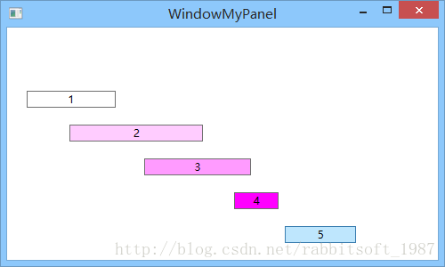
作者:FoolRabbit
出处:http://blog.csdn.net/rabbitsoft_1987
欢迎任何形式的转载,未经作者同意,请保留此段声明!


 1459
1459


 被折叠的 条评论
为什么被折叠?
被折叠的 条评论
为什么被折叠?
 到【灌水乐园】发言


