


<html>
<head>
<meta http-equiv="Content-Type" content="text/html" charset="utf-8" />
<link rel="stylesheet" type="text/css" href="candy_css.css">
</head>
<body>
<a href="#" class="button">Button</a>
<a href="#" data-icon="✆" class="button blue brackets">Call</a>
<a href="#" data-icon="✰" class="button pink serif skew glossy">Stars</a>
<a href="#" data-icon="✿" title="Reddit" class="button green serif back xl glass icon"></a>
<br />
<a href="#" data-icon="✍" class="button green">Blog</a>
<a href="#" data-icon="☺" title="Love" class="button pink oval icon"></a>
<a href="#" data-icon="✪" title="Quit" class="button orange shield xl glossy icon"></a>
<a href="#" data-icon="" title="Upload" class="button blue back xl glass icon"></a>
<a href="#" data-icon="✔" title="RSS" class="button orange drop glass icon"></a>
</body>
</html>
candy.css
/* BonBon Buttons 1.1 by simurai.com

1.1 Added unprefixed attributes, :focus style, <button> support
1.0 Released

Usage:

	Default button: 			<a href="" class="button">Label</a>
	More fancy with icon: 		<a href="" class="button orange glossy" data-icon="鈽�">Label</a>

Following additional class names are supported:

	Color: 		orange, pink, blue, green, transparent
	Font: 		serif
	Material: 	glossy, glass
	Size: 		xs, xl
	Shape: 		round, oval, brackets, skew, back, knife, shield, drop, morph
	Icon only: 	icon
	Disabled:	disabled

*/


@import url(http://fonts.googleapis.com/css?family=Droid+Sans:bold+Lobster);
@import url(http://fonts.googleapis.com/css?family=Lobster);


/* -------------- THE button -------------- */
.button {

/* text */
	text-decoration: 		none;
	font: 					24px/1em 'Droid Sans', sans-serif;
	font-weight: 			bold;
	text-shadow: 			rgba(255,255,255,.5) 0 1px 0;
	-webkit-user-select: 	none;
	-moz-user-select: 		none;
	user-select: 			none;


/* layout */
	padding: 				.5em .6em .4em .6em;
	margin: 				.5em;
	display: 				inline-block;
	position: 				relative;

	-webkit-border-radius: 	8px;
	-moz-border-radius: 	8px;
	border-radius: 	8px;

/* effects */
	border-top: 		1px solid rgba(255,255,255,0.8);
	border-bottom: 		1px solid rgba(0,0,0,0.1);

	background-image: 	-webkit-gradient(radial, 50% 0, 100, 50% 0, 0, from( rgba(255,255,255,0) ), to( rgba(255,255,255,0.7) )), url(noise.png);
	background-image: 	-moz-radial-gradient(top, ellipse cover, rgba(255,255,255,0.7) 0%, rgba(255,255,255,0) 100%), url(noise.png);
	background-image: 	gradient(radial, 50% 0, 100, 50% 0, 0, from( rgba(255,255,255,0) ), to( rgba(255,255,255,0.7) )), url(noise.png);

	-webkit-transition: background .2s ease-in-out;
	-moz-transition: 	background .2s ease-in-out;
	transition: 		background .2s ease-in-out;

/* color */
	color: 				hsl(0, 0%, 40%) !important;
	background-color: 	hsl(0, 0%, 75%);

	-webkit-box-shadow: inset rgba(255,254,255,0.6) 0 0.3em .3em, inset rgba(0,0,0,0.15) 0 -0.1em .3em, /* inner shadow */
						hsl(0, 0%, 60%) 0 .1em 3px, hsl(0, 0%, 45%) 0 .3em 1px, /* color border */
						rgba(0,0,0,0.2) 0 .5em 5px; /* drop shadow */
	-moz-box-shadow: 	inset rgba(255,254,255,0.6) 0 0.3em .3em, inset rgba(0,0,0,0.15) 0 -0.1em .3em, /* inner shadow */
						hsl(0, 0%, 60%) 0 .1em 3px, hsl(0, 0%, 45%) 0 .3em 1px, /* color border */
						rgba(0,0,0,0.2) 0 .5em 5px; /* drop shadow */
	box-shadow:		 	inset rgba(255,254,255,0.6) 0 0.3em .3em, inset rgba(0,0,0,0.15) 0 -0.1em .3em, /* inner shadow */
						hsl(0, 0%, 60%) 0 .1em 3px, hsl(0, 0%, 45%) 0 .3em 1px, /* color border */
						rgba(0,0,0,0.2) 0 .5em 5px; /* drop shadow */
}

/* -------------- button (tag) -------------- */

button.button {
	border-left: none;
	border-right: none;
}
button.button:hover {
	cursor: pointer;
}


/* -------------- icon -------------- */
.button:before {
	font: 			1.2em/0 sans-serif;
	content: 		attr(data-icon); /* gets the icon value from the custom data attribute and puts it infront of the button label */
	margin-right: 6px;
}


/* icon only */
.icon {
	font-weight: normal;
	font-style: normal;
}
.icon:before {
	display: 		block;
	height: 		.75em;
	line-height:    .75em;
	margin: 0;
}


/* -------------- colours -------------- */

.button.orange {
	color: 				hsl(39, 100%, 30%) !important;
	background-color: 	hsl(39, 100%, 50%);

	-webkit-box-shadow: inset rgba(255,254,255,0.6) 0 0.3em .3em, inset rgba(0,0,0,0.15) 0 -0.1em .3em, /* inner shadow */
							hsl(39, 100%, 40%) 0 .1em 3px, hsl(39, 100%, 30%) 0 .3em 1px, /* color border */
							rgba(0,0,0,0.2) 0 .5em 5px; /* drop shadow */
	-moz-box-shadow: 	inset rgba(255,254,255,0.6) 0 0.3em .3em, inset rgba(0,0,0,0.15) 0 -0.1em .3em, /* inner shadow */
							hsl(39, 100%, 40%) 0 .1em 3px, hsl(39, 100%, 30%) 0 .3em 1px, /* color border */
							rgba(0,0,0,0.2) 0 .5em 5px; /* drop shadow */
	box-shadow:		 	inset rgba(255,254,255,0.6) 0 0.3em .3em, inset rgba(0,0,0,0.15) 0 -0.1em .3em, /* inner shadow */
							hsl(39, 100%, 40%) 0 .1em 3px, hsl(39, 100%, 30%) 0 .3em 1px, /* color border */
							rgba(0,0,0,0.2) 0 .5em 5px; /* drop shadow */
}
.button.orange:hover { 	background-color: hsl(39, 100%, 65%); }


.button.blue {
	color: 				hsl(208, 50%, 40%) !important;
	background-color: 	hsl(208, 100%, 75%);

	-webkit-box-shadow: inset rgba(255,254,255,0.6) 0 0.3em .3em, inset rgba(0,0,0,0.15) 0 -0.1em .3em, /* inner shadow */
							hsl(208, 50%, 55%) 0 .1em 3px, hsl(208, 50%, 40%) 0 .3em 1px, /* color border */
							rgba(0,0,0,0.2) 0 .5em 5px;	/* drop shadow */
	-moz-box-shadow: 	inset rgba(255,254,255,0.6) 0 0.3em .3em, inset rgba(0,0,0,0.15) 0 -0.1em .3em, /* inner shadow */
							hsl(208, 50%, 55%) 0 .1em 3px, hsl(208, 50%, 40%) 0 .3em 1px, /* color border */
							rgba(0,0,0,0.2) 0 .5em 5px;	/* drop shadow */
	box-shadow: 		inset rgba(255,254,255,0.6) 0 0.3em .3em, inset rgba(0,0,0,0.15) 0 -0.1em .3em, /* inner shadow */
							hsl(208, 50%, 55%) 0 .1em 3px, hsl(208, 50%, 40%) 0 .3em 1px, /* color border */
							rgba(0,0,0,0.2) 0 .5em 5px;	/* drop shadow */
}
.button.blue:hover { 	background-color: hsl(208, 100%, 83%); }

.button.green {
	color: 				hsl(88, 70%, 30%) !important;
	background-color: 	hsl(88, 70%, 60%);
	-webkit-box-shadow: inset rgba(255,254,255,0.6) 0 0.3em .3em, inset rgba(0,0,0,0.15) 0 -0.1em .3em, /* inner shadow */
							hsl(88, 70%, 40%) 0 .1em 3px, hsl(88, 70%, 30%) 0 .3em 1px, /* color border */
							rgba(0,0,0,0.2) 0 .5em 5px; /* drop shadow */
	-moz-box-shadow: 	inset rgba(255,254,255,0.6) 0 0.3em .3em, inset rgba(0,0,0,0.15) 0 -0.1em .3em, /* inner shadow */
							hsl(88, 70%, 40%) 0 .1em 3px, hsl(88, 70%, 30%) 0 .3em 1px, /* color border */
							rgba(0,0,0,0.2) 0 .5em 5px; /* drop shadow */
	box-shadow:		 	inset rgba(255,254,255,0.6) 0 0.3em .3em, inset rgba(0,0,0,0.15) 0 -0.1em .3em, /* inner shadow */
							hsl(88, 70%, 40%) 0 .1em 3px, hsl(88, 70%, 30%) 0 .3em 1px, /* color border */
							rgba(0,0,0,0.2) 0 .5em 5px; /* drop shadow */
}
.button.green:hover { 	background-color: hsl(88, 70%, 75%); }

.button.pink {
	color: 				hsl(340, 100%, 30%) !important;
	background-color: 	hsl(340, 100%, 75%);
	-webkit-box-shadow: inset rgba(255,254,255,0.6) 0 0.3em .3em, inset rgba(0,0,0,0.15) 0 -0.1em .3em, /* inner shadow */
							hsl(340, 70%, 50%) 0 .1em 3px, hsl(340, 80%, 40%) 0 .3em 1px, /* color border */
							rgba(0,0,0,0.2) 0 .5em 5px; /* drop shadow */
	-moz-box-shadow: 	inset rgba(255,254,255,0.6) 0 0.3em .3em, inset rgba(0,0,0,0.15) 0 -0.1em .3em, /* inner shadow */
							hsl(340, 70%, 50%) 0 .1em 3px, hsl(340, 80%, 40%) 0 .3em 1px, /* color border */
							rgba(0,0,0,0.2) 0 .5em 5px; /* drop shadow */
	box-shadow: 		inset rgba(255,254,255,0.6) 0 0.3em .3em, inset rgba(0,0,0,0.15) 0 -0.1em .3em, /* inner shadow */
							hsl(340, 70%, 50%) 0 .1em 3px, hsl(340, 80%, 40%) 0 .3em 1px, /* color border */
							rgba(0,0,0,0.2) 0 .5em 5px; /* drop shadow */
}
.button.pink:hover { 	background-color: hsl(340, 100%, 83%); }


.button.transparent {
	color: 	rgba(0,0,0,0.5) !important;
}
.button.transparent, .button.transparent:hover, .button.transparent:active {
	background-color: transparent;
	background-image: none;
}
.button.transparent:hover {
	opacity: .9;
}


/* -------------- States -------------- */

.button:hover {
	background-color: 	hsl(0, 0%, 83%);
}


.button:active {
	background-image: 	-webkit-gradient(radial, 50% 0, 100, 50% 0, 0, from( rgba(255,255,255,0) ), to( rgba(255,255,255,0) )), url(noise.png);
	background-image: 	-moz-gradient(radial, 50% 0, 100, 50% 0, 0, from( rgba(255,255,255,0) ), to( rgba(255,255,255,0) )), url(noise.png);
	background-image: 	gradient(radial, 50% 0, 100, 50% 0, 0, from( rgba(255,255,255,0) ), to( rgba(255,255,255,0) )), url(noise.png);

	-webkit-box-shadow: inset rgba(255,255,255,0.6) 0 0.3em .3em, inset rgba(0,0,0,0.2) 0 -0.1em .3em, /* inner shadow */
							rgba(0,0,0,0.4) 0 .1em 1px, /* border */
							rgba(0,0,0,0.2) 0 .2em 6px; /* drop shadow */
	-moz-box-shadow: 	inset rgba(255,255,255,0.6) 0 0.3em .3em, inset rgba(0,0,0,0.2) 0 -0.1em .3em, /* inner shadow */
							rgba(0,0,0,0.4) 0 .1em 1px, /* border */
							rgba(0,0,0,0.2) 0 .2em 6px; /* drop shadow */
	box-shadow: 		inset rgba(255,255,255,0.6) 0 0.3em .3em, inset rgba(0,0,0,0.2) 0 -0.1em .3em, /* inner shadow */
							rgba(0,0,0,0.4) 0 .1em 1px, /* border */
							rgba(0,0,0,0.2) 0 .2em 6px; /* drop shadow */

	-webkit-transform: 	translateY(.2em);
	-moz-transform: 	translateY(.2em);
	transform: 			translateY(.2em);
}

.button:focus {
	outline: none;
	color: rgba(254,255,255,0.9) !important;
	text-shadow: rgba(0,0,0,0.2) 0 1px 2px;
}

.button[disabled], .button[disabled]:hover, .button.disabled, .button.disabled:hover {
	opacity: 			.5;
	cursor: 			default;
	color: 				rgba(0,0,0,0.2) !important;
	text-shadow: 		none !important;
	background-color: 	rgba(0,0,0,0.05);
	background-image: 	none;
	border-top: 		none;

	-webkit-box-shadow: inset rgba(255,254,255,0.4) 0 0.3em .3em, inset rgba(0,0,0,0.1) 0 -0.1em .3em, /* inner shadow */
							rgba(0,0,0,0.3) 0 .1em 1px, /* border */
							rgba(0,0,0,0.2) 0 .2em 6px; /* drop shadow */
	-moz-box-shadow: 	inset rgba(255,254,255,0.4) 0 0.3em .3em, inset rgba(0,0,0,0.1) 0 -0.1em .3em, /* inner shadow */
							rgba(0,0,0,0.3) 0 .1em 1px, /* border */
							rgba(0,0,0,0.2) 0 .2em 6px; /* drop shadow */
	box-shadow: 		inset rgba(255,254,255,0.4) 0 0.3em .3em, inset rgba(0,0,0,0.1) 0 -0.1em .3em, /* inner shadow */
							rgba(0,0,0,0.3) 0 .1em 1px, /* border */
							rgba(0,0,0,0.2) 0 .2em 6px; /* drop shadow */

	-webkit-transform: 	translateY(5px);
	-moz-transform: 	translateY(5px);
	transform: 			translateY(5px);
}

/* -------------- Fonts -------------- */

.serif {
	font-family: 'Lobster', serif;
	font-weight: 			normal;
}


/* -------------- Sizes -------------- */

.xs { font-size: 16px; }
.xl { font-size: 32px; }


/* -------------- Materials -------------- */

.button.glossy:after, .button.glass:after {
	content: 	"";
	position: 	absolute;
    width: 		90%;
    height: 	60%;
    top: 		0;
    left: 		5%;

    -webkit-border-radius: 	.5em .5em 1em 1em / .5em .5em 2em 2em;
    -moz-border-radius: 	.5em .5em 1em 1em / .5em .5em 2em 2em;
    border-radius: 			.5em .5em 1em 1em / .5em .5em 2em 2em;

    background-image: 		-webkit-gradient(linear, 0% 0, 100% 0, from( rgba(255,255,255,.55) ), to( rgba(255,255,255,.5) ),
    							color-stop(.5, rgba(255,255,255,0)), color-stop(.8, rgba(255,255,255,0)) );
    background-image: 		-moz-linear-gradient(left, rgba(255,255,255,.55), rgba(255,255,255,0) 50%, rgba(255,255,255,0) 80%, rgba(255,255,255,.5) );
    background-image: 		gradient(linear, 0% 0, 100% 0, from( rgba(255,255,255,.55) ), to( rgba(255,255,255,.5) ),
    							color-stop(.5, rgba(255,255,255,0)), color-stop(.8, rgba(255,255,255,0)) );
}
.button.glossy:active:after,
.button.glass:active:after,
.button.disabled:after,
.button[disabled]:after
 { opacity: .6; }

.button.icon.glossy:after,
.button.icon.glass:after { height: 75% ; }

/* -------------- Glass + Transparent -------------- */
.button.glass {
	text-shadow: rgba(255,255,255,.5) 0 -1px 0, rgba(0,0,0,0.18) 0 .18em .15em;
}
.button.glass:active {
	text-shadow: rgba(255,255,255,.3) 0 1px 0, rgba(0,0,0,0.15) 0 .18em .15em;
}


/* -------------- Shapes -------------- */

/* round */
.round, .round.glossy:after, .round.glass:after {
	border-top: none;
	-webkit-border-radius: 	1em;
	-moz-border-radius: 	1em;
	border-radius: 			1em;
}

/* oval */
.oval {
	border-top: 			none;
	padding-left: 			.8em;
	padding-right: 			.8em;
	-webkit-border-radius: 	5em / 2em;
	-moz-border-radius: 	5em / 2em;
	border-radius: 			5em / 2em;
}
.oval.glossy:after, .oval.glass:after {
	top: 					5%;
	-webkit-border-radius: 	5em / 2em 2em 1em 1em;
	-moz-border-radius: 	5em / 2em 2em 1em 1em;
	border-radius: 			5em / 2em 2em 1em 1em;
}
.oval.icon {
	padding-left: 			.8em;
	padding-right: 			.8em;
	-webkit-border-radius: 	1.5em / 1em;
	-moz-border-radius: 	1.5em / 1em;
	border-radius: 			1.5em / 1em;
}
.oval.icon.glossy:after, .oval.icon.glass:after {
	-webkit-border-radius: 	1.5em / 1em;
	-moz-border-radius: 	1.5em / 1em;
	border-radius: 			1.5em / 1em;
}

/* brackets */
.brackets, .brackets.glossy:after, .brackets.glass:after {
	border-top: 			none;
	-webkit-border-radius: 	.5em / 1em;
	-moz-border-radius: 	.5em / 1em;
	border-radius: 			.5em / 1em;
}

/* skew */
.skew {
	border-top: 			none;
	padding-right: 			1.2em;
	padding-left: 			0.8em;
	-webkit-border-radius: 	5em 1em / 5em 1em;
	-moz-border-radius: 	5em 1em / 5em 1em;
	border-radius: 			5em 1em / 5em 1em;
}
.skew.glossy:after, .skew.glass:after {
	left: 10%;
	-webkit-border-radius: 	7em 1em / 5em 1em;
	-moz-border-radius: 	7em 1em / 5em 1em;
	border-radius: 			7em 1em / 5em 1em;
}
.skew.icon {
	padding-right: 			.9em;
	padding-left: 			.8em;
}

/* back */
.back, .back.glossy:after, .back.glass:after {
	border-top-color: 		rgba(255,255,255,0.5);
	-webkit-border-radius: 	1.6em 1.6em 1em 1em / 4em 4em 1em 1em;
	-moz-border-radius: 	1.6em 1.6em 1em 1em / 4em 4em 1em 1em;
	border-radius: 			1.6em 1.6em 1em 1em / 4em 4em 1em 1em;
}
.back.glossy:after, .back.glass:after {
	 left: 	6%;
	 width:	88%;
}

/* knife */
.knife {
	padding-left: 1.5em;
	-webkit-border-radius: 	.2em .5em .5em 8em / .2em .5em .5em 5em;
	-moz-border-radius: 	.2em .5em .5em 8em / .2em .5em .5em 5em;
	border-radius: 			.2em .5em .5em 8em / .2em .5em .5em 5em;
}
.knife.glossy:after, .knife.glass:after {
	left: 					3%;
	width: 					97%;
	-webkit-border-radius: 	.1em .5em .5em 8em / .1em .5em .5em 2em;
	-moz-border-radius: 	.1em .5em .5em 8em / .1em .5em .5em 2em;
	border-radius: 			.1em .5em .5em 8em / .1em .5em .5em 2em;
}
.knife.glossy.icon:after, .knife.glass.icon:after {
	left: 					5%;
	width: 					95%;
	-webkit-border-radius: 	.5em .5em 1em 6em / .5em .5em 1em 4em;
	-moz-border-radius: 	.5em .5em 1em 6em / .5em .5em 1em 4em;
	border-radius: 			.5em .5em 1em 6em / .5em .5em 1em 4em;
}

/* shield */
.shield, .shield.glossy:after, .shield.glass:after {
	-webkit-border-radius: 	.4em .4em 2em 2em / .4em .4em 3em 3em;
	-moz-border-radius: 	.4em .4em 2em 2em / .4em .4em 3em 3em;
	border-radius: 			.4em .4em 2em 2em / .4em .4em 3em 3em;
}
.shield {
	padding-left: 	.8em;
	padding-right: 	.8em;
}
.shield.icon {
	padding-left: 	.6em;
	padding-right: 	.6em;
}

/* drop */
.drop {
	border-top: none;
	-webkit-border-radius: 	2em 5em  2em .6em / 2em 4em 2em .6em;
	-moz-border-radius: 	2em 5em  2em .6em / 2em 4em 2em .6em;
	border-radius: 			2em 5em  2em .6em / 2em 4em 2em .6em;
}
.drop.glossy:after, .drop.glass:after {
	left: 4%;
	-webkit-border-radius: 	2em 6em  2em 1em / 2em 4em 2em 2em;
	-moz-border-radius: 	2em 6em  2em 1em / 2em 4em 2em 2em;
	border-radius: 			2em 6em  2em 1em / 2em 4em 2em 2em;
}
.drop.icon {
	padding-right: .6em;
}


/* morph */
.morph {
	border-top: none;
	-webkit-border-radius: 	5em / 2em;
	-moz-border-radius: 	5em / 2em;
	border-radius: 			5em / 2em;
	-webkit-transition: 	-webkit-border-radius .3s ease-in-out;
	-moz-transition: 		-moz-border-radius .3s ease-in-out;
	transition: 			-moz-border-radius .3s ease-in-out;
}
.morph:hover {
	-webkit-border-radius: 	.4em .4em 2em 2em / .4em .4em 3em 3em;
	-moz-border-radius: 	.4em .4em 2em 2em / .4em .4em 3em 3em;
	border-radius: 			.4em .4em 2em 2em / .4em .4em 3em 3em;
}
.morph:active {
	-webkit-border-radius: 	.3em;
	-moz-border-radius: 	.3em;
	border-radius: 			.3em;
}
.morph:after {
	display: none;
}


/* Damn, this became a fat baby..  */
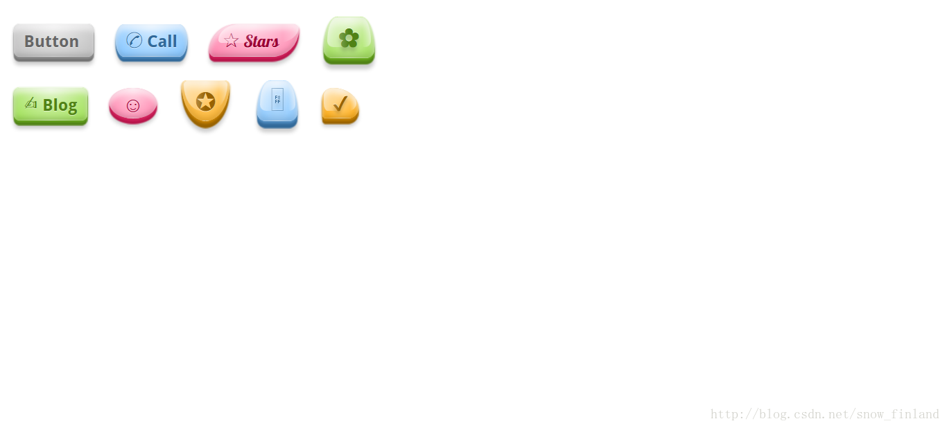
效果图:


 607
607


 被折叠的 条评论
为什么被折叠?
被折叠的 条评论
为什么被折叠?
 到【灌水乐园】发言


