


转载请注明出处『Android5.x新特性之 Toolbar和Theme的使用:http://blog.csdn.net/feiduclear_up/article/details/46457433 CSDN 废墟的树』
Android5.0以后谷歌大力推崇Material Design设计,有意统一之前Android style风格乱象的情况。上一篇博客我们学习了Android5.x 新控件之RecyclerView,CardView,Palette的使用。这篇文章来介绍Android5.x新特性之 Toolbar和Theme的使用.
注意 在使用Android5.x中的Toolbar和Theme需要在你的工程的build.gradle文件下引入如下配置
dependencies {
    compile fileTree(dir: 'libs', include: ['*.jar'])
    compile 'com.android.support:appcompat-v7:22.2.0'
}
- 1
- 2
- 3
- 4

- 1
- 2
- 3
- 4
Toolbar
你还在为Android 的ActionBar的文字不能随意设置位置而烦恼么?你还在为ActionBar不能自定义添加自己的布局而烦恼么?现在告诉你一个好消息,当你看到这篇文章时,就不必烦恼了。Google在Android5.0以后推出了一个Toolbar来完全代替之前的Actionbar,Toolbar的出现解决了Actionbar的各种限制,Toolbar可以完全自定义和配置。我们从以下几个点了解Toolbar的使用
- Toolbar的基础使用
- Toolbar配置主题Theme
- Toolbar中常用的控件设置
- Toolbar的自定义
Toolbar的基础使用
我们从以下几点来一步一步的学习Toolbar的使用
- Style(风格)
- Layout(布局)
- Activity(代码)
Style
为了能在你的Activity中使用Toolbar,你必须在工程里修改styles.xml文件里的主题风格,系统默认如下
<style name="AppTheme" parent="Theme.AppCompat.Light.DarkActionBar">
- 1
- 1
这种Theme表示使用系统之前的ActionBar,那么我们想要使用Toolbar怎么办呢?
<style name="AppTheme" parent="Theme.AppCompat.Light.NoActionBar">
- 1
- 1
这个主题表示不使用系统的Actionbar了,这是第一步。
Layout布局
为了使用Toolbar,我们第二步是在你的activity_main.xml布局里添加Support v7提供的Toolbar,代码如下
<RelativeLayout xmlns:android="http://schemas.android.com/apk/res/android"
    xmlns:tools="http://schemas.android.com/tools"
    android:layout_width="match_parent"
    android:layout_height="match_parent"
    tools:context=".MainActivity">

    <android.support.v7.widget.Toolbar
        android:id="@+id/toolbar"
        android:layout_width="match_parent"
        android:layout_height="?attr/actionBarSize"
        android:minHeight="?attr/actionBarSize"
        >
    </android.support.v7.widget.Toolbar>

</RelativeLayout>
- 1
- 2
- 3
- 4
- 5
- 6
- 7
- 8
- 9
- 10
- 11
- 12
- 13
- 14
- 15
- 1
- 2
- 3
- 4
- 5
- 6
- 7
- 8
- 9
- 10
- 11
- 12
- 13
- 14
- 15
为了在你的UI中使用Toolbar,你得为每个activity布局添加Toolbar,并且给Toolbar设置一个id android:id=”@+id/toolbar”。这是第二部。
代码添加Toolbar
为了使用Toolbar,我们第三部是在你的Activity代码中做如下代码处理:
 Toolbar toolbar;
    @Override
    protected void onCreate(Bundle savedInstanceState) {
        super.onCreate(savedInstanceState);
        setContentView(R.layout.activity_main);

        toolbar = findView(R.id.toolbar);
        setSupportActionBar(toolbar);
    }
- 1
- 2
- 3
- 4
- 5
- 6
- 7
- 8
- 9
- 1
- 2
- 3
- 4
- 5
- 6
- 7
- 8
- 9
代码中通过findView找到Toolbar,然后通过setSupportActionBar(toolbar);将Toolbar设置为Activity的导航栏。
通过上面的三个步骤,你就已经使用了Support v7提供的Toolbar了。看看那效果图。
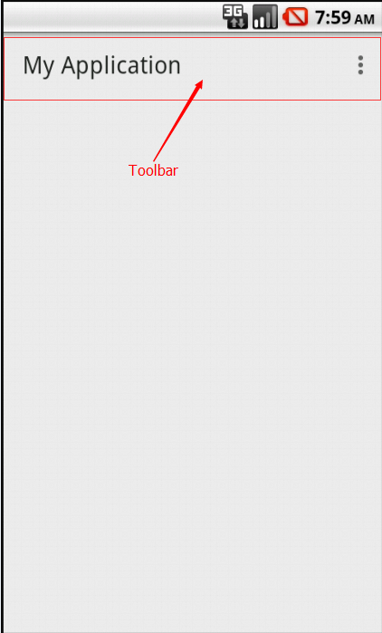
是不是感觉很丑?没有一点MD设计的风格,不过别失望,这仅仅是为了让Toolbar正常工作而已,为了让Toolbar有Material Design风格,我们必须去设置Toolbar的主题风格。
Toolbar配置主题Theme
我们重新配置系统主题Theme,修改styles.xml代码如下:
  <style name="AppTheme" parent="Theme.AppCompat.Light.NoActionBar">
        <!-- Customize your theme here. -->
        <!--导航栏底色-->
        <item name="colorPrimary">@color/accent_material_dark</item>
        <!--状态栏底色-->
        <item name="colorPrimaryDark">@color/accent_material_light</item>
        <!--导航栏上的标题颜色-->
        <item name="android:textColorPrimary">@android:color/black</item>
        <!--Activity窗口的颜色-->
        <item name="android:windowBackground">@color/material_blue_grey_800</item>
        <!--按钮选中或者点击获得焦点后的颜色-->
        <item name="colorAccent">#00ff00</item>
        <!--和 colorAccent相反,正常状态下按钮的颜色-->
        <item name="colorControlNormal">#ff0000</item>
        <!--Button按钮正常状态颜色-->
        <item name="colorButtonNormal">@color/accent_material_light</item>
        <!--EditText 输入框中字体的颜色-->
        <item name="editTextColor">@android:color/white</item>
    </style>
- 1
- 2
- 3
- 4
- 5
- 6
- 7
- 8
- 9
- 10
- 11
- 12
- 13
- 14
- 15
- 16
- 17
- 18
- 19
- 1
- 2
- 3
- 4
- 5
- 6
- 7
- 8
- 9
- 10
- 11
- 12
- 13
- 14
- 15
- 16
- 17
- 18
- 19
各个属性就不解释了,注释都很清楚。我们来看看Toolbar怎么使用这些主题吧?
配置activity_main.xml中的Toolbar改成为如下:
 <android.support.v7.widget.Toolbar
        android:id="@+id/toolbar"
        android:layout_width="match_parent"
        android:layout_height="?attr/actionBarSize"
        android:background="?attr/colorPrimary"
        >
    </android.support.v7.widget.Toolbar>
- 1
- 2
- 3
- 4
- 5
- 6
- 7
- 1
- 2
- 3
- 4
- 5
- 6
- 7
相比上面的Toolbar配置,这里只多添加了 这么一行代码
android:background="?attr/colorPrimary"
- 1
- 1
给Toolbar设置背景属性,这里使用了styles.xml文件中如下属性
 <!--导航栏底色-->
 <item name="colorPrimary">@color/accent_material_dark</item>
- 1
- 2
- 1
- 2
经过如下配置再来看看效果图吧!
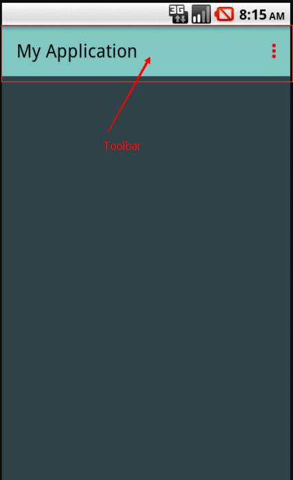
效果有点改进,我们继续发现Toolbar的优势吧!
Toolbar中常用的控件设置
那么Toolbar是否都有Actionbar的所有功能呢?毋庸置疑,来看代码:
toolbar = findView(R.id.toolbar);
        setSupportActionBar(toolbar);
        getSupportActionBar().setDisplayShowTitleEnabled(false);
        toolbar.setTitle("主标题");
        toolbar.setSubtitle("副标题");
        toolbar.setLogo(R.drawable.ic_launcher);
        toolbar.setNavigationIcon(android.R.drawable.ic_input_delete);
- 1
- 2
- 3
- 4
- 5
- 6
- 7
- 1
- 2
- 3
- 4
- 5
- 6
- 7
Toolbar可以设置 Title(主标题),Subtitle(副标题),Logo(logo图标)NavigationIcon(导航按钮)。
注意 如果你想要通过toolbar.setTitle(“主标题”);设置Toolbar的标题,你必须在调用它之前调用如下代码:
getSupportActionBar().setDisplayShowTitleEnabled(false);
- 1
- 1
上面代码用来隐藏系统默认的Title。
那么Toolbar能不能使用Menu菜单功能呢?答案是肯定的了。来看看加载如下menu菜单的Toolbar吧
<menu xmlns:android="http://schemas.android.com/apk/res/android"
    xmlns:app="http://schemas.android.com/apk/res-auto"
    xmlns:tools="http://schemas.android.com/tools"
    tools:context=".MainActivity">
    <item
        android:id="@+id/action_edit"
        android:icon="@drawable/abc_ic_search_api_mtrl_alpha"
        android:orderInCategory="80"
        android:title="查找"
        app:showAsAction="always" />

    <item
        android:id="@+id/action_share"
        android:icon="@drawable/abc_ic_menu_share_mtrl_alpha"
        android:orderInCategory="90"
        android:title="分享"
        app:showAsAction="always" />

    <item
        android:id="@+id/action_settings"
        android:orderInCategory="100"
        android:title="@string/action_settings"
        app:showAsAction="never" />
</menu>
- 1
- 2
- 3
- 4
- 5
- 6
- 7
- 8
- 9
- 10
- 11
- 12
- 13
- 14
- 15
- 16
- 17
- 18
- 19
- 20
- 21
- 22
- 23
- 24
- 25
- 1
- 2
- 3
- 4
- 5
- 6
- 7
- 8
- 9
- 10
- 11
- 12
- 13
- 14
- 15
- 16
- 17
- 18
- 19
- 20
- 21
- 22
- 23
- 24
- 25
怎么给menu的各个Item添加点击事件呢?Toolbar给我们提供如下方法
Activity继承Toolbar的OnMenuItemClickListener接口
public class MainActivity extends AppCompatActivity implements Toolbar.OnMenuItemClickListener
- 1
- 1
//实现接口
toolbar.setOnMenuItemClickListener(this);
@Override
    public boolean onMenuItemClick(MenuItem item) {

        switch (item.getItemId()) {
            case R.id.action_edit:
                Toast.makeText(this, "查找按钮", Toast.LENGTH_SHORT).show();
                break;
            case R.id.action_share:
                Toast.makeText(this, "分享按钮", Toast.LENGTH_SHORT).show();
                break;
        }

        return false;
    }
- 1
- 2
- 3
- 4
- 5
- 6
- 7
- 8
- 9
- 10
- 11
- 12
- 13
- 14
- 15
- 16
- 1
- 2
- 3
- 4
- 5
- 6
- 7
- 8
- 9
- 10
- 11
- 12
- 13
- 14
- 15
- 16
至此,Toolbar添加控件就基本完结了,来看看效果如下
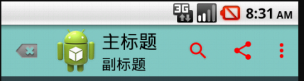
是不是很炫?我们还没有使用自定义的Toolbar呢?那怎么使用呢?
Toolbar的自定义
其实Toolbar是继承ViewGroup的一个容器控件,言外之意就是我们可以在Toolbar添加自己的布局了。看代码
<android.support.v7.widget.Toolbar
        android:id="@+id/toolbar"
        android:layout_width="match_parent"
        android:layout_height="?attr/actionBarSize"
        android:background="?attr/colorPrimary">

        <RelativeLayout
            android:layout_width="match_parent"
            android:layout_height="wrap_content"
            android:gravity="center">

            <Button
                android:layout_width="wrap_content"
                android:layout_height="wrap_content"
                android:text="add" />

            <TextView
                android:layout_width="wrap_content"
                android:layout_height="wrap_content"
                android:layout_centerInParent="true"
                android:layout_gravity="center_vertical"
                android:text="标题"
                android:textSize="18sp" />

            <ImageView
                android:layout_width="wrap_content"
                android:layout_height="wrap_content"
                android:layout_alignParentRight="true"
                android:background="@drawable/abc_ic_menu_share_mtrl_alpha" />

        </RelativeLayout>
    </android.support.v7.widget.Toolbar>
- 1
- 2
- 3
- 4
- 5
- 6
- 7
- 8
- 9
- 10
- 11
- 12
- 13
- 14
- 15
- 16
- 17
- 18
- 19
- 20
- 21
- 22
- 23
- 24
- 25
- 26
- 27
- 28
- 29
- 30
- 31
- 32
- 1
- 2
- 3
- 4
- 5
- 6
- 7
- 8
- 9
- 10
- 11
- 12
- 13
- 14
- 15
- 16
- 17
- 18
- 19
- 20
- 21
- 22
- 23
- 24
- 25
- 26
- 27
- 28
- 29
- 30
- 31
- 32
效果图:
这样我们就可以任意给Toolbar布局了。也解决了标题不能居中的问题。有特殊需求的Toolbar的童鞋就可以自行补脑实现各种需求效果啦!
Android5.x Material Design 主题风格Theme配置
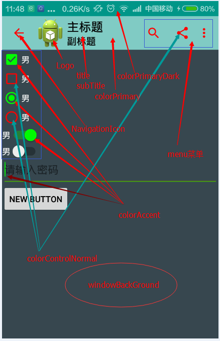
在通往Material Design风格的路上总是遥远的,但也阻挡不了我们学习的劲头,仅仅会使用Toolbar是不够的。除了Toolbar的风格,我们还可以通过设置Theme主题该控制Android很多控件的风格。直接上一张图片效果。
以上效果的主题配置如下:
  <style name="AppTheme" parent="Theme.AppCompat.Light.NoActionBar">
        <!-- Customize your theme here. -->
        <!--导航栏底色-->
        <item name="colorPrimary">@color/accent_material_dark</item>
        <!--状态栏底色-->
        <item name="colorPrimaryDark">@color/accent_material_light</item>
        <!--导航栏上的标题颜色-->
        <item name="android:textColorPrimary">@android:color/black</item>
        <!--Activity窗口的颜色-->
        <item name="android:windowBackground">@color/material_blue_grey_800</item>
        <!--按钮选中或者点击获得焦点后的颜色-->
        <item name="colorAccent">#00ff00</item>
        <!--和 colorAccent相反,正常状态下按钮的颜色-->
        <item name="colorControlNormal">#ff0000</item>
        <!--Button按钮正常状态颜色-->
        <item name="colorButtonNormal">@color/accent_material_light</item>
        <!--EditText 输入框中字体的颜色-->
        <item name="editTextColor">@android:color/white</item>
    </style>
- 1
- 2
- 3
- 4
- 5
- 6
- 7
- 8
- 9
- 10
- 11
- 12
- 13
- 14
- 15
- 16
- 17
- 18
- 19
- 20
- 1
- 2
- 3
- 4
- 5
- 6
- 7
- 8
- 9
- 10
- 11
- 12
- 13
- 14
- 15
- 16
- 17
- 18
- 19
- 20
1.colorPrimary: Toolbar导航栏的底色。
2.colorPrimaryDark:状态栏的底色,注意这里只支持Android5.0以上的手机。
3.textColorPrimary:整个当前Activity的字体的默认颜色。
4.android:windowBackground:当前Activity的窗体颜色。
5.colorAccent:CheckBox,RadioButton,SwitchCompat等控件的点击选中颜色
6.colorControlNormal:CheckBox,RadioButton,SwitchCompat等默认状态的颜色。
7.colorButtonNormal:默认状态下Button按钮的颜色。
8.editTextColor:默认EditView输入框字体的颜色。


 459
459


 被折叠的 条评论
为什么被折叠?
被折叠的 条评论
为什么被折叠?
 到【灌水乐园】发言


