


Write By Monkeyfly
以下内容均为原创,如需转载请注明出处。
前提:
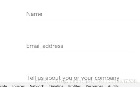
今晚在浏览网页时,无意中发现SegmentFault网站中一位网友的评论中有一张动态图片(如上图所示),效果看起来挺炫酷的,所以呢,也想自己动手做一做,因为之前也看到过好多类似的动态效果,一直都没有机会做。今天就趁着业余时间尝试着做一些,顺便能锻炼自己的能力。
如下图所示:
准备工作:
做之前的第一件事,就是根据这张图来分析上图中的动态效果到底是如何实现的。单纯光说做的话,大家基本都会做。最重要的还是用CSS实现的想法和过程,不清楚实现的方式,不会灵活运用所学的知识,那也是白搭。
就说这么多吧,接下来让我们正式开始分析:
1.都是表单元素,大家都知道,就不多赘述了;
2.先看文字,一眼就能认出,肯定是用label标签来做的,并且运用了动态的顶部偏移效果。
问题一:那为什么不是placeholder属性呢?
首先从语义上就pass掉了,placeholder属性是输入框的提示文字,仅仅在用户输入前做提示用;而且当用户获取到输入框的焦点之后,placeholder就应该消失了,而不是一直存在。
问题二:那么,label标签是如何实现的呢?
很明显,使用absolute定位到input输入框的左下方,然后运用动画效果移动到input的顶部。这个不用多说,大家应该都知道吧。
问题三:应该用哪个动画效果呢?
我首先想到的是jQuery中用于创建自定义动画的函数animate(); 当然你也可以用其他的方法。
首先,来复习一下animate()方法吧。说实话,我也忘了怎么用了。
语法:
(selector).animate({styles},speed,easing,callback)参数说明
styles   - 设置要产生动画效果的一个或多个css属性/值。【必选项】
speed    - 设置动画的速度。【可选项】
            可选的值:
            1.表示动画时长的毫秒数值(如:1000);
            2.三种系统预定速度的字符串("slow","normal", or "fast")之一。
easing   - 规定在动画过程中元素的速度。默认为"swing"。【可选项】
            可能的值:
            1.swing:两边慢,中间快。
            2.linear:匀速移动。
callback - 规定动画完成之后要执行的函数。【可选项】
简单看个栗子就知道怎么用了。
HTML代码:

<button id="go"> Run</button>
<div id="block">Hello!</div>
jQuery代码:
// 在一个动画中同时应用三种类型的效果
$("#go").click(function(){
$("#block").animate({
width: "90%",
height: "100%",
fontSize: "20px",
borderWidth: 10
}, 1000 );
});3.然后设置input的外边框为outline:none;(输入框获得焦点时,外边框有一圈蓝色的光效,不美观所以要去掉)
并且设置input为无边框border:none;
当然要留下底部边框,即border-bottom:1px solid #c3c3c3;
4.接下来,就是最最重要的部分。
给input的底部边框border-bottom添加动画效果,同时再改变颜色就可以了。
//输入框获得焦点时
$(this).css({"border-bottom": "1px solid red"});
//输入框失去焦点时
$(this).css({"border-bottom": "1px solid #c3c3c3"});
这样做肯定是不行的,因为没有涉及到动画效果。
- 后来发现不对,GIF中的input底部边框一直都在,此时意识到自己的想法有问题。
- input的border-bottom的长度不能动态的改变,这种方法根本不能实现。觉得应该换一种实现方式。
5.新的想法诞生:
- 要不就用一个div作为底边框来实现,将div设置absolute定位到与input底边框重合(覆盖上去);
- 并且默认设置div的width为0,让它先隐藏起来;
- 当输入框获取焦点的时候,只需要动态地改变div的width和输入框的width一样就行了;
- 而且div的颜色在开始时就直接默认为红色。
这样应该就可以实现了,试试就知道了。
代码如下:
//输入框获得焦点时
$("input").focus(function(event) {
    //label上升
     $(this).siblings("label").stop().animate({"bottom": "50px"}, 500);
     //底边框展开
     $(this).next(".bottom-line").stop().animate({"width": "400px"}, 500);
});
//输入框失去焦点时
$("input").blur(function(event) {
    //label下降
     $(this).siblings("label").stop().animate({bottom: "10px"}, 500);
     //底边框收回
     $(this).next(".bottom-line").stop().animate({"width": "0"}, 500);
});
注意:
- 当与animate()方法一起使用时,属性名称必须是驼峰写法。即必须使用paddingLeft代替padding-left,marginRight代替margin-right,依次类推。
- 可以应用动画的属性,请参考:http://www.runoob.com/jquery/eff-animate.html
- 颜色动画不包含在核心jQuery库中。如果想要应用动画颜色,需要从jQuery.com下载颜色动画插件。
6.接下来给大家说一说为什么要在animate()方法之前添加stop()方法。
stop()方法的作用是:停止当前正在运行的动画。(动画效果运行到一半也会立即停止)添加与不添加的区别:
- 添加stop()方法:当前的动画效果进行一半就立即停止了,取消当前正在进行的动画。
- 不添加stop()方法:当前的动画效果进行完毕后,才会去执行stop()方法并停止当前动画。
- 其实添不添加stop()方法的效果是很明显的,自己试试就知道了。说了你可能不会直观的感受到。
完整代码如下所示:
<!DOCTYPE html>
<html lang="en">
<head>
<meta charset="UTF-8">
<title>jQuery实现input边框动态效果</title>
<style>
*{
margin:0;
padding:0;
box-sizing: border-box;
}
body{
background-color: #333;
}
.content{
width:1000px;
height: 500px;
margin:0 auto;
margin-top: 200px;
background-color: #fff;
}
.details {
padding:50px 50px 0;
}
.details .item{
width:400px;
margin:20px auto;
position: relative;
}
.item label{
font-size: 16px;
position: absolute;
left:2px;
bottom:10px;
font-family: "宋体";
color:#777;
cursor: text;
}
.item input{
padding-top: 35px;
width:400px;
height: 80px;
font-size: 20px;
border:none;
outline: none;
border-bottom: 1px solid #c3c3c3;
}
.item .bottom-line{
position: absolute;
width: 0;
height: 2px;
left:0;
bottom: -1px;
background-color: red;
}
</style>
</head>
<body>
<div id="container">
<div class="content">
<div class="details">
<div class="item">
<label for="item-firsthev">首重</label>
<input id="item-firsthev" type="text">
<div class="bottom-line"></div>
</div>
<div class="item">
<label for="next-hev">续重</label>
<input id="next-hev" type="text">
<div class="bottom-line"></div>
</div id="">
<div class="item">
<label for="charge">运费</label>
<input id="charge" type="text">
<div class="bottom-line"></div>
</div>
</div>
</div>
</div>
<script src="jquery-3.2.1.min.js"></script>
<script>
输入框获得焦点时
$("input").focus(function(event) {
//label动态上升,升至顶部
$(this).siblings("label").stop().animate({"bottom": "50px"}, 500);
//div模拟的下边框伸出,其width动态改变至input的width
$(this).next(".bottom-line").stop().animate({"width": "400px"}, 500);
});
输入框失去焦点时
$("input").blur(function(event) {
//label动态下降,恢复原位
$(this).siblings(",label").stop().animate({bottom: "10px"}, 500);
//用div模拟的下边框缩回,其width动态恢复为默认宽度0
$(this).next(".bottom-line").stop().animate({"width": "0"}, 500);
});
</script>
</body>
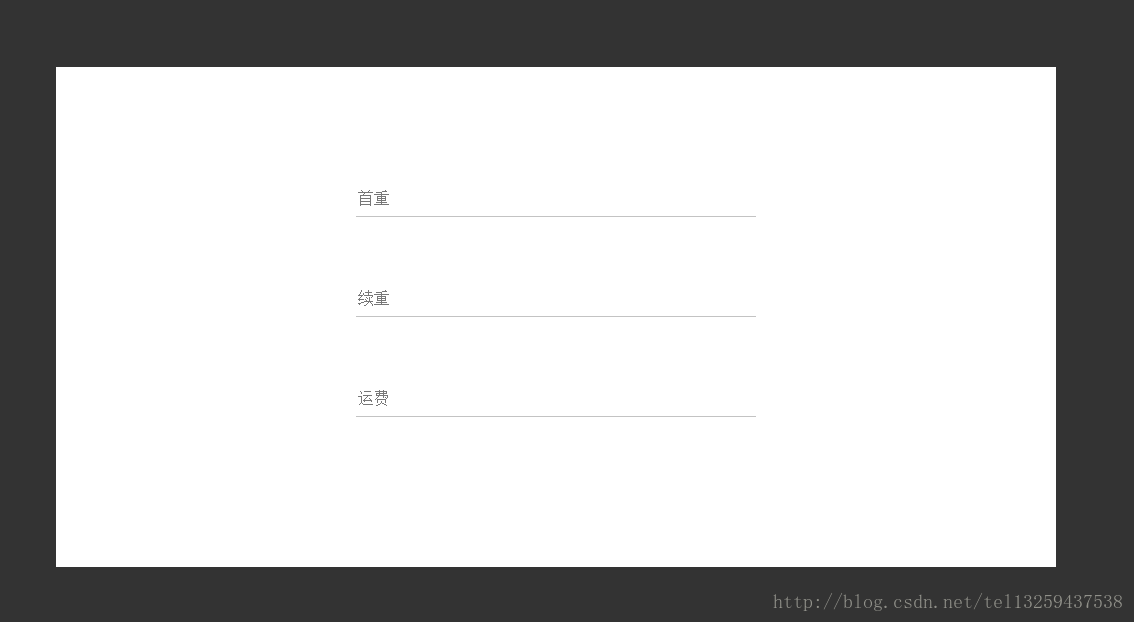
</html>实现效果图:
至此,所有内容已全部展示完毕。
结束语
- 再后来发现,其实还可以用CSS3新增的过渡属性transition来实现。通过此复合属性,可以设置对象变换时的过渡。
- 只可惜自己不会用,对这个属性也不熟悉,等日后学会了再完善。
- 希望知道其他方法的同学也可以分享一下自己的方法。
- 毕竟,我只是个新手。


 3522
3522


 被折叠的 条评论
为什么被折叠?
被折叠的 条评论
为什么被折叠?
 到【灌水乐园】发言


